Friday, January 17, 2014

To the Front

Source: Erik Freeland archdaily.com
Section, Source: archdaily.com
Urban Townhouse, New York City, New York, USA, 2009 designed by GLUCK+
The conventional plan and section were redefined with the stair and elevator core pushed up against the street façade, instead of running along one of the party walls.  As a result, loft-like spaces run fluidly the entire length of the 38-foot-deep building, rather than being compartmentalized into small front and back rooms. An open mezzanine living room, a private office nook, and sitting rooms to private bedrooms, extend off the stairs which wind like a ribbon around the elevator core. -- ArchDaily

Source: Luc Roymans archdaily.com

Section, Source: archdaily.com
House BRZ, Antwerp, Belgium, 2012 designed by P8 architecten
Since the surface per level is only 45m2, it was chosen to leave this space as much open as possible. The stairs were moved to the front of the house so they have only a small impact on the flexibility of the plan. This way the stairs become a playful design element visible from the outside. They appear and disappear behind the different windows. -- ArchDaily

Thursday, January 16, 2014

Cube 7

Source: Jeremy Bittermann archdaily.com
Clyfford Still Museum, Denver, Colorado, USA, 2011 designed by Allied Works Architecture
Through the trees, the structure of the building is visible, consisting of cast-in-place architectural concrete walls with a variety of surface relief and texture. The façade features thin, vertical lines of concrete that project from the building’s surface in a fractured, organic, and random pattern, creating a rich surface that changes in the intense Denver sunlight and forms varied shadows across the building. -- ArchDaily

Source: Chang Kyun Kim archdaily.com
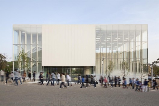
White Block Gallery, Heyri Art Valley, South Korea designed by SsD
A matrix of 3 solid gallery volumes carefully positioned creates 7 additional galleries in a compact but open ended configuration. Designed to showcase global contemporary art from super sized sculpture and paintings to multi-media installations, the spaces are unique in proportion and lighting allowing curators to accommodate new future forms of art and media. -- ArchDaily

Source: Brad Feinknopf archdaily.com
McGee Art Pavilion, Alfred, New York, USA, 2011 designed by ikon.5 architects
The McGee Art Pavilion is an expansion to the School of Art and Design at the New York State College of Ceramics. Designed as a large ceramic container for holding art and light, the pavilion is set on a plaza between two existing campus buildings on the main pedestrian road on the campus, creating a realization of the manufacturing history of Alfred. -- ArchDaily

Source: Marc Lins Photography archdaily.com
Fresach Diocesan Museum, Fresach, Austria, 2011 designed by Marte.Marte Architekten
The public square has been completed by a monolithic block placed on the gently rising land to the northeast. The foundation and main level divide the hermetic shell for the diocese’s church treasures, and bring the large cube into harmony with the scale of the surrounding buildings. -- ArchDaily

Source: David Holmes archdaily.com
The Lighthouse Young People’s Centre, Birmingham, UK designed by Associated Architects
The site has a strong visual presence in the local area, overlooking a major route into Birmingham city centre. The use of semi-transparent coloured cladding allows the sports hall to be naturally lit in the day and to provide a strong dynamic presence in the area.  In the evening, the use of artificial lighting and feature LED lighting allows The Lighthouse to become the ‘beacon’ within the community. -- ArchDaily

Source: Joshua White archdaily.com
Matthew Marks Gallery, West Hollywood, California, USA, 2012 designed by ZELLNERPLUS
This is a 3000 square foot, free standing new building for renowned New York art dealer Matthew Marks.
The building was conceived as a monolithic, windowless, 70 x 40 x 32 foot white stucco box. -- ArchDaily

Source: Didier Boy de la Tour archdaily.com
Mont de Marsan Mediatheque, Place de la Caserne Bosquet, 40000 Mont-de-Marsan, France, 2012 designed by archi5
The Media Library stands in the middle of the Bosquet barracks, and care has been taken to augment the dialogue with the place’s strong architectural whole. With its clean envelope of pure geometric lines, a 197 ft x 197 ft square, the building complies with the classical layout yet contrasts with its austerity by offsetting the system with a corner opening onto the city. Its facades reflect the surrounding barracks like a respectful, deferential mirror. -- ArchDaily

 
Source: KSG Architekten + BDA Feldschnieders + Kister archdaily.com
Research Building DLR SpaceLIFT, Robert-Hooke-Straße 7, Bremen, Germany, 2012 designed by Ksg Architekten + Architekten BDA Feldschnieders + Kister
To its outside the square layout presents itself as a solitary volume with a dense, two storey cubature. Integrating a colonnade on the upper level, the inside opens itself up to its visitors despite the high levels of security. -- ArchDaily

Source: Steven Massart archdaily.com
MuCEM, Marseille, France, 2013 designed by Rudy Ricciotti
First of all a perfect square of 72 m per side, it is a classic plan, Latin, under the control of Pythagoras. Within this square, another of 52 m per side, comprising the exhibition and conference halls identified as the heart of the museum.. -- ArchDaily

Source: Christian van der Kooy archdaily.com

Erasmus Pavilion, Rotterdam, The Netherlands, 2013 designed by Powerhouse Company + DeZwarteHond
A compact building volume, the positioning of the mass in the center core, a careful orientation of the program toward the sun—combined with the active facade, the solar panels on the roof, the natural ventilation, and flexible zoning transform this transparent building into a low- consumption landmark. -- ArchDaily

Source: 11h45 archdaily.com
Auditorium Of Bondy & Radio France Choral Singing Conservatory, Bondy, France designed by PARC Architectes
The architecture of the building plays with the aesthetics of the hangar : a very simple square plan and an undulated metal skin. Unlike a traditional hangar, it opens to its context through a series of arches, letting in natural light and views. Inside, every space has a specific acoustics related to its function and its ambiance. -- ArchDaily

Source: Michael Moran archrecord.construction.com
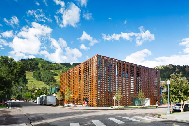
Aspen Art Museum, Aspen, Colorado, USA, 2014 designed by Shigeru Ban Architects
From the exterior, the museum’s main feature is the basket-weave cladding that covers its two street-facing facades. The slats, “woven” together on-site, are made from a paper-and-resin composite sandwiched between two thin layers of brown okoume wood protected with a UV coating. The density of the weave changes from top to bottom and as it moves away from the corner of the building. Practically, the screen provides shade from the intense Colorado sunlight. Aesthetically, it helps give the museum a craftsy, homemade quality, despite its bulky presence. -- Architectural Record

Source: Pepo Segura archdaily.com
Girona Public Library, Girona, Girona, Spain, 2014 designed by Corea & Moran Arquitectura
The square-shaped volume is almost entirely glazed in U-glass punctuated by sections of transparent glass, flooding the interior with a diffuse light especially comfortable for reading while framing views of the surrounding neighborhood. At night the library glows like a giant urban lantern, welcoming everyone to enter and become part of this place for knowledge, culture and community life. -- ArchDaily

Thursday, January 9, 2014

Cube 6

Source: philly.curbed.com
Plan, Source: philly.curbed.com
Fisher House, Hatboro, Pennsylvania, USA, 1967 designed by Louis I. Kahn
Characterized by its dual cubic volumes, stone foundation and detailed cypress cladding, the Fisher house stands as a clear statement of how Kahn was working at the time and how his work differed from that of his contemporaries. In the Fisher House, Kahn eschews the linearity of the modern plan and focuses on a simple geometry, allowing the cubes to provide a separation of public and private space. -- wikipedia

Source: Felipe Combeau archdaily.com
Plan, Source: archdaily.com
Casa Nº1 en Curacavi, Curacaví, Santiago Metropolitan Region, Chile, 2012 designed by Felipe Combeau + Pablo Alfaro
It is a 14×14 m square that contains the entire program in a single level.  ....a pass through the square in order to establish a clear way to enter and exit the house and internally separate the public areas from the private ones. This operation allows the box to break and make the outside enough permeable. -- ArchDaily

Source: Peter Jarvard archdaily.com
Plan, Source: archdaily.com
Campus Roskilde, Roskilde County, Denmark, 2013 designed by Henning Larsen Architects
Campus Roskilde will consist of four square buildings – slightly rotated towards each other to screen the area from the motorway and create a more intimate, varied space around the campus square. -- ArchDaily

Source: Adam Mørk archdaily.com

Plan, Source: archdaily.com
City in the City, 211 18 Malmö, Sweden, 2015 designed by Schmidt Hammer Lassen Architects
The building consists of cubic areas that are twisted and given different sizes to match the directions and heights of buildings in the surrounding city.  The different functions of the building are organised as separate elements to resemble a small city. The lobby becomes the street, which runs through the entire ground floor and ties everything together. Like medieval cities, which had curved, narrow streets organised around plazas and squares, the lobby is designed to form small gathering places and recesses where visitors can stop, sit and enjoy the view of the canal and the park. -- ArchDaily

Wednesday, January 8, 2014

O4

Source: MZ Architects archdaily.com
Al Dar Headquarters, Al Raha Beach, Abu Dhabi, United Arab Emirates, 2010 designed by MZ Architects
The AlDar Headquarters designed by MZ Architects has a distinctive and innovative design: a semispherical building comprising two circular convex shaped facades linked by a narrow band of indented glazing. This iconic fully glazed structure is completely circular in elevation and curved in all other directions. -- ArchDaily

Source: Joseph di Pasquale architect archdaily.copm
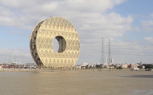
Guangzhou Circle, Guangzhou, Guangdong, China, 2013 designed by Joseph di Pasquale architect
The total height is 138 mt for 33 floors, 85.000 square meters of floor area and about 50 million euros of global investment. The inner hole is a unique space that has no equal in the world with its almost fifty meters of diameter (48 mt). -- ArchDaily
Tuesday, December 31, 2013

Skin of Architecture: Pattern 12

Source: Thomas Fischer archdaily.com
Institute buildings University Kassel, Kassel, Germany, 2010 designed by ATELIER 30
....the busy public spaces such as the foyer and main entry zones are highlighted by a glass facade opening up the buildings interior towards the campus and the historic structures of the former industrial complex “Henschel- Anlage”. This stands in stark contrast to the Jura-stone facade with its precisely inset window strips. -- ArchDaily

Source: Arthur Meerloo archdaily.com
BioPartner, Wassenaarseweg, Leiden, The Netherlands, 2012 designed by JHK Architecten
The similar design and alignment of the two buildings creates a powerful ensemble, which is further accentuated by the consistent use of materials, clear horizontal segmentation and high-quality detailing. The omni-directional design of the buildings ensures that there are no rear or side elevations and every façade is presented as frontage.   -- ArchDaily

Source: Metropolis archdaily.com
Building Omega, Santiago de Surco, Peru, 2013 designed by Metropolis
Other facades were cover with aluminum panels and a broken weft of windows so a visual tension could be generated in the whole complex. -- ArchDaily

Source: Mathieu Ducros archdaily.com
Academy Of Art Crafts (ESMA), 50 Route de Narbonne, 31320 Auzeville-Tolosane, France, 2013 designed by LCR Architectes
The school, overlaid with two levels of parking (55 spaces reserved for school and 60 for the residence), offers facades that affirm their identity on different orientations. -- ArchDaily

Friday, December 20, 2013

Skin of Architecture: Punched Holes 7

Simmons Hall at MIT, Cambridge, completed in 2002, has a cast-concrete exoskeleton clad in sanded aluminum. Read the description from architect's web site.

Source: trendir.com
Cell Brick House, Tokyo, Japan designed by Atelier Tekuto
three-storey home featuring a unique facade of alternating steel blocks and glass. While the connection between architecture and nature may not be immediately apparent, this amazing home’s checker-board exterior lets light permeate interiors, like sunlight beaming through foliage. On the inside, these steel boxes become built-in storage shelves. -- TrenDir

Source: archdaily.com
KMAR – Koninklijke Marechaussee, Amsterdam, The Netherlands designed by Wansleben Architekten
The building’s outer facade stands out by dint of a seeming sobriety indicative of a defensive nature. You initially feel you’re facing a massive, dark complex – square, plenty of windows that nevertheless look small in their deep recesses, and with a facade texture like that of a woven carpet, partly due to the windows.  -- ArchDaily

Source: Vulkers Fotografie archdaily.com
ROC Mondriaan Laak II, Den Haag, The Netherlands, 2011 designed by LIAG
The building forms a powerful and colourful (a la Mondriaan) completion of the Leeghwaterplein. Seen from the train, it serves as a calling card for ROC Mondriaan. The building has a grid shaped concrete façade decorated in the ROC colours. The effect in combination with the windows results in a strong whole.  -- ArchDaily

Source: Giovanna Silva archdaily.com
Office Building, Vado Ligure, Savona, Italy, 2011 designed by Carlo Bagliani + Antonio Norero
....a chess textile because of the industrial landscape around the parcel, thinking to some building painted in black and white chess in order to be viewed by the air traffic. -- ArchDaily

Source: Mika Huisman archdaily.com
Helsinki University Main Library, Kaisaniemenkatu, Helsinki, Finland, 2012 designed by Anttinen Oiva Architects
The architectural starting point – the cityscape considered – was a vision of a unique public building that will suit its surroundings in terms of its materials, design and height.  The dense fenestration grid, which blurs the standard floor division, together with the large arched openings give the library a distinct external appearance. By varying the size of the arched openings the building is fitted as an integrative solution within a situation of three different types of street space. -- ArchDaily

Thursday, December 19, 2013

Skin of Architecture: Text

Source: José Oller archdaily.com
Mary Immaculate Parish Hall, Santa Cruz of Tenerife, Spain designed by Equipo Olivares Arquitecto
The very nature of a building intended for worship, raised the need to get spaces for contemplation and meditation. For this, the Parish Hall turns to the interior gardens, isolated from the outside by cyclopean concrete walls and reinforced concrete. The closings are understood as light screens. -- ArchDaily

Source: Ernesta Caviola archdaily.com
Villa Sottanis Library and Gamesroom, Via Annuti, 36, 16030 Casarza Ligure Genoa, Italy, 2008 designed by 5+1AA Alfonso Femia Gianluca Peluffo
A number of verses written by Gianni Rodari, who was and still is the greatest fairy tale writer of the 20th century, have been chosen to represent the new centre. The cultural and playful nature of the project can be interpreted through his works that the building explicitly pays tribute to. -- ArchDaily

Source: Pietro Savorelli archdaily.com
Curno Public Library and Auditorium, Via IV Novembre, 24128 Bergamo BG, Italy, 2009 designed by Archea Associati
Through various laboratory tests and various samples, they opted for a colored concrete with a “mix-design” integrated with natural iron oxide pigments and with the addition of lubricants to make the concrete workable according to particular conformations of the molds.
The realization of the letters on the surface of the walls was made possible by the positioning of plastic matrices onto those surfaces. -- ArchDaily

Fougères Biblioteque, Fougères, France, 2009 designed by Tétrarc Architects
The Fougères Biblioteque follows the contemporary approach to libraries as meeting spaces, rather than just book storage. Due to the public function of the building,it expresses itself to the city trough the facade details -- ArchDaily

Source: Element Arkitekter AS archdaily.com
The Teachers House, Osterhaus gate 4, Oslo, Norway designed by Element Arkitekter AS
Two layers of glass and the screen print (silketrykk in Norwegian) on the outside of the inner glass. In the competition we put art on the façade in order to symbolize the important role of Union of Education Norway concerning teaching and education. The art also functions as sunscreen. -- ArchDaily

Source: FG+SG archdaily.com
Corten Apartments, Venice, Italy, 2012 designed by 3ndy Studio
The facade designed by 3ndy Studio reproduce the dimension of the destroy one, but however suggests the spot of time on the plaster. In order to complete the facade and make it an exclusive one. 3ndy Studio under suggestion of Philippe Daverio, asked Giorgio Milani, a sculptor from Piacenza, to take part in this big artistic operation. Milani wrote on this page, enriching by using fullness and emptiness due to the words of the alphabet carved from the panels of corten steel. From here has been born “ Footfalls echo in the memory”, a work of lettering, which means composing letters and symbols carefully chosen by the artist, Giorgio Milani, according to their nineteenth-century origin (the age in which this building as been built) and their aesthetics dress, balancing 22 different alphabets, upper-case and lower-case letters, of different fonts in order to have an aesthetic and cultural harmony. -- ArchDaily

Source: Studio Erick Saillet archdaily.com
La Passerelle, La Saône, France, 2013 designed by Pierre Vurpas et Associés Architectes
A stone pebble cut like a diamond, a mineral forecourt that reaches out to draw in passers-by, a glass facade like an ever-changing skyscape, gilded like copper, words from the old French dictionary engraved into the glass panels, illuminated by curtains of woven metal: La Passerelle, a new cultural space for Trévoux, slots into the gap next to the hospital like a missing piece of the puzzle creating a perfect blend of history and contemporary architecture. -- ArchDaily