Sunday, December 4, 2011

Vertically Stacked

Source: Charles Correa
Kanchanjunga Apartments, Mumbai, India, 1983 designed by Charles Correa
Correa pushed his capacity for ingenious cellular planning to the limit, as is evident from the interlock of four different apartment typologies varying from 3 to 6 bedrooms each. Smaller displacements of level were critical in this work in that they differentiated between the external earth filled terraces and the internal elevated living volumes. -- ArchDaily

Source: Safdie Architects
Ardmore Habitat Condominium, Singapore, 1985 designed by Safdie Architects
the project consists of two 17-story vertically-stacked units with terraces. -- architect's web site

Tartu Rebase Street, Tartu, Estonia, 2008 designed by Atelier Thomas Pucher and Bramberger [architects]
....to combine the advantages of privacy, outdoor gardens, and boundless views that a single residential home offers with the low economic and maintenance costs of an apartment.
....solution was to create `Stacked Villas´ by superimposing Villas or Penthouses on top of each other. This would maintain the major advantages such as wide boundless views, private outdoor spaces and generous living areas on the one hand as well as the economical advantages of less building and maintenance costs which would subsequently have less impact on the environment. -- ArchDaily

Source: Kiattisak Veteewootacharn
The Emporio, Bangkok, Thailand, 2008 designed by Architects 49
While façade design, emphasizes the vertical architecture element to enhance sense of elegance and luxury, inspired by eastern cultural and traditional element. The Emporio place is where two disparate cultures meet in their finest forms. The modern western design yields the optimum functionality for easy living. Enchanted by the rich oriental values discreetly expresses in the outstanding rhythm of architecture. -- ArchDaily

Source: Misae Hiromatsu archdaily.com
Bumps, Beijing, China, 2008 designed by SAKO Architects
The residence buildings are 80 meters height. Every two floors are set as a unit. Every unit is staggered by 2 meters horizontally. Whole 80m’s building is repetitions of these units. The setback areas are used for terraces. Interlaced black and white units highlight the concave-convex façade and show a clear lineament of the building. All the windows are 1 meter square. Randomly placed windows weaken the existence of all pillars and beams. Therefore, the appearance of the buildings look like stacked by lots of small black and white ‘boxes’ together.  -- ArchDaily

Source: ltarkitekter.dk
Harbour Isle Apartments, Copenhagen, Denmark, 2008 designed by Lundgaard & Tranberg Arkitekter
The project builds upon an urban plan that transforms a former industrial area to a modern, integrated residential and business zone, taking better advantage of the harbour front location.
The project consists of 236 apartments in two U-shaped blocks with inner courtyards opening towards the harbour.
Varying heights of 5 to 8 storeys visually reduce the scale of the project and, along with the thin proportions of the glass partitions, give the white facades a light and graceful appearance. -- architect's web site

Source: Sapa: Architectural Aluminium Solutions
Broadcasting Place, Leeds, UK, 2009 designed by Feilden Clegg Bradley Studios
Through this massive form, windows were conceived as the flow of water cascading through a rock formation. This design intent is reinforced by the selection of cor-ten steel as a solid, sculptural and weathering material, constructed as a rain-screen façade.  -- ArchDaily

Source: Josef Weichenberger Architects
Wohngarten Sensengasse, Vienna, Austria, 2009 designed by Josef Weichenberger Architects
The linear construction, composed of three connected individual buildings, creates a membrane-like break between the park area and the urban space. In doing so, particular attention has been paid to permeability with paths and visual connections in the direction of the park on the one hand and the partly two-floor ground floor area forms part of the open urban space. These spaces with their views upon the surrounding greenery create a “green break” in association with the untouched and completely preserved tree avenue in the Sensengasse which fuse the façade of the garden and the airy opening of the “vertical green” together with the park to form one organic whole. -- ArchDaily

Source: Wang Weijen Architecture archdaily.com
Hong Kong Polytechnic University, Hung Hom, Hong Kong, 2009 designed by Wang Weijen Architecture
With four strategic voids created vertically and each became activity centres for four-levels of classrooms, the design organizes the program into several four-storied cubical massing as planning module. Through offsetting these cubical modules, a series of inter-connected greenery sky gardens are developed into an alternative pedestrian system all the way up as semi-outdoor campus spaces. -- ArchDaily

Source: Julian Weyer archdaily.com
Siloetten/The Sil(o)houette, Løgten, Denmark, 2010 designed by C. F. Møller Architects in collaboration with Christian Carlsen Arkitektfirma
.... where the former silo complex has been transformed into a ‘rural high-rise’, with 21 high-quality residences composed as individual and unique ‘stacked villas’. -- ArchDaily
Read a post from inhabitat
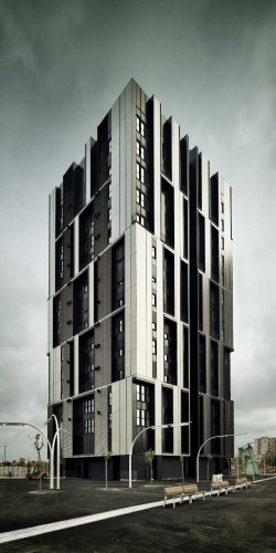
Social Housing Tower Of 75 Units In Europa Square, Barcelona, Spain, 2010 designed by Roldán + Berengué
Grouping together floors from 3 to 3, the image of the tower, perceived in some kind of cinematographic long plan, could approximate to a building of 5 floors of height.  -- ArchDaily
Source: Fran Parente archdaily.com
Fidalga 727, Sao Paulo, Brazil, 2010 designed by Triptyque
This proposal is nourished by the formal and textual complexity of the site, and reformulates the traditional “paulista” residence model. The fragmentation of the building’s body into three parts is made for a better integration of the recreational area and the vertical / horizontal circulation spaces. A small square in the frontal area is given back to the urban space.  -- ArchDaily

 Source: Thilo Härdtlein archdaily.com
Stella Zwei, Vienna, Austria , 2010 designed by Zechner & Zechner
The external form of the building is defined by the non-uniform placement of loggias, some of which are planned to span two stories. The loggias are bright spaces cut into the anthracite grey box, and this creates a playful and varied facade. -- ArchDaily

Source: Jim Ernst / DPA / Adagp archdaily.com
La Liberté , Groningen, The Netherlands, 2011 designed by Dominique Perrault Architecture
Through the treatment of the façades, Dominique Perrault creates a real dialogue between the both buildings and between the project and its urban environment. Whatever the viewpoint, the façades of the three housing blocks never offer the same treatment of colours – black, grey and whites. These shades of colour strengthen the stack impression and energize the city skyline. -- ArchDaily

Source: archdaily.com
Residential Tower, Mexico City, Mexico, 2011 designed by Meir Lobaton + Kristjan Donaldson
The residential tower provides the family the luxury of living in an apartment building without sacrificing the comfort of a backyard.  Gardens located on every level try to break with the dichotomy between land and building, and, more importantly, provide an area that is attractive and functional for the family members.Each floor plan is organized around a single apartment type that is 400 square meters with a gardened extension of approximately 160 square meters.  By rotating the apartments 90 degrees at successive levels, the gardens sit above the cantilevered bedrooms of the apartment below. -- ArchDaily
Source: Federico Cairoli archdaily.com
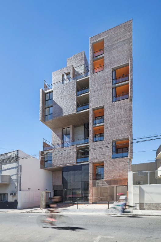
First of May Neighborhood, Santa Fe, Argentina, 2012 designed by CBAyA
The combination of two different kinds of standard floor plans, in quantity and location at different heights generates formal variables that seek to adapt to the changes that every investment project suffers. Both floor options are formed around a central void, which in either case opens to the front, the side, or the back allowing views to different points on each level and ventilating the whole from within. By locating in that central space, vertical and horizontal circulations, we are looking to replace the typical closed and dark core, with a space that is integrated in multiple directions, and allows different parts of the city to peek into the internal structure of this building which aspires to become a neighborhood. -- ArchDaily

Source: Boeri Studio archdaily.com
Bosco Verticale, Milan, Italy, 2013 designed by Boeri Studio
Bosco Verticale, Vertical Forest, by Boeri Studio is a high-density tower block that experiments with the integration of a lush landscape within the facade of the architecture.  The two towers, currently in construction in Milan, Italy, deal with the concept of regenerating the lost forests on the ground within the inhabitable space of buildings.  The towers are 80 metres and 112 metres tall.  Together they will have the capacity to hold 480 big and medium sized trees, 250 small size trees, 11,000 groundcover plants and 5,000 shrubs – the equivalent of a hectare of forest.  -- ArchDaily
Read a post from the Pop-Up City 
Read a post from Jetson Green

Source: Klab archdaily.com
Urban Cubes, Pagkrati, Athens, Greece designed by KLab
The different units are manifested on the façade as cubes that protrude from the building’s surface as a way to give a sculptural sophistication to the project that uses the city’s typology in a new manner. -- ArchDaily

Source: FG+SG archdaily.com
360° Building, São Paulo, Brazil, 2013 designed by Isay Weinfeld
....360º Building as an alternative to the vertical multi-family housing “model”, which, in its commonest form, merely stacks up apartment units – ordinary, compact and closed onto themselves. ....features 62 elevated homes with yards: real yards, not balconies, designed as genuine living spaces, wide, airy and bright. -- ArchDaily

Source: Iwan Baan archrecord.construction.com
Ardmore Residence, Singapore, 2013 designed by UNStudio
....Each unit features outdoor showers off the master bedroom, large glazed areas, and double-height balconies for natural ventilation, plenty of sunlight, and vast panoramas of Singapore. -- Architectural Record
Read a post from ArchDaily

Source: Dana Polo archdaily.com
Z Design Building, Holon, Israel, 2013 designed by Ami Shinar – Amir Mann
This articulation is achieved simply as each second floor (containing four apartments) rotates around the building core relative to the two floors below or above. Thus also every second apartment gains a large 30 sqm “roof terrace”, as an integral element of building mass. -- ArchDaily

Source: Iwan Baan popupcity.net
Torre David: Informal Vertical Communities, book by Urban Think Tank
Torre David is an unfinished skyscraper in the heart of Caracas’ former central business district. 45 floors high it’s the third tallest building in Venezuela. For some reasons the tower has been under construction for over 21 years, and it is unlikely that the building will ever be finished.
Torre David accommodates over 750 families that squatted the building in 2007 and turned it into a huge informal vertical community. The self-organized ‘vertical slum’ is a one-of-a kind urban phenomenon that shines a very interesting light on urban development and its social aspects. Urban Think Tank devoted the great book Torre David: Informal Vertical Communities to the tower, which is one of the world’s largest informal communities. -- The Pop-Up City

Source: The New York Times
Residential Tower, Atlantic Yards, Brooklyn, New York designed by SHoP Architects
....the world’s tallest prefabricated, or modular, building, a 32-story residential tower at Flatbush Avenue and Dean Street. It is the first of 15 planned modular buildings at the $4.9 billion Atlantic Yards site; some are to rise to 50 stories. -- The New York Times
Construction Halted on SHoP Architects’ Atlantic Yards Housing Project -- ArchDaily

Saturday, December 3, 2011

Building/Ground: Changing Topography 3

Source: Emilio Ambasz Associates
Houston Plaza Center, Houston, Texas, USA, 1982 designed by Emilio Ambasz Associates
Thus, the grid of the city became the grid of the plaza, with a rough edge on the outside representing the incomplete nature of the growing city, and the square pool in the center representing the plaza itself.
The ground slopes down from the edge of the plaza to the large square pool in the center, with its circular opening above the atrium. The taller trellises toward the center serve as gazebos, with portals and seating. -- architect's web site

Source: thecityview.com
Memorial to the Murdered Jews of Europe, Berlin, Germany, 2005 designed by Eisenman Architects
with 2,711 blank, dark gray concrete pillars—or as they are often called, steles. (Stele is the Greek term for a slab or upright stone, frequently inscribed, used as commemorative markers in ancient times.) These abstract forms, 3 feet wide and almost 8 feet long, vary in height up to 15 feet and occupy a grid with 3-foot-wide paths. Eisenman sculpted the flat site into rolling contours so that the steles’ differing heights are exaggerated, then tilted them from .5 to 2 degrees in two different directions to maintain an overall unity of a level top (not slanted) within this changing topography. These elements—abstract forms, gridded plan, rolling terrain—adhere to the overriding theme of repetition with displacement, to create an immensely powerful kinesthetic, tactile, and visual experience.-- Architectural Record July 2005.

Prada Catwalk Man SS 2012, Milan, Italy, 2011 designed by OMA
The audience is organized in a perfect field. 600 visitors sit on individual blue foam blocks distributed over a 1.5 x 1.5 meter grid spread through the entire hall. Models flow through the highly-organized audience, following multiple choreographed routes that allow maximum visibility. -- architect's web site

Source: mayalin.com
2 x 4 Landscape, Wood, 36' x 53' x 10', Originated at the Henry Art Gallery, Seattle, Washington, USA, 2006 designed by Maya Lin
The sculpture 2 x 4 Landscape is fabricated from thousands of construction grade 2 x 4's placed on end.  From above they transform a landscape into a pixel-like view of a hill, incrementally rising in height to form the hill.  Its form, imaginary but consciously shaped, makes ambiguous the boundary between land and water.  It is both reminiscent of a landform and a water wave.  The duality of this shape is noticeable as you walk around it, and is oriented in the space so that from two approaches it appears as a simple hill and from the other sides it appears fluid and amorphous, a wave about to crest. -- architect's web site

Friday, December 2, 2011

Building/Ground: Changing Topography 2

Source: predock.com
Spencer Theater for the Performing Arts , Alto, New Mexico, USA, 1998 designed by Antoine Predock Architect
The Spencer Theater for the Performing Arts represents the convergence of the theater of landscape and the theater of performance. 
The wedge-like form of the theater suggests a monolithic piece of stone that has forced its way up from beneath the crust of the mesa.-- architect's web site

Source: archdaily.com
Oslo School of Architecture, Oslo, Norway, 2001 designed by JVA
An access court has been cut out of the existing 1st floor slab, marking the entrance and bringing daylight in to the ground floor foyer. A strip has been cut out of the existing slab along the inside of the existing building, bringing daylight to the surrounding functions. A simple U-shaped circulation zone is established along the strip. A new string of teaching rooms completes the U and forms a bridge across the entrance area. -- ArchDaily

Source: archdaily.com
Oslo Opera House, Bjørvika, Oslo, Norway, 2007 designed by Snøhetta
As early as the competition entry, Snøhetta proposed that the roofscape should be openly accessible to the general public and that it should be clad with white stone. Today the building’s defining feature is the characteristic geometry of the roof as it rises from the fjord and is laid out like a carpet over the public areas. -- ArchDaily
Read an article from Architectural Record

Source: FS+SG archdaily.com
School of Music In Lisbon, Lisbon, Portugal designed by João Luís Carrilho da Graça
The clearest statement of this project was the creation of an exterior space – a large patio covered with grass – formed by a volume that gradually increases in height and protects it from the exterior noise. As the top of the building gently slopes upwards, the rooms grow successively higher, from smaller classrooms meant for instruments that produce a weaker sound (the flute, for instance), to larger rooms meant for percussion instruments. -- ArchDaily

Source: Tamas Bujnovszky archdaily.com
Faculty of Informatics, Debrecen, Hungary, 2011 designed by Peter Kovacs DLA + Istvan Lengyel
There is a glassed, two-story bridge on the east and a huge beam element on the west. The auditoriums took their places in the courtyards: on the east side creating a small slope, one of them slides halfway under ground level and effects a roomy yard; on the west side, sliding above each other in both directions, the two-story auditoriums are tightly placed among the wings. -- ArchDaily

Source; Bruce Damonte archdaily.com
Wolfe Center for the Arts, Bowling Green, Ohio, USA, 2011 designed by Snøhetta
Snøhetta has created a grand open hall that greets the visitor from the main entrance. Sunlit and spacious, the lobby provides views upward to the lounges, classrooms and studios of the art, music, and drama departments on the second level. -- ArchDaily

Source: Adam Mork archdaily.com
Plassen Cultural Center, Molde, Norway, 2012 designed by 3XN Architects
The architectural solution is a structure where almost all surfaces and spaces have more than one function. Together with the building's roof, an existing staircase next to the building constitute a total of three outdoor amphitheatres that collectively accommodate several thousand spectators. During the day the roof offers a cafe with outdoor seating, a recreational area with splendid views and exhibition space for the building’s gallery; while the staircase on the side of the building is an essential link between the city’s upper and lower districts. -- ArchDaily

Source: Hufton + Crow archdaily.com
Giants Causeway Visitor Centre, Antrim, Northern Ireland, UK, 2012 designed by Heneghan & Peng Architects
The proposal for the new visitor facilities can be understood as two folds into the landscape. One folds upwards revealing the building and the second folds down to form the carpark and shield it from view of the approach road and coastal path. Between the two folds, a ramp leads to the coastal ridgeline which is restored at this location. -- ArchDaily

Source: Georges Fessy archdaily.com
Palais des Sports de Rouen, Rouen, France, 2012 designed by Dominique Perrault Architecture
The functions are very clearly distinguished. Sports areas are situated in the central part of the building, the reception space is in the south wing of the building along the Lillebonne Street and the administrative and services areas in the north wing. -- ArchDaily

Thursday, December 1, 2011

Parallelogram

Source: pcf-p.com
John Hancock Tower, Boston, Massachusetts, USA, 1976 designed by Pei Cobb Freed & Partners
The extreme disparity in size between the tower and the church was the central predicament we faced. ....several aspects of the tower's design may be cited as essential: First, the attenuated rhomboid plan-form emphasizes the planar and minimizes the volumetric presences of the building. Second, placement of the rhomboid diagonally on the site, with its narrow edge adjacent to the church, effectively disembodies the tower as seen from the square. Third, notches bisecting the end walls accentuate the weightless verticality of these planes and make legible the tower's nonrectangular geometry. -- architect's web site

Source: Sara Caris arch1day.org
The Gateway, Singapore, 1990 designed by Pei Cobb Freed & Partners
...two identical parallelogram tower blocks each 37 storeys tall.
Locals refer to the buildings as "two towering cardboard boxes". The buildings are detailed in a way that If you see them from a certain angle they seem to be two-dimensional. -- MIMAO

Source: msmearch.com
Plan, Source: msmearch.com
Carol Cobb Turner Branch Library, Morrow, Georgia, USA 1991 designed by Mack Scogin Merrill Elam Architects
The building plan is, in effect, an asymmetrical, skewed dogtrot with a dividing breezeway / corridor with rooms off both sides.  -- architect's web site

Source: wikipedia.org
7 World Trade Center, New York City, New York, USA 2006 designed by SOM
This 52-story Manhattan tower looks to historic SOM predecessors as a model of simple form and functional representation, but moves beyond these precedents through contemporary building enhancements that have created a new model for life safety and sustainable design.  -- architect's web site
The triangular park at 7 WTC, situated between the now-extended Greenwich Street and West Broadway, creates public open space and provides light and views in a previously congested area. The park, designed by landscape architect Ken Smith, consists of a central open plaza with a fountain and flanking groves of trees and shrubs. At the center of the park, solid marble benches surround a 30-foot-wide fountain with jets of water. Featured in the fountain area is a sculpture by renowned artist Jeff Koons, Balloon Flower (Red).  -- official web site
Read an article from New York Times.
Read an article from Architectural Record
A stainless steel screen at the base was designed by James Carpenter Design Associates

Source: archdaily.com
Plan, Source: archdaily.com
Archipelago house, Stockholm archipelago, Sweden, 2006 designed by Tham & Videgård Hansson
The geometry of the plan is generated by the specifics of the site, the house being fitted into the flat surface between two mountain rocks and turning simultaneously towards the sun in south and frontally towards the sea in west. With the small rooms placed in the back, the social areas of the house stand out as an open platform crisscrossed by sliding glass. The zig-zagged layout also creates a series of outside places sheltered from the strong winds. -- ArchDaily

Source: construction.com
Plan, Source: archdaily.com
Kanagawa Institute of Technology Workshop, Kanagawa, Japan, 2008 designed by Junya Ishigami + Associates
Though Ishigami’s parallelogram-shaped building gently challenges the rectilinear grid of pathways uniting the campus, it fits comfortably within the existing walkways encircling its site. -- Architectural Record
Read a post from ArchDaily

Source: Pedro Pegenaute archdaily.com
Plans, Source: archdaily.com
Shrine of the Virgin of La Antigua, Alberite, La Rioja, Spain, 2009 designed by Otxotorena Arquitectos
....the need to incorporate a preexisting stone archway in the design. This archway was rescued from a previous demolition in the town and it was preserved by the locals. This way, it is intended to re-use the archway and to put more value on it. It was obviously called to assume a main role in the shape and perception of the building from the beginning. The building volume is conceived, in any case, considering the idea of framing the archway by building a parallel roof and floor to wrap and protect it. -- ArchDaily

Source: archdaily.com
Plan, Source: archdaily.com
Family House In Myslin, Myšlín, Mnichovice, Czech Republic, 2009 designed by Aulík Fišer Architects
The land slopes downwards from the access road. As it faces south, it was possible to hide a part of the house below the ground and thus control its volumetric effect within the above-mentioned context. Also the fact that the free façade areas are limited positively affects the energy consumption. -- ArchDaily

Source: Justin Alexander archdaily.com
Plan, Source: archdaily.com
The Shed, Sydney, Australia, 2010 designed by Richard Peters Ass
ociates
a project that presented an exciting opportunity to develop a smaller, sustainable and more efficient way to live, while challenging the convention that ʻbigger is betterʼ.  -- ArchDaily

Source: Toshiyuki Yano archdaily.com
Plan, Source: archdaily.com
House In Kodaira, Tokyo, Japan, 2010 designed by Suppose Design Office
There is a front yard at the dwelling. We were considering the garden to connect the outside and inside but also to separate them for keeping the personal environment. To create the courtyard as a semi private zone, a tent structure was used for a partition to separate the two spaces. The tent is covering the garden as if it was a roof, a wall and also a fence.  -- ArchDaily

Source: Nobumitsu Watanabe archdaily.com
Plan, Source: archdaily.com
House kn, Miura, Kanagawa, Japan designed by Kochi Architect’s Studio
The relation “Garden and house” is improved to”The big box including the garden and environment around the site” in the scale. The box makes a big window on environment is chosen, sky in the south and green tract of land in the north. This is trial for urban residence to close and open to the environment. It enable to feel more large scale. -- ArchDaily

Source: Rainer Viertlboeck archdaily.com
Plan, Source: archdaily.com
Veer Towers, Las Vegas, Nevada, USA, 2010 designed by Murphy Jahn
The design solution strives for simplicity and dynamism, reinforcing the iconic character of the whole complex. The idea was to establish a functional basis that defines a unique shape, which derives from a rational leasing span. The towers’ cores and lobbies are planned into the retail base while the residential uses float above it.  -- ArchDaily

Source: Paul Younger archdaily.com

Site Plan, Source: archdaily.com
HCA Hub, Hereford College of Arts, Hereford, UK, 2011 designed by Hewitt Studios
The proposal delivers much-needed cafe, exhibition and admin space in a striking new volume. With a strong sustainability agenda, the structure is formed of glu-laminated and mass-timber and the space is naturally ventilated and day-lit. A reflective pool is used to both animate the space and mediate sunlight. Externally, the building is clad in anodised aluminium and western red cedar, whilst comprehensive landscape scheme roots the building to the site, creating a series of external social and exhibition spaces for the College and its students.  -- ArchDaily

Source: Tord-Rickard Söderström archdaily.com
Plan, Source: archdaily.com
Victoria Tower, Stockholm, Sweden, 2011 designed by Wingårdh Arkitektkontor AB
With thirty-four storeys, Victoria Tower is one of the tallest buildings in Stockholm. Twenty-two of its floors are occupied by a 229-room hotel, the rest by offices, conference facilities and a sky bar. -- ArchDaily

Source: David Cervera Castro archdaily.com
Plan, Source: archdaily.com
Residence BJ41, Mérida, Yucatán, México, 2012 designed by R79
Once you enter this house, the social areas emerge in front of you, while we sense the existence of private spaces on top. Social areas, which lie in the lower part, are facing the outside. The kitchen is on the west side, and has access to the terrace which extends to the pool and deck for events. This has a wooden floor and folding shutter doors. The upper floor consists of a family area that connects the kitchen with the three children’s bedrooms and the master bedroom. -- ArchDaily

Source: Rasmus Norlander archdaily.com
Plan, Source: archdaily.com
Trafag, Industriestrasse 11, Bubikon, Switzerland designed by e2a
The principle of coexistence will be established in the process in order to achieve maximum benefit while keeping expenditure to a minimum: roads and entrances will be positioned parallel to existing roads in order to make everywhere as easily accessible as possible: while deliveries will be made via a direct access from the road, the entrance for customers and employees will be located at the front. -- ArchDaily

Source: Dorottya Sára Ligetvári archdaily.com
Plan, Source: archdaily.com
Funeral Home in Dabas, Dabas, Hungary, 2015 designed by L.Art Architectural Office
The buttress rises from the ground towards the main weight of the building – which contains the funeral home – and continues in a solid wall under the roof, which turns away and begins to slope towards the forest and returns below the surface. -- ArchDaily

Source: Luxigon / DPA / Adagp
Plan, Source: archdaily.com
The Blade, Yongsan International Business Center, Seoul, South Korea, 2016 designed by Dominique Perrault Architecture
By its silhouette and its dynamic allure, the tower establishes itself in the area as a geographical landmark. Its mysterious shape appears like a totem, an iconic figure.
It is not a square or a round building, but a rhomboid prism, arranged in a way that makes it look different depending on the angle of approach. Inspired by its slender shape and sharp edges, the tower has been named The Blade. -- ArchDaily