Thursday, December 8, 2011

Skin of Architecture: Pattern

Source: wikipedia.org
Trinity Church, Boston, Massachusetts, USA, 1877 designed by H. H. Richardson
Dedicated in 1877, Trinity presented a bold, fresh new face and feeling for ecclesiastical architecture in America. The Church continues to be heralded today as a celebrated example of "Richardsonian Romanesque" design, named after its architect, H. H. Richardson.  -- official web site

Source: the faculty lounge
Institute for Scientific Information(ISI), Drexel University, Philadelphia, Pennsylvania, USA, 1978 designed by Venturi, Scott Brown and Associates
This quintessential “decorated shed” is an important early work of postmodernism and a cherished University City landmark. The principal south elevation, with its polychrome tile patterns and porcelain enamel signage ... -- Preservation Alliance for Greater Philadelphia

Source: msmearch.com
Clayton County Headquarters Library, Jonesboro, Georgia, USA, 1978 designed by Mack Scogin Merrill Elam Architects
The exterior skin is a combination of metal sidings with a variety of textures and patterns. The general tectonic is industrial grade.  -- architect's web site

Source: FG+SG – Fernando Guerra, Sergio Guerra
Companies Incubator, Vila Verde, Braga, Portugal, 2007 designed by Contemporânea
The entire volume is all over covered with white and dark blue tiles, in a slightly lagged chess pattern in order to provoke a fascinating optical effect that characterizes the whole, creating a strong and mysterious image that only after a big sign decodes.  -- ArchDaily
Source: construction.com
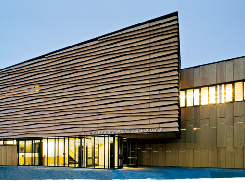
Community Rowing Boathouse, Boston, Massachusetts, USA, 2008 designed by Anmahian Winton Architects
For inspiration for the wood Community Rowing Boathouse, the architects looked to regional vernacular linear buildings, such as covered bridges and tobacco sheds. Tobacco sheds provided a particularly compelling model because sculls and shells, like tobacco leaves, need proper ventilation. This observation led the architects to the idea of a kinetic building. -- Architectural Record
Source: Michael Heinrich archdaily.com
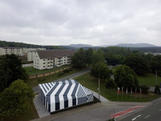
DEA Vogelweh Kleeblatt, Kaiserlautern, Germnay, 2009 designed by Molter-Linnemann Architekten
As a sculpture the building would be able to underplay its true size and purpose. It seemed somehow fitting to apply these dazzle-paint patterns to an unmovable object in a vortex of moving spectators, hiding shape and size but drawing attention to its presence, which in a public space can be considered an additional form of security. -- ArchDaily

Source: chankrieger.com
Yawkey Distribution Center, Greater Boston Food Bank, Boston, Massachusetts, USA, 2009 designed by Chan Krieger Sieniewicz
Recognizing the prominence of the site from the highway, the project’s design is intended to serve as a billboard which will distinguish the façade from its large, utilitarian application while highlighting the important mission of the organization. The Food Bank’s wheat shaft logo is distributed across tabs on the exterior wall such that what at first seems to be a random pattern comes together momentarily as a coherent image, before fragmenting again as the car continues past the building.  -- architect's web site

Source: Nicolas Waltefaugle archdaily.com
A Canopy and a Pavilion at Porte des Lilas, Paris, France, 2009 designed by Matthieu Gelin & David Lafon
A golden lacquered perforated steel sheet wraps the circus pavilion. This double skin works like a moucharabieh. The mesh, permeable to light, protects the various elements of the program such as toilets, reserves and the workshop. This materiality corresponds to the idea of a circus; by night the interior light becomes a lantern that participates in the entertainment.  -- ArchDaily

Source: Jeroen Musch archdaily.com
Artistic amenity Stadshaard, Enschede, The Netherlands, 2009 designed by Cie
Its basic form is simple, while its elevations are clad in one-metre-square panels with expressive motifs and figurative depictions. These are reminiscent of the delftware tiles that line Holland’s traditional open hearths and therefore hint that this structure might have something to do with fire and warmth: the City Hearth.  -- ArchDaily

Source: René de Wit archdaily.com
Archive Depot, Van Harinxmakanaal, The Netherlands, 2009 designed by Bekkering Adams Architects
The building is clad with light bronze anodized aluminum panels with perforations and imprints, treating the material in the same way as the printed circuit boards, found in the computers of the data room. A specifically designed pattern is wrapped around the building, designed to its specific purpose: with many holes if ventilation is needed, with lights at the entrance area, and with zeros and ones in bas-relief, celebrating the computer language of the servers. The treatment of the aluminum panels strengthens the monolithical look of the building. -- ArchDaily

Source: Michael Nast archdaily.com
Single Family House, Berlin, Germany, 2009 designed by Brandt + Simon Architekten
The untypical facade of coloured plain tiles make this house a peculiar new member of the urban fabric. Simultaneously the hasty passerby will not neccessarily take notice of the greenish structure blending with plants and trees deep in the gap between neighbouring buildings. -- ArchDaily

Source: Alejo Bagué archdaily.com
Nursery, Zarautz, Gipuzkoa, Spain, 2010 designed by Ignacio Quemada Arquitectos
....designed and built it from LUXALON 84 R enamelled aluminium panels, selecting six colours from the reduced exterior colour chart. -- ArchDaily

Source: Laura Ceccarelli archdaily.com
Museum Building, Cormano, Milan, Italy, 2010 designed by Area_Progetti
The entrance is in a sheltered area, covered by the museum box. This big outer hall crossed by the urban road is the way the building relates to the city. The new zebra-striped volume clearly declare indeed the new activities taking place in the cotton mill. -- ArchDaily

Source: Cino Zucchi Architetti archdaily.com
Christ Resurrection Church, Cormano, Milan, Italy, 2010 designed by Cino Zucchi Architetti
The outer facades are faced with an array of vertical slabs of equal dimension but different materials: white Trani stone, Grey Serena stone, oxidized zinc sheets, silkscreened glass. Their rhythm, position and quantity changes according to sun orientation, quality of internal spaces and relationship with the urban setting, generating a bi-dimensional decorative pattern which acts as a finer texture in respect to the bolder volumetric statement. -- ArchDaily

Source: Hervé Abbadie
Maison de la Petite Enfance à Clichy sous Bois, Clichy sous Bois, France, 2010 designed by Gaetan Le Penhuel Architectes
This new project of ‘’the house of the early childhood’’ is to reinforce the urban character of downtown Clichy Sous Bois. It should complement other equipment already built and provide a new use close to the town hall and communal cultural space. It must accompany a new social and urban vitality in the heart of this area with great potential.  -- ArchDaily

Source: Ty Cole archdaily.com
Nitehawk Cinema and Apartments, Brooklyn, New York, USA, 2011 designed by Caliper Studio
The façade’s distinctive organic pattern was generated algorithmically using evolutionary techniques. Thousands of lines of RhinoScript allowed for an iterative design process in which generations of patterns were evaluated based on visual criteria (variability and density for example) within a framework that required adherence to basic fabrication constraints. The same custom computational tools used in the design phase were then capitalized upon to automate the production of digital files used for CNC fabrication.  -- ArchDaily

Source: John Gollings archdaily.com
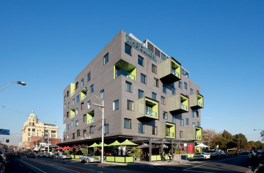
Pixel, Melbourne, Australia, 2011 designed by studio505
The facade is a system of perimeter planters, fixed shading louvers, double glazed window walls and solar panel shading. studio505 developed a complex yet simple patterning system to engender the project with a human scale ‘flow’ of textures allowing the reading of the various elevations, with their differing functional and ESD requirements and materials, to espouse coherency through fluidity.  -- ArchDaily

Source: Gabriel Saunders
Vivida, Hawthorn, Australia, 2011 designed by ROTHELOWMAN
Aware that the building would be seen from varying angles and distances, ROTHELOWMAN created a bespoke external wallpaper in direct response to the building’s internal cells, stacked up in neat, square boxes. This patterning served to re-skin the Telstra building, positively affect shading and heating requirements, and create a dynamic, metallic façade that changed in appearance at different times of the day, and when viewed at different angles.  -- ArchDaily

Source: Shen Zhonghai archdaily.com
Design Collective, Qingpu, China, 2012 designed by Neri & Hu
The existing building has been completely covered with an opaque graphic wrapper made with carbon fiber panel to create an introverted spatial condition to showcase furniture both visually and experientially. The main entry is characterized by a large steel funnel, serving as a transition element from the urban context to the exhibition space. The shape of the entry tube also serves as a means of emphasizing the arrival into the 3 story exhibition hall where the visitors introverted journey begins. -- ArchDaily

Source; Philippe Ruault archdaily.com
Teletech Call Center, Dijon, France designed by MVRDV
The façade for example could not be exchanged but is transformed with a simple print of a QR flashcode translated into the activities of the company; the façade acts as communicator and signals the transformation. -- ArchDaily

Source: Luc Boegly archdaily.com
Saint-Nazaire Theatre, Saint-Nazaire, France, 2012 designed by K-architectures
Concrete is conferred sovereign status as a material. It is smooth in parts, chiselled in others. Here and there, it is adorned with a floral imprint pattern providing a classical link to the station and to romantic theatres. This imprint, inspired by a 17th century French silk textile motif, has been scaled to the size of the building – a simple ornamental feature trans- posed to the relief of the material itself. In places, this relief is so deep that it digs into the concrete walls, taking the shape of rosettes. -- ArchDaily

Source: Stéphane Chalmeau archdaily.com
Mervau, Saint-Gilles-Croix-de-Vie, France, 2012 designed by Tetrarc Architects
The sun shading equipment is in the form of playful vernacular designs. The walls and boundaries between the housing appear as cast shadows, an allusion to the pine trees in the Vendée forests, heightening the hamlet’s seaside resort atmosphere. -- ArchDaily

Source: Adjaye Associates archdaily.com
Sugar Hill Development,Harlem, New York City, New York, USA, 2012 designed by Adjaye Associates
The cladding is achieved with rose embossed graphite tinted pre-cast panels, which create an ornamental effect, paying tribute to the rich culture and history of Harlem.  The roses on the building façade are set to varying sizes and depths to enhance the play of light across the surface. The tinted precast concrete material was refined through a series of studies, samples and tests, and is designed to sparkle with sunlight allowing the building to shimmer throughout the day. The graphite color also serves as a contrast to the luminous glass facade that begins at the public entry plaza and wraps around the entire building creating a glowing beacon for the gateway to the Sugar Hill district. -- ArchDaily

Source: Mecanoo architects archdaily.com
Library of Birmingham, Birmingham, UK, 2013 designed by Mecanoo architecten
The exterior of the building, from the first to the eighth floor will be wrapped with an intricate metal façade, echoing the tunnels, canals and viaducts which fuelled Birmingham’s industrial growth.  -- ArchDaily
Read a post from ArchDaily

Intermediating Patterns Exhibition, Tokyo, Japan -- ArchDaily

Source: Chae Soo Uk archdaily.com
The Sarang Community Church, Suwon-si, Gyeonggi-do, South Korea, 2013 designed by Seoinn Design Group
Wood finish in exterior and landscapes in roof garden creates the ambience of nature to the people. -- ArchDaily

Source: Pedro Pegenaute archdaily.com
111 Dwellings in Larrein Salburua, Vitoria-Gasteiz, Álava, Spain, 2013 designed by Roberto Ercilla + Miguel Angel Campo
The domestic façade, with hollows and terraces, is wrapped in silk-screen printed or perforated recycled aluminium panels. These panels vary density and size of the circles and provide changing images to simulate a large mural of light and shadows, which vary according to openings and lighting of the hollows. This skin can be opened or closed on all hollows of the façade, as if it were a practicable shutter. The final effect gives a unified image to the block and provides it with its own personality standing against its surroundings. -- ArchDaily

Source: Eibe Sînnecken archdaily.com
Kleine Rittergasse 11, 60594 Frankfurt am Main, Germany, 2014 designed by Franken Architekten
For the façade, Franken Architekten employed the notion of the afterimage – the effect of staring at an object for a length of time and seeing a blurry or faded rendition of it after closing one’s eyes. So a fuzzy picture of the demolished building (visible at bottom) would be produced in the new building, but an image that would be blurrier the closer one gets. To achieve this, a computer algorithm scanned drawings of the original to create a new drawing of parallel lines and inserting a “parametric jitter” each time it crossed the trusses. -- ArchDaily

Wednesday, December 7, 2011

Pedestrian Ways: Modern Pedestrian Bridges 2

Source: Richard Davies
Floating Bridge, London, UK, 1996 designed by Future Systems
The slender form of the bridge is evocative of a brightly coloured insect touching the water as lightly as a water skater, offering pedestrians a sense of freedom as they cross. Colour is central to the concept – like a laser beam of light the bridge skims the dock with a piercing lime green line, the sense of perspective exaggerated by the tapering plan of the deck. -- MIMOA

Source: Dirk Verwoerd
Zubizuri Bridge, Bilbao, Spain, 1997 designed by Santiago Calatrava
The Zubizuri (Basque for "white bridge"), also called the Campo Volantin Bridge or Puente del Campo Volantin, is a tied arch footbridge across the Nervion River in Bilbao, linking the Campo Volantin right bank and Uribitarte left bank of the river. The design consists of an inclined structural steel arch linking two platforms, with access ramps and stairways on both banks. -- MIMOA

Source:  Naomi Schiphorst
Borneo Sporenburg Bridge, Amsterdam, The Netherlands, 2000 designed by West 8
Three red steel bridges span the water between the residential islands Sporenburg and Borneo. Two of them have a span of 90 m, and the third has a span of 25 m over the inner harbour. The pedestrian bridge has a spectacular meandering shape. -- MIMOA 

Source: arup.com
Nescio Bridge, Amsterdam, The Netherlands, 2005 designed by Wilkinson Eyre Architects/Arup
The Netherlands’ first suspension bridge carries cyclists and pedestrians over the Amsterdam Rhine canal to the new suburb of Ijburg. Spanning the canal 10m above the water, the bridge allows enough clearance to give commercial boats unrestricted access to the waterway. The mono-cable, self-anchored structure curves to follow the natural course for cyclists. It splits in two at both ends to separate pedestrians from cyclists and to improve the stiffness of the structure. -- engineer's web site

Source: Carlos Dias
Pedro e Inês Bridge, Coimbra, Portugal, 2006 designed by Cecil Balmond/Adão da Fonseca
this bridge connects the two shores of the Mondego River in the city of Coimbra, managing to create an access by foot and bicycle to the two parks located in each side of the river. The wooden passage has a small "square" in the centre where the two dislocated passages are joined together. It's a very elegant structure with a very minimalistic design, challenging engineering. -- MIMOA

Source: archdaily.com
Quingpu Pedestrian Bridge, Quingpu, Shanghai, China, 2008 designed by CA-DESIGN
we decided to link both sides of the 50 meters wide river with a bent path. The bent axis responds to different access conditions and visually adapts to the surroundings.
In order to resist the strong torsion stress associated with the support-less winding shape of the bridge, we activate structurally all the sides of its distorted volume. -- ArchDaily

Source: archdaily.com
Bridge in Esch, Esch, Alzette, Luxembourg, 2009 designed by Metaform Architects And T6-Ney & Partners
The idea was to create a direct connection between the heart of the city and the green space (Park of Galgenberg).
The single volume is characterized by an uncluttered and minimalist design philosophy. The volume gesture clearly contrasts with the chaotic environment (overhead lines, power lines, boulevard, bus platforms and trains, roundabouts etc). The aesthetic of the project makes this bridge unique and creates a strong image for the station area. -- ArchDaily

Source: wikipedia.org
Leonardo Bridge Project, Oslo, Norway
The Leonardo Bridge Project is a non-profit corporation in the United States with a 501(c) 3 under the Allied Arts Foundation. Our mission is to build a global network of permanent landmark bridges, public arts projects based on Leonardo da Vinci’s 1502 “Golden Horn” (Halic) bridge design.
The project is the brain-child of Norwegian artist, Vebjørn Sand, who is the artistic director.
The Leonardo Bridge Project is not a cookie-cutter structure but a re-imagining of Leonardo’s eloquently flexible design. It is a design, like a brilliant passage of music, re-imagined for different locations, in different materials and by different artisans around the world.  -- official web site

Source: Emilio Collavino archdaily.com
Ponte della Musica, Rome, Italy, 2011 designed by Buro Happold
The bridge has been designed to serve as an open public space that can be used for festivals, exhibitions and fairs and also has the future facility to operate as a tram and bus route. Designed by Buro Happold it is the first public footbridge to cross the Tiber since Roman times.  -- ArchDaily

Source: RO&AD Architecten archdaily.com
Moses Bridge, Halsteren, The Netherlands, 2011 designed by RO&AD Architecten
Its construction is entirely made of wood, waterproofed with EPDM foil. The bridge lies like a trench in the fortress and the moat, shaped to blend in with the outlines of the landscape.
The bridge can’t be seen from a distance because the ground and the water come all the way up to its edge. When you get closer, the fortress opens up to you through a narrow trench. You can then walk up to its gates like Moses on the water. -- ArchDaily

Source: Lourdes Jansana - Nicolás Markuerkiaga archdaily.com
Footbridge over the River Segre, Lleida, Spain, 2011 designed by Ravetllat Ribas Architects
The landings are very different on each one of the margins. On the right side, the footbridge support seeks to avoid any substantial alterations in the surroundings, and the margin rises in order to absorb the height difference caused by preserving the hydraulic section. In contrast, on the left bank, the void existing between Avinguda dels Camps Elisis and the new wall of the riverbank allows to develop a wider landing of the bridge, which extends seamlessly and becomes the footbridge. -- ArchDaily

Source: Rosales + Partners Architects archdaily.com

Phyllis J. Tilley Memorial Bridge, Fort Worth, Texas, USA, 2012 designed by Miguel Rosales
This beautiful pedestrian bridge will link trail connections to two of our city’s fastest growing residential centers – downtown and the cultural district. the 384-foot Stress Ribbon style bridge is the first of its kind to be constructed in the United States. --Streams and Valleys
Read a post from ArchDaily

Tuesday, December 6, 2011

Pedestrian Ways: Covered Pedestrian Path

Source: Te-Ming Chang
Architects' Corner, Cambridge, Massachusetts, USA, 1970-1971 designed by Sert, Jackson and Associates/TAC
Three architects built quarters for their own offices, along with rental space, in the same block. The three buildings relate in general scale, window treatment, and materials, but allow Design Research to remain the star.
One of the best things about the entire complex is the interior pedestrian walkway through the center of the block, a quiet, tree-shaded brick alley connecting the four buildings. -- "A.I.A. Guide to Boston", Michael and Susan Southworth, The Globe Pequot Press, Chester, CT, 1991. P. 407-408

Source: Sam Thiess archdaily.com
Santos Place, Brisbane CBD, Australia, 2009 designed by Donovan Hill
Santos Place is a 41 storey office project in the Brisbane CBD which uses a new covered pedestrian laneway as its preferred address.
The ground level has a conspicuously people friendly setting that signals a less corporate way of developing the city, providing multiple functions to promote activities that engage with the public realm of the street and ‘lane’.
The through-site-link includes a tenancy along the northern and southern edge that can ‘spill-out’ to activate the pedestrian lane. The tenancy space also has a frontage to Turbot Street, offering the urban benefit of multiple addresses, and consequently, more street activities.  -- ArchDaily

Source: Amparo Garrido archDaily.com
I.M.A.M., Móstoles, Madrid, Spain, 2009 designed by nodo17 Architects
The center of Móstoles City, although it seems to have a caothic condition, it is formed by a structure of differents public squares. From the Town Hall Square, there is urban pathway that conects the Cultura Square, the Ernesto Peces Square and the Pradillo Square. The IMAM project, located between party walls, it is conceived like one more square that belongs to this general structure of public spaces. It not only proposes a new  passageway between Colón and Ricardo Medem Streets but also a new  half-covered public space with vegetation, childs playground, benchs… -- ArchDaily

Source: Julien Lanoo archdaily.com
Covered Pedestrian Crossing, Tourcoing, France, 2010 designed by Atelier 9.81
Downtown Tourcoing is currently at the heart of an extensive restructuring, launched a few years ago. All public spaces, streets and squares are being fully renovated, and a large shopping mall with movie theaters will be inaugurated soon. As part of this project, the Metro, tram and bus station come together to offer a true multimodal system.  -- ArchDaily

Monday, December 5, 2011

Plugged In

Source: Tomio Ohashi Kisho Kurokawa Architect & Associates
Nakagin Capsule Tower, Tokyo, Japan, 1972 designed by Kisho Kurokawa
the first capsule architecture design. The module was created with the intention of housing traveling businessmen that worked in central Tokyo during the week. It is a prototype for architecture of sustainability and recycleability, as each module can be plugged in to the central core and replaced or exchanged when necessary.  -- ArchDaily
The Nakagin Capsule Tower realizes the ideas of metabolism, exchangeability, recycleablity as the prototype of sustainable architecture.  -- architect's web site
Read a post from PingMag 

Read a post from ArchDaily

Source: Cooney-Hughes archdaily.com
The Colonnade Condominiums, Singapore, 1980 designed by Paul Rudolph
Initially intending to design a housing structure as a set of prefabricated units hoisted onto a structural frame  ...
Rudolph referred to these replicable units as the “twentieth-century brick,” a means of construction that would seemingly make construction of large scale buildings more feasible. However, as Rudolph came to find upon the time of construction, technical and financial reasons expelled the possibility of the prefabricated units. Instead, the Colonnade was built of pour-in-place concrete, which still successfully conveyed the appearance of his initial design goals.  -- ArchDaily

Source: Samuel Ludwig archdaily.com
WoZoCo, Amsterdam, The Netherlands, 1997 designed by MVRDV
Stuck conforming to zoning regulations of the surrounding area, MVRDV calculated that only 87 of the proposed 100 units could fit the restricted footprint due to regulations about daylighting. From this arose the idea of cantilevering the remaining units on the north facade, to connect to the transparent gallery of the main block found below while also opening up space on the rest of the site.  -- ArchDaily
More from architect's web site

Source: Patrick Bingham-Hall archdaily.com
Bishan Public Library, Singapore, 2006 designed by LOOK Architects
‘Pods’ cantilevered off the main building façade exude a distinctive charisma on the exterior and create suspended alcoves at an intimate scale from the building interior.  -- ArchDaily

Source: archdaily.com
Carabanchel Housing, Madrid, Spain, 2007 designed by dosmasuno arquitectos
Its construction responds to a necessity of industrial optimization. Therefore, the structure of the main body is constructed in concrete from a single high accuracy aluminum cast. At the same time, the light steel structure modules that constitute the additioned elements enable volumetric variations. This industrialized system facilitates the constructive process, avoiding rubbish and accelerating the implementation times.  -- ArchDaily

Source: Makoto Yoshida
Twin Bricks, Saitama, Japan, 2008 designed by Atelier Tekuto
Twin Bricks, consists of two wings – A five unit rental dwelling and the owner’s own two-family house. An intriguing spatial composition materializes due to the seemingly random composition of the glass block and ALC Panels which hide all structure. -- ArchDaily

Source: Jeroen Musch archdaily.com
Schiecentrale 4b, Rotterdam, The Netherlands, 2008 designed by Mei Architecten
All spaces on the west side of the building are fitted with glazed façades. This part of the building offers a wonderful view of the Nieuwe Maas and the harbour. The partitions of the living/working units can be opened from floor to ceiling with harmonica doors, allowing the creation of an exterior space within the building volume. -- ArchDaily

Source: Zander Olsen archdaily.com
10 Weymouth Street, London, UK, 2009 designed by Make Architects
.... a highly modelled brass-clad elevation was created at the rear of the building which greatly enhances the appearance of this fascinating pocket of urban space. Each apartment features a projecting balcony with a perforated brass screen which mirrors the mews facade pattern and blends harmoniously with the neighbouring buildings.  -- ArchDaily

Source: John Gollings archdaily.com
The Cullen, Prahran VIC, Australia, 2009 designed by Jackson Clements Burrows Architects
....the built form reinforces this notion by expressing cantilevered forms as an active sculptural response to Grattan Street. -- ArchDaily
Source: Filip Dujardin archdaily.com
Learning Centre Destelheide, Dworp, Belgium, 2009 designed by Bovenbouw
....Destelheide as a remarkable composition of buildings by architect Felix. A composition in a brutalist architectural language, monolithically constructed in prefab concrete elements. -- ArchDaily

Source: coco arquitectos archdaily.com
Social Housing In Carabanchel, Madrid, Spain, 2010 designed by coco arquitectos
A room floating outside the building, attached to the facade, large enough to accommodate any domestic activity.  .... the new room, freely set in the facade, expresses this new understanding: a random image with all elevation being unique, every single dwelling different from each other, and only the intervention of the users helping it to acquire significance. -- ArchDaily

Source: Jason A. Knowles archdaily.com
Sanford Consortium for Regenerative Medicina, La Jolla, California, USA, 2011 designed by Fentress Architects
...private office “pods” for senior researchers and investigators at Sanford. Cantilevered from exterior walkways, the pods offer protected views that overlook the Torrey Pines Golf Course, the historic Gliderport and the Pacific Ocean.  -- ArchDaily

Source: Marc Cramer archdaily.com
UBC Faculty of Pharmaceutical Sciences, Vancouver, British Columbia, Canada, 2012 designed by Saucier + Perrotte architectes
The initial concept stems from the idea of a tree, whose branch system creates a canopy floating above the ground level. As this organic network is abstracted, it is subsequently given tectonic manifestation, and the architecture takes on a more geometric form. The striking design promotes enjoyable, livable spaces for research and learning, creating public and private spaces for the exchange of ideas. -- ArchDaily

Source: Mihai Ivan, Laura Ivan, and Nick Ross archdaily.com
TCH Boutique Hotel, Downtown Los Angeles, California, USA, 2012 designed by Abramson Teiger Architects
The exterior is clad in Cor-ten steel because of its ability to be sculpted. It is a material that serves both artistic expression and architectural function. A series of perforated panels, within the solid skin, depict pixilated skulls. The skulls represent a tension between the skin (exterior) and the brain (interior). They house the “eyes” of the viewer. Light passing through these perforations (eyes) is visible inside during the day and outside at night. -- ArchDaily

Source; Stéphane Chalmeau archdaily.com
Housing Vitrolles, Vitrolles, France, 2012 designed by MDR Architectes
Each of the four building is unique. The implementation of textured cement boxes and openings vary from one building to the next. We wanted this characteristic to “break” the repetitive visual effect and for the residents to self-appropriate their living area.
This differentiation is furthermore underlined by a color code allowing the identification of each unit from afar. -- ArchDaily

Source: Andrés Valbuena archdaily.com
Click Clack Hotel, Bogotá, Bogota, Colombia, 2012 designed by Plan B Arquitectos
This hotel is an attempt to open or permeate the norm: it is slim and has four open facades due to side setbacks; the larger facades are set back to allow a double skin of metal and glass, and the main facade articulates urban life and cantilevers the 1.5 m allowed by the building code. -- ArchDaily

Source: Shu He archdaily.com
Jiangyin Primary & Secondary School, Yushanwan Garden, Furong Avenue Side Road, Jiangyin, Wuxi, Jiangsu, China, 2013 designed by BAU Brearley Architects + Urbanists
In support of a more balanced approach to work, rest, and play for children, this project places the non-academic activities at its heart. A large area of the site is dedicated to sports, music, dance, theatre, visual art and “other” programs. -- ArchDaily

Source: Arthur Tintu archdaily.com
L.S.G. HEad Office Building, Bucharest, Romania, 2013 designed by Urban Office
Compound geometry of the building is defined by boxes which “bombard” or dot the façade, which confer a certain degree of urban porosity, meant to reduce the massiveness of the building, in order to offer a gradual transition to the surrounding residential area. -- ArchDaily

Source: Agence Bernard Bühler archdaily.com
Alegria, Bayonne, France, 2013 designed by Agence Bernard Bühler
Access to housing is through the north side through a corridor dressed with vertical blades glazed red. All apartments are south-facing. Each housing is extended by a balcony on the south side.
The buildings are very simple in their form and are animated by colored elements such as screens or blades glazed colored red. -- ArchDaily

Source: Hervé Abbadie archdaily.com
46 Homes in Rue du Maroc, Paris, France, 2013 designed by MAAST
The compact building comprises apartments stretching its full width on the narrower adjoining side, and apartments of a variety of orientations throughout the rest of the space. all offer street or garden views framed by prefabricated wooden boxes covered in lacquered steel. -- ArchDaily

Source: Nuno Ladeiro + Marco Martins archdaily.com
Vila Nova de Tazem Residential Building, Largo Joaquim Borges Artiaga, Vila Nova de Tánzem, Portugal, 2013 designed by Nuno Ladeiro + Marco Martins
The use of the geometric cube and the parallelepiped has a universality that continues to “contaminate” the architecture of the XXI century. Therefore, modern rationalism, evident in the facades of this proposal, corresponds in part to a more meaningful calculation of constructivist geometric symbols that in fact are part of modern architecture which is not yet exhausted. -- ArchDaily

Source: Cécile Septet archdaily.com
Tete in L’air, 94 Rue Philippe de Girard, Paris, France, 2013 designed by KOZ Architectes
....the playful rhythm of the plug-in wood boxes that punctuate the facade disrupt the rational constructive order, and give the place a spontaneous character. The boxes aleatory position make the layout of each apartment unique and allow for different uses, from their official bedroom function to SHOHO spaces or gym room! Small courtyards at the rear of the building provide private gardens at the ground floor and help us  bring natural light in all the bathrooms to add extra comfort and a house-like quality of life. -- ArchDaily

Source: Tamas Bujnovszky archdaily.com
Kemenes Volcanopark Visitor Center, Celldömölk, Hungary, 2013 designed by Foldes Architects
....the raw materials, the homogeneous grey of the concrete, the lava inspired colour of the corten steel, and the flue-like arrangement of the space, deliver the spirit and essence of a volcano’. -- ArchDaily

Source: Margherita Spiluttini archdaily.com
St. Nikolaus Neumarkt, Austria designed by Kadawittfeldarchitektur
The relationship of tension between glass and wood, inside and outside, public openness and private intimacy mirrors the life of its senior citizens: the house becomes a protective shell that consciously filters and enables the public space so that it is integrated into the surroundings. -- ArchDaily

Source: Jasmin Schuller archdaily.com
Doninpark, Vienna, Austria, 2013 designed by LOVE architecture and urbanism
The window openings and alcoves, which seem to be almost randomly placed, create a façade that is “scaleless”, just like the surrounding area. This makes it almost impossible for the viewer to capture the true dimensions of the building at first sight and effectively masks the true size and expanse of the building. -- ArchDaily

Source: Sergio Grazia archdaily.com
Grande Scynthe – Place Du Courghain, Dunkirk, France, 2013 designed by Philippe Dubus Architecte
The units’ living rooms are turned towards the center of the development and the canal, an arrangement that is accentuated by the large balconies that jut out towards the landscape in search of sunlight. -- ArchDaily

Source: Takuji Shimmura archdaily.com
Zac Boucicaut In Paris, Paris, France, 2014 designed by Ameller, Dubois & Associés Architectes
Each apartment has a protruding edge, forming a loggia in the continuation of living room. These loggias are alternated or superposed depending on their location on the plan. This composition gives air, light and varied visual openings, some of them quite uniquely overlooking the Eiffel Tower. -- ArchDaily