Thursday, December 15, 2011

Bent Ribbons

Source: Flickr User: harry_nl
Educatorium, Utrecht, the Netherlands, 1997 designed by OMA
The Educatorium is composed of two planes which fold to accommodate a range of distinct programs, including an outdoor plaza, two lecture halls, cafeteria and a testing facility. Planes interlock to create a single trajectory in which the entire university experience – socialization, learning, examination – is encapsulated. -- architect's web site
The design of the Educatorium is conceptualized as two planes that fold, wrap, and interlock with one another.  In section the two planes appear to be in contention with one another; one plane rigid the other fluid a suggestion as to the programmatic, spatial, and social juxtapositions happening within. -- ArchDaily

Source: MVRDV
Calveen Office building, Amersfoort, the Netherlands, 1999 designed by MVRDV
This new typical plan consists of a central core with a passage of 1.5 meters along a closed façade and an office zone along the floor-to-ceiling glass façade. By mirroring the plan on each level in the east-west orientation, a zigzag section is created, which is the most important trademark of the building. -- architect's web site

Source: Piotr Krajewski
Elbberg Campus, Hamburg, Germany, 2003 designed by BRT Architects
the office building featuring curved and folded, metal-clad planes that snake up and around the building. Seen on end from the street, glass walls with louver fill in the areas between these planes.  -- a weekly dose of architecture
 Read a post from MIMAO

Source: Fernando Guerra, Sergio Guerra archdaily.com
Bus Station of Rio Maior, Rio Maior, Portugal, 2005 designed by Domitianus Arquitectura
It is a blade, or piece of white concrete with high-intensity plastic that solves the whole proposal, revealing an autonomous body coated by wood panels which are organized, in two different floors the area of service users. -- ArchDaily

Source: Te-Ming Chang
Institute of Contemporary Art(ICA), Boston, USA, 2006 designed by Diller Scofidio + Renfro
“The Fold,” hardly a new idea, was all the rage in the 1990s, inspired by writings of Gilles Deleuze and the proclivities of emerging computer software. Despite that decade’s prodigious outflow of “folded” schemes from architecture schools and theoretical practices, only a few (from UN Studio and several other firms) actually got built. While the ICA’s fold flows dynamically down the building’s west side, the curve becomes more rigid, far less expressive on the east face, where it seems almost a conceit superimposed on more straightforward, rectilinear forms. -- Architectural Record

Source: Jordán Sanz archdaily.com
Optimil Offices, Castellón, Spain, 2006 designed by CSO arquitectura + ALT arquitectura
The project arises from the manipulation of a continuous surface which by means of two operations, cutting and folding, resolve the entire programme. In this way it appears as if it were an object which does not emerge from the ground, it poses on it. Without jumps or breaks in its continuity, it wraps playfully round the topography being an external face and internally, a floor, wall, ceiling, framework and roof.  -- ArchDaily
Source: Jaime Sicilia archdaily.com
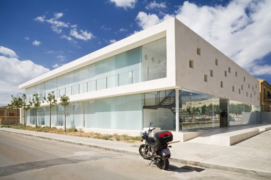
Cultural Center in Son Ferriol, Palma de Mallorca, Spain, 2006 designed by Jordi Herrero + Sebastián Escanellas
The building has two main uses. The ground floor houses the Senior Center, a coffee shop, two offices and a multipurpose room. On the ground floor is the Casal de Barri, a library and three multi-purpose rooms. The core bathrooms, stairs and elevator are located at the corner, to optimize the distribution. -- ArchDaily

Source: K.Torimura archdaily.com
House in Minami Boso, Chiba, Japan designed by Kiyonobu Nakagame & Associates
“Having these [the views] in our mind, we came up with the design concept to provide the one continuous wall folded in different directions setting up the various views,” explained the architects.  This continuous wall does not create a bulky structure that is intrusive on the landscape, but rather, the folded wall creates an elegant residence that embraces the surroundings by making the users focus on the natural instead of the built. -- ArchDaily

Source: Art Gray Photography
Brentwood Residence, Los Angeles, California, USA, 2007 designed by Belzberg Architects
...the complex interlocking geometry and asymmetrical volumes that make up the exterior.  -- ArchDaily

Source: archdaily.com
Suntro House, Oaxtepec, Mexico, 2007 designed by Jorge Hernandez de la Garza
The natural light is filtered trough the folds of the house in shape of rays that softly flood the spaces. Reflects and shadows on walls and ceilings animate the interior. The shape responds to the hard hotness of the site, to place every space in the best way inside of a curved skin that opens to the immediate context to obtain the best climate and views to allow the wind circulate in a way that in summer the house can stay cool. -- ArchDaily

Source: archdaily.com
Openhouse, Hollywood Hills, California, USA, 2007 designed by XTEN Architecture
Set in a visible hillside area above Sunset Boulevard, the Openhouse appears as a simple folded line with recessed glass planes, a strong sculptural form at the scale of the site.  -- ArchDaily

Source: archdaily.com
Shell, Kitasaku, Nagano, Japan, 2008 designed by ARTechnic architects
A large shell shaped structure finds itself in the middle of the woods. It is hard to determine what exactly the structure is, and unlike the surrounding caves and rocks, it clearly is not a part of nature – nor is it a ruin. A frame, a shape, made at a completely different place for a completely different purpose. Within this shell shaped structure will one find floors constructed, wall separating spaces, and rooms furnished.  -- ArchDaily

Source: Tisselli Studio Architetti archdaily.com
VC1, Cesana, Italy, 2008 designed by Tisselli Studio Architetti
Cleanliness and compactness of the prospects are the aims always pursued and happily reached through the use of a simple and direct language, particularly evident in the formulation of the principal prospects: ample balconies extend themselves along the front whole length, but an single graphic sign coordinates the complexity of the system-prospect of the openings, synthesizing the single elements in an unique dominant motive, in the identification profile of the whole architectural body. -- ArchDaily

Source: archdaily.com
Folded House, Vienna Woods, Austria, 2008 designed by x Architekten
The folding of the rooms and the interior development realise an analytically clear structure. The building as a serpentine line enables residents a ground level access to the gardens on all levels. The garden, attic, bedrooms and living rooms are intertwined.  -- ArchDaily

Source: Benthem Crouwel Architekten
Elicium RAI(ICA), Amsterdam, The Netherlands, 2009 designed by Benthem Crouwel Architekten
The Ballroom is a single large column-free space that may be divided up using sliding partitions. A seven-storey stack rises above the congress halls. Elicium puts the RAI in a better position to attract large multi-day international events and gives it a bold new front.  -- ArchDaily

Source: Pepo Segura archdaily.com
Social Housing Building, Tarragona, Spain, 2009 designed by Aguilera Guerrero
That plastic figure materializes in a continuous skin which guarantees a clear and unified view the building, but that specializes to serving the diverse situations of the building program and housing. Finally, the skin is cut and disappears, open to the best views and orientations, leaving visible its interior, this space wrapped, solidified and materialized, where are drawn some modulated serials overtures of housing. -- ArchDaily

Source: James Steinkamp
235 Van Buren, Chicago, Illinois, USA, 2009 designed by Perkins + Will
The southern glass façade and random balconies provide a large-scale backdrop to the open space created by a major traffic interchange. A ribbon of concrete frames the glass wall, undulating to define the penthouse units and providing a large-scale gesture to the expressway as well as the taller buildings to the north. The random balconies express the individuality of the units within, as well as provide a kinetic image from the freeway.  -- ArchDaily

Source: addinc.com
Waterplace, Providence, Rode Island, USA designed by ADD Inc.
....design responds directly to the target market. Innovative bi-level units attract empty-nesters in search of the spaciousness of a single-family home with the advantages and allure of a downtown address. -- architect's web site

Source: construction.com
Sheraton Milan Malpensa Airport Hotel & Conference Centre, Milan, Italy, 2010 designed by King Roselli Architetti
The building is a study in contrast and fluidity. The firm devised a comblike shape with alternating room modules and external courtyards that link to an elongated spine housing lounge and circulation areas. Roselli and his colleagues chose white “pultruded” fiberglass, a pliable, pulled, and extruded membrane used in such applications as prefabricated emergency housing. Inside, King Roselli carried its bold gestures into the public areas, using arcing ribbons of plasterboard across ceilings and around walls that recall the facade's fiberglass strips, and penetrating the hotel's core with a soaring atrium.  -- Architectural Record

Source: David Adika archdaily.com
Beam House, Arbel, Israel, 2010 designed by Uri Cohen Architects
The beams of the roof rest on that ‘central concrete wall’ and serve as cantilevers to the linear roof of the living area. This keeps the northern glass façade free of columns. The circular external lines affect the interior design creating a resting bench in the living room and unique lines in the windows and walls of the private spaces. -- ArchDaily

Source: +31 Architects archdaily.com
Water Villa Omval, Amsterdam,  the Netherlands , 2010 designed by +31 Architects
Resting on the water, +31 Architects' latest residence offers a gently curving form complete with a roof terrace. According to the architects, “The split-level principle of the watervilla is accentuated by the round design of the facade.” -- ArchDaily

Source: Simon Constantini
Giacomuzzi Commercial Building, Kaltern, Italy, 2010 designed by monovolume architecture + design
The building grows up from street level to second floor like a bent ribbon. In between it shelters three storeys very open to the surroundings due to its ample insulated glass façades. The technical solutions such as photovoltaics and solar panels are integrated seamlessly into the ribbon.  -- ArchDaily

Source: Paul Czitrom archdaily.com
Smooth Building, Nuevo León, México, 2010 designed by Jorge Hernandez de la Garza
The structure develops like a single continuous element that surrounds the volume with different textures that respond to the climatic conditions and to the magnificent views of the context.  -- ArchDaily

Source: Paul Ott archdaily.com
Raiffeisen Finanz Center, Eisenstadt, Austria, 2010 designed by Pichler & Traupmann Architekten ZT GmbH
The continuity of the building envelope conveys a sense of identity to both staff and customers, while the building’s volumetric shaping ensures it a striking role in the appearance of the town. -- ArchDaily

Source: archidose.org
House at the Park, Hamburg, Germany, 2010 designed by splendid_architecture
Seen from the road, the house sits at the far end of an expanse of grass, tucked by the trees as if for protection and views out. Getting closer the S-shaped ribbon that meanders from roof to wall to floor to roof to wall and floor again (in two directions) acts like podium, raising the house above the landscape that it also integrates itself into. The U-shaped plan on the first floor locates living spaces up front and bedrooms with more privacy in the rear; between is dining. The bar above houses the master bedroom.  -- a weekly dose of architecture

Source: Hiroyasu Sakaguchi archdaily.com
House in Takadanobaba, Tokyo, Japan, 2011 designed by Florian Busch Architects
The conceptual openness is achieved by dissolving structural rigidity into a liberating play of alternating pin connections. The floor-wall-ceiling folds become a structurally continuous shell that is held both apart and together by a few incredibly fine steel columns: 80mm diameter on the first and second, 60mm on the third floor. Lateral torsion by seismic forces is countered by the structural composition’s using the building’s length of 18 metres. -- ArchDaily

Source: Atrium archdaily.com
Gorki House, Moscow, Russia, 2011 designed by Atrium
...the idea of folded plane, which is lifted a little above the ground and forms the space of the house. It creates a variety of inner and outer spaces which serve usual dwelling functions.  -- ArchDaily

Source: Leonardo Walther archdaily.com
GP House, Pachuca, Hidalgo, Mexico, 2011 designed by Bitar Arquitectos
GP House contains the basic spaces required for a townhouse: living room, dining room, bedrooms, family room, etc; distributed in two stories connected by a staircase concentrated in a vertical volume that breaks the horizontality that formally predominates the house. -- ArchDaily

Source: Tamás Bujnovszky archdaily.com
Hungarian Autoklub Headquarters, Budapest, Hungary, 2011 designed by Vikar & Lukacs Architect Studio
The main gesture of the building is a ribbon that wraps around the office spaces on seven floors, while articulating a letter ‘a’.  -- ArchDaily

Source: Andrea Martiradonna archdaily.com
Gazoline Petrol Station, Piemonte, Italy, 2011 designed by Damilano Studio Architects
Whether it’s providing a break for refueling, or just to stretch the legs before continuing the journey, the design of a service is strongly tied to the idea of travel. With the same continuity, the service station is separated from the asphalt like a ribbon of road wrapping around itself, creating a temporary oasis to accommodate the traveller. The architecture of a service station is usually conceived as a mere support function, thus influencing its shape. The architecture, static by definition, becomes closely linked to the concept of continuous flow that becomes the urban landscape. -- ArchDaily

Source: GU Yunduan archdaily.com
Rollercoaster, Beijing, China, 2011 designed by Interval Architects
a continuous self-folding belt structure that resembles the image of a “roller coaster”. The structure folds three-dimensionally to create a series of spaces such as open gardens, shaded pavilions and exhibition corridors. The entire belt bends around and in-between the existing trees on the site so they are well-preserved and maximally utilized for shading.  -- ArchDaily

Source: Alan McAteer archdaily.com
Riverside Museum, Glasgow, Scotland, 2011 designed by Zaha Hadid Architects
The design is a sectional extrusion, open at opposing ends along a diverted linear path, allowing the museum to position itself as a third river flowing through one of the city’s most historic locations.  -- ArchDaily

Source: Giuseppe Dall’Arche archdaily.com
Tower B1, Roma, Italy, 2011 designed by Valle Architetti
On the facades the transformation into residences and offices has been characterized by the addition of terraces for the new apartments. To avoid a series of repetitive isolated terraces, the exteriors have been grouped into volumes of loggias clad with micro-perforated sheets and characterized by a pattern of alternating bored-holes on each level. They create a pierced screen that has the appearance of a fabric on the facades and cross-stitching on the corners of the larger apartments to the west. -- ArchDaily

Source: Howard Waisman archdaily.com
Robert H. N. Ho Research Centre, Vancouver, Canada, 2011 designed by CEI Architecture 
Its narrow site dictated a narrow floor plate. Floor-to-floor heights between the two structures match, and a full-height atrium separates the buildings while providing access to light, common social gathering spaces, and direct functional connections. -- ArchDaily

Source: Henning Larsen Architects
The Wave, Vejle, Denmark, designed by Henning Larsen Architects
a new unique housing that embraces the sculptural and organic forms to become a new landmark for the city.  -- ArchDaily
Source: construction.com
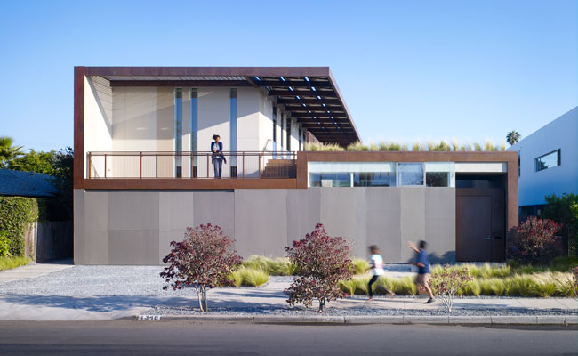
Yin Yang House, Venice, California, USA, 2012 designed by Brooks + Scarpa
To visually unify the house, the architect defined horizontal and vertical edges with a steel band that winds without interruption around the exterior. “It pulls all the pieces together, a continuous squiggle,” says Scarpa.  -- Architectural Record

Source: Vulkers Fotografie archdaily.com
Sports Facility Strijp, Eindhoven, The Netherlands, 2012 designed by LIAG architects
The structure of the complex consists of long horizontal bands that culminate in rounded edges. To help the different groups of users maintain their own distinct identity, the bands around the parts of the building used by the different groups are in their own colours. The main shape of the building is created by a flowing continuous line with curved edges. -- ArchDaily

Source: Derek Lepper archdaily.com
Centre for Digital Media, Vancouver, British Columbia, Canada, 2012 designed by Musson Cattell Mackey Partnership Architects
The concept is inspired by two themes or dialogues – technology and regionalism. This building seeks to express the program through a weaving and folding gesture in the architecture. The program is stacked with academic / retail at the ground floor and three levels of student housing above. A singular ribbon, folding and bending, collects these uses to engage the street as the catalyst marker on the site. -- ArchDaily

Source: ACDF* Architecture archdaily.com
Saint-Eustache Library, Vancouver, British Columbia, Canada, 2012 designed by ACDF*
The volumetric concept of the project is based on a simple extruded rectangular tube that is folded twice.  At each end of the elevated tube, glass surfaces open fully to views of the river at the level of the abundant tree tops. -- ArchDaily

Wednesday, December 14, 2011

Urban Spaces: Canopy

Source: epdlp
La Placa dels Paisos Catalans, Barcelona, Spain, 1983 designed by Albert Viaplana and Helio Pinon
Its most conspicuous feature is an enormous metal canopy, held aloft by spindly columns. ...The canopy contributes the monumental scale appropriate to a ceremonial urban gateway, but it makes no concession to the Beaux-Arts grandeur typical of railway architecture -- or, indeed, to any conventional idea of grace. -- Herbert Muschamp, New York Times, August 02, 1992
This plaza in front of the Estacio de Sants (railroad station) is an empty, useless disaster of a space. There is no gathering place, no vistas...in short there is no there, there. This desolate void is no way to arrive or leave a great city. -- PPS
More drawings and images from architect's web site.

Lotus International(39), pp. 9-14

Source : fras1977
Thames Barrier Park, London, UK, 2000 designed by landscape architect Allain Provost, architect Patel Taylor in collaboration with Group Signers and engineers Ove Aarum
On the north bank of the Thames and with stunning views of the awesome flood Barrier lies a jewel in the crown of London's parks. Thames Barrier Park lies in Silvertown, and is supported by the London Development Agency.
Set within 22 acres of lawns, trees and hedges, the waterside park features fountains, gardens, wildflower meadows, a children's play area and a 5-a-side football/basketball court, with magnificent views of the barrier. -- official web site
More from a post by VULGARE

Source: Machado and Silvetti Associates
South Boston Maritime Park, Boston Massachusetts, USA, 2004 designed by Machado and Silvetti Associates
The largest zone at the northern end of the park provides a raised lawn panel with a continuous staircase lining Northern Avenue. Two large pergolas at the lawn’s inner edge mark the transition to the central zone, creating a backdrop for events seen from Northern Avenue. The middle zone contains a low café structure and outdoor seating areas, while the southern end of the park is conceived as a more intimate area of benches and densely planted shade trees.  -- architect's web site

Source: openbuildings.com
Calder Woodburn Rest Area, Goulburn Valley Highway, Shepparton, Victoria, Australia, 2008 designed by BKK Architects
There is a long and rich history of the service station as an urban, suburban and rural icon within Australian car culture. The familiar image of a large floating roof providing shelter go the services below is a strong memory for all that have taken a road trip.
The Rest Station marks a point on the journey, a place for pausing; a place for reflection and to strech ones legs. The roof serves as both shelter and sign in the landscape. It celebrates road culture and acts as a nodal point in a countinuing journey. -- Open Buildings

Source: ZGF archdaily.com
Simon and Helen Director Park, Portland, Oregon, USA, 2009 designed by OLIN
Formerly a parking lot the size of a city block, Simon and Helen Director Park now offers Portland a significant new urban experience.
A signature element is a glass and wood canopy accessible from the adjacent sidewalk and sitting high along the street’s edge, offering views over the park.  -- ArchDaily
Read an article from ARCHITECT 

Source: Nicolas Waltefaugle archdaily.com
A Canopy and a Pavilion at Porte des Lilas, Paris, France, 2009 designed by Matthieu Gelin & David Lafon
The shelter is a pure construction. Its expression is linked to the elements of structure that compose it and which are necessary to its stability.  The canopy holds its strength and continuity through materials.  The folding that comes out from the ground forms both a wall and coverage.  Pilars stroll freely like pedestrians in a group. The cover and the pilars are then read as two autonomous entities improving the perception of overhangs.  -- ArchDaily

Source: Matt Winquist archdaily.com
Phoenix Civic Space Shade Canopies, Phoenix, Arizona, USA, 2009 designed by Architekton
Floating above the park, four canopies create a series of outdoor rooms defined by undulating green planes that reflects the park’s corrugated topography. -- ArchDaily

Source: Machado and Silvetti Associates
Silver Spring Civic Building, Silver Spring, Maryland, USA, 2010 designed by Machado and Silvetti Associates
Alongside the entry spine to the east lies the major composition of public spaces, arranged sequentially, so as to create a direct visual and civic relationship between the Great Hall, Prefunction Space, Portico, and Plaza. These spaces are arranged along a common axis, and are directly related to one another through similarity of width. Doors from the Great Hall lead directly into the double-height Pre-function Space, which is, in turn, directly accessible to, and visible from, the Plaza.  -- architect's web site

Source: a3lab archdaily.com
WestendGate, Frankfurt am Main, Germany, 2010 designed by Just Burgeff architekten + a3lab
The organic tree-like structure of the sculptural roof is easily recognizable from a great distance. 1000 sqm of roof surface extend at one point up to a height of 14 meters, zoning in the square, with translucent air cushions filling out the construction and providing office workers and hotel guests refuge from the rain.  -- ArchDaily

Source: Jonas Adolfsen archdaily.com
Lantern Pavilion, Langgata, Sandnes, Norway, 2010 designed by AWP / Atelier Oslo
The proposal used the iconographic shape of and old, uplifted wooden house. By the redefinition of its traditional construction and by making it glow in the dark, a new landmark for the city was created, a symbol of the old city upscaled to the new city’s dimensions, dealing with the Norwegian wood ancient architecture motives to design a contemporary object.  -- ArchDaily

Source: Studio Gang Architects archdaily.com
Lincoln Park Zoo South Pond, Chicago, Illinois, USA, 2010 designed by Studio Gang Architects
A new boardwalk circumscribing the pond passes through various educational zones that explicate the different animals, plants, and habitat found in each. A pavilion integrated into the boardwalk sequence provides shelter for open-air classrooms on the site. Inspired by the tortoise shell, its laminated structure consists of prefabricated, bent-wood members and a series of interconnected fiberglass pods that give global curvature to the surface.  -- ArchDaily

Source: Wing Yi Hui + Lap Ming Wong
Wood Pavilion designed by Wing Yi Hui + Lap Ming Wong, two students from Hong Kong studying at The Oslo School of Architecture and Design
The performance-oriented design studio, under the guidance of Professors Michael U. Hensel, Defne Sunguroğlu Hensel and Dr. Birger R. Sevaldson , gave the students the opportunity to explore the performance of the wood and create a “customization possibility” within the constraints of a “platform of standardization.” -- ArchDaily  

Metropol Parasol, Plaza de la Encarnacion, Seville, Spain, 2011 designed by J. H. MAYER Architects
the breathtaking sequence of undulating umbrellas is the largest wooden structure in the world. The design of the Metropol Parasol is part of the redevelopment of the Plaza de la Encarnación, designed by J. MAYER H. Architects , the project becomes the new icon of Seville, an identification which affirms the role of Seville as one of the most fascinating cultural destinations in the world.  -- Social Design Magazine
Read a post from ArchDaily 

Source: design/buildLAB
Covington Farmers Market, Covington, Virginia, USA, 2011 designed by design/buildLAB
The Covington Farmers Market was designed and built by design/buildLAB, a third year architecture studio at the Virginia Tech, School of Architecture + Design focused on the research, development and implementation of innovative construction methods and architectural designs.  -- ArchDaily

Source: Adrià Goula archdaily.com
Sant Antoni Sunday Market, Barcelona, Spain, 2011 designed by Ravetllat Ribas Architects
In order to safeguard the Sunday activity we covered the central area of the street with a light roof, supported by arcades on the sidewalks. The structure is permanent, but there is a partially retractable roof that can reduce its surface during weekdays and increase the coverage to the market stalls on Sundays. -- ArchDaily

Source:David Frutos archdaily.com
Deck Over A Roman Site, Parque Del Monlinete, Cartagena, Murcia, Spain, 2011 designed by Amann-Canovas-Mauri
The primary goal of the project is to respect the existing remains, using a long-span structure, which requires the least amount of support for lifting the cover. The intervention unifies all the remains in a single space, allowing a continuous perception of the whole site. The cover also generates a new urban facade in the partition wall. -- ArchDaily

Source: Tim Van de Velde archdaily.com
Market Hall, Ghent, Belgium, 2012 designed by Marie-José Van Hee + Robbrecht & Daem
Rather than just providing an open space for events, they sought, by meticulously positioning a market hall, to rectify this deficiency and reinstate the presence of old urban areas that had become unrecognisable. The building positions itself between Poeljemarkt, Goudenleeuwplein, and a new lower ‘green’ connecting to the ‘brasserie’, bicycle park and public toilets below the hall. And although the building clearly occupies a position on the 24,000m2 site, it fits in well. Compared to St. Nicholas Church, Belfry and Cathedral, it assumes the heights of a lower group of buildings such as the adjacent town hall, from which it derives, mathematically, its profile. -- ArchDaily

Tuesday, December 13, 2011

Urban Spaces: Urban Canal Restoration

Up the Creek, With a Paddle: Urban Stream Restoration and Daylighting by Adrian Benepe -- HuffPost

Source: wikipedia.org
Waterplace Park, Providence, Rhode Island, USA, 1994
Waterplace Park is connected to 3/4 mile of cobblestone-paved pedestrian walkways along the waterfront known as Riverwalk. Venice-styled Pedestrian bridges cross the river. Most of Riverwalk is below street level and automotive traffic. Waterplace Park and Riverwalk together are host to Providence's popular summertime Waterfire events, a series of bonfires lit on the river accompanied by Classical and World music.  -- Wikipedia
Nurtured by a Canal, a Downtown Desert Blooms
Choked with roads, strewn with rubble and crowded with hard-top parking lots, the grim center of this city seemed blighted beyond redemption.
But today this half-mile swath bears a new name, Waterplace Park, and with its new outlook hints of a Venice in New England. Much of the credit goes to the architect William D. Warner, who, though he didn't exactly part the asphalt, has created a model of urban revitalization, turning what was once a desert of hardtop and highway into a canal and promenade. -- New York Times
WaterFire Providence official web site

Source: Taeoh Kim archdaily.com
ChonGae Canal Restoration Project, Central Seoul, Korea, 2007 designed by Mikyoung Kim Design
The ChonGae Canal Restoration Project is an ambitious redevelopment initiative that transformed the urban fabric of Seoul, Korea.
The project symbolizes this political effort through the use of donated local stone from each of the eight provinces of North and South Korea. The individual stones act to frame the urban plaza and the eight source points where runoff is daylighted and represents the unified effort in the transformation of this urban center.  -- ArchDaily

Monday, December 12, 2011

Urban Spaces: Plan as Pavement

Source: wikipedia.org
Freedom Plaza(Formerly Western Plaza), Washington D.C. USA, 1980 designed by Venturi, Rauch and Scott Brown
the plaza is mostly composed of stone, inlaid with a depiction of parts of Pierre (Peter) Charles L'Enfant's plan for the City of Washington.  -- Wikipedia
The top terrace is elevated above street level to create a sense of separation from the streets and to create an edge to the piazza seen from the sidewalks. An edging of shrubbery adds a touch of softness.  -- Lotus International(50), pp.87-89

Source: phila.org
Welcome Park, Philadelphia, Pennsylvania, USA, 1982 designed by Venturi, Rauch and Scott Brown
Laid out in marble on the ground is the original city plan of Penn's Philadelphia. In the middle of the park is a miniature version of the statue of William Penn that crowns City Hall, several blocks away. Penn's plans and promotions for Philadelphia are engraved on the walls surrounding the park.  -- USHistory
The park is a sensitive urban design that works at several levels. It is an instructive and recreational place for tourists, an urban amenity for the pleasure of the people who live or work in the area to sit in, and is oriented to appeal to children as well. -- Lotus International(50), pp. 107-109

Source: devotchka skyscrapercity.com
Source: worldisround.com
Plaza San Martin, Cordoba, Argentina designed by Miguel Angel Roca
The correct relationship between architectural typology and urban morphology could dilute the false antithesis between architecture and urban design and planning in the recovery of the discipline as urban art.
The two irreducible institutions -- street and square; the three structurizing elements of the existential image of space -- nodes, places or monuments; routes, roads, links between arrival and departure spots; and the most anonymous urban fabric -- districts, areas or neighborhoods; they are all the unique basic models for the recovery, reconstruction or materialization of the public domain which is the basic task of urban art. --  Lotus International(39), pp. 70-73.
More images from a post by BOWER

Sunday, December 11, 2011

Cylindrical 8

These are projects that are segments of cylindrical forms:

Source: csmonitor.com
Sunday School, Christian Science Center, Boston, Massachusetts, USA, 1974 designed by Pei Cobb Freed and Partners
At the southwest corner of the plaza the quarter-circle Sunday School both screen Horticultural Hall and connects the Huntington and Massachusetts Avenue faces. -- "A.I.A. Guide to Boston", Michael and Susan Southworth, The Globe Pequot Press, Chester, CT, 1991. P. 295-296

Source: kpf.com
333 Wacker Drive, Chicago, Illinois, USA, 1983 designed by KPF
while the northwestern side mirrors the river with a reflective green-glass skin and graceful curving façade, emerging from its context as a luminous glass volume.  -- architect's web site
Ugh--a new sign atop 333 W. Wacker -- Cityscapes

Source: pbase.com
Source: servimg.com
Institut du Monde Arabe, Paris, France, 1987 designed by Jean Nouvel
Located at the threshold of the historical peripheries of Paris along the River Seine, it responds to its immediate context both in plan and elevation. In plan it follows the curvature of the road, whose form is dictated by the river. Its 2 main volumes encompass an inner courtyard with the north mass rising 9 stories and the southern portion rising to 11 stories.  -- ArchDaily

Source: wikipedia.org
17 State Street, New York City, New York, USA, 1988 designed by Emery Roth and Sons
it is most noted for its distinct curved facade. The bottom floors of the skyscraper are home to New York Unearthed, an urban archaeology museum with approximately two million artifacts from local excavation sites.  -- Wikipedia

Saturday, December 10, 2011

Cylindrical 7

Source: Wikipedia.org
Solomon R. Guggenheim Museum, new York City, New York, USA, 1959 designed by Frank Lloyd Wright
From the street, the building looks like a white ribbon curled into a cylindrical stack, slightly wider at the top than the bottom. -- Wikipedia
Read a post from ArchDaily

 Source: Bruno Vanbesien 
Student Centre Panjab University,Chandigarh, India, 1962 designed by Le Corbusier
The Student Center, a major landmark of the city of Chandigarh was inaugurated in 1975. Following the Punjabi spirit of eat and make merry there is a cafeteria with a scenic panoramic view on the top floor of the Center and a large number of eateries that are frequented by students as well as tourists visiting Chandigarh. -- MIMOA

Source: Forster + Partners
London City Hall, London, UK, 2002 designed by Foster + Partners
City Hall includes a series of green features, including an unconventional building form to minimize heat gain and loss by reducing the exterior surface areas, as well as a stepped profile to the south to self-shade in the summer. Although the outer plane of the double skin facade is all glass, the inner wall contains significant less glazing area. The building uses natural ventilation and a geothermal system rather than air conditioning to maintain a comfortable interior. -- betterbricks.com
it expresses the transparency and accessibility of the democratic process and demonstrates the potential for a sustainable, virtually non-polluting public building.  -- architect's web site

Source: archdaily.com
Cocoon, Zürich, Switzerland, 2007 designed by Camenzind Evolution
Flanked on three sides by mighty, age-old trees the elliptical structure reads as a freestanding sculptural volume that gracefully spirals up from the park. The stainless steel mesh enveloping the building combines visual privacy with restrained elegance, while establishing a strong and unmistakable presence.  -- ArchDaily

Source: big.dk
Danish Pavillion, Expo 2010, Shanghai, China, 2010 designed by BIG
With the pavillion we relaunch the bike in Shanghai, as a symbol of modern lifestyle  and sustainable urban development. -- architect's web site

Source: Tomaz Gregoric archdaily.com
Plan, Source: archdaily.com
Cultural Center of EU Space Technologies, Vitanje, Slovenia, 2012 designed by Dekleva Gregoric Arhitekti + SADAR + VUGA + OFIS architects + Bevk Perovic Arhitekti
The building features a series of interlocking rings that lie on top of each other to create a continuous ramped structure. The design integrates two buildings in one: a local community centre with a circular multi-purpose hall and local library and the museum of Space technologies with its exhibition and research areas. KSEVT will have a public significance and generate social, cultural, and scientific activities, with fixed and temporary exhibitions, conferences and club/study activities. -- ArchDaily

Source: Sergio Marquez archdaily.com

Plan, Source: archdaily.com
The Vanke Sales House, Xiamen, China, 2012 designed by AECOM
The proposal for the sales house was to also use the spiral as both a formal gesture and a circulation strategy that created an expression and experience that was not very different from that found in the landscape. -- ArchDaily

Friday, December 9, 2011

Curved Forms

Source: Jose Conde
Domus, la Casa del Hombre (Museum of Mankind), Coruña, Galicia, Spain, 1995 designed by Arata Isozaki & Associates
a museum located in A Coruña, Galicia, on the coastal road that unites Riazor Beach with the city centre. The ocean façade is created from prefabricated concrete sheets, 2.61 metres wide and 16 metres tall. Curved according to a clothoid line, they give one the impression of having been affected by violent waves and ocean winds. The opposite façade is composed of a double wall of Galician granite, each sheet being 21 centimetres thick. It is 10 metres high, and shaped to form a screen. -- MIMOA

Source: stevenholl.com
Kiasma Museum of Contemporary Art, Helsinki, Finland, 1998 designed by Steven Holl Architects
The general character of the rooms, which are almost rectangular with one wall curved, allows for a silent yet dramatic backdrop for the exhibition of contemporary art. These rooms are meant to be silent, but not static; they are differentiated through their irregularity.  -- architect's web site

Source: Luís Ferreira Alves I Jorge Santos archdaily.com
Multimedia Center, Espinho, Portugal, 2000 designed by CNLL
This building is a symbol of a tradition that connects Espinho to the sea and thus pays discrete homage to the past growth of a city which has always left many of its tears in this vast salty sea. It is a building that seeks to interpret the scale and dimension of today within a large, boat-like container. -- ArchDaily

Source: rpbw.com
P & C Department Store, Cologne, Germany, 2005 designed by Renzo Piano Building Workshop
Quite massive, but sculpted in a curvy shape, this 5-story building covers an area of 23,000 square metres, of which 15,00 square metres are open to public.
This curvature also carves out enough space to create a public square just in front of the church. -- architect's web site
The façade of Renzo Piano’s design for the P&C Weltstadthaus department store is covered with 6,500 glass panels mounted in delicate wooden girders. To meet the budgetary requirements, the doubly curved surface was to be assembled from flat quadrilateral panels. -- designtoproduction

Source: iwan.com
Art Museum at Chinese Academy of Arts (CAFA), Beijing, China, 2008 designed by Arata Isozaki & Associates
Composed of two surfaces of walls, separated at the end to let natural light into the building through the skylight and large windows.
Above the main entrance, located in the center of the building, you enter a large atrium with large ramps that gradually climb several levels of the museum. Natural light through the glass museum through anti UV treated films.  -- homemagz.com