Saturday, September 24, 2011

Building/Ground: Shared Open Spaces

These are examples of private projects that provide public open spaces:
Source: archdaily.com
Lever House, New York City, New York, USA, 1952 designed by Skidmore, Owings & Merrill
The design of the Lever House offsets the tall office tower from the horizontal base. The horizontal base is lifted off of the ground plane by pilotis except for a small enclosed portion, providing a public plaza underneath and a threshold between the exterior and interior of the building. Here, the ground floor has space for displays, waiting visitors, an auditorium, and a demonstration kitchen.  -- ArchDaily

Source: David McCloskey Dextrovert.com
Fountain Place, Dallas, Texas, USA, 1986 designed by I. M. Pei and Partners
At the tower's base, half of the building volume is carved away up to a height of sixty feet, allowing the water garden with its ordered forest of bald cypress trees to flow through beneath. This eventful garden, designed by the landscape architect Dan Kiley, is the essential heart of Fountain Place. It gives the complex both its name and unique identity as an office development that transcends mere servitude as a 9 to 5 workplace. 
Fountain Place has won wide recognition for the successful achievement of civic goals within a private development. The project was selected to represent the United States in a joint exhibition, "The Socially Responsible Environment,' staged simultaneously in New York and Moscow in 1991. -- architect's web site.

Source: Foster + Partners
Hongkong and Shanghai Bank Headquarters, Hong Kong, China, 1986 designed by Foster + Partners
A mirrored sunscoop reflects sunlight down through the atrium to the floor of a public plaza below a sheltered space that at weekends has become a lively picnic spot. From the plaza, escalators rise up to the main banking hall, which with its glass underbelly was conceived as a shop window for banking.  -- architect's web site

Broadgate Exchange House, London, UK, 1990 designed by Skidmore, Owings & Merrill
London’s Broadgate Exchange House has become an instant classic, one that exemplifies a principle fostered by SOM that virtually all of the world’s cities can find important new urban space. Here, the space was found by utilizing air rights and applying sophisticated engineering techniques to the design.  -- architect's web site
A revolutionary development transforming derelict rail land into a thriving financial district employing 20,000.  The creation of this new commercial precinct on 29 acres of land at Broadgate set a new standard for large-scale urban commercial development. The development included 12 new buildings, pedestrian routes, three new public squares including an ice rink and incorporated an impressive collection of public art. -- Stanhope

Source: archdaily.com
Formosa 1140, West Hollywood, California, USA, 2008 designed by Lorcan O’Herlihy Architects
project emphasizes the central importance of shared open space for the residents and the community. Formosa takes what would be the internalized open space of the courtyard and moves it to the exterior of the building to create a park which occupies approximately one third (4,600 sf) of the project site.
Formosa 1140 contains within its own genetic code the imprint of a larger urban design that will offer some kind of public space back to the city and in so doing, distribute a patchwork of parks across Los Angeles’s formidable grid.  -- ArchDaily

Source: Pedro Pegenaute archdaily.com
Iglesia San Jorge, Pamplona, Navarre, Spain, 2008 designed by Tabuenca & Leache
A large atrium acts as an exterior entrance hall, linking the 2 squares previously mentioned and creating an urban scenario for those people who simply pass through it, while at the same time, it serves as a meeting and gathering point for congregants just before they enter the temple. The atrium also connects the church to the parish centre, which contains the apartments for the priests on the top floor. -- ArchDaily

Source: stevenholl.com


Horizontal Skyscraper - Vanke Center, Shenzhen, China, 2009 designed by Steven Holl Architects
The decision to float one large structure right under the 35-meter height limit, instead of several smaller structures each catering to a specific program, was inspired by the hope to create views over the lower developments of surrounding sites to the South China Sea, and to generate the largest possible green space open to the public on the ground level. ...The Vanke Center is a tsunami-proof 21st century hovering architecture that creates a porous micro-climate of freed landscape and is one of the first LEED platinum rated buildings in Southern China. -- Steven Holl Architects.

Source: Koichi Torimura archdaily.com
Yokohama Apartment, Nishi-ku, Yokohama, Kanagawa, Japan designed by ON design partners
Yokohama apartment is a residential complex consisting of semi public courtyard canopied by four one-room units for young artists. The semi public courtyard is a place for exhibition and work. -- ArchDaily

Friday, September 23, 2011

Fluid Forms 2

Source: Edmund Sumner architecturetoday.co.uk
Boiler Suit, Guy’s & St Thomas’ Hospital, London, UK, 2007 designed by Heatherwick Studio
Boiler Suit is fabricated from high grade stainless steel frames, with braid woven through as the “warp”. The 108 tiles are geometrically identical, with 17 variants required to accommodate specific junctions. The tiles are a secondary façade system that is demountable and allows the machinery to vent through, whilst framed reveals shade the large windows on the south façade to reduce solar gain.  -- designer's web site.
Read a post from Architecture Today.

Source: cooper.edu

The Cooper Union for the Advancement of Science and Art, New York City, New York, USA, 2009 designed by Morphosis Architects
In the spirit of the institution’s dedication to free, open and accessible education, the building itself is symbolically open to the city. Visual transparencies and accessible public spaces connect the institution to the physical, social and cultural fabric of its urban context. At street level, the transparent facade invites the neighborhood to observe and to take part in the intensity of activity contained within. Many of the public functions – an exhibition gallery, board room and a two-hundred-seat auditorium – are easily accessible one level below grade. -- Morphopedia
 
Source: Archipelontwerpers archdaily.com
The Gown, The Hague, The Netherlands, 2010 designed by Archipelontwerpers
From the understanding that cities are changing continuously; we translated the once existing historical art nouveau facades into a contemporary fragment of liquid architecture.  -- ArchDaily

The Yellow Diamond, Seoul, Republic of Korea, 2010 designed by Jun Mitsui & Associates Architects + Unsangdong Architects
The exterior is angled planes of gold-yellow frit-pattern glass representing a unique gem. As the visitors approach from either direction, they encounter changing sparkle and enjoy glimpses into the retail spaces. The public passage through the building draws pedestrians inside, heightening the intrigue to explore the creative spaces within.  -- ArchDaily

Source: Stéphane Groleau archdaily.com
Ville de Lévis, Lévis, QC, Canada, 2010 designed by STGM Architectes
The other three facades– without windows due to the building’s water treatment installations were designed differently. To mitigate the visual impact of these facades on the neighborhood, the architects devised aluminum cladding that reacts to the different light modulations. The regular, steady rhythm of the panels gently undulate the facade which change the perception of the building through the day and season. The silver panels provide a textured rendition of the material as a reference to the light reflecting on the water and a reminder of the building’s purpose. -- ArchDaily

Source: archdaily.com
Zahner Factory Expansion, Kansas City, Montana, USA, 2011 designed by Crawford Architects
the form for the façade was derived from metal oxidation patterns inspired by those found on Zahner’s campus. The final graphite concept sketch drew inspiration from multiple patterns to create a form that was specific to the proportions and context of the expansion. Once the sketch was complete, a computer based algorithm converted the sketch’s tonal values into a 3-dimensional digital surface model of the façade. The resulting form grows out of the rigid, solid geometry of the existing building’s east façade with a single sweeping motion, and increases in complexity as it moves around the corner to the west, paying tribute to both Zahner’s past and future.  -- ArchDaily
Another article from ARCHITECT Magazine.

Source: Rafael Gamo archdaily.com
Kiral Apartments, Mexico City, Mexico, 2011 designed by Arqmov Workshop
Kinetics and Op Art inspired the project, transmitting an optic illusion of movement that requires and captures an active attention from the viewer. Mexican society experiences a continuous and uncontrolled motion; therefore the building responds to this phenomenon and reflects the reverberation of the city. -- ArchDaily

Source: Henning Köpke Fotografie archdaily.com
Interims Audimax, Technical University Munich, Germany, 2011 designed by Deubzer Konig & Rimmel Architekten
The facade consists of rough cut spruce planks. To counter the varying exposure to the weather and given the short time of service, the decision was made to coat the facade in black wood stain, so that the aging process is not visible. By offsetting the facade’s substructure by one module the image of an undulating surface is created, which is shaped by the light. -- ArchDaily

Source: Luc Boegly archdaily.com
Cräche rue Pierre Budin, Paris, France, 2012 designed by ECDM
The building is in prefabricated concrete, long-lasting and resistant to the torments of the urban life. The surrounding wall is drilled by translucent and colored windows. These windows have various heights, for a place thought as much for the children than for the adults, the parents or the staff. -- ArchDaily

Thursday, September 22, 2011

Skin of Architecture: Double-skin 3

These are examples of multi-unit residential projects that employed double-skin design:

Source: Te-Ming Chang
Peabody Terrace Apartments, Cambridge, Massachusetts, USA was designed by Josep Lluís Sert and constructed in 1964 and renovated by Bruner/Cott Architects between 1993 and 1995, contains 492 apartments. Adjustable system of sun-shades was installed on the East/West facing balconies.

Read a post from ArchDaily

Source: Dennis Gilbert archdaily.com
Carabanchel 19, Madrid, Spain, 2006 designed by Sheppard Robson
The louvre screening system that wraps around the building unifies the complex and creates a unique aesthetic. It also allows residents to control their own environment, providing shading and privacy to the balconies off each apartment. Pools and planting in the internal courtyards pre-cool the night air for natural ventilation and enhance the microclimate. -- ArchDaily

Source: archdaily.com
Formosa 1140, West Hollywood, California, USA, 2008 designed by Lorcan O’Herlihy Architects
External circulation is used as a buffer between public and private realms and articulated through layers of perforated metal and small openings.
The careful placement of outer skin panels and inner skin fenestration creates a choreographed effect, both revealing and concealing, while achieving a unique expression of form and materials. The exterior skin also keeps west facing units cooler by acting as a screen and shading device. -- ArchDaily

Source: betterbricks.com
Het Kasteel, Amsterdam, the Netherlands, 2008 designed by HVDN Architekten
This new housing project on the edge of Amsterdam uese a double skin facade to improve energy performace and comfort, and also to create flexible semi-enclosed outdoor spaces for each dwelling unit. Solar heat gain is managed through shading within the cavity. Natural ventilation is provided via operable inner and outer windows. The double skin also provides an acoustic buffer from an adjacent rail yard. -- betterbricks.com
Read a post from ArchDaily 

Source: Hisao Suziki archdaily.com
30 Dwellings in Manresa, Barcelona, Spain, 2009 designed by nothing architecture
A second skin of translucent white laminated glass in south facade works as a solar filter generating qualified intermediate, luminous, ethereal spaces… agreeable and comfortable. His first totally glazed skin slips from being a limit to become an extension from the interior towards the exterior. -- Arch Daily

Source: Juny Brullet archdaily.com
30 Houses Building, Barcelona, Spain, 2009 designed by Rahola Vidal
The new facade is defined by painted steel shutters. The individual windows are grouped in bigger bars unifying the whole. The shutter’s structure is advanced to the plane of the facade to generate terraces. These are conceived as an extension of the adjacent interior space. -- ArchDaily

Source: José Hevia archdaily.com
Apartment Building CASP 74, Barcelona, Spain, 2009 designed by Bach Arquitectes
The street facade is composed as a dialogue between fixed panels formed by steel framed vertical ceramic planks, and sliding aluminum blinds providing the necessary privacy and lighting control. Simultaneously the solution meets with the strict regulations of the Eixample area. -- ArchDaily

Source: Vincent Monthiers archdaily.com
Le Clos des Sablière, Bordeaux, France, 2009 designed by Agence Bernard Bühler
The passageways are open, ventilated and bright thanks to the front panels but also through vertical hoppers providing light in the heart of the movement. These breakthroughs have a vertical distance between the housing and the corridor. Open loggias on one side and on the corridors of the other units have therefore a double orientation for well-lit rooms. -- ArchDaily

Source: archdaily.com
Lofts @ Cherokee Studios, Los Angeles, CA, USA, 2010 designed by Brooks + Scarpa
The perforated anodized aluminum panels of the building creates an ever- changing screen that sparkles in the sun and glows at night, while simultaneously providing shade to cool the building, reducing noise, enhancing privacy, and still allowing for spectacular views, great natural light and ventilation from ocean breezes which pass through its millions of perforations even when all panels are closed.  -- architect's web site.

Source: construction.com
Metal Shutter House, New York City designed by Shigeru Ban completed in May 2011.
the 11-story condominium features a layered facade — one that opens completely. Enclosed by perforated-steel shutters that roll, and hangarlike bifold doors that fold up, the building front literally peels away, so that its eight units are filled with daylight, air, and marvelous city views. -- Architectural Record September 2011.
Read a post from ArchDaily.

Source: Cécile Septet archdaily.com
71 council and private flats, Sète, France, 2011 designed by CFA
There are balconies running along the façade and these outdoor extensions allow occupants to walk around the outside of their flats. A galvanised steel screen protects it during very hot weather and also provides a nice amount of privacy. It follows the curve created by the varying widths of the balconies. It lends harmony to the three blocks and makes them easier to interpret. They become gigantic steel cocoons whose materials remind us of the maritime world, while their shape is reminiscent of a ship’s stem and the wind in the screen slats sounds like the jangling of masts in a port. The screen also allow occupants to make appropriate their balconies without disturbing their neighbours, and to create a ‘homely’ feel while also enjoying the view and life in the town centre. -- ArchDaily

Source: Toni Villar archdaily.com
Houses Between Dividing Walls in Albacete, Calle Octavio Cuartero, Albacete, Spain, 2011 designed by Francisco Candel Giménez
The skin that forms the façade to the street has a dual function; on the one hand, it must capture the maximum amount of light considering its orientation and on the other hand, it must preserve the privacy of the interior spaces eventually avoiding the front view from the other side of the street building. To do this, the maximum sliding openings are arranged on the front façade, as large balconies, protected by extra-clear glass and a double exterior façade with cleaning walkways and motorized translucent glass panels, which act as mobile curtains. -- ArchDaily

Source: RMDM Architects archdaily.com
10 Logements, Paris, France, 2012 designed by RMDM Architectes
The buildings are clad with coated aluminum cassette panel cladding in three shades from grey to white. Plain panels on the standard sections alternate with perforated panels on the railings and the hinged shutters animate the façade according to the degree of opening, whilst also providing protection from the summer sun and maintaining the residents’ privacy. -- ArchDaily

Source: Nigel Young archdaily.com
Faena Aleph Residences, Buenos Aires, Argentina, 2012 designed by Foster + Partners
Faena Aleph Residences is inspired by the architecture of traditional Buenos Aires housing and its cultural legacy. The exquisite design of the apartments blurs the boundaries between exteriors and interiors and redefines the concept of urban housing. Double-height patios are combined with split-level living spaces, and each apartment has vaulted ceilings and bronzed sliding windows to maximize natural ventilation. Through a combination of moveable screens and balconies, shade can be modified for both low and high sun angles, ensuring privacy and drawing daylight into the living spaces and terraces. -- ArchDaily

Source: Marc Cramer archdaily.com
Irène, Montreal, Canada, 2012 designed by KANVA
Perforated aluminium panels were customized into a novel exterior building envelope that screens the upper three storeys of an addition above an existing industrial building. Drawing an analogy with a theatrical curtain, the metallic skin acts equally to veil and to reveal the activity within, serving a performative function that adds a touch of spectacle to the neighbourhood. -- ArchDaily

Source: Stephane Chalmeau archdaily.com
Legendre, Paris, France, 2012 designed by Avenier Cornejo Architectes
Contrasting sharply with the original streetscape, this unusual building imposes its presence and sets off the preexisting adjacent buildings. The street façade is a series of vertical, perforated metal panels. A pattern stretches across the multiple panels like a net to give the building a uniform feel. The cladding covers both solid and glazed sections. Over the windows, the metal panels act as full-height shutters that rotate outwards and animate the building facade. -- ArchDaily

Source: Luc Boegly archdaily.com
Square Vitruve, Paris, France, 2013 designed by Atelier du Pont
Basing its analysis on sun studies to assess the impact of the nearby high-rise buildings, Atelier du Pont suggested adding balconies wherever this made sense. This was a simple idea that was hard to put into practice, yet provided the apartments with outdoor areas and completely remodelled the architecture of the façades. -- ArchDaily

Source: Studio Farris Architects archdaily.com
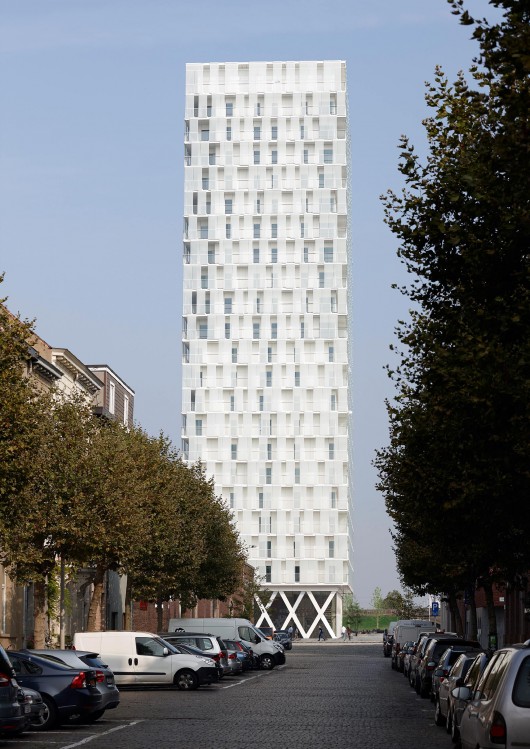
Park Tower, Antwerp, Belgium, 2014 designed by Studio Farris Architects
The ingenious patchwork of glass façade panels that shelter the terraces from the wind add a playful, layered effect highlighted by a fascinating dynamic of light and shadow. -- ArchDaily

Wednesday, September 21, 2011

Piled Up 2

Source: smugmug.com
Scarborough College, Toronto, Canada, 1969 designed by John Andrews 
The project was an early Canadian example of the sculptural use of concrete and the internalized megastructure approach that responded to the need to accommodate a rapidly growing population in a harsh winter climate.  -- the Canadian Encyclopedia

Source: archdaily.com
Florey Building, Oxford, UK, 1971 designed by James Stirling 
The structure is primarily a concrete frame with exposed, A-frame “feet” at the ground level. As with his previous university buildings, terra cotta tiles make up the majority of the façade, while the inside of the somewhat ‘U’-shape made up of a glazing system that faces North and overlooks the River Cherwell. The building contains 74 dormitories over four levels, with a top level of double-height gallery rooms for graduates and a ground level equipped with a dining hall and other general rooms.  -- ArchDaily
Read an article from Architectural Review

Source: harvard.edu
Gund Hall, Graduate School of Design, Harvard University, Cambridge, USA, 1972 designed by John Andrews
Roof as defining element takes on a more dramatic and conceptually persuasive note at Gund Hall, the Graduate School of Design by John Andrews, as its raking lines parallel and cover an open terraced sequence of overlooking studio spaces. -- American Architecture: Ideas and Ideologies in the Late Twentieth Century, Paul Heyer, pp. 74-75

Source: architecturetoday.co.uk
City of Westminster College, London, 2011 designed by Schmidt Hammer Lassen
As in much Nordic architecture, climate is a stong influence on the architectural language. In Denmark the term ‘climate screen’ is often used instead of ‘facade’. The wording signals a particularly responsive treatment of the building edge. Here the east and west facades have a climate screen made up of double-glazed windows set behind a fixed vertical brise soleil screens. The screen filters out direct sunlight but allows for high levels of daylight penetration. On the south facade the building is stepped outwards to overcome solar gain with the north facade angled backwards to maximise daylight and respect the neighbours’ rights to light.  -- Architecture Today
 Read a post from ArchDaily

Tuesday, September 20, 2011

Building/Ground: Winter Gardens

Source: wikipedia.org
The Ford Foundation Building, New York City, New York, USA, 1968 designed by Kevin Roche and John Dinkeloo
The building occupies the width of a block, and has facades of about 200 feet on either side, creating a near-perfect square, out of which a large volume has been removed to create a garden courtyard. The resulting L-shaped block of office space opens onto either the atrium or the street, depriving only a small number of workers of exterior views. The placement of the atrium in that location is surprisingly clever. In addition to maximizing sunlight for the plants, the cut reflects the location of the adjacent park in Tudor City, which slopes down through the envelope of the building, rolling down into a fountain at the center of the space. -- Wikipedia.
Read an article from ArchDaily 

Source: wikipedia.org
590 Madison Avenue(formerly IBM Building), New York City, New York, USA, 1983 designed by Edward Larrabee Barnes
Its plan included square footage exceeded the legal limitation of allowable floor area but it was accepted because of the bonus for providing benefits of public open space. The building was completed in 1983. It’s a successful example of an office building providing public open space.
The building occupies only 40 percent of the property and the rest of the square footage are assigned to public open space. The space is filled with series of amenities such as food and drink kiosks, tables and chairs, receptacles, and so on. Green bamboo trees installed in the space celebrates the serenity of an indoor garden.  -- Wikipedia

Source: Koetter Kim & Associates
Meditech World Headquarters, Canton, Massachusetts, USA, 1986 designed by Koetter Kim & Associates
The building is organized around a central covered garden space, offering a park-like setting for the year-round enjoyment of the Codex community( as well as providing a semi-climatized buffer between the building and the outside environment). -- architect's web site.

Source: kpf.com
DZ Bank Headquarters(Westendstraße 1), Frankfurt, Germany, 1993 designed by KPF
The project includes office and residential tower and low-rise office podium with retail, a central winter garden and underground parking.  -- architect's web site

Source: Geostud the fashionspot.com
Cartier Foundation, Paris, France, 1994 designed by Jean Nouvel
The phantom in the park.  With its transparency.  With its enclosure.  Trees are visible behind the high glazed barrier, which has taken the place of a long opaque wall, brushing against their eight-meter high enclosure. The lone Chateaubriand Cedar rises up, framed by two screens which assert the entrance.  The visitor passes beneath the cedar and sees the spectacle of the trees surrounding the glazed exhibition hall, also eight meters high, in a reading through the depth of the site.
In summer the huge sliding bays disappear and the hall transforms into the extension of the park, given rhythm by high posts. The architecture is about lightness, with a refined framework of steel and glass.  Architecture where the game consists in blurring the tangible boundaries of the building and rendering superfluous the reading of a solid volume amid poetics of fuzziness and effervescence.  When virtuality is attacked by reality, architecture must more than ever have the courage to take on the image of contradiction. -- architect's web site.
Read a post from ArchDaily.

The World Financial Center, New York City, New York, USA, 1998 designed by Cesar Pelli
The World Financial Center and its grand centerpiece, the 10-story glass pavilion Winter Garden, features extensive public spaces, dozens of shops and restaurants, and a stunning outdoor waterfront esplanade. The Winter Garden and its adjacent outdoor plaza are celebrated venues for both private functions as well as Brookfield’s Arts & Events program, which features everything from unique art installations and exhibits to musical and cultural performances, offered to the public year-round and free-of-charge. -- official web site
New Look for the Winter Garden -- ArchDaily


Source: Richard Meier & Partners Architects
United States Courthouse, Pheonix, Arizona, USA, 2000 designed by Richard Meier & Partners Architects
The 350-foot by 150-foot, glazed atrium is treated as an internal civic space, that houses the cylindrical glazed form of the special proceedings court -- architect's web site
the focus is a massive atrium lobby which offers occupants and visitors a naturally acclimatized public space of outdoor proportions.
Passively cooled by natural convection currents and a water-misting system, the atrium provides energy efficient space that is comfortable for public gatherings. The phenomenon of adiabatic cooling – through evaporation rather than heat exchange – is used to attain a drop in air temperature without a significant expenditure of energy. Even on the hottest summer days, the temperature in the hall can be lowered from between 15 degrees to 20 degrees Fahrenheit, and the movement of air at occupied levels enhances the sensation of comfort.  -- ArchDaily
Read an article about style of government buildings by Robert Campbell.

Source: MVRDV
Pyjama Garden Medical Center Extention, Veldhoven, The Netherlands, 2003 designed by MVRDV
The building for the public program, such as the restaurant, the conference center and the library for the MMC in Veldhoven, has been designed as a covered garden with natural sunlight, a glass house acclimatized by flora that compensates for the introverted orientation of the rest of the hospital. It gives the patient some freedom from the endless corridors and sterile medical environments. It's a pyjamas garden amid the Lysol disinfectant of the hospital ward.  -- architect's web site

Source: Carlos Morel @ Flickr
Genzyme Center, Cambridge, Massachusetts, USA, 2003 designed by Behnisch, Behnisch & Partner
The building's central atrium acts as a huge return air duct and light shaft. Fresh air moves into the atrium and up and out exhaust fans near the skylight. Natural light from the fully glazed facade and from the atrium (brought in by solar-tracking mirrors above the skylight) is reflected deep into the building.  -- AIA/COTE Top Ten Green Projects
Read an article about it concrete frame superstructure from PCA

Source: Rafael Viñoly Architects
Atlas Building, Wageningen, the Netherlands, 2007 designed by Rafael Viñoly Architects
A vast skylit atrium encourages the creation of an interactive environment, invigorated through a series of pedestrian bridges that join the floor levels and functions. -- architect's web site

Source: KSP Jürgen Engel Architekten archdaily.com
Nanjing Art Museum, Nanjing, China, 2010 designed by KSP Jürgen Engel Architekten
The two interlocking u-shaped buildings also create a space that is covered with a light glass roof. This 17-meter high access area, which narrows at its two main entrances, links the two stone halves of the building and guides visitors into the Museum. -- ArchDaily

 Source: kadawittfeldarchitektur archdaily.com
Adidas Laces, Herzogenaurach, Germany, 2011 designed by kadawittfeldarchitektur
In contrast to conventional office typologies, the ring structure developed by kadawittfeldarchitektur lends to the building a double relationship to the landscape – both to the outer surroundings and to the communicative landscape of the atrium. The connecting walkways, “Laces”, efficiently open up access to all office areas without the need to cross through other departments. At the same time they transform the atrium into a creative center of the building that provides an identity.  -- ArchDaily

Source: Experimental Branch of Architecture archdaily.com
Cultural – Sport Complex For Disabled, Tehran, Iran, 2011 designed by Experimental Branch of Architecture
....a tall building was inevitable and finally the program turns into functional boxes. These functional boxes locate and slip over each other to make voids between spaces. The spaces which behave in relation to inside and outside of the building. -- ArchDaily

Source: archrecord.construction.com
The Lunder Building, Massachusetts General Hospital, Boston, Massachusetts, USA, 2011 designed by NBBJ
In the five-story bed tower, two wedge-shaped openings cut out of the overall volume accommodate an 80-foot-high skylit atrium, as well as an open-air garden court, where bamboo trees shoot upward past the patient levels.  -- Architectural Record
AIA Selects Four Projects for National Healthcare Design Awards -- ArchDaily

Source: Sama J.Canzian archdaily.com
The Atrium, Victoria, BC, Canada, 2011 designed by D’Ambrosio Architecture & Urbanism
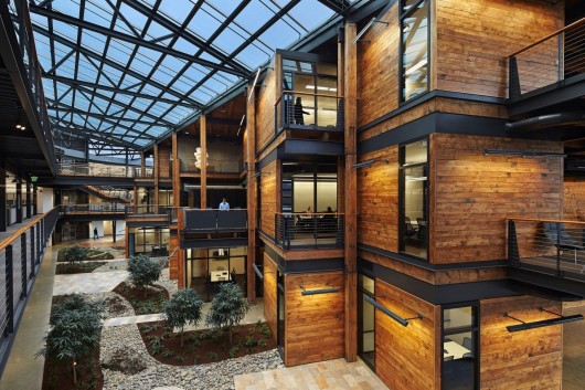
A seven-storey atrium introduces daylight into the heart of the complex while enlivening the street at night with warm glowing light through the large expanses of glass. The use of wood as an interior finish is maximized in what is otherwise non-combustible construction. Seen from the street through a seven-storey glass curtain, views of the space with its wood wall grilles and roof trusses, distinguish the atrium from the surrounding more insular buildings. -- ArchDaily

Source: Benjamin Benschneider archdaily.com
Federal Center South Building 1202, Seattle, Washington, USA, 2012 designed by ZGF Architects
The indoor campus environment enhances the concept of creating a collective community and identity by centralizing all common services and conferencing within the “commons” or social heart of the building. -- ArchDaily

Source: Piotr Krajewski archdaily.com
Marshal’s HQ, aleja Niepodległości, Poznań, Poland, 2015 designed by / WAPA Warsztat Architektury
The interiors are articulated by two atriums which play crucial role in the air circulation and are thermal buffers (collect heat in winter and provide ventilation and fresh air supplies in summer). -- ArchDaily