 |
| Source: Michael Moran |
Graduate student apartment, Harvard University, Allston, Massachusetts, USA, 2003 designed by Machado and Silvetti Associates
The site marks arrival to Harvard's campus from downtown Boston and areas south. The building's configuration and image are based on interpretations of its physical context — the early-twentieth-century, five-story, brick-clad, U-shaped neo-Georgian courtyard houses and the mid-twentieth-century, twenty-story, concrete paneled modern towers.
While One Western Avenue combines these two emblematic types, it adds something else, a three-story bridge raised four levels above the ground and spanning 180 feet. This volume divides the main central void into two contrasting spaces, a courtyard (with framed views to the river) and a front lawn. It creates a large covered terrace, furnished with a wooden platform intended for everyday use as well as special occasions. This configuration produces desirable conditions that normally exclude one another: a courtyard open to the river and three stories of apartments occupying the same riverfront situation. -- architect's web site.
Comments of this building from
The Harvard Crimson October 9, 2003.
 |
| Source: MVRDV |
Parkland Building, Geuzenveld, Amsterdam, The Netherlands, 2006 designed by MVRDV
By splitting the program into five towers that are sandwiched between a deck with the amenities and roof of penthouses, an open and airy block is formed, offering variations of views from all directions. It creates a lifted semi-public park, a semi-public balcony that overlooks the park. This garden can be seen as a supplement to the park and enlarges it, even when it is built... --
architect's web site
Quai Branly Museum, Paris, France, 2006 designed by Jean Nouvel
what is solid seems to disappear, giving the impression that the museum is a simple façade-less shelter in the middle of a wood. When dematerialization encounters the expression of signs, it becomes selective; here illusion cradles the work of art.
All that remains is to invent the poetry of the site by a gentle discrepancy: a Parisian garden becomes a sacred wood, with a museum dissolving in its depths. -- architect's web site
 |
| Forum Building, Barcelona, Spain Source: Thomas Mayer arcspaces.com |
 |
| CaixaForum in Madrid, Spain Source: construction.com |
Forum Building, Barcelona, Spain, 2004 and
CaixaForum, Madrid, Spain, 2008 designed by Herzog & de Meuron
In both cases, the architects lift the buildings off the ground to create a shaded public plaza and point of entry, with essentially windowless program spaces above. --
Architectural Record.
 |
| Source: construction.com |
MAXXI/National Museum of XXI Century Arts, Rome, Italy designed by Zaha Hadid Architects.
Hadid and her partner, Patrik Schumacher, approached the building as a “quasi-urban field, a ‘world’ to dive into rather than a signature object,” explains Hadid.
In addition to opening a pedestrian connection through the city block, the scheme acknowledges the angled street grid beyond Via Masaccio — twisting the museum building to align with a nearby streetcar line. Or, as the architects explain in their tortured project text, “An inferred mass is subverted by vectors of circulation.”--
Architectural Record October 2010.
Another article from
Architecture Today.
Zaha Hadid’s Maxxi Museum faces Closure from
Archdaily.
 |
| Source: construction.com |
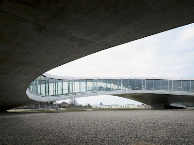
Rolex Learning Center in Lausanne, Switzerland designed by Japanese architectural practice SANAA opened in February 2010.
Between floor and ceiling—the former blanketed by a mousy gray carpet, the latter a stark white sound-absorbing surface—is a remarkable space that’s a hybrid of built and natural environment that takes its cues from the nearby Alps, visible from inside. The building, a flowing landscape, is unencumbered by walls, allowing views across its interior and through the patios; overhead is a continuous plane. -- Architectural Record June 2010.
Another article from
Architecture Today.
 |
| Photographic Project for Rolex Learning Center |
It started when the photo club of the EPFL, in association with some staff of the school, launched a call for entries to do an exhibition on the uses and the life inside the, then brand new, Rolex Learning Center, as experienced by the students, by the students. Johann Watzke and two other members of the photo club, Anne-Fanny Cotting (another architecture student) and Aurélie Mindel (chemistry student), pitched the idea and they settled on the idea of having people practicing different winter sports inside the RLC. The space, with the slopes and the overall whiteness, was perfect as a metaphor for the Swiss mountains in winter. --see more photos from ArchDaily.
More info from
designtoproduction
 |
| Source: MVRDV archdaily.com |
Le Monolithe, Lyon, France, 2010 designed by MVRDV
The block is characterised by a large interior court with a raised public space overlooking the city, the new marina and a park, in this way resembling the French classical ‘Grand Gallérie’. The block is divided into five sections, each one designed by a different architect in order to achieve diversity and architectural variety. -- ArchDaily
CCTV - Headquarters, Beijing, China, 2010 designed by OMA
The new headquarters for China Central Television, OMA's largest project to date, combines the entire process of TV-making – administration, production, broadcasting – into a single loop of interconnected activity. Rising from a common platform accommodating production facilities, two towers – one dedicated to broadcasting, one to services, research, and education – lean towards each other and eventually merge in a dramatic, seemingly impossible cantilever. --
architect's web site
 |
| Source: Sergio Pirrone archdaily.com |
Hong Kong Institute of Design, 3 King Ling Road, Tseung Kwan O, Hong Kong, 2010 designed by CAAU
Covered in glass which is screenprinted white, the immaculate and minimal volume of the platform floats above the towers “like “an aerial city.”. It groups together the library, school administration offices as well as various related spaces. Its landscaped roof is accessible during exceptional events. -- ArchDaily
 |
| Source: stevenholl.com |
Nanjing Sifang Art Museum, Nanjing, China, 2011 designed by Steven Holl Architects
The museum is formed by a "field" of parallel perspective spaces and garden walls in black bamboo-formed concrete over which a light "figure" hovers. The straight passages on the ground level gradually turn into the winding passage of the figure above. The upper gallery, suspended high in the air, unwraps in a clockwise turning sequence and culminates at "in-position" viewing of the city of Nanjing in the distance. This visual axis creates a linkage back to the great Ming Dynasty capital city. --
architect's web site
 |
| Source: construction.com |
Universidade Agostinho Neto, Luanda, Angola, 2011 designed by Perkins+Will
....central library—the latter an R-shaped structure, most of it raised four stories above the ground to allow cooling breezes to reach classroom blocks on its leeward side. (Right now, the library building includes student-union and administrative facilities, which will eventually get their own structures as the library expands.) The library is the only building that is air-conditioned; other structures depend for cooling on the ingenuity of the architects (and consulting engineers Battle McCarthy, based in London) in limiting solar gain and stimulating airflow. -- Architectural Record
 |
| Source: Alisan Cirakoglu archdaily.com |
Gallium Block, Ankara, Turkey designed by Cirakoglu Architecture
The building which has office spaces ranging from 70 m2 to 1600 m2 is also a passage way from Technopolis’ offices region to recreation area. This passage is achieved by elevating the building and having the mass of the building sit on the level difference in the site. This also provides free access into the inner court of the building from different directions. The inner court in between the two office prisms is a open air social gathering place which extends to interiors as enterance hall of the building. -- ArchDaily
 |
| Source: Dario Diarena archdaily |
Citadel of Construction, Perugia, Italy, 2013 designed by HOFLAB
....to gain land with a building raised from the ground allowing room for a green slope. --
ArchDaily


No comments:
Post a Comment