 |
| Source: I. M. Pei & Partners |
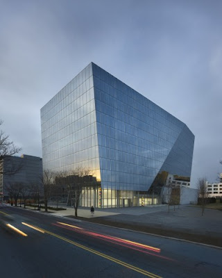
Fountain Place, Dallas, Texas, USA, 1986 designed by I. M. Pei and Partners
Texas Society of Architects’ 25-Year Award Presented to I. M. Pei & Partners’ Fountain Place -- ArchDailyThe solution takes the form of a glazed prism informed by a rigorous and precise geometrical procedure employing the diagonal of a double square in plan and section. -- architect's web site.
 |
| Source: Pelli Clarke Pelli Architecs |
Cira Centre, Philadelphia, Pennsylvania, USA, 2005 designed by Pelli Clarke Pelli Architecs
Standing apart from the city’s cluster of tall buildings, the tower is a singular object, designed to change in character when seen from different angles and at different times of the day. Its angled, sculptural form is sheathed in a sleek, reflective surface, giving the tower a crystalline, forward-looking presence. -- architect's web site
 |
| Source: kpf.com |
Shanghai World Financial Center, Shanghai, China, 2008 designed by KPF
A square prism—the symbol used by the ancient Chinese to represent the earth—is intersected by two cosmic arcs, representing the heavens, as the tower ascends in gesture to the sky. The interaction between these two realms gives rise to the building’s form, carving a square sky portal at the top of the tower that lends balance to the structure and links the two opposing elements—the heavens and the earth. -- architect's web site.
 |
| Source: worldarchitecturenews.com |
Tour Granite, Pairs, France, 2008 designed by Christian de Portzamparc
Forming the head of this triangle of towers the Granite Tower (Tour Granite) covers 70,000 sq m and forms a prismatic shape to make best use of the footprint space. -- World Architecture News
 |
| Source: SOM.com |
Esentai Tower, Almaty, Kazakhstan, 2008 designed by SOM
An elegant, crystalline building form and the icy transparency of the exterior skin, where a pattern of ceramic frit frosts the surface and reinforces its vertical proportions, establish the tower as a unique landmark on Al-Farabi Avenue. -- architect's web site
 |
| Source: Prakash Patel archdaily.com |
1100 First Street, Washington, D.C., USA, 2009 designed by Krueck & Sexton Architects
Glass, the building’s exterior material, is used in two different but related ways: cleanly detailed and folded at the courtyard in a manner that lightens each volume and clearly identifies the main facade, and more deferential and modular at the adjacent streets. The architectural language that results from the precise articulation of surfaces and edges is timeless and enduring. -- ArchDaily
 |
| Source: archiplanet.org |
One Bryant Park, New York City, New York, USA, 2010 designed by Cook+Fox Architect
Read a post from ArchDailythe faceted and tapered 2.1-million-square-foot tower deploys a host of highly integrated strategies that helped it win the highest possible level of LEED certification. Its features include daylighting maximized by a high-performance all-glass skin, rainwater and greywater recycling, and an advanced air filtration system.-- Architectural Record, May 25, 2010
 |
| Source: Pelli Clacke Pelli Architects |
Torre de Cristal, Paseo De La Castellana, Madrid, Spain, 2010 designed by Pelli Clarke Pelli Architects
Like a block of crystal, Torre de Cristal has an angled, sculptural form. The building’s facets reflect the sky, giving life and movement to the structure. -- architect's web site.
 |
| Source: kpf.com |
Northeast Asia Trade Tower (NEATT), Songdo IBD, South Korea, 2011 designed by KPF
Designed to be a landmark on the skyline of Songdo IBD—a 1,415-acre, master-planned community on the Incheon, Korea, waterfront—the Northeast Asia Trade Tower aims to both symbolize and embody the tenants of an international business hub in a free-trade zone. Occupying a site at the southern edge of Central Park, the tapering volume is a mixed-use development that combines office, hotel, and service apartment components, each with its own entrance lobby. -- architect's web site
| Source: Dean Kaufman/Courtesy MOCA Cleveland |
Museum of Contemporary Art, Cleverland, Ohio, USA, 2012 designed by Farshid Moussavi
The four-story building, which anchors the Uptown district, rises 60 feet from a hexagonal base to a square top, where the primary exhibition space is located. Clad primarily in mirror-finish black Rimex stainless steel, the façade will reflect its urban surroundings, changing in appearance with differences in light and weather. -- official web siteRead a post from ArchDaily
 |
| Source: SOM |
One World Trade Center (the Freedom Tower), New York City, USA, 2013 designed by SOM
Another article from Architectural Record Spetember 2011.The tower will no longer twist, but will be chamfered back from its corners, creating eight tall isosceles triangles. Maintaining the original building’s torque with a square base would have been awkward, notes SOM spokesperson Elizabeth Kubany. -- Architectural Record, June 29, 2005.
Updated visuals for One World Trade -- ArchDaily
Banksy Critiques One World Trade as “Shyscraper” -- ArchDaily
Another article from Architectural Record 10/17/ 2014.
No comments:
Post a Comment