|
| Source: Jeremy Bittermann archdaily.com |
Clyfford Still Museum, Denver, Colorado, USA, 2011 designed by Allied Works Architecture
Through the trees, the structure of the building is visible, consisting of cast-in-place architectural concrete walls with a variety of surface relief and texture. The façade features thin, vertical lines of concrete that project from the building’s surface in a fractured, organic, and random pattern, creating a rich surface that changes in the intense Denver sunlight and forms varied shadows across the building. -- ArchDaily
 |
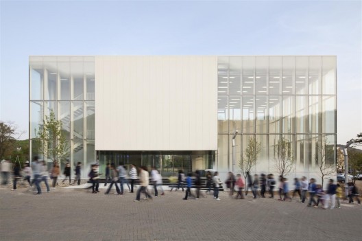
| Source: Chang Kyun Kim archdaily.com |
White Block Gallery, Heyri Art Valley, South Korea designed by SsD
A matrix of 3 solid gallery volumes carefully positioned creates 7 additional galleries in a compact but open ended configuration. Designed to showcase global contemporary art from super sized sculpture and paintings to multi-media installations, the spaces are unique in proportion and lighting allowing curators to accommodate new future forms of art and media. -- ArchDaily
 |
| Source: Brad Feinknopf archdaily.com |
McGee Art Pavilion, Alfred, New York, USA, 2011 designed by ikon.5 architects
The McGee Art Pavilion is an expansion to the School of Art and Design at the New York State College of Ceramics. Designed as a large ceramic container for holding art and light, the pavilion is set on a plaza between two existing campus buildings on the main pedestrian road on the campus, creating a realization of the manufacturing history of Alfred. -- ArchDaily
 |
| Source: Marc Lins Photography archdaily.com |
Fresach Diocesan Museum, Fresach, Austria, 2011 designed by Marte.Marte Architekten
The public square has been completed by a monolithic block placed on the
gently rising land to the northeast. The foundation and main level
divide the hermetic shell for the diocese’s church treasures, and bring
the large cube into harmony with the scale of the surrounding buildings. --
ArchDaily
 |
| Source: David Holmes archdaily.com |
The Lighthouse Young People’s Centre, Birmingham, UK designed by Associated Architects
The site has a strong visual presence in the local area, overlooking a major route into Birmingham city centre. The use of semi-transparent coloured cladding allows the sports hall to be naturally lit in the day and to provide a strong dynamic presence in the area. In the evening, the use of artificial lighting and feature LED lighting allows The Lighthouse to become the ‘beacon’ within the community. -- ArchDaily
 |
| Source: Joshua White archdaily.com |
Matthew Marks Gallery, West Hollywood, California, USA, 2012 designed by ZELLNERPLUS
This is a 3000 square foot, free standing new building for renowned New York art dealer Matthew Marks.
The building was conceived as a monolithic, windowless, 70 x 40 x 32 foot white stucco box. -- ArchDaily
 |
| Source: Didier Boy de la Tour archdaily.com |
Mont de Marsan Mediatheque, Place de la Caserne Bosquet, 40000 Mont-de-Marsan, France, 2012 designed by archi5
The Media Library stands in the middle of the Bosquet barracks, and care
has been taken to augment the dialogue with the place’s strong
architectural whole. With its clean envelope of pure geometric lines, a
197 ft x 197 ft square, the building complies with the classical layout
yet contrasts with its austerity by offsetting the system with a corner
opening onto the city. Its facades reflect the surrounding barracks like
a respectful, deferential mirror. --
ArchDaily
 |
| Source: KSG Architekten + BDA Feldschnieders + Kister archdaily.com |
Research Building DLR SpaceLIFT, Robert-Hooke-Straße 7, Bremen, Germany, 2012 designed by Ksg Architekten + Architekten BDA Feldschnieders + Kister
To its outside the square layout presents itself as a solitary volume
with a dense, two storey cubature. Integrating a colonnade on the upper
level, the inside opens itself up to its visitors despite the high
levels of security. --
ArchDaily
 |
| Source: Steven Massart archdaily.com |
MuCEM, Marseille, France, 2013 designed by Rudy Ricciotti
First of all a perfect square of 72 m per side, it is a classic plan, Latin, under the control of Pythagoras. Within this square, another of 52 m per side, comprising the exhibition and conference halls identified as the heart of the museum.. -- ArchDaily
 |
| Source: Christian van der Kooy archdaily.com |
Erasmus Pavilion, Rotterdam, The Netherlands, 2013 designed by Powerhouse Company + DeZwarteHond
A compact building volume, the positioning of the mass in the center
core, a careful orientation of the program toward the sun—combined with
the active facade, the solar panels on the roof, the natural
ventilation, and flexible zoning transform this transparent building
into a low- consumption landmark. --
ArchDaily
 |
| Source: 11h45 archdaily.com |
Auditorium Of Bondy & Radio France Choral Singing Conservatory, Bondy, France designed by PARC Architectes
The architecture of the building plays with the aesthetics of the
hangar : a very simple square plan and an undulated metal skin. Unlike a
traditional hangar, it opens to its context through a series of arches,
letting in natural light and views. Inside, every space has a specific
acoustics related to its function and its ambiance. --
ArchDaily
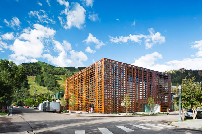 |
| Source: Michael Moran archrecord.construction.com |
Aspen Art Museum, Aspen, Colorado, USA, 2014 designed by Shigeru Ban Architects
From the exterior, the museum’s main feature is the basket-weave cladding that covers its two street-facing facades. The slats, “woven” together on-site, are made from a paper-and-resin composite sandwiched between two thin layers of brown okoume wood protected with a UV coating. The density of the weave changes from top to bottom and as it moves away from the corner of the building. Practically, the screen provides shade from the intense Colorado sunlight. Aesthetically, it helps give the museum a craftsy, homemade quality, despite its bulky presence. --
Architectural Record
 |
| Source: Pepo Segura archdaily.com |
Girona Public Library, Girona, Girona, Spain, 2014 designed by Corea & Moran Arquitectura
The square-shaped volume is almost entirely glazed in U-glass punctuated
by sections of transparent glass, flooding the interior with a diffuse
light especially comfortable for reading while framing views of the
surrounding neighborhood. At night the library glows like a giant urban
lantern, welcoming everyone to enter and become part of this place for
knowledge, culture and community life. --
ArchDaily