|
| Source: architecture.com |
Tower of Winds, Yokohama, Japan, 1986 designed by Toyo Ito Associates Architects
In the Tower of Winds Ito represents the visual complexity of Tokyo metaphorically in terms of a never-ceasing, ever-changing wind. The tower, a light sculpture that responds to wind speed and directions, was designed years before anyone else explored the use of photo-responsive glass or ‘interactive architecture’ in the same way. --
RIBA Royal Gold Medal 2006
 |
| Source: wikipedia.org |
Lipstick Building(53rd at Third), New York City, New York, USA, 1986 designed by John Burgee Architects with Philip Johnson
The building receives its name from its shape and color, which resemble a tube of lipstick. The shape, which is unusual in comparison to surrounding buildings, uses less space at the base than a regular skyscraper of quadrilateral footprint would use. This provides more room for the high numbers of pedestrians who travel via Third Avenue. -- Wikipedia
the unusual shape, which has given the building its nickname, was a requirement of the developer, to make the building stand out and compensate for the less fashionable location of Third Avenue. The elliptical shape also claims to make all the exterior offices "corner" offices. -- galinsky
 |
| Source: archdaily.com |
 |
| Plan, Source: archdaily.com |
Office Silo & Containers, Tajonar, Navarra, Spain, 2005 designed by Vaillo + Irigaray
The office buildings is composed by an elliptical construction, as a counterpoint to the wings: in front of an horizontal and pointy construction, a curved tall tower appears, searching for the minimum “friction” between the rest of the buildings. --
ArchDaily
 |
| Source: CMV Architects archdaily.com |
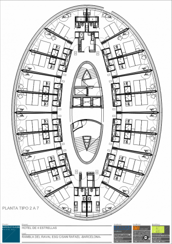 |
| Plan, Source: archdaily.com |
Barceló Raval Hotel, Madrid, Spain, 2007 designed by CMV Architects
The hotel was built as an elliptical construction, made up from two basements, a ground floor and ten high-rise floors. The project was born with some specific volumes marked by “PERI” of Ravalin Barcelona, and all the attention goes in the direction of the axes of the elliptical plant. In the same way, depending on the direction from which it is seen, the building is perceived in a more or less volumetric way. -- ArchDaily
 |
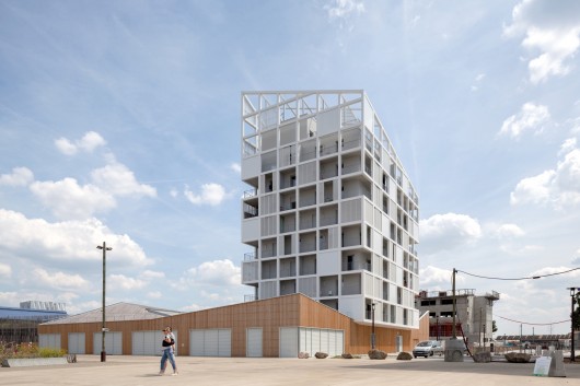
| Source: Jomar Bragança archdaily.com |
Parc Zodiaco Building, Minas Gerais, Brazil, 2010 designed by GPA&A
The residential building was developed to harmonize with its surroundings, so we used curves, balconies, and gardens as a way to insert it into the landscape, softening its contours. --
ArchDaily
 |
| Source: architectmagazine.com |
 |
| Source: architectmagazine.com |
1 Bligh Street, Sydney, Australia, 2011 designed by Architectus and Ingenhoven Architects
After considering a number of schemes, the architects adopted an elliptical plan, with its long side facing toward the harbor. The ellipse gives each office space floor-to-ceiling panoramic views. --
ARCHITECT Magazine
 |
| Source: architectmagazine.com |
 |
| Plan, Source: architectmagazine.com |
Coffee Plaza, Hamburg, Germany, 2011 designed by Richard Meier & Partners Architects
Raised on a podium overlooking nearby Sandtorpark, the oval-shaped tower mediates the separation between the park and plaza. Inside, behind a ventilated façade, the oval configuration improves visual and physical connections between the office workers, resulting in greater collaboration. --
ARCHITECT Magazine
 |
| Source: Aleksey Naroditsky archdaily.com |
 |
| Plan, Source: archdaily.com |
Bank Saint Petersburg, Saint Petersburg, Russia, 2011 designed by NPS Tchoban Voss
The tower contrasts them by its height and its special silhouette. On
the riverside its glass façade bends inwardly along the entire height.
The resulting waistline adds subtle dynamics to the building making it
appear elegant from almost every direction from across the river. --
ArchDaily
 |
| Source: Aedas archdaily.com |
Al Bahar Towers, Abu Dhabi, United Arab Emirates, 2012 designed by Aedas
For Abu Dhabi’s newest pair of towers, Aedas Architects have designed a responsive facade which takes cultural cues from the “mashrabiya”, a traditional Islamic lattice shading device. Completed in June 2012, the 145 meter towers’ Masharabiya shading system was developed by the computational design team at Aedas. Using a parametric description for the geometry of the actuated facade panels, the team was able to simulate their operation in response to sun exposure and changing incidence angles during the different days of the year. -- ArchDaily
Read a post from
inhabitat
 |
| Source: Filip Dujardin archdaily.com |
 |
| Site plan, Source: archdaily.com |
Police Headquearters & Charleroi Danses, Boulevard Pierre Mayence, 6000 Charleroi, Belgium, 2014 designed by Ateliers Jean Nouvel + MDW Architecture
The Charleroi police headquarters has been installed in a blue tower
building which is a reminder of the dark blue colours of the police
force. The idea was to create a city scale landmark which is not too
high, as a sort of dialogue with the City Hal belfry, and as a message
stating that the police force services are open to all at all times. --
ArchDaily