Wednesday, May 30, 2012

Primitive Hut 2

Source: SoHo Architektur archdaily.com
Haus BRU 1.25, Heimertingen, Bavaria, Germany, 2008 designed by / SoHo Architektur
Decisions on construction method, materiality and quality were primarily based on building costs. Fair faced interior walls, screed as finished flooring, visible insulation strips between floor and walls, and the use of corrugated cement fibre panels for facade cladding and roofing – no need for rainpipes and gutters – help to reduce the costs. The timber building enables a strong connection between interior and exterior through the accurately positioned openings on ground level. -- ArchDaily

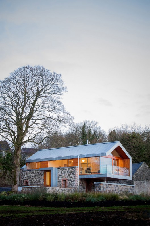
Source: David Grandorge archdaily.com
Ty Pren, Brecon Beacons National Park, King’s Rd, Llandovery, Dyfed SA20 0AW, UK, 2009 designed by Feilden Fowles
The rich local vernacular inspired the concept of a modern ‘long house’, following the contours of the land, embedding itself in the slope of the hill and responding to the prevailing conditions. The design evolved into a crisp extrusion using skilled craftsmen to deliver a high-tech building. The typology of the long house leant itself to a passive solar plan, enhanced by the topography and aspect of the site. Contemporary construction techniques have delivered a thoroughly modern and high performance building, which responds to the landscape. The design was environmentally driven throughout. The passive solar design strategy uses every natural energy source available, and is supplemented with active features such as the log boiler. -- ArchDaily

Source: openbuildings.com
Sliding House, Suffolk, UK, 2009 designed by dRMM de Rijke Marsh Morgan Architects
The brief was a self-build house to retire to in order to grow food, entertain and enjoy the landscape. The site offered a combination of rolling England and agricultural Holland, restrained by stringent local Planning parameters for rural development. A genuine appreciation of vernacular farm buildings shared by architect and client/builder led to a manipulation of the local timber framed and clad 'shed' idiom. -- Open Buildings

Source: FG+SG – Fernando Guerra, Sergio Guerra archdaily.com
House In Leiria, Leiria, Portugal, 2010 designed by Aires Mateus
The house is a recognizable archetype emptied of its centre by the light designed by a three heighted courtyard that opens horizontally at the garden level. The bedroom courtyards, revealed in the garden, relate with this archetypal object providing different readings on its scale. Scale and volume are controlled in a chaotic context, with a clear identity that from its core relates with the historical legacy far away: the Leiria Castle. -- ArchDaily

Source: Nelson Garrido archdaily.com
Casa na Areia, Comporta, Grândola, Portugal, 2010 designed by Aires Mateus
This project is a response to very specific conditions. Its basis is the recovery of existing wood-masonry buildings, providing the complex with a homogeneous unity under a sloping roof. The design begins with the existing material conditions, depending on their inhabitation potential. -- ArchDaily

Source: Roberto de Leon archdaily.com
Yew Dell Gardens Visitor Center, Crestwood, Kentucky, USA, 2010 designed by De Leon & Primmer Architecture Workshop
The Yew Dell Gardens Visitor Center is situated within the historic property of the Garden Conservancy. The project required the rehabilitation of an existing tobacco barn with a program including a reception area, information and tickets sales, gift shop, plant sale area, group tour meeting zone, internet sales office, and storage. Preserving the exterior iconic image of the tobacco barn structure, the new facility is designed as a ‘building-within-a-building’. -- ArchDaily

Source: Satoshi Shigeta archdaily.com
House in hieidaira, Shiga Prefecture, Japan, 2010 designed by Tato Architects
The houses in the nearby existing residential area are gable-roofed keeping to the regulation that demands slanted roof, which appeared to be providing a sense of serenity along the street.  
The floor space of upstairs was not required to be so large but was required to be independent to some extent. As ordinarily upright walls would make the space of upstairs cramped and the ceiling of downstairs too high, the partition walls were leaned to have the solid space divided diagonally, and thereby a ”hill-like-floor” and a ”roof-like-ceiling” emerged. Here appeared such a new model as assembling a small cottage type into a large cottage type. A cottage type is assertive enough to make people imagine the interior to be consistent to the exterior, and vice versa. Above a ceiling suggesting a cottage style roof another ceiling suggesting another cottage style roof is provided, and thereby we think we have created a solid space as if it is ever extending up. -- ArchDaily

Source: Gustav Willeit archdaily.com
Casa Prè de Sura, San Martino in Badia, Italy, 2010 designed by Casati
This gabled house in Italy by Austrian architects Casati has stripy wooden walls on the outside and bumpy limestone walls on the inside. Boxy windows project from the facade and frame views towards the castello di San Martino; a small castle on a nearby hillside. A window in the master bedroom wraps over onto the roof, while others meet the floor so that small children can see out. -- ArchDaily

Source: Sean Breithaupt + Yvette Monohan archdaily.com
Connemara, Connemara National Park, Ireland, 2010 designed by Peter Legge Associates
The two cottages though close (a mere three metres apart) were not directly in line nor at the same level but were parallel. A basic decision in the redevelopment process was that they should continue to read as separate elements in the landscape. To allow the cottages read as two separate buildings, a transparent link was required, one totally glazed.  This link would become the entry and circulation hub for the house connecting the cottages at both levels. -- ArchDaily

Source: Filip Dujardin archdaily.com
Habitation TSL, Brussels, Belgium, 2011 designed by adn Architectures
Our first response to a specific domain of work is to propose an alternative design of interior spaces in a limited volume and restricted by planning regulations that defy logic. The work is a reflection of the cavity determine by significant mass elements of the facades, with the input system, solar gain from the south views where landscape is framed. -- ArchDaily

Source: Rene de Wit archdaily.com
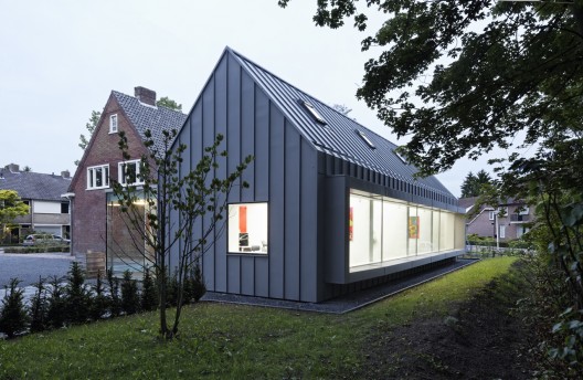
Dentist with a View, Best, The Netherlands, 2011 designed by Shift architecture urbanism
The four new treatment rooms are situated in a new volume that at the same time mimics and contrasts the existing house. Its archetypical volume is derived from the existing house – it takes over the exact same inclination of the pitched roof – while it is being materialized in a very different material. Both the roof and the facades of the extension are clad with zinc. This strengthens the iconic quality of the archetype and renders the new extension into a “contextual alien” that blends into the rural surroundings and at the same time creates a clear new landmark that expresses its new function. -- ArchDaily

Source: archrecord.construction.com
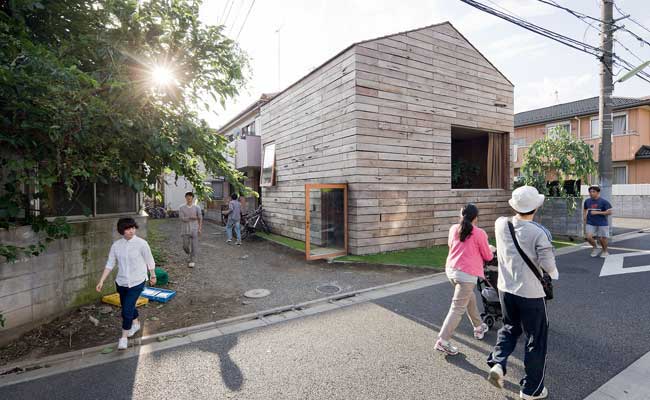
House in Komazawa, Setagaya-ku, Tokyo, Japan, 2011 designed by Go Hasegawa & Associates
....a gabled roof typical of the neighborhood. On the first floor, large windows incised in the wood-clad walls offer generous views of nearby trees. Plywood sheaths the interior walls and gives the open-plan space a sense of intimacy.
One half of the second floor contains two bedrooms, a bath, and a narrow, south-facing outdoor terrace. The other half, devoted to a study, has a slatted floor of two-by-threes with 1.18-inch gaps. The open slots allow residents to catch glimpses of activity below and make it possible for daylight to permeate the two floors. -- Architectural Record


Source: Brando Posocco archdaily.com
Villa Jian, Yantai, Shandong, China, 2012 designed by CU Office
The concept of Villa Jian came from the local architecture word called “Jian”. In the local architecture culture, there was one commonly used for building space base unit that is “Jian”, one ”Jian” represented a width of about 3.3 m to3.6 m of spatial scale, this word ”Jian” not only represented a space base unit, but also strongly linked with the local traditional form of construction. -- ArchDaily

Source: Nobuaki Nakagawa archdaily.com
ISM House, Chiba, Japan, 2012 designed by I.R.A
The impressive house that has the form of the white arrow was built to the site without an important context. -- ArchDaily

Source: Li Xiao archdaily.com
N4+ Gluebam House, Wuhan, China, 2012 designed by Advanced Architecture Lab[AaL]
“Glued bamboo prefabricated construction system” ,developed by the Advanced Architecture Lab(AAL) together with the bamboo institute of the Chinese Academy of Forestry, is trying to transform the rich bamboo resource in China into the industrialized building structure material.  “N4+”is a housing typology based on gluebam, located in Huazhong University of Science and Technology, the house is positioned in proximity with the architectural department. “N4+” house completed in 25 days, is a prototype base on the concept of mass production and fabrication, delivery to site for fast construction. -- ArchDaily

Source: Stephane Chalmeau archdaily.com
Maison 2G, Orsay, France, 2012 designed by Avenier Cornejo Architectes
Flirting with the building regulations of the materials and the context of the landscape led a project of “total look” wood. The volume is simple and one-piece, the  wood cladding envelope dramatic. Composed of strips of cedar crate, this one allows omnipresent light, to be so over-input and redirected the angular pants interiors. The volumes are designed and vibrate throughout the day. -- ArchDaily

Source: Guy Wenborne archdaily.com
Barn House, Kawelluco, Chile designed by Cazú Zegers G.
A Barn´s wooden skin creates a relation with the surrounding scenery. It does not impose, but incorporates itself, to the traditional type of construction, typical of southern Chile. This Barn house, is a contemporary representation of a traditional barn model. The use of wood covering for walls and roof , creates an interior twice as high festoned with somewhathigh altillo windows and balconies leading to the surrounding landscape. -- ArchDaily

Source: Jürg Zimmermann archdaily.com
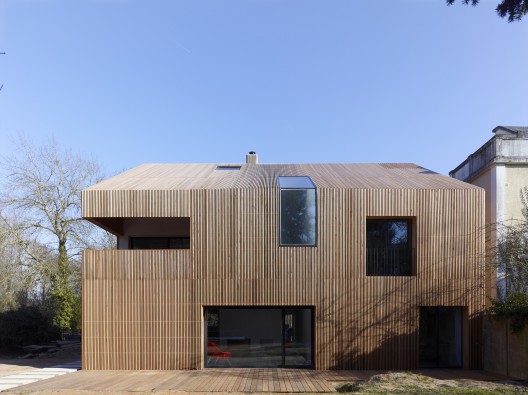
Gottshalden, Winterthur, Switzerland, 2012 designed by Rossetti + Wyss Architekten
The house in Gottshalden is located on a plateau over the Lake Zurich. It is set in green surroundings with a high quality of life, dominated by agricultural use. The volume exhibits a unified design, with a reduced, sharp-angled timber facade. The building is reduced to an almost graphical figure, with even the minimal distances to the eaves and corners verging on disappearance. -- ArchDaily

Source: Åke E-son Lindman archdaily.com
Villa Wallin, Yxlan, Stockholm, Sweden, 2013 designed by Erik Andersson Architects
....the archetypal house. Designed strictly by using the proportional ratio of 1:3, the house measures six meters in depth, eighteen meters in length and six meters in height. The facade windows also follow a clear pattern: they are all square in form and have the same size. -- ArchDaily

Source: Adolf Bereuter archdaily.com
Haus am Moor, Vorarlberg, Austria, 2013 designed by Bernardo Bader Architects
Based on the traditional houses of the Bregenz district, the two-storey residence has a simple rectangular plan with a steep gabled profile and a wooden deck driven through its middle. -- ArchDaily

Source: Maciej Gasienica Giewont archdaily.com
Public Toilets, Kazimierz Dolny, Poland designed by Piotr Musialowski + Lukasz Przybylowicz
The entire property was surrounded by a fence, inspired by the traditional wooden fences. From the north side, it was transformed into the wooden rail shelter to integrate all elements of the new building. -- ArchDaily

Source: Adam Currie archdaily.com
Loughloughan Barn, Broughshane, Northern Ireland, UK, 2013 designed by McGarry-Moon Architects
The preservation and consolidation of the stone structure was fundamental in achieving an architecture where the old and new complemented each other. Thus the residence was designed by fusing new technologies with older building techniques whilst incorporating sustainability ideals in order to create a rural architecture for the 21st century, rather than simply remodelling or recreating the methods and manners of the past. -- ArchDaily

Tuesday, May 29, 2012

Botanical Garden Visitor Centres

Source: Roberto de Leon archdaily.com
Yew Dell Gardens Visitor Center, Crestwood, Kentucky, USA, 2010 designed by De Leon & Primmer Architecture Workshop
The Yew Dell Gardens Visitor Center is situated within the historic property of the Garden Conservancy. The project required the rehabilitation of an existing tobacco barn with a program including a reception area, information and tickets sales, gift shop, plant sale area, group tour meeting zone, internet sales office, and storage. Preserving the exterior iconic image of the tobacco barn structure, the new facility is designed as a ‘building-within-a-building’. -- ArchDaily

Source: construction.com
Ruth Lilly Visitors Pavilion, Indianapolis, Indiana, USA, 2010 designed by Marlon Blackwell Architect
Partly because the building is not orthogonal, it can seem animated, almost alive. As visitors walk around it, different features present themselves. The triangular tip of the cantilever tilts upward but isn’t visible from the principal approach. Similarly, the wooden ceiling slats veer off from straight parallel runs in some places to form elongated peepholes, creating an optical illusion that sometimes makes them appear inverted like a pleat and sometimes flat with the roof plane. The pavilion’s slightly canted north wall — composed of precisely spaced wood slats cut lengthwise as parallelograms — can appear, like old-fashioned Venetian blinds, solid from some angles and open at others. -- Architectural Record
Read another article from ARCHITECT Magazine

Source: Peter Sigrist thepolisblog.org
Brian C. Nevin Welcome Center, Cornell University Plantation, Ithaca, New York, USA, 2010 designed by Baird Sampson Neuert Architects
Sited within the University’s botanical garden, the Welcome Center and site improvements advance Cornell Plantations leadership role in environmental stewardship education and identity as a ‘green garden’. The orientation and educational center, bio-swale and new gardens, provide integrated visitor and educational experiences. Sited and embedded into a hillside, the Welcome Centre is organized on two levels, with the lower garden level devoted to visitor service functions, and the upper level organized to enable regular classroom functions. Targeted to achieve the highest LEED standards, the project’s sustainability strategy is conceived as an integral part of the overall botanical garden experience. -- architect's web site
 Read an article from official web site

Source: Perkins+Will archdaily.com

VanDusen Botanical Garden Visitor Centre, Vancouver, British Columbia, Canada, 2011 designed by Perkins+Will
The building’s design draws on natural forms with nary a right angle in sight. The typical roof panel is 15 feet by 65 feet and curves along all three axes—with more than 50 different panels needed to enclose the building. -- ARCHITECT
Details from architect's web site 
Read a post from ArchDaily

Source: Patrick Bingham Hall archdaily.com
Cairns Botanic Gardens Visitors Centre, Cairns, Australia, 2011 designed by Charles Wright Architects
.... a mirrored facade that literally reflects the surrounding gardens.  The architects’ describe it as having a “visual effect similar to the suit as worn by the alien hunter in the original 1987 Predator film.” The camouflaged gateway houses a café terrace, information and exhibition space, and offices for the council staff. It activates the pedestrian promenade and links the gardens with the Arts Centre, while serving as a cool and dry zone all year round for tourists visiting the often hot and wet environment of the tropical gardens. -- ArchDaily

Source: nytimes.com
The Visitor Center at the Brooklyn Botanic Garden, New York City, New York, USA, 2012 designed by Weiss/Manfredi
a wall of clear glass under an accordion-folded copper roof (the front half of the new building, intended for the houseplant shop). Ahead, the roof continues past the edge of the glass over a wide entryway through which you can make out the green of trees beyond. On the other side of this pedestrian slot through the building is a high wall, the same clean, white concrete of the plaza ground. The effect is distinctly urbane.
So you approach nature now through the stuff of the city. But most of the building remains out of sight, seemingly lost in nature, embedded in a grass-and-tree-covered berm. It’s a move that creates high-contrast oppositions between growing and built, and that also defends the garden against the asphalt and masonry of its neighbor. -- New York Times
Read an article from Architectural Record
Read an article from ARCHITECT Magazine
Read a post from ArchDaily

Source: Lara Swimmer archdaily.com
Naples Botanical Garden Visitor Center, 4820 Bayshore Dr, Naples, Florida, USA, 2014 designed by Lake|Flato Architects
Wooded pavilions crafted from local and durable sinker cypress entwine throughout lush gardens and plant collections to create an immersive and engaging experience for visitors and researchers as well as an enticing venue for events. -- ArchDaily

Thursday, May 24, 2012

Climbing Up 4

Source: Roger Frei archdaily.com
Limmat Footbridge and Promenade Lift, Ennetbaden, Switzerland, 2007 designed by Leuppi & Schafroth Architekten
Situated on the same location where a cable ferry over the river once existed, a steel structure bridges the approximately 30 meter high and 80 meter long distance between the two points. This new linear path – perceivable as a walk-through sculpture – is composed of a horizontal bridge, a vertical elevator tower and a horizontal walkway. Red-brown in color – varying in shade depending on the light – this steel artifact complements its surroundings. At night, the indirectly illuminated structure glows in the landscape. -- ArchDaily 

Source: José Manuel Rodrigues archdaily.com
Urban Requalification of S. Martinho do Porto, São Martinho do Porto, Portugal, 2008 designed by Gonçalo Byrne Arquitectos
With the intention to overcome the barrier between the lowest level – the town, and the highest level – the historic center, a panoramic elevator was designed. -- ArchDaily

Source: Aitor Ortiz archdaily.com
Urbanization and Urban Elevator in Galtzaraborda, Galtzaraborda, Spain designed by VAUMM
The elevator has been built “in the only place where it could be”, its location is a crossing point resulting from the rule requiring minimum distances, maintaining the view of site from the houses around and not exceeding alignments of them. The second point that determines the shape of the elevator is the position of the gateway bridge which is misalignment and tangent to the elevator to keep away from the tree, focusing the pedestrian way in the virtual axis of the void space. -- ArchDaily

Source; Santos Diez / Bisimages archdaily.com
Accessible Ribadeo, Galicia, Spain, 2010 designed by Abalo Alonso Arquitectos
The problem has been put forward: improving the connections between both worlds; transforming, or using the difference in floor level as a connection hub. The city council launches a call for proposals through an ideas contest. There are no budgetary constraints. There is not a program where needs are clearly defined and specified, nor a specific location or intervention site. There is just a problem which is calling for a solution. -- ArchDaily

Source: Bent René Synnevåg archdaily.com
Forest Stair in Stokke, Stokke, Norway, 2012 designed by Saunders Architecture
The design plays with the idea of an artificially facilitated foray up above the forest floor, an elevated viewpoint that would otherwise be unavailable to the visitor. -- ArchDaily

Source: John Hill
Pedestrian Connection, Chur, Switzerland, 2012 designed by Esch Sintzel Architects
The architects wove a stairway along and across a funicular, which allows people without the means of using the stairs to ascend and descend the ten stories separating the school building at the base and the one next to the Cathedral of Chur. -- A Weekly Dose of Architecture

Source: Imagina2 visualization studio archdaily.com
Urban Elevator, Echavacoiz, Grupo Urdanoz, s/n, 31009 Pamplona, Navarra, Navarre, Spain, 2013 designed by AH Asociados
This project emerge from an R+D+I study on Pedestrian Mobility in “Echavacoiz Norte”, commissioned by the City Council of Pamplona to the Innovation Department of ah asociados. In this research, three critical areas with historical accessibility and urban integration problems were detected and could be solved by implementing mechanical systems. -- ArchDaily

Source: Luis Rodrique Lopez archdaily.com
Barrakka Lift Project, Valletta, Malta, 2013 designed by Architecture Project
Valletta is being given a new lease of life as the island prepares to host the presidency of the European Union in 2017 and the city having recently been named European Capital of Culture for 2018. The structure is designed to enhance movement of large numbers of visitors and residents between the Grand Harbour and Valletta, from the water’s edge along the Valletta waterfront, over the powerful landward enceinte of fortifications and into the heart of the city, creating new links to the Upper Barrakka Gardens and the new City Gate.  -- ArchDaily

Wednesday, May 23, 2012

Skin of Architecture: Cuts 2

Source: Diego Opazo archdaily.com
Servef Center in Novelda, Novelda, Spain, 2008 designed by Calatayud-Navarro Arquitectos
The configuration is set using two mass structures hosting the most significant parts of the project. Movement between these structures and the perimeter of the constructed building generates a series of interstices set as transitional spaces, which allow us not only to generate both the accesses and the patios, but also to highlight its autonomy. -- ArchDaily

Source: Enrico Iascone Architetti archdaily.com
Guest House, Bologna, Italy, 2009 designed by Enrico Iascone Architetti
The high-end design used prefabbricated wooden elements for the aboveground storeys on a concrete undergruond level. The whole architecture is a play on opposite: a large apparently monolitic volume whose more secluded sides have different size glazed lights giving glimpses into deep interiors and providing views onto the outside. -- ArchDaily

Source: Studio Erick Saillet archdaily.com
Rockfeller University Restaurant, Lyon, France, 2009 designed by XTO architectes
The building is a landmark on the site, highlighted by the main staircase. This principal component of the project is essential to manage the flow of people. Its volume translates its function: the physical link between levels. It works as a visual sign on the site. The vertical and horizontal lines reinforce the dynamic of its perception. -- ArchDaily

Source: Marc Tey archdaily.com
Kiarong House, Bandar Seri Begawan, Brunei Darussalam, 2010 designed by Moh Hack & Partners
The main theme of the house design is how to merge the ground floor of family common living space with surrounding greenery and nature. The design challenge is how to take away the isolation boundaries between the living space and nature. -- ArchDaily

Source; KSP Jürgen Engel Architekten archdaily.com
Nanjing Art Museum, Nanjing, China, 2010 designed by KSP Jürgen Engel Architekten
The travertine natural stone facing with its narrow window indentations obscures the sheer number of storeys and as such reinforces the overall monolithic impression of the museum building. Simultaneously, the alternation between vertical stone panels and window slits with sheet metal jutting out at the sides creates rhythm in the façade. -- ArchDaily

Source; Hugo Carvalho Araújo archdaily.com
Lar Casa de Magalhaes, Ponte de Lima, Portugal, 2010 designed by Atelier Carvalho Araújo
Outside, the rhythm of the facade refers to the tree trunks, a blending option, highlighting the existing houses, white-washed. -- ArchDaily

Source: A3 Luppi Ugalde Winter archdaily.com
Biotechnology Research Institute, Irigoyen, Buenos Aires, Autonomous City of Buenos Aires, Argentina, 2011 designed by De La Fuente + Luppi + Pieroni + Ugalde + Winter
A quick drawing of horizontal stripes and a mysterious black box dialogue in a game of harmonious tension. Concrete becomes a plastic material, a tapestry drawn with the traces of the formwork, highlighting the texture of boards. -- ArchDaily

Source: Alisan Cirakoglu archdaily.com
Gallium Block, Ankara, Turkey designed by Cirakoglu Architecture
The exterior of the building is relatively silent compared to inner court. The vertical openings on the exterior facade provide controlled daylight into the offices. -- ArchDaily

Source: Jakub Certowicz archdaily.com
CINiBA, Bankowa, Katowice, Poland, 2011 designed by HS99
The facades, clad in a repetitious fabric of rich kahan red sandstone, relate to the raw clay bricks on the neighbouring buildings without the connotation of scale inherent to a singular brick element. The exterior treatment abstracts the building’s function of organized book storing while introducing a notion of mystery inseparably connected to books. The lack of discernible scale produces a monolith when seen from afar that is gradually familiarized. Details such as the decreasing proportions of the façade tiling, the irregular cut of the sandstone slabs, as well as the windows carefully nested inside become visible. -- ArchDaily

Source: Miguel de Guzmán archdaily.com
Archaeological Museum of Oviedo, Oviedo, Asturias, Spain, 2011 designed by PardoTapia Arquitectos
The program needs are solved through the use of “articulators” that give an identity to the museum. They become a recognized element that answers to the representative and symbolic needs of the institution. The new exposition rooms are designed as “modern cloisters”. Through the light flux work, the spatial continuity is guaranteed. The alabaster front plates and the trusses limestone recreate a Romanesque space. -- ArchDaily

Source: Benoit Wehrlé archdaily.com
Gymnase Clapiers, Montpellier, France, 2012 designed by MDR Architectes
.... the configuration of the buildings and the management of the protected or reduced openings on the facades, according to their orientation, play an important part in the energy performance of the building: the western bay windows are narrow and deep in order to limit the glaring sun from the west. -- ArchDaily

Source: 3dHelps archdaily.com
Juso Continuing Care Unit, Aldeia de Juso, Cascais, Portugal, 2012 designed by Saraiva & Asociados
.... the investment focused on the study of constructive solutions which would guarantee thermal insulation in facades, windows/ doors and roofs. The result is verified in the reduction of windows, creating openings which were enough to illuminate each compartment and which allowed the creation of facades that were rhythmically marked by ‘rips’. This game offered a harmonious and contemporary visual to the building. -- ArchDaily

Source: Igloomedia / Cosmin Dragomir archdaily.com
Monolit Office Building, Bucharest, Romania, 2012 designed by Igloo Architecture
The plasticity of the prism, with its clean cut lines, makes the monolith stand out among the other stones and lends its the strength to impose order, stability and rigor. This shape best reflects the identity and aspirations of the client-company and creates a suggestive image. One of the key-elements that supported the formation of this image was the use of black granite – a natural, precious mineral that highlights the degree of solidity, with the black, in this case, clearly contributing even on a conceptual level to the architectural solution. -- ArchDaily

Source: Díaz Paunetto Arquitectos archdaily.com
GELM Annex, Corozal, Puerto Rico, 2012 designed by Díaz Paunetto Arquitectos
....line the building in a weathering steel cladding, a high durability and low maintenance material, drilled with a pattern allusive of the bamboos surrounding it. This allows light to filter into the space and establishes a dialogue with the environment. Colored glass panes were incorporated into the sliding glass doors, alluding to the colors used in the nursery, which bathe the interior with color. -- ArchDaily

Source: Alcolea+Tárrago Arquitectos archdaily.com
Innova Local And Business Development Centre, Carrer Torres Quevedo, Pineda de Mar, Barcelona, Spain, 2013 designed by Alcolea+Tárrago Arquitectos
The project propose functional strips to the different programme areas in each floor. All the building is a big technological black box that tries to follow the idea of neutrality, elegance and expresiveness. -- ArchDaily

Source: Hisao Suzuki archdaily.com
Comisaría Provincial De Albacete, Albacete, Spain designed by Matos-Castillo Arquitectos
The two facades of the lattice correspond to public areas and main communications. Constructed in-situ, both sides, inner and outer are made of concrete. -- ArchDaily

Source: Yoshihiro Koitani archdaily.com
Zurita Box, Coyoacán, Mexico City, Federal District, Mexico, 2013 designed by Darkitectura
....at the front we managed to rescue the mega box purity with an ACM panel facade that boasts a design based on a rectangular holes pattern that multiplies itself as needed visibility , lighting and ventilation inside the house , this double facade also generates thermal and acoustic insulation properties that make the project more sustainable. -- ArchDaily

Source: Haruo Mikami archdaily.com
Casa LK, Brasilia, Federal District, Brazil, 2013 designed by Estúdio MRGB
....the main facade, open enough to allow for the passage of wind and light and closed enough to safeguard the residents in their daily activities. From the tension generated between these polarities sprang forth a remarkable visual element: the fence wall formed by different widths of reinforced concrete strips. While defining ideal permeability for the surface, the strips create a counterpoint to the preponderant horizontalness in the composition of the facade. -- ArchDaily

Source: John Edward Linden Photography archdaily.com
The Wallis Annenberg Center for the Performing Arts, 9390 North Santa Monica Boulevard, Beverly Hills, California, USA, 2013 designed by Studio Pali Fekete architects
.... re-utilize the historic post office without major alterations by inserting the ancillary programmatic elements within it and building an annex to house the new 500 seat Goldsmith Theatre.  -- ArchDaily