Monday, April 29, 2013

Curved Forms 6

Source: kpf.com
International Commerce Centre, Hong Kong, China, 2010 designed by KPF
The tower’s subtly tapered re-entrant corners and the gently sloped curves at its base are designed to optimize its structural performance. These curves splay out at the base of the tower, rooting the tower in its surroundings, while creating sheltering canopies on three sides, and a dramatic atrium on the north side. -- architect's web site
Read a post from ArchDaily

Source: Hufton + Crow archdaily.com
CMA CGM Headquarters, Marseille, France, 2013 designed by Zaha Hadid Architects
However, although the tower’s vertical form may steal the spotlight, special attention was also placed upon the ground life of the tower. Situated on a busy site, surrounded by an elevated motorway viaduct and on top of a convergence of public transport facilities, the tower’s lower portion extends its horizontality in order to “relate to the extreme horizontal energy of pedestrian, automobile, tram and shipping movements at ground level. -- ArchDaily

Source: Miró Rivera Architects archdaily.com
Circuit of The Americas, Austin, Taxes, USA, 2013 designed by Miró Rivera Architects
The architects bring their innovative approach to the structural systems: rather than being concealed behind a building’s façade they are articulated and become significant parts of the design. An architectural theme reoccurring throughout the site is the use of red steel tubes. The tubes cascade down the side of the Observation Tower to form a canopy for the Amphitheater stage and also frame the Main Grandstand. Evocative of sports cars and movement, this element ties the structures together creating a consistent visual experience. -- ArchDaily

Monday, April 22, 2013

Folded Form 5

Source: Gabriel Saunders
Vivida, Hawthorn, Australia, 2011 designed by ROTHELOWMAN
Aware that the building would be seen from varying angles and distances, ROTHELOWMAN created a bespoke external wallpaper in direct response to the building’s internal cells, stacked up in neat, square boxes. This patterning served to re-skin the Telstra building, positively affect shading and heating requirements, and create a dynamic, metallic façade that changed in appearance at different times of the day, and when viewed at different angles.  -- ArchDaily

Source: Vincent Fillon archdaily.com
Origami, 36 Avenue de Friedland, Paris, France, 2011 designed by Manuelle Gautrand Architecture
An emblematic showcase of the building – the main façade is mostly glass, partially covered with a second-skin of screen-printed marble pattern. The rendered effect is a tremendous origami and the view of this delicate folded marble can be enjoyed both from exterior and interior of the building. -- ArchDaily

Source: Simon Menges archdaily.com
Keystone Office Building, Karlin, Prague, Czech Republic, 2012 designed by EM2N Architects
The external appearance of the building takes up geometrical themes found in Czech Cubism at the start of the 20th century. The volumetric concept of the façade creates an ambivalently legible network of forms oriented in different directions. The double-layered façade not only produces a sculptural outer skin, but also improves the performance of the windows in terms of thermal and acoustic insulation. -- ArchDaily

Source: Michael Compensis archdaily.com
Textilmacher, Munich, Germany, 2013 designed by tillicharchitektur
Its iconic feature is the geometrically folded facade, which deforms the simple cubature by an animated play of light and shadow.
The matt bright surface of the anthracite pigmented concrete responds to its environment. Depending on the season, time of day, weather, and light incidence, the facade continuously changes its character. -- ArchDaily

Source: Gerard Van Beek Fotografie archdaily.com
Veilige Veste, Leeuwarden, The Netherlands designed by KAW Architecten
Covering the whole building with especially designed square composite elements; that is how architect Beatrice Montesano translated the work of the previous mentioned artists in the transformation of the old police station.  The strict 12 by 12 feet grid constituting the building inspired Montesano to design the diagonally angled squares, that are positioned alternately to create the diamond shape pattern that covers the building. -- ArchDaily

Monday, April 15, 2013

Skin of Architecture: Pattern 11

Source: Takeshi Yamagishi archdaily.com
Kanayama Community Center, Ota City, Gunma, Japan, 2009 designed by Kengo Kuma & Associates
The exterior wall is a thin and light screen, a transformation of the ‘stone wall’ that characterizes the historic spot. Stone is fit in the steel plate supporting the load of the entrance porch, so that a feel of calmness and strength can be added to the semi open-air space. There are two types of shapes in the stone, determined by the weight that can be carried by one person, and they are developed in a regular pattern to gain a sense of lightness, seeking a symbol born from the pattern. -- ArchDaily

Source: Raimund Koch archdaily.com
Urban Townhouse, New York City, New York, USA, 2009 designed by GLUCK+
The front façade engages the street with a custom water-cut aluminum rain screen with brick-shaped openings relating to the solid bricks of its neighbors and panel joints corresponding to the neighboring building stories. During the day, it appears as a flat, patterned mass, marked off from the adjacent houses by the tall glass slots on either side. The horizontal joints of the aluminum panels break up the vertical surface as a reference to the rhythm of the window spacing of the row houses. -- ArchDaily

Source: Luis Asín Lapique archdaily.com
Enterprise Park in Arte Sacro, Av. Ingeniería, s/n Sevilla 41091, Spain, 2010 designed by Suárez Santas Arquitectos
The production spaces are located behind a continuous enclosure built with a lattice of white concrete prefabricated pieces, modulated following a five-meter grid, and adaptable to each specific need. -- ArchDaily

Source: Lucas Shaller archdaily.com
BTV branch, Innsbruck, Austria, 2011 designed by Rainer Köberl
Black and white squares cover the building in a regular pattern. It suggests a chessboard, but also has something of the white snow-covered mountains that surround Innsbruck. The striking feature of this bank building is its steeply rising roof – Köberl wanted to make the building as tall as possible so it is not swamped by the surrounding urban architectural jumble. Underscoring the shape is the striking pattern of the facade. Like a chessboard, the outer skin consists of square, concrete-coloured panels made of fibre-reinforced concrete alternating with black air holes of the same size. -- ArchDaily

Source: Adrià Goula archdaily.com
Viviendas en Toulouse, Toulouse, France, 2013 designed by Mateo Arquitectura
A complex of four independent but conceptually connected volumes (A, B, C and D) arranged around a semi-private garden. ....finished in black and white brick, in varying but complementary proportions. A, on the street tarmac, is mainly black (80% black, 20% white). B, designed to reflect, is its opposite (80% white, 20% black). C, at the corner, is balanced (50% white, 50% black). -- ArchDaily

Source: Alex Chan archdaily.com
Library of South University of Science and Technology of China, Shenzhen, Guangdong, China, 2013 designed by Urbanus
GRC (Glass Fiber Reinforced Concrete) was originally specified for the library façade. With the consideration of façade scale, structural load, sizes of fabricated structural components, local shading requirement, and other factors, the GRC unitized component was designed into a light and high-strength hollow module that had a dimension of 1,800*675*400mm; its hollow core was then filled with insulating materials, with mold release and curing treatment. -- ArchDaily

Source: Derek Swalwell archdaily.com
Fairbairn House, Melbourne VIC, Australia, 2013 designed by Inglis Architects
The house presents itself to the public and does not seek refuge behind a fence. Whilst doing so it only hints of its inner workings through materiality allowing a mounting of suspense. The breezeway brick screen is a key device and creates these necessary layers. It serves multiple purposes. The first being a strong idea of entry by creating a secondary landscaped space which gives the property a sense of intimacy. -- ArchDaily

Monday, April 8, 2013

Angled

Source: Wikipedia.org
Source: http://arch48jliang.wordpress.com/category/class-assignment/
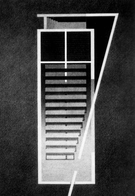
Church of the Light, Ibaraki, Osaka, Japan, 1989 designed by Tadao Ando
The Church of the Light consists of three 5.9m concrete cubes (5.9m wide x 17.7m long x 5.9m high) penetrated by a wall angled at 15°, dividing the cube into the chapel and the entrance area. One indirectly enters the church by slipping between the two volumes, one that contains the Sunday school and the other that contains the worship hall. -- wikipedia<
Read a post from ArchDaily 

Source: Juan Solano archdaily.com
Plan, Source: archdaily.com
Street House, San Isidro, Lima, Peru, 2009 designed by Seinfeld Arquitectos
....create a third front side to incorporate natural light to achieve as many rooms in the house. This street runs lengthwise the project, from the entrance to the rear garden. -- ArchDaily

Source: Krister Engström archdaily.com
Cliff Hanger, Lerum, Sweden, 2010 designed by Björn Gross & Josef Wideström
This house is situated on a steep slope by the lake Aspen near Gothenburg. The direction of the volume is adapted to the topography, while the diagonal ridge opens up the interior living space and the terrace towards the evening sun. This diagonal cut creates a dynamic shape in three dimensions, emphasized by the dramatic cantilever – the cliff hanger. -- ArchDaily

Source: Pallon Daruwalla & Shimul Javeri Kadri archdaily.com

Plan, Source: archdaily.com
Nirvana Film Office, Bangalore, India, 2011 designed by SJK Architects
The Core of this box is the N-S connector staircase that slices through the building with a huge skylight above, suffusing it with sunlight and natural ventilation much like a courtyard would in another typology. -- ArchDaily

Source: DYGSA archdaily.com

Model, Source: archdaily.com
Hinanai Village House, Hiroshima, Japan, 2013 designed by DYGSA
The main partition wall meets the ends at angles 80 and 100 degrees, which widens the view from the inside into the outside and raises awareness about the natural surroundings. The path made of concrete and leading to the front wooden sliding door stretches to the inside space and reaches the glass sliding doors on the opposite side of the house -- ArchDaily

Source: Pietro Savorelli archdaily.com

Plan, Source: archdaily.com
The Whale Primary School, Italy, 2013 designed by Studio di Architettura Andrea Milani
From a compositional point of view the new school was conceived as a pure and elemental as the square, which work with carvings and changes of heights is going to outline was carved inside the various functions of which it is composed: canteen services for faculty, connecting corridors, classrooms and laboratories. -- ArchDaily

Source: Nico Saieh archdaily.com

Plan, Source: archdaily.com
Center of Traditions Lo Barnechea, Lo Barnechea 1200, Lo Barnechea, Santiago Metropolitan Region, Chile, 2014 designed by Gonzalo Mardones Viviani
Placed in a corner lot, the cultural center was planned to open to the public roadway, creating an outdoor amphitheater which is the extension of the public space, where the acts and cultural events are exposed to pedestrians; and a large hall that runs through the whole building, connecting levels and enhancing the encounter inside of it. -- ArchDaily

Source: Nelson Garrido archdaily.com

Plan, Source: archdaily.com
Street House, Jaber Al-Ahmad International Stadium, Sixth Ring Road, Al-Ardiya, Kuwait designed by Massive Order
The idea is to build a house with an internal street/courtyard that spans between the main street and the service road at the back. This internal street splits the house into two masses; hence the program is divided into two: living and services.  The living room and bedrooms on one side and the services and vertical circulation on the other connected via the internal street. -- ArchDaily

Monday, April 1, 2013

Spiral

Photo by Lynne Rostochil - http://www.flickr.com/photos/25726169@N03/
Bavinger House, Norman, Oklahoma, USA, 1955 designed by Bruce Goff
The Bavinger House put a new twist on the naturalist modernism of Goff’s contemporaries. Where Wright used flat planes and conventional floor plans, Goff introduced distinctive floor plans, mixing materiality with eccentric spaces to produce a desired effect. Evoking a castle-like sense of earthy monumentality the home rises against the forested landscape, eventually reaching its ultimate point. -- ArchDaily

Source: Adam Mørk archdaily.com
Cathedral of the Northern Lights, Alta, Norway, 2013 designed by SHL Architects
The significance of the northern lights is reflected in the architecture of the cathedral. The contours of the church rise as a spiralling shape to the tip of the belfry 47 metres above the ground. The façade, clad in titanium, reflects the northern lights during the long periods of Arctic winter darkness and emphasizes the experience of the phenomenon. -- ArchDaily