Showing posts with label Pattern. Show all posts

Friday, October 17, 2014

Skin of Architecture: Pattern 13

Source: Daici Ano archdaily.com
Louis Vuitton Matsuya Ginza Facade Renewal, Ginza, Chuo, Tokyo, Japan, 2013 designed by Jun Aoki & Associates
Gentle bulges and dents elaborate the façade of opal beige reliefs. With these pattern, the façade reveals various appearances in sunlight, and also during the night, the LED lights behind the reliefs lit the façade to render another expression reminiscent of Louis Vuitton’s monogram. -- ArchDaily

Wednesday, August 13, 2014

Skin of Architecture: Map

Source: Andrés Valbuena archdaily.com
Click Clack Hotel, Bogotá, Bogota, Colombia, 2012 designed by Plan B Arquitectos
This hotel is an attempt to open or permeate the norm: it is slim and has four open facades due to side setbacks; the larger facades are set back to allow a double skin of metal and glass, and the main facade articulates urban life and cantilevers the 1.5 m allowed by the building code. -- ArchDaily

Source: Harry Cock archdaily.com
Train Station and City Hall complex, Delft, The Netherlands, 2014 designed by Mecanoo
Within the new station hall an undulating ‘vault’, which has been designed to evoke an “unforgettable arrival experience”, features a scaled 1877 map of the Dutch city rendered in blue and white. -- ArchDaily

Tuesday, December 31, 2013

Skin of Architecture: Pattern 12

Source: Thomas Fischer archdaily.com
Institute buildings University Kassel, Kassel, Germany, 2010 designed by ATELIER 30
....the busy public spaces such as the foyer and main entry zones are highlighted by a glass facade opening up the buildings interior towards the campus and the historic structures of the former industrial complex “Henschel- Anlage”. This stands in stark contrast to the Jura-stone facade with its precisely inset window strips. -- ArchDaily

Source: Arthur Meerloo archdaily.com
BioPartner, Wassenaarseweg, Leiden, The Netherlands, 2012 designed by JHK Architecten
The similar design and alignment of the two buildings creates a powerful ensemble, which is further accentuated by the consistent use of materials, clear horizontal segmentation and high-quality detailing. The omni-directional design of the buildings ensures that there are no rear or side elevations and every façade is presented as frontage.   -- ArchDaily

Source: Metropolis archdaily.com
Building Omega, Santiago de Surco, Peru, 2013 designed by Metropolis
Other facades were cover with aluminum panels and a broken weft of windows so a visual tension could be generated in the whole complex. -- ArchDaily

Source: Mathieu Ducros archdaily.com
Academy Of Art Crafts (ESMA), 50 Route de Narbonne, 31320 Auzeville-Tolosane, France, 2013 designed by LCR Architectes
The school, overlaid with two levels of parking (55 spaces reserved for school and 60 for the residence), offers facades that affirm their identity on different orientations. -- ArchDaily

Monday, April 15, 2013

Skin of Architecture: Pattern 11

Source: Takeshi Yamagishi archdaily.com
Kanayama Community Center, Ota City, Gunma, Japan, 2009 designed by Kengo Kuma & Associates
The exterior wall is a thin and light screen, a transformation of the ‘stone wall’ that characterizes the historic spot. Stone is fit in the steel plate supporting the load of the entrance porch, so that a feel of calmness and strength can be added to the semi open-air space. There are two types of shapes in the stone, determined by the weight that can be carried by one person, and they are developed in a regular pattern to gain a sense of lightness, seeking a symbol born from the pattern. -- ArchDaily

Source: Raimund Koch archdaily.com
Urban Townhouse, New York City, New York, USA, 2009 designed by GLUCK+
The front façade engages the street with a custom water-cut aluminum rain screen with brick-shaped openings relating to the solid bricks of its neighbors and panel joints corresponding to the neighboring building stories. During the day, it appears as a flat, patterned mass, marked off from the adjacent houses by the tall glass slots on either side. The horizontal joints of the aluminum panels break up the vertical surface as a reference to the rhythm of the window spacing of the row houses. -- ArchDaily

Source: Luis Asín Lapique archdaily.com
Enterprise Park in Arte Sacro, Av. Ingeniería, s/n Sevilla 41091, Spain, 2010 designed by Suárez Santas Arquitectos
The production spaces are located behind a continuous enclosure built with a lattice of white concrete prefabricated pieces, modulated following a five-meter grid, and adaptable to each specific need. -- ArchDaily

Source: Lucas Shaller archdaily.com
BTV branch, Innsbruck, Austria, 2011 designed by Rainer Köberl
Black and white squares cover the building in a regular pattern. It suggests a chessboard, but also has something of the white snow-covered mountains that surround Innsbruck. The striking feature of this bank building is its steeply rising roof – Köberl wanted to make the building as tall as possible so it is not swamped by the surrounding urban architectural jumble. Underscoring the shape is the striking pattern of the facade. Like a chessboard, the outer skin consists of square, concrete-coloured panels made of fibre-reinforced concrete alternating with black air holes of the same size. -- ArchDaily

Source: Adrià Goula archdaily.com
Viviendas en Toulouse, Toulouse, France, 2013 designed by Mateo Arquitectura
A complex of four independent but conceptually connected volumes (A, B, C and D) arranged around a semi-private garden. ....finished in black and white brick, in varying but complementary proportions. A, on the street tarmac, is mainly black (80% black, 20% white). B, designed to reflect, is its opposite (80% white, 20% black). C, at the corner, is balanced (50% white, 50% black). -- ArchDaily

Source: Alex Chan archdaily.com
Library of South University of Science and Technology of China, Shenzhen, Guangdong, China, 2013 designed by Urbanus
GRC (Glass Fiber Reinforced Concrete) was originally specified for the library façade. With the consideration of façade scale, structural load, sizes of fabricated structural components, local shading requirement, and other factors, the GRC unitized component was designed into a light and high-strength hollow module that had a dimension of 1,800*675*400mm; its hollow core was then filled with insulating materials, with mold release and curing treatment. -- ArchDaily

Source: Derek Swalwell archdaily.com
Fairbairn House, Melbourne VIC, Australia, 2013 designed by Inglis Architects
The house presents itself to the public and does not seek refuge behind a fence. Whilst doing so it only hints of its inner workings through materiality allowing a mounting of suspense. The breezeway brick screen is a key device and creates these necessary layers. It serves multiple purposes. The first being a strong idea of entry by creating a secondary landscaped space which gives the property a sense of intimacy. -- ArchDaily

Wednesday, September 5, 2012

Skin of Architecture: Pattern 10

Source: 3XN archdaily.com
Saxo Bank, Copenhagen, Denmark, 2004 designed by 3XN
The building is shaped like two blocks with the end walls pointing towards the canal, joined together by facades that are withdrawn from the end walls. The facades are shaped like double curved glass that wave like a piece of textile. -- ArchDaily

Source: Christian Richters archdaily.com
Cite du Design, Saint-Etienne, Loire, France, 2009 designed by LIN Architects
.... the project also incorporates the integration of a new building, the “platine” which is an interclimatic laboratory, a 31 m high observation tower, gardens and a public esplanade.The Platine’s geometric skin pattern is an adaptive envelope that wraps exhibition spaces, an auditorium, a green house and a library.  The seemingly random dispersion of transparent and opaque triangles is linked to the varying programmatic element’s needs of light.  In this way, the façade responds to the program housed within while also becoming an expression of the different activities in the Cité du Design. -- ArchDaily

Source: 3XN archdaily.com

Bella Sky, Copenhagen, Denmark, 2011 designed by 3XN
A 15 degree incline is incorporated into the two towers, allowing the designers to create a variation of 200 rooms, providing a unique and diverse hotel experience for the users. The two towers lean away from one another to provide each room with an unobstructed view of the city. -- ArchDaily
Read another post from ArchDaily 

Source: Moreno Maggi archdaily.com
Georges-Freche School of Hotel Management, Montpellier, France, 2012 designed by Massimiliano and Doriana Fuksas 
The project can be called “experimental” as much for its triangular shaped aluminium façade as for the use of reinforced concrete.  Both materials have been adapted in order to be able to adopt specific shapes  – curved and fluid – as required by the structure. The facades of the building have been constructed using 17,000 cases of anodized aluminum in triangular shapes. Each aluminum case is unique and bears its own specific bar code in order that it can be identified for its specific situation on the façade. The interaction between the facades reinforces the dynamic tension between the solid materials and the cavities, the light and the shadows, that are an inherent part of the projet.  The geometric design of the aluminum “skin” is developed further to apply to the 5,000 triangular glass frames that are mounted on metal nets. -- ArchDaily

Source: Claudio Manzoni archdaily.com
Bicentennial Civic Center, Córdoba, Argentina, 2012 designed by Lucio Morini + GGMPU Arquitectos
A medium-rise building housing the ministries dominates the complex: a faceted prism made out of concrete.  It is based on a square cuboid 45 meters high and with a side measuring 26 meters, which at a height of 16 meters suffers a 20-degree rotation.  This movement generates a more complex morphology based on triangles, which in turn produces a very particular play of shadows and light.  To avoid the flat character present in the early studies for the triangular facades produced by the rotation, a series of geometric rhomboid-based combinations were explored in order to instill tri-dimensionality to the very planes of the facades. -- ArchDaily

Source: Michael Schmucker archdaily.com
Podium at Menlyn, Pretoria, South Africa, 2012 designed by Boogertman + Partners Architects
The monochromatic triangular facade consists of a 3 shaded curtain wall of grey glass which spans the soft curve of the building on the corner of Atterbury Road and Lois Avenue, as well as the south façade. This striking feature takes full advantage of its prime location directly across from Menlyn Park Shopping Centre. The curtain wall acts as a mirror to the sky, evolving in colour and intensity as the sun moves across the African sky. In some instances the mottled facade appears as a single uniform colour from the outside. -- ArchDaily

Source: Zhubo Design Zstudio archdaily.com
Administrative Office Building of South University Of Science And Technology Of China, Guandong Province, China, 2012 designed by Zhubo Design Zstudio
To adapt to the southern climate, we create three courtyards within the office area. -- ArchDaily

Source: Tord-Rikard Söderström archdaily.com
Aula Medica, Solnavägen 7, Karolinska Institutet, 171 65 Solna, Sweden, 2013 designed by Wingårdhs
The twisted elevation is made entirely of flat glass panes; a geometry made possible by the triangular pattern that encloses the entire building. A variation of different panes handles the demands for insulation, transparency as well as shade without compromising the uniform character. -- ArchDaily

Monday, August 6, 2012

Skin of Architecture: Pattern 7

Source: Luuk Kramer archdaily.com
Petting Farm, Almere, The Netherlands, 2008 designed by 70F Architecture
....a wooden box with an open facade system for the upper half of the building, allowing the wind to ventilate the whole farm continuously. Half of the building is stable; the other half consists of toilets, storage and on the second floor an office and storage. The stable itself has no second floor. As you walk lengthways through the building, you will pass the animals that are contained to the left and to the right behind fences. There are no doors in the building, but there are six shutters, two for the public on the short ends of the building and four for the animals, two on either long side of the building. One could say that the box, a building extensively reduced in aesthetic violence, wakes up and goes to sleep every day. -- ArchDaily

Source: Ashton Porter Architects archdaily.com
Suburban Studio, London Borough of Enfield, Greater London, UK, 2010 designed by Ashton Porter Architects 
The main studio facade that addresses the garden floats above a glass panel and forms a screen to separate the work-space of the studio from the domestic garden. The materials of the studio make reference to the suburban context; timber cladding echoes domestic fencing, corrugated aluminium refers to inter-war prefabricated garages and a former Anderson shelter. -- ArchDaily

Source: Juri Troy Architects archdaily.com
House J-T, Lochauer Straße, Hörbranz, Austria, 2011 designed by Juri Troy Architects 
The circumferential and vertical silver fir facade not only serves as a filter, but also almost imperceptibly directs views to the carefully selected outlooks. -- ArchDaily

Source:  Jeroen Musch archdaily.com
Water Villa, Amsterdam, The Netherlands, 2011 designed by Framework Architects + Studio Prototype
The relation between the water and house is central to the design. There is a subtle playfulness between open and closed. The vertically designed pattern, an abstract allusion to the water, provides not only optimal privacy but also a subtle play of light inside the residence itself. The inhabitants are able to regulate their privacy by, for example, an integrated folding window that can be opened and closed by remote control. The house is spacious with three levels, one of which is below the water, while living and work areas are located above the water. -- ArchDaily

Source: Paul Ott photografiert archdaily.com
Boat’s House at Millstätter Lake, Seeboden, Carinthia, Austria, 2012 designed by MHM architect
The key signature design feature is “hidden” in the wooden façades: on account of an authority ban, which prohibited an outside footbridge for docking on to the boathouse at the west facade (although there has always been footbridge in the past), a system of facade-integrated folding elements was developed. The uniqueness of these folding elements lays in the fact that in contrast to the usually available folding elements, they can form a completely horizontal, passable surface. In the open position these gates make up the by authority eliminated footbridge in the west façade. -- ArchDaily

Source: Thomas Mayer archdaily.com
Immanuel Church, Cologne, Germany, 2013 designed by Sauerbruch Hutton
The bell tower, church and chapel are clad externally with diagonally laid timber planks. Their character is de ned by simplicity of form in combination with straightforward construction and honest materiality. -- ArchDaily

Source: Filip Dujardin archdaily.com
Firestation Berendrecht, Kruisweg 22, 2040 Antwerpen, Belgium, 2014 designed by Bovenbouw
On top of the two utilitarian floors  there is a domestic floor with a living room, kitchen, fitness, sleeping rooms and an outdoor sports field, arranged around a patio. The sports field, located on the corner of the building, is covered with a semi-transparent wooden panelling and therefore stays in contact with outside. -- ArchDaily

Tuesday, May 8, 2012

Skin of Architecture: Pattern 9

Source: Nikolaos Zachariadis,
Frog Queen, Graz, Steiermark, Austria, 2009 designed by SPLITTERWERK
The building form approximates a cube, measuring 18.125 x 18.125 x 17m, wrapped on all four elevations with a pixilated pattern of square panels. From a distance, these panels appear to be painted in a range of ten values of grey tone, together dematerializing the volume of the building against both the trees of the surrounding site and the clouds and sky. Thus the cubic building is at once monumental in its objecthood in the open landscape – scale-less and immaterial – and yet utterly non-iconographic in its overall form.  -- ArchDaily

Source: Takashi Yamaguchi Associates archdaily.com
Breathing Factory, Osaka, Japan, 2009 designed by Takashi Yamaguchi & Associates
The building body is covered with a delicate membrane constituted of aluminum louvers in order to avoid showing the disgusting clustered pipes. Concerning the maintenance ease, the louver aperture ratio and the space behind those offer a proper access to the pipes system.
The reconstruction was also an experimental way to reduce as much as possible the impact on the neighborhood of the intimidating volume of the uninteresting factory.
To attain to this result, the louver’s angles, and horizontal or vertical directions are directed by randomized mathematical rules.  -- ArchDaily

Source: Michael Moran Studio archdaily.com
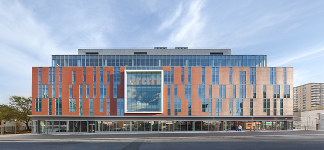
Columbia University Northwest Corner Building, New York City, New York, USA, 2010 designed by Rafael Moneo, Davis Brody Bond Aedas, and Moneo Brock Studio
In the building’s façades the structural frame is represented by a pattern of aluminum fins, creating a patchwork of light and shadow, and the building’s mass appears a shimmering prismatic structure sitting atop a carved stone pedestal. The campus-side façade is almost entirely glass, revealing the interior workings of the building and again emphasizing openness and a connection to the campus community. -- ArchDaily
Read another post from ArchDaily

Source: Jaime Sicilia archdaily.com
Molí d’en Xema School and Son Boga Nursery, Manacor, Mallorca, Spain, 2010 designed by BB Arquitectes
The construction of the School consists of a single linear building where the child can complete all stages of  education  until high school; the allocation of classes on the basis of age and the subsequent linear progress through the building, favors the use of the center and takes maximum advantage of the restricted size of  the plot. -- ArchDaily

Source: Yves André archdaily.com
CEI 3, Cheseaux-Noréaz, Switzerland, 2011 designed by bauzeit architekten
Broad anthracite fabrics cover a large part of the building, conferring it’s changing reflections according to the variations of the natural light during the day and year. The building’s skin has the will to express the diversity and the complexity of the program and at the same time to guarantee a sober and quality image in an environment, already, rather heterogeneous. These stretched textiles have, at the same time, the virtue of filtering the dazzling of the sun on the work surfaces and the computer’s screens, ensuring interior privacy, while preserving optimal views to the outside. -- ArchDaily

Source: Luc Boegly archdaily.com
M3A2 Cultural and Community Tower, Paris, France, 2011 designed by Antonini + Darmon Architectes
A break between the Flour Market and the new building is preserved. It respects the existing building and accentuates the slenderness of the tower. The two, independent buildings coexist completely. The signal-like extension stands out of its context by means of its evolving shape. It is a sensitive, delicate object, treated simply to avoid rivalry with the strong presence of the Flour Market. On the contrary it acts as a light, gravitational counterpoint. An architectural dialectic and emulation come into play much like a castle and its keep, both intrinsically inseparable. -- ArchDaily

Source: Tim Griffith archdaily.com
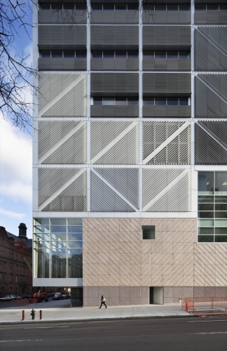
UCSF Mission Bay Parking Structure, San Francisco, California, USA, 2012 designed by WRNS Studio
The upper levels of the structure are shrouded with a custom anodized aluminum louver system in warm earth tones. The vertical louvers change orientation from panel to panel, creating a quilted pattern through play with light and shadow. The varied spacing and orientation facilitate natural ventilation and control light spill from the garage at night in order to reduce the visual impact on neighbors. The louvers are also shaped to bounce daylight into the structure. Vertical fins define two-story view apertures and modulate between the pedestrian scale and the garage’s large volume. -- ArchDaily

Source: Ronan Lacroix archdaily.com
Rebière 21 housing, Paris, France, 2012 designed by Hondelatte Laporte Architectes
All façades, including those facing the cemetery have not been differentiated deliberately. They are all made up of dual-colour panels (white and galvanized metal) in a check pattern. According to the light, the time of day and the viewpoint, they reflect different colours. -- ArchDaily

Source: Miguel de Guzmán archdaily.com
Social Housing in Valleca´s Eco-boulevard, Madrid, Spain, 2013 designed by Olalquiaga Arquitectos
The building is distributed in 4 blocs with a central corridor serving as access to the apartments. Instead of a uniform and monotonous corridor, probably poorly lit and ventilated, we propose, through subtraction and substitution of habitable cells, its widening in some parts as well as the liberating of some habitable modules, in order to achieve greater diversity, the entrance of more natural light and views. -- ArchDaily

Thursday, May 3, 2012

Skin of Architecture: Pattern 8

Source: K. Kwan archdaily.com
Embassy Of Canada In Korea, Seoul, South Korea, 2007 designed by Zeidler Partnership Architects
The building, composed of two blocks tied together by a base, forms an undulating mass framing the tree. The massing and skin of the building are inspired by impressionist images of the Canadian landscape. The west block is the mountain_a majestic and simple form in the tradition of Lawren S. Harris. The east block is the forest birch bark trunks, vertical elements, creating a natural rhythm against the sparkling sky; an image inspired by Canadian impressionist, Tom Thomson. -- ArchDaily

Source: BitterBredt archdaily.com


The Ascent at Roebling’s Bridge, Covington, Kentucky, USA, 2008 designed by Daniel Libeskind
Through the vertical, non-repeating articulation of the facade, the building breaks from the conventional, horizontal orientation of typical high-rise buildings. Its multiple layers blur the distinction between interior and exterior, both visually and experientially. The resulting texture also provides shade to all units from the eastern sun.  -- ArchDaily

Source: Sapa: Architectural Aluminium Solutions
Broadcasting Place, Leeds, UK, 2009 designed by Feilden Clegg Bradley Studios
Through this massive form, windows were conceived as the flow of water cascading through a rock formation. This design intent is reinforced by the selection of cor-tensteel as a solid, sculptural and weathering material, constructed as a rain-screen façade. -- ArchDaily

Source: Alexander Severin / Razummedia construction.com
Myrtle Hall, Brooklyn, New York, USA, 2010 designed by WASA/Studio A
In a contemporary take on Myrtle Avenue's smaller-scale brownstones and brick buildings, they limited the north volume to four stories and clad it in panelized masonry. -- Architectural Record
Source: architectmagazine.com
College of DuPage Technology Education Center, Glen Ellyn, Illinois, USA, 2010 designed by DeStefano Partners
The facility recognizes the duality of teaching at TEC with distinct architectural vocabularies for the shops and general teaching spaces, weaving the program together into a facility that expresses the balance between the instruction and hands-on experience. Designed to be used as a teaching tool, the building's architectural expression reveals structural and MEP systems to students studying applications for those trades. Contrasting exterior materials visually articulate the rich functional mix of interior spaces. For example, large, colored precast concrete panels define the lab spaces and a more transparent curtain wall system defines the classroom and office spaces. -- ARCHITECT
Source: Adrià Goula archdaily.com
University Housing, Gandía, Valencia, Spain, 2011 designed by Guallart Architects
In Spain the national Housing Plan clearly establishes that apartments can be built with an area of between 30 and 45 m2, with up to 20% of shared space, but does not specify where or how this should be located.
The fact is that the idea of sharing spaces is fully compatible with the goals of social and environmental sustainability, grounded as it is on the principle of ‘doing more with less’: that is, offering people more resources through the mechanism of sharing. -- ArchDaily

Source:  Erick van Egeraat archdaily.com
Sumatrakontor Hamburg, Hamburg, Germany, 2011 designed by Erick van Egeraat, Michiel Raaphorst
Aesthetically, the new building refers to the red-brick harbour aesthetics of the historic Speicherstadt on the one hand and the traditional white plaster façades of the inner city on the other. Mixed with glass and aluminium, the outer façades facing the streets are predominantly composed of natural stone. In contrast, all façades towards the courtyard are white. The folded elevation emphasises the vertical structure and defines a unique statement within the entire plan of the Überseequartier. -- ArchDaily

Source: César San Millán archdaily.com
63 Dwellings in Arkayate, Vitoria, Álava, Spain, 2012 designed by Patxi Cortazar
The openings are very regular, although this is not apparent on the east facade, where two colors of prefabricated brick are used in a disorderly play. -- ArchDaily

Source: Andrey Ukolov archdaily.com
Gudou Plaza, Pushkin Street, Sukhumi, Georgia, 2013 designed by Andrey Ukolov + Ekaterina Osipova
....the used façade system functions as the protection from the sun light, preserves the internal space from overheating, hides diaphragm plate fitted behind the glazing (the building situated in earthquake-prone zone). Façade segments are pre-fabricated details and made from aluminum profile. Maintenance scaffolds are placed between two surfaces of the glazing. -- ArchDaily

Source: Luc Lodder archdaily.com
Safari, Maarssenbroek, The Netherlands, 2013 designed by ARCHITECTENZAAK
The fragmented facade design is based on the character of eroded stone facades of old monuments. The entirely white monolith building becomes a pleasant natural character by applying three different textures in the façade cladding. This way the robust building reacts on the fluctuating incidence of light in a soft way and presents itself as a sparkling diamond. -- ArchDaily

Source: David Barbour archdaily.com
St John Bosco Art College, Croxteth, Liverpool, Liverpool, Merseyside L11, UK, 2014 designed by BDP
The new school is housed in a 91m x 55m three storey single span column free environment, which contains an exciting mix of learning environments and social spaces, focusing on a sculpted landscape at the heart of the school. -- ArchDaily

Monday, February 13, 2012

Not Aligned

Source: José F. García Martín
Murcia City Hall, Murcia, Spain, 1998 designed by Rafael Moneo
The façade/retable of the Town Hall facing the square could never, nor would ever, want to compete with the classical order. It's organised as a musical score, numerically, accepting the system of horizontal levels of the floor slabs. The façade resist symmetries and offers as its key element the balcony of the gallery. -- MIMAO

Source: Te-Ming Chang
Lafayette Corporate Center, Boston, Massachusetts, USA designed by ADD Inc
The new skin reorients stores outward to engage pedestrian traffic and adds three stories of office space above to restore the roof lines to those of the street's original structures. -- architect's web site

Source: archdaily.com
University of Twente Campus buildings, Enschede, The Netherlands designed by Arons en Gelauff Architecten
The building is nine stories high on the sport fields’ side. On the Boulevard side, the building fits the small-scale character of this pedestrian street with two building layers. The supermarket and the hairdresser are on this side. On the first floor, the dwellings are situated round a communal roof terrace.The façade facing the sport centre is fitted out as a climbing wall. -- ArchDaily
Source: Te-Ming Chang
One Western Avenue, Graduate Student Housing, Harvard University, Allston, Massachusetts, USA, 2003 designed by Machado and Silvetti Associates
The surface treatment of all of the volumes is designed to allow the ideal prismatic geometry of the various building masses to register on the façade planes. -- architect's web site

Source: Juan Carlos Doblado, Nómena Arquitectos archdaily.com
Cipreses Residential Complex, San Isidro, Lima, Perú designed by Juan Carlos Doblado + Nómena Arquitectos
The image of the building towards Javier Prado Av. has a greater presence of ordered and eaves openings that frame the bodies of each tower. Inland arises more informal language based on the horizontal displacement of the windows creating a rhythm accented by various shades of color. -- ArchDaily

Source: cbtarchitects.com
Sierra — NorthPoint Parcel S, Cambridge, Massachusetts, USA designed by CBT
The spacious, two-story loft and flat units are organized around two central light wells that flood the interiors with plentiful amounts of natural daylight and bring the outside in. -- architect's web site

Source: cbtarchitects.com
Tango — NorthPoint Parcel T, Cambridge, Massachusetts, USA designed by CBT
The facade of the building combines a palette of clear and colored spandrel glass, precast concrete, zinc cladding, and hardwood details that give the building a strong, contemporary presence. Large expanses of floor-to-ceiling glass provide ample light and views from the residential units. -- architect's web site

Source: Charlie Xia archdaily.com
PKU University Of Law, Beijing, China designed by Kokaistudios
.... transformed the facades to become light filters and diffusing soft daylight light all over the interiors. -- ArchDaily

Source: Georges Fessy archdaily.com
Court of Justice of the European Communities, Kirchberg platform, Grand Duché du Luxembourg, 2008 designed by Dominique Perrault
On the lower level of this major body, the “grande galerie” is reorganized and extended, serving as a spinal cord, to provide circulation between the different extensions as well as to the two new towers, which provide office space for more than 600 translators and legal officers working in 23 languages. With a height of 100 metres each, the new towers are now the tallest in Luxembourg. -- ArchDaily

Source: Paul Tierney archdaily.com
Roebuck Castle Student Residence, UCD Belfield Campus, Dublin, Ireland, 2010 designed by Kavanagh Tuite Architects
The unitised panels create an airtight façade (point fixed to the slab edges for minimum cold bridging), and together with wood-framed curtain wall façades to the three stair core volumes, provide large sealed elements that are then easily air-sealed to the basic concrete structure with EPDM membranes. This strategy largely ‘designed-out’ problems of air sealing the project. -- ArchDaily

Source: Klaus Frahm archdaily.com
Hamburg Brooktorkai, Hafen, Hamburg, Germany, 2010 designed by Antonio Citterio And Partners
The severe look of the tall residential volume, with its large sheets of sandstone in an irregular pattern, and the dark reddish clinker of the horizontal facade of the office building have the shared feature of the bronze-tone sections of the windows and glazings. -- ArchDaily

Source; Philippe van Gelooven archdaily.com
Sint-Gillis, Sint-Gillis, Belgium, 2010 designed by Lensass Architects
The streetscape shows a school building that takes up two building lots. This is reflected in the dual building design of the facade. The elongated windows accentuate the vertical rhythm of the street. The building integrates easily into the formal vocabulary of its surroundings. -- ArchDaily

Source: Manolo Toledo archdaily.com
El Ejido Courthouse, El Ejido, Almería, Spain, 2011 designed by Andrés López Fernández
The building is intended to convey the two conditions inherent in the administration of justice. On the one hand the strength and firmness shown by the strength of the buildings geometry and structural material. Then on the other hand, transparency, enshrined in the constitution of the porous boundary walls and partitions that allow friendly and complex nuanced relationship building in an urban environment. In fact, the construction of the main facade is reminiscent of poles placed on shelves. -- ArchDaily

Source; Ed Massery archdaily.com
Kaufmann Program Center, Pittsburgh, Pennsylvania, USA, 2011 designed by Renaissance 3 Architects
The addition encompasses an outdoor community courtyard and a glass-enclosed café where people can sit, eat, and watch performances in the courtyard. Meeting rooms on the second and third floors were established that provide excellent views of the courtyard. At night, colored, translucent resin panels lit by LED lights light up the public courtyard and façade. -- ArchDaily

Source: Géraldine Bruneel archdaily.com
Mitsulift HQ, Lebanon, 2012 designed by / Raed Abillama Architects
....the efficiency of the construction by minimizing direct sunlight and heat intake. To optimize this effect the ceiling height was raised, and high, deep recessed slit windows were created so that the openings are in the shade on the east and west. This proportion of high windows gives more natural, homogenized light into the deep end of the office. -- ArchDaily

Source: FG + SG archdaily.com
House in Lisbon, Lisbon, Portugal, 2013 designed by ARX PORTUGAL Arquitectos
The elevation obviously follows on the Lisbon tradition, stressed further by the windows’ rhythmic structure, opened in a span system created by horizontal strips and  vertical bars – characteristic of the city architecture. Just as most of Lisbon’s old buildings, it is a flat elevation whose expressiveness comes from its rhythmic nature and the light-and-shade effects produced with the backing-up of its surfaces. This apparatus brings the elevation a sense of time, expressed by the change in the shadows throughout the day: from a more subtle morning light – with no direct sunlight – to the strong contrasting afternoon shadows. -- ArchDaily

Source: Cecile Septet archdaily.com
Rue des Poissonniers Housing, 18th arrondissement of Paris, Paris, France, 2013 designed by MAAST
Corian was chosen for the building’s envelope because it reflects lights. The facade overlooking the street is inspired by the classic three-part Parisian facade. It is covered with very light corian and marked with rolling corian blinds, installed directly on the façade to create a perfectly smooth surface. -- ArchDaily

Source: Thilo Härdtlein archdaily.com
Atrium Amras, Innsbruck, Austria, 2013 designed by Zechner & Zechner
The facade is constructed from precast concrete components, each the height of an individual storey. These create a nonuniform grid composed of two differently sized window openings that alternate to form a varied pattern. The windows are a composite design with slim profiles and sun protection systems fitted in the middle for protection from the wind. The slight offset of the facade elements at each storey creates an interplay of light and dark, marks the edges of each level and makes it possible to read the floors. The contrast of light and dark is intensified by differences in the roughness of the surfaces. -- ArchDaily
Source: Mathieu Ducros archdaily.com
Academy Of Art Crafts (ESMA), 50 Route de Narbonne, 31320 Auzeville-Tolosane, France, 2013 designed by LCR Architectes
The facade, randomly double laced in a vertical rhythm, gives a depth and lightness to the whole process while allowing the necessary sun protection to the various rooms. Facades create a graphic effect sustained by projected shadows and a colored highlighting. -- ArchDaily