Showing posts with label Color. Show all posts

Wednesday, November 27, 2013

Glass fins

Source: betterbricks.com
Upper Secondary School, Copenhagen, Denmark, 2007 designed by 3xn Arkitekter
The operable exterior shading devices--colored glass fins with graphic lettering--create this building's signature facade and provide dynamic shading to balance daylighting with solar heat gain. Behind the glass fins, operable windows provide natural ventilation. -- betterbricks.com

Source: Agence d’architecture Boyer archdaily.com
La Colle sur Loup, La Colle-sur-Loup, France designed by Agence d’architecture Boyer-Percheron-Assus et Associé
....the south facade shows a double facade: a succession of colourful “brise-soleil” which orient themselves according to the sun and the moment of the day. -- ArchDaily

Source: Keith Collie and Tim Crocker archdaily.com
Biochemistry Center, Oxford, UK designed by Hawkins Brown
Laminated colored glass fins were fixed to the mullions of the curtain wall system.  The fins provide a sense of privacy for those working in the labs and their varying color palette was selected to “pick up on the surrounding context.” -- ArchDaily

Source: Brad Feinkopf archdaily.com
South Campus Chiller Plant, College of Pharmacy, The Ohio State University, Columbus, Ohio, USA, 2013 designed by Ross Barney Architects
The materials for the new chiller plant will be concrete precast panels with a high sheen polish finish. Large glazed openings are located to help identify the function of the building by framing views of the chiller equipment. Since there are no visible moving parts, dichoric glass fins located in the joints of the precast panels, will convey a sense of motion as the colors change from the movement of the sun. -- ArchDaily

Source: Hisao Suzuki archdaily.com
Comisaría Provincial De Albacete, Albacete, Spain designed by Matos-Castillo Arquitectos
....a glass wall oriented northwest (offices) and a double skin of glass and vertical louvers oriented southeast (communications). The colour of the glass louvers has no specific references and helps to eliminate old stereotypes. -- ArchDaily

Source: Piotr Krajewski archdaily.com
Marshal’s HQ, aleja Niepodległości, Poznań, Poland, 2015 designed by / WAPA Warsztat Architektury
The exterior part outlines the cavity around the whole building, which makes it float above the heavy base and provides an outdoor terrace underneath the upper floors. The interior part is meant to be an extension of the open space around the core of the building and was designed as a transparent, multifunctional and flexible space for various purposes. -- ArchDaily

Tuesday, January 29, 2013

Colorful

DETAIL Practice: Colour 
DETAIL Practice "Colour" provides the expertise that every architect working with colour needs, covering colour theory and the laws of colour harmony through the basics of colour perception and colour's effects, and up to strategies for developing consistent colour concepts in the design process. -- ArchDaily

Source: Pedro Mutis Johnson archdaily.com
Los Heroes Building, Santiago, Chile designed by Murtinho y Asociados Arquitectos
To create and transform the old and grey `70s building into a new one expressing character, we use the relationship of leisure – nature as the main architectural concept. The ludic and light expression was the way to conjugate and symbolize this concept-relationship (leisure-nature). The façade skin builds this ludic and light expression, and celebrates the relationship between the institution and its urban context, or in other words, between the building and its “urban nature”. -- ArchDaily

 Source: Scagliola en Brakkee
380 Student Units and Public Space Design, Utrecht, The Netherlands, 2008 designed by Architectenbureau Marlies Rohmer
The facade consists of a grid of multicoloured aluminium panels in which the windows are omitted. Seen from a distance, the colours blend into a grey, scaly skin. The closer you come, the more it appears as a colourful honeycomb for the bright young students – our ‘smarties’ – from all over the world.  -- ArchDaily

Source: Marcel van Kerckhoven archdaily.com
Department of Education Hogeschool Utrecht, Utrecht, The Netherlands, 2008 designed by Ector Hoogstad Architecten
The colourful west facade gives the HU a face towards the city, makes the building scale-less and abstract, while also alluding to the speed of the traffic racing past. The facade is an expression of the occupants and their diverse activities, a metaphor for the HU’s multifaceted community. -- ArchDaily

Source: Wojtek Gurak @ Flickr
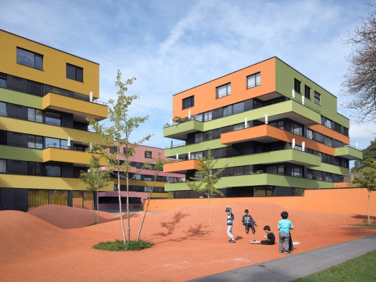
24 Social Housing,PAU Carabanchel, Madrid, Spain designed by Rafael Cañizares Torquemada & Eduardo Valdillo Ruiz

Source: Stephan Lucas archdaily.com
Sports and Leisure Center, Saint-Cloud, France, 2009 designed by KOZ Architectes
The building uses colour very openly and assertively, with a wide palette ranging from red to green, by way of yellow, pink and orange. These colours cover the façade in wide stripes. Inside, the same colours are systematically repeated, like stepping in an oversized graffti. A colour coding that helps you locate from the outside the areas created on the inside. A means of spatial orientation for young children. An echo to street culture codes for those who crawl on what is dubbed the coolest indoor climbing wall in France,or practice on the pop fencing rows below! -- ArchDaily

Source: Miguel de Guzmán archdaily.com
Housing Building, Carabanchel, Madrid, Spain, 2009 designed by Amann-Canovas-Maruri
The clustering of dwellings is obtained from mechanical necessities. The interior is made with integrated furniture; versatile space with openings available in the wall. The exterior body is constructed of metal, therefore acts as a ventilated façade. The building is an ordered set of car bodies whose metallic colours are the choice for users. -- ArchDaily

Source: Republica DM archdaily.com
Bollullos, Seville, Andalusia, Spain, 2009 designed by Republica DM
The buildings that make up this center are designed based on criteria of passive, solar architecture, intended to achieve maximum energy efficiency both in their form (open but protected to the south and closed to the north, to allow natural ventilation and light ingress), and in their materials (prefabrication to minimize waste), and with the same attention to the building process as to the subsequent maintenance. -- ArchDaily

Source: RE-ACT Now Studio archdaily.com
Spectrum Residential Ensemble, Constanta, Romania, 2009 designed by Re-Act Now
The «spectral crystallization» of the facades looking onto the sea ends the story about the things above, make everything appear unreal, hallucinating, filtered, illusive… It is a mental-visual trance that you welcome and which remains in your mind, in your senses, in the conscious and subconscious. -- ArchDaily

Source: betterbricks.com
Upper Secondary School, Copenhagen, Denmark, 2007 designed by 3xn Arkitekter
The operable exterior shading devices--colored glass fins with graphic lettering--create this building's signature facade and provide dynamic shading to balance daylighting with solar heat gain. Behind the glass fins, operable windows provide natural ventilation. -- betterbricks.com

Source: Yoshihisa Araki archdaily.com
Harvest Medical College, Hyogo, Japan designed by Shogo Iwata
Its design theme is “reflection of various color ”. The building uses six primary colors in interior, exterior, furniture and signs. The composition of these colors reflects embracing diversity that we regard as the primal concept of medical and welfare. The frontal facade consists of the composition of primal colors. The checker board patterned steel porous folded plates layered in front of it make the facade rich and ephemeral. -- ArchDaily

Source: Tord-Rikard Soderstrom archdaily.com
Kuggen, Lindholmsplatsen, Göteborg, Sweden, 2011 designed by Wingårdh Arkitektkontor
Finally, its brocade of glazed terracotta panels takes on different appearances depending on our viewing angle and the changing daylight conditions. The red colors refer to the industrial paint that was closely associated to the wharfs and the harbor. Here and there they meet a contrasting green patch, as in an autumn leaf. These details change the building’s character from one side to another, and over the course of the day. -- ArchDaily

Source: Elenberg Fraser archdaily.com
A’Beckett Tower, Melbourne, Australia, 2011 designed by Elenberg Fraser
With 347 louvres in 16 different colors, you could be forgiven for thinking Elenberg Fraser was engaging with the local architectural context with their new building for Pan Urban, A’Beckett Tower. Au contraire, they are exploring the sensory effects of color, rather than symbolic representation, by testing Goethe’s Theory of Colors. -- ArchDaily

Source: Studio Olafur Eliasson archdaily.com
Your Rainbow Panorama, Aros Allé 2, 8000 Aarhus, Denmark, 2011 designed by Studio Olafur Eliasson
The circle of Your rainbow panorama complements the museum’s square plan exactly. These basic geometric forms challenge each other in a friendly dialogue about spatial dimensions, movement, and the passing of time. The continuous curve limits your view to about twenty meters ahead, revealing one colour shade after the other. The intimacy created by this short distance is reflected back on the moving bodies.  -- ArchDaily

Source: Ronan Lacroix archdaily.com
Rebière 21 housing, Paris, France, 2012 designed by Hondelatte Laporte Architectes
Detached from the building, three elegant columns of covered flower-shaped terraces spiral upwards. Each housing unit has its own remarkable terrace, designed as an “extra room” with specific qualities: it is an independent, hybrid space somewhere between the exterior and the interior, and its specific colour gives each flat its own atmosphere. -- ArchDaily

Source: Roger Frei archdaily.com
Affoltern Housing Development, Wehntalerstrasse, CH-8046 Zurich, Switzerland, 2012 designed by EM2N
The positions of the large projecting balconies (which also have recessed areas) are staggered from floor to floor and thus sculpture the volume of the building. Together with the coloured parapets and metallic bands of windows they help structure the buildings and shape the character of the development. -- ArchDaily

Source: Burton Hamfelt Architectuur archdaily.com
MBO College North, Amsterdam, The Netherlands, 2012 designed by Burton Hamfelt Architectuur
Designed as a series of five interchangeable separate buildings, the colorful and parceled facade is primarily related by the functional distribution of the building and at the same time intended as an eye-catcher for the whole area. -- ArchDaily

Source: Toshihisa Iishi archdaily.com
Enviromental Building, Okazaki, Aichi Prefecture, Japan, 2012 designed by Henri Gueydan
Close to Nagoya, this environmental building for rental and shops, complements an older type of housing, now fully renovated and colorful. In this rather dreary suburb, the idea is to break with the existing view as if the start making of a new urbanity.   -- ArchDaily

Source: Alberto Ruiz López & María Giménez Molina archdaily.com
Renovation of the Saint Exupéry School, Alcobendas, Madrid, Spain, 2013 designed by Argola Arquitectos + Flint Archicture
Architectural integration is achieved through the use of brick facades, present both in the existing building and in the common services new construction.
This structure, supports a lighter construction made of colored glass walls, which aligns with the geometry of the existing building. -- ArchDaily

Source: RCR Arquitectes archdaily.com
“Els Colors” Nursery, Manlleu, Barcelona, Spain designed by RCR Arquitectes
Ease in composition comes from the equal size of the parts, and the identification of each of them in the entire assembly comes from their color. Glazed facade with laminated glass and opaque aluminum doors to patios. Lattice elements with metal plate structure and colored glass (red, orange and yellow) 2/3 acid-tinged and 1/3 transparent. -- ArchDaily

Source: Pieter Lozie archdaily.com
A Colorful Demolition: The Abandoned Interiors of Ghent’s Rabot Towers Revealed, Ghent, Belgium
With the removal of the facade panels we get to see behind the building’s public face, revealing the many living room interiors, where the bright walls are framed by the tight rhythm of the window frames, almost like an abstract artwork. -- ArchDaily

Source: Cecilie Bannow archdaily.com
Grønneviksøren Student Apartments, Bergen, Norway, 2013 designed by 3RW Arkitekter
By using different window sizes and different façade panels and colors, it breaks up the monotony of a modular building system and gives it a lively layer. The result is far from what one might expect from a modular project of this size. Working both with and against the module principal has been crucial to eliminate the risk of creating monotone and characterless architecture. -- ArchDaily

Source: KSR Architects archdaily.com
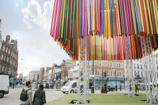
Colorful Pop-Up Pavilion Forms the Centerpiece for Camden Create Festival, London borough of Camden designed by KSR Architects
As part of a new three-day festival in the London borough of Camden, KSR Architects have designed a brightly colored pop-up pavilion for the famous Britannia Junction. The festival’s centerpiece is made up of 640 fluorescent tubes hanging from a stage truss system to make a colossal wind chime, animating the area with movement, color and sound. -- ArchDaily

Source: archdaily.com
OMA to Research the Link Between Color and Economic Development
Paint company AkzoNobel has announced plans to fund a global research project by OMA which will investigate the link between color and economic development. The project is part of AkzoNobel’s wider ‘Human Cities’ initiative, which they say “highlights our commitment to improving, energizing and regenerating urban communities across the world.” -- ArchDaily

Source: a21 studio archdaily.com
The Chapel, Ho Chi Minh City, Vietnam, 2014 designed by a21 studio
The multi-layer colorful curtains are orderly arranged and placed in the opens to add more colors to the entire space as well as soften the coldness of the metal frames. -- ArchDaily

Source: Jesús Granada archdaily.com
12 dwellings in Jaen, Calle Llana de San Juan, 41, 23004 Jaén, Jaén, Spain, 2014 designed by bRijUNi Architects
....the colorful facade, challenging the monotonous and constructive regulations, and the existing rich chromatic diversity in the surroundings, to become the protagonist of such a unified but not individualized project.... -- ArchDaily

Wednesday, January 16, 2013

Blue

SOurce: wikipedia.org
Pacific Design Center, Center Blue, West Hollywood, California, USA, 1975 designed by Cesar Pelli
The Pacific Design Center, or PDC, is a 1,200,000 square feet (110,000 m2 ) multi-use facility for the design community located in West Hollywood, California. One of the buildings is often described as the Blue Whale because of its outsize nature relative to surrounding buildings and its brilliant blue glass cladding. -- wikipedia

Source: jebake @ Flickr
Antiquities Museum, Arles, France, 1995 designed by Henri Griani
The Musée départemental de l'Arles antiques, opposite the remains of the Cirque Romain, was inaugurated in 1995. Henri Ciriani's architectural project, decidedly modern, is adapted to the basic functions of an archaeological museum:
1. The transmission and presentation of collections to the public;
2. Conservation and restoration, with a mosaics conservation and restoration workshop and an archaeology laboratory;
3. The reception of different kinds of publics (visits, workshops, internships).
The building's triangular layout symbolically incarnates these three functions. -- official web site
Watch a video on YouTube 
Architectural Review, 2:94, P. 35-40
World Architecture, 4:96, P. 88-93

Source: Herzog & de Meuron
Forum 2004 Building and Plaza, Barcelona, Spain, 2004 designed by Herzog & de Meuron 
the elevated flat triangular body emerged almost spontaneously, because it maximizes the possible footprint by forming an extensive cover for the plaza and perfectly expresses the specific situation of the land it occupies between the branches of the right-angled Cerda Grid and the Avenida Diagonal.  -- architect's web site
Museu Blau, Museu de Ciències Naturals de Barcelona, Barcelona, Spain, 2011 designed by Herzog & de Meuron 
Relocating the Museum of Natural Sciences into the Forum Barcelona building signals the beginning of a new life cycle for both institutions: one where each mutually benefits from the space, program and potential of the other. And the Museum of Natural Science promises to energetically revitalise the existing building, replacing vacant space with intense new public activities.   -- architect's web site

Source: Koichi Torimura archdaily.com

On the Corner, Shiga, Japan, 2011 designed by Eastern Design Office
The site is a wedge-shaped flatiron lot which resides at a corner where two streets merge at an acute angel. It was left behind neither used for residential nor for industrial development. Since no one wanted to buy it, and the public sector would not invest to change it into a park, the lot remained.
It is a triangular building configured by the square elements. The cross confines the power of the mixed materials into one. -- ArchDaily


Source: construction.com

Copenhagen Concert Hall, Copenhagen, Denmark, 2009 designed by Ateliers Jean Nouvel
From the outside in bright light, it looks like nothing more than a large rectangular box that for some reason is swathed in electric-blue scaffolding net and plopped down in an industrial landscape. When the sun goes down, it is transformed into an ethereal, dematerialized object with images of musicians eerily flitting across the screens of glass fiber with a PVC coating.
Seating 1,809 and raised above the lobby, it looks in section like some giant clam caught among pilings within a huge (190 by 315 feet) blue cage, 148 feet high.  -- Architectural Record

Source; Rob 't Hart archdaily.com
Melanchthon College Schiebroek, Rotterdam, The Netherlands designed by OIII Architecten
The broad daylight limits the use of artificial light and provides a pleasant learning atmosphere. The contemporary look that is achieved partly by the bright violet-blue glass facade and slender “golden” frames gives the school a distinctive and welcoming place. -- ArchDaily

Source: openbuildings.com
Guthrie Theater, Minneapolis, Minnesota, 2006 designed by Jean de Gastines
Situated next to the old Washburn-Crosby A Mill, in the heart of what was once the greatest flour-milling complex, the new Guthrie Theater Center pays homage to its industrial neighbors while capturing the magic of the theater.
The exterior is a composition of metal and glass that evokes industrial forms, rendered in a modern way. The large circular form of the thrust theater echoes the area’s adjacent grain silos, while the towering rectangular structure of the proscenium theater is in harmony with nearby flour mills. At dusk, the exterior walls flicker with the ghosts of great dramatic moments played out on the Guthrie stage. Barely discernible, these urban memories inhabit the facade. They stir in the dark shadows of twilight, when evening descends and the theater comes to life. -- Open Buildings

Source: Nelson Kon archdaily.com
OZ House, São Roque – São Paulo, Brasil, 2013 designed by Andrade Morettin Arquitetos Associados
The house is built with exposed concrete and a modular wooden structure. The roof and facade cladding is made of metal tiles and a polystyrene filling for thermal protection. -- ArchDaily

Source: popupcity.net
Smurbanism Works!
What was supposed to be a temporary transformation looks to be a permanent change. The South Spanish town Juzcar was turned entirely blue for the latest Smurfs movie by Sony Pictures. After 141 days blueness, the inhabitants of the small town have voted to keep the façades of the buildings blue forever. -- The Pop-Up City

Monday, January 14, 2013

Orange

Source: Åke E:son Lindman archdaily.com
Moderna Museet Malmö, Gasverksgatan 22, Malmö, Sweden, 2009 designed by Tham & Videgård Arkitekter
Seen from the exterior a new extension marks the arrival of the new museum. The extension provides a new entrance and reception space, as well as a cafeteria and a new upper gallery. Its perforated orange façade both connects to the existing brick architecture and introduces a contemporary element to the neighbourhood. The perforated surface gives the façade a visual depth, and is animated through the dynamic shadow patterns which it creates. The ground floor is fully glazed so that sunlight is screened through the perforated façade. -- ArchDaily

Source: construction.com
The Orange Cube, Lyon, France, 2010 designed  by Jakob + MacFarlane
the architects to create a box pierced by three large voids oriented toward the water. “The most obvious solution, from our point of view, was to take the negative space and treat it as a cutout from the whole,” says MacFarlane. “It seemed like a good of way of making something interesting out of the project.” -- Architectural Record

Source: 11H45 archdaily.com
Morangis Retirement Home, Paris, France, 2013 designed  by VOUS ETES ICI Architectes
A warm orange to yellow coating has been applied on the outer walls exaggerating the warmth of the light. The ambiance is friendly and warm and the yellow resonates nicely with the natural warmth of wood. As a result the dynamic spaces we offer are worth the effort needed to reach by elderly people. This bright and lively color, stimulating without being aggressive, is also the one used for the window and door frames of the facades found under the awnings and in the bedrooms. -- ArchDaily

Source: Paul Raftery archdaily.com
L’Orange de Ris, Chemin de Montlhéry, Ris-Orangis, France, 2013 designed by Edouard Francois
....we needed to recreate an entry. It is from this idea that the “Orange of Ris” was born. It is not simply a building but a positive sign at the entry to the city, voluntarily colorful and full of endearing materiality. -- ArchDaily

Source: Gerard Van Beek Fotografie archdaily.com
Veilige Veste, Leeuwarden, The Netherlands designed by KAW Architecten
Covering the whole building with especially designed square composite elements; that is how architect Beatrice Montesano translated the work of the previous mentioned artists in the transformation of the old police station.  The strict 12 by 12 feet grid constituting the building inspired Montesano to design the diagonally angled squares, that are positioned alternately to create the diamond shape pattern that covers the building. -- ArchDaily

Friday, December 21, 2012

Green

Source: kpf.com
333 Wacker Drive, Chicago, Illinois, USA, 1983 designed by KPF
while the northwestern side mirrors the river with a reflective green-glass skin and graceful curving façade, emerging from its context as a luminous glass volume.  -- architect's web site
Ugh--a new sign atop 333 W. Wacker -- Cityscapes

Source: http://jasoninhollywood.blogspot.com
Pacific Design Center, Green Building, West Hollywood, California, USA, 1988 designed by Pelli Clarke Pelli Architects
The Green Building is an expansion of the Pacific Design Center, which started with the iconic Blue Building. The Pacific Design Center building was originally envisioned as a single, free-​standing structure to house showrooms for the interior design trades. Today, it is a multi-​building complex that includes offices for the design, entertainment and arts industries. The Green Building is unique in shape and color, although materials, scale and detailing correspond to the first building. Both buildings are organized as a series of stacked two-​level atria. The buildings connect at the terrace and first floor levels. -- architect's web site

Source: Paul Warchol archdaily.com
Sarphatistraat Offices, Amsterdam, The Netherlands, 2000 designed by Steven Holl Architects
The porous architecture of the rectangular pavilion is inscribed with a concept from the music of Morton Feldman’s “Patterns in a Chromatic Field”. The ambition to achieve a space of gossameroptic phenomena with chance-located reflected color is especially effective at night when the color patches paint and reflect in the canal. -- ArchDaily

Source: archdaily.com
Amalia House, Styria, Austria, 2007 designed by GRID Architects
Located on top of a hill in Styria, overlooking the valley of Kirchbach Amalia offers space for up to six people, without having to spare any comfort.
Organised in 2 levels, one of them split, she lets the landscape float in and gives view to her surrounding from everywhere within. -- ArchDaily

Source: Luuk Kramer archdaily.com
Animal Refuge Centre, Amsterdam, Netherlands, 2007 designed by Arons en Gelauff Architecten
This building is folded like a ribbon along the waterway around the plot. Inside this, two large play spaces for the animals have been created. -- ArchDaily

Source: Julian Weyer
Vitus Bering Innovation Park, University College Vitus Bering, Horsens, Denmark, 2009 designed by C. F. Møller Architects
The building’s dynamic and innovative character is expressed via its spiral shape. On the facades, the movement is seen in the glazing strips that stretch towards the sky across the six storeys of the building and create the impression of a spiral sequence, while internally it is expressed via the main staircase in green fibre cement, which runs in a spiral form between the storeys in the unifying internal atrium.  -- ArchDaily

Source: Christian Richters archdaily.com
Mittlerer Ring, Munich, Germany, 2009 designed by Léon Wohlhage Wernik Architekten
There are five buildings of the same type, along which the façade continues, following the line of the curved street. The gables of the old buildings are revealed at regular intervals between the residential buildings. The entire lengthy front can really only be appreciated while driving past it, since it cannot be perceived in a single view. A characteristic, unmistakeable sculpture is the overall result and has already picked up the nickname “the crocodile”. -- ArchDaily

Source: Gramazio & Kohler archdaily.com
Public Toilets, Uster, Switzerland, 2011 designed by Gramazio & Kohler
The public toilet in the city park of Uster has a complex facade of 295 folded aluminumstrips. The depth of the folding and the slightly different colors of each strip generate a shimmering facade that changes depending on sun angle and the observers’ perspective. -- ArchDaily

Source: Aitor Ortiz archdaily.com
IDOM Headquarters, Bilbao, Spain, 2011 designed by ACXT Arquitectos
An imaginary green carpet has been designed as if simply placed over the roof, hiding all air conditioning units which in most office buildings are visible, with the resulting sound and visual impact. 
.... some “brise soleil” whose design emerges as an imaginary extension of the roof carpet as something that has been stretched over the façades and “folds” in its singularities: an existing balcony facing the canal, the entrance, access points for firemen through the façade and other unique areas. -- ArchDaily

Source: Hamonic +Masson archDaily.com
Villiot-Rapée Apartments, Paris, France, 2011 designed by HAMONIC + MASSON
Each level and each flat has a different floor lending itself to different practices and uses. Rather than being like a balcony, a loggia (or a terrace), which can be seen and used on a daily basis, winds its way around the outside of the flats and gives residents the feeling that they live outdoors. This “poured garden” creates close ties to the building’s external environment. The silver-colored gangway ceilings underscore the difference between inside and outside. The loggias in the covered ribbons are clad in aluminium and the balcony areas in stainless steel. Then, a system of aluminium screen walls, colored glass, stainless steel lists and mirror sheets, stacked up on top of each other, story on story, contribute to deconstructing the façades and to mix up inside and outside, giving our two towers a Parisian caravanserai look. -- ArchDaily

Source: Andy Ryan archdaily.com
BSA (Boston Society of Architects) Space, Boston, Massachusetts, USA, 2011 designed by Höweler + Yoon Architecture
....is centered around a highly visible “cloud” ceiling and an iconic stair. These two architectural elements act as brand markers for BSA Space and an invitation into the exhibits and meeting spaces above. -- ArchDaily

Source: Sergio Grazia archdaily.com
Primary School & Nursery in the “Claude Bernard” ZAC, Paris, France, 2012 designed by Atelier d’Architecture Brenac-Gonzalez
The entrance hall is treated as a flow interchange that highlights the oddly shaped stairways that occupy and cross the empty space. The three-storey atrium clarifies the way the building functions as a whole and shows how the different sections have been superimposed. The monumentality of the entrance hall contrasts with the other areas; it emphasizes movement and creates criss-cross perspectives that lend the design a playful narrative force. -- ArchDaily

Source: ARTEC Architekten archdaily.com
Multi-generational: Living at Mühlgrund, Vienna, Austria, 2012 designed by ARTEC Architekten
A cascade stair in the narrow zone between the corridor and the metal wall leads from the main entrance on the west side, through the building, to the top level. In between is a vertical garden with 1000 plants in eleven 7-metre-long, prefabricated-concrete planters, whose tension cables were developed three-dimensionally. -- ArchDaily

Source: Platoon Kunsthalle Berlin archdaily.com
Platoon Kunsthalle Berlin, Berlin, Germany, 2012 designed by Platoon Cultural Development
Platoon Kunsthalle is built of 33 iso cargo containers. as icons of a flexible architecture in a globalized culture, the stacked containers form a unique construction that can be rebuilt anywhere else any time. -- ArchDaily

Source: Marcel van der Burg archdaily.com
Sports Hall, Rietlanden, The Netherlands, 2012 designed by Slangen + Koenis Architects
To accentuate the placement of the new structure, we created very colourful facades at the two sides that intersect the existing buildings, accentuating the contrast between old and new. The two front facades are very crisp and light with white colours in varying materials. -- ArchDaily

Source: David Frutos archdaily.com
Administration Extension, La Nucia, Alicante, Spain, 2013 designed by CRYSTALZOO
....a modern building that responds to its environment, a building whose architecture reflects the fusion of uses, accentuating the new identity of La Nucía’s population with a progressive character, banking on innovation and fusion of styles in the city. -- ArchDaily