 |
| Source: fastcodesign.com |
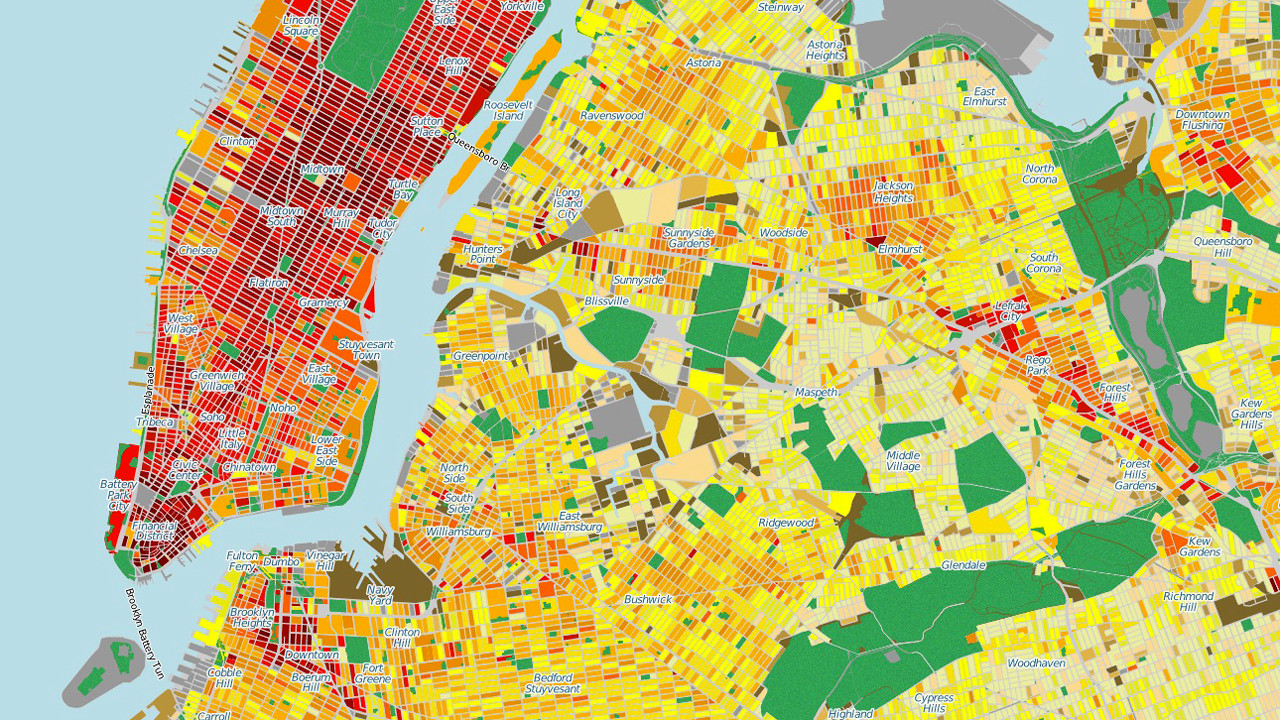
A Mind-Blowing Map Of Energy Consumption In Every Single NYC Building
How much power does any piece of a city block use? There’s no way to tell. A building’s facade, unless it’s covered with lights, isn’t exactly screaming its annual energy expenditures.
A new map by the School of Engineering and Applied Science at Columbia University gives us a picture of energy consumption in the five boroughs of New York, on a block-by-block basis. -- Fast Co

Renewable Energy Map
Every state in America can produce its own energy from clean, renewable sources, keeping millions of energy dollars in-state, reducing pollution, and creating new jobs and new sources of income. Find out which renewable energy sources your state can tap into. -- NRDC(Natural Resources Defense Council)

Where US energy is produces
An interactive map showing where the US energy is produced. You can select an energy sector from the drop-down menu for a state-by-state view of production figures from 2010; map of states with "fracking" as of May 2011. -- NBC News

US Energy Expenditure Map
Energy Expenditure Map shows energy expenditure per person of each state from 1970 to 2012. It also shows number breakdown of transportation and residential.-- US Department of Energy

USDA Energy Investment Map
The Energy Investments Map is an interactive map to help users understand where USDA is providing investment support for renewable and sustainable energy initiatives across the United States. New investment data have been posted along with a few new features. -- USDA Energy Investment Map

U.S. Energy Mapping System
A new tool from the U.S. Energy Information Administration shows how fossil fuels infrastructure crosses every part of the country. It also shows existing and potential for renewable energy. With all the debate around the proposed new natural gas pipeline in Massachusetts, this tool can help us better understand our energy infrastructure and its implications . You can start with the entire country, and then zoom into Massachusetts to see how we compare against other states. -- Greenovate BostonGo to the map at U.S. Energy Information Administration