 |
| Source: K. Kwan archdaily.com |
Embassy Of Canada In Korea, Seoul, South Korea, 2007 designed by Zeidler Partnership Architects
The building, composed of two blocks tied together by a base, forms an undulating mass framing the tree. The massing and skin of the building are inspired by impressionist images of the Canadian landscape. The west block is the mountain_a majestic and simple form in the tradition of Lawren S. Harris. The east block is the forest birch bark trunks, vertical elements, creating a natural rhythm against the sparkling sky; an image inspired by Canadian impressionist, Tom Thomson. -- ArchDaily
 |
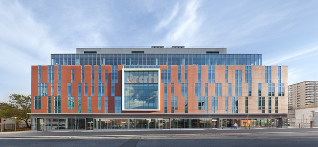
| Source: BitterBredt archdaily.com |
The Ascent at Roebling’s Bridge, Covington, Kentucky, USA, 2008 designed by Daniel Libeskind
Through the vertical, non-repeating articulation of the facade, the building breaks from the conventional, horizontal orientation of typical high-rise buildings. Its multiple layers blur the distinction between interior and exterior, both visually and experientially. The resulting texture also provides shade to all units from the eastern sun. --
ArchDaily
 |
| Source: Sapa: Architectural Aluminium Solutions |
Broadcasting Place, Leeds, UK, 2009 designed by Feilden Clegg Bradley Studios
Through this massive form, windows were conceived as the flow of water cascading through a rock formation. This design intent is reinforced by the selection of cor-tensteel as a solid, sculptural and weathering material, constructed as a rain-screen façade. -- ArchDaily
 |
| Source: Alexander Severin / Razummedia construction.com |
Myrtle Hall, Brooklyn, New York, USA, 2010 designed by WASA/Studio A
In a contemporary take on Myrtle Avenue's smaller-scale brownstones and brick buildings, they limited the north volume to four stories and clad it in panelized masonry. -- Architectural Record
 |
| Source: architectmagazine.com |
College of DuPage Technology Education Center, Glen Ellyn, Illinois, USA, 2010 designed by DeStefano Partners
The facility recognizes the duality of teaching at TEC with distinct architectural vocabularies for the shops and general teaching spaces, weaving the program together into a facility that expresses the balance between the instruction and hands-on experience. Designed to be used as a teaching tool, the building's architectural expression reveals structural and MEP systems to students studying applications for those trades. Contrasting exterior materials visually articulate the rich functional mix of interior spaces. For example, large, colored precast concrete panels define the lab spaces and a more transparent curtain wall system defines the classroom and office spaces. -- ARCHITECT
 |
| Source: Adrià Goula archdaily.com |
University Housing, Gandía, Valencia, Spain, 2011 designed by Guallart Architects
In Spain the national Housing Plan clearly establishes that apartments can be built with an area of between 30 and 45 m2, with up to 20% of shared space, but does not specify where or how this should be located.
The fact is that the idea of sharing spaces is fully compatible with the goals of social and environmental sustainability, grounded as it is on the principle of ‘doing more with less’: that is, offering people more resources through the mechanism of sharing. -- ArchDaily
 |
| Source: Erick van Egeraat archdaily.com |
Sumatrakontor Hamburg, Hamburg, Germany, 2011 designed by Erick van Egeraat, Michiel Raaphorst
Aesthetically, the new building refers to the red-brick harbour aesthetics of the historic Speicherstadt on the one hand and the traditional white plaster façades of the inner city on the other. Mixed with glass and aluminium, the outer façades facing the streets are predominantly composed of natural stone. In contrast, all façades towards the courtyard are white. The folded elevation emphasises the vertical structure and defines a unique statement within the entire plan of the Überseequartier. -- ArchDaily
 |
| Source: César San Millán archdaily.com |
63 Dwellings in Arkayate, Vitoria, Álava, Spain, 2012 designed by Patxi Cortazar
The openings are very regular, although this is not apparent on the east facade, where two colors of prefabricated brick are used in a disorderly play. -- ArchDaily
 |
| Source: Andrey Ukolov archdaily.com |
Gudou Plaza, Pushkin Street, Sukhumi, Georgia, 2013 designed by Andrey Ukolov + Ekaterina Osipova
....the used façade system functions as the protection from the sun light,
preserves the internal space from overheating, hides diaphragm plate
fitted behind the glazing (the building situated in earthquake-prone
zone). Façade segments are pre-fabricated details and made from aluminum
profile. Maintenance scaffolds are placed between two surfaces of the
glazing. -- ArchDaily
 |
| Source: Luc Lodder archdaily.com |
Safari, Maarssenbroek, The Netherlands, 2013 designed by ARCHITECTENZAAK
The fragmented facade design is based on the character of eroded stone
facades of old monuments. The entirely white monolith building becomes a
pleasant natural character by applying three different textures in the
façade cladding. This way the robust building reacts on the fluctuating
incidence of light in a soft way and presents itself as a sparkling
diamond. -- ArchDaily
 |
| Source: David Barbour archdaily.com |
St John Bosco Art College, Croxteth, Liverpool, Liverpool, Merseyside L11, UK, 2014 designed by BDP
The new school is housed in a 91m x 55m three storey single span column
free environment, which contains an exciting mix of learning
environments and social spaces, focusing on a sculpted landscape at the
heart of the school. -- ArchDaily


No comments:
Post a Comment