 |
| Source: Nikolaos Zachariadis, SPLITTERWERK |
Frog Queen, Graz, Steiermark, Austria, 2009 designed by SPLITTERWERK
The building form approximates a cube, measuring 18.125 x 18.125 x 17m, wrapped on all four elevations with a pixilated pattern of square panels. From a distance, these panels appear to be painted in a range of ten values of grey tone, together dematerializing the volume of the building against both the trees of the surrounding site and the clouds and sky. Thus the cubic building is at once monumental in its objecthood in the open landscape – scale-less and immaterial – and yet utterly non-iconographic in its overall form. -- ArchDaily
 |
| Source: Takashi Yamaguchi Associates archdaily.com |
Breathing Factory, Osaka, Japan, 2009 designed by Takashi Yamaguchi & Associates
The building body is covered with a delicate membrane constituted of aluminum louvers in order to avoid showing the disgusting clustered pipes. Concerning the maintenance ease, the louver aperture ratio and the space behind those offer a proper access to the pipes system.
The reconstruction was also an experimental way to reduce as much as possible the impact on the neighborhood of the intimidating volume of the uninteresting factory.
To attain to this result, the louver’s angles, and horizontal or vertical directions are directed by randomized mathematical rules. -- ArchDaily
 |
| Source: Michael Moran Studio archdaily.com |
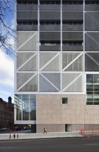
Columbia University Northwest Corner Building, New York City, New York, USA, 2010 designed by Rafael Moneo, Davis Brody Bond Aedas, and Moneo Brock Studio
In the building’s façades the structural frame is represented by a pattern of aluminum fins, creating a patchwork of light and shadow, and the building’s mass appears a shimmering prismatic structure sitting atop a carved stone pedestal. The campus-side façade is almost entirely glass, revealing the interior workings of the building and again emphasizing openness and a connection to the campus community. -- ArchDailyRead another post from ArchDaily
 |
| Source: Jaime Sicilia archdaily.com |
Molí d’en Xema School and Son Boga Nursery, Manacor, Mallorca, Spain, 2010 designed by BB Arquitectes
The construction of the School consists of a single linear building where the child can complete all stages of education until high school; the allocation of classes on the basis of age and the subsequent linear progress through the building, favors the use of the center and takes maximum advantage of the restricted size of the plot. -- ArchDaily
 |
| Source: Yves André archdaily.com |
CEI 3, Cheseaux-Noréaz, Switzerland, 2011 designed by bauzeit architekten
Broad anthracite fabrics cover a large part of the building, conferring it’s changing reflections according to the variations of the natural light during the day and year. The building’s skin has the will to express the diversity and the complexity of the program and at the same time to guarantee a sober and quality image in an environment, already, rather heterogeneous. These stretched textiles have, at the same time, the virtue of filtering the dazzling of the sun on the work surfaces and the computer’s screens, ensuring interior privacy, while preserving optimal views to the outside. -- ArchDaily
 |
| Source: Luc Boegly archdaily.com |
M3A2 Cultural and Community Tower, Paris, France, 2011 designed by Antonini + Darmon Architectes
A break between the Flour Market and the new building is preserved. It respects the existing building and accentuates the slenderness of the tower. The two, independent buildings coexist completely. The signal-like extension stands out of its context by means of its evolving shape. It is a sensitive, delicate object, treated simply to avoid rivalry with the strong presence of the Flour Market. On the contrary it acts as a light, gravitational counterpoint. An architectural dialectic and emulation come into play much like a castle and its keep, both intrinsically inseparable. -- ArchDaily
 |
| Source: Tim Griffith archdaily.com |
UCSF Mission Bay Parking Structure, San Francisco, California, USA, 2012 designed by WRNS Studio
The upper levels of the structure are shrouded with a custom anodized aluminum louver system in warm earth tones. The vertical louvers change orientation from panel to panel, creating a quilted pattern through play with light and shadow. The varied spacing and orientation facilitate natural ventilation and control light spill from the garage at night in order to reduce the visual impact on neighbors. The louvers are also shaped to bounce daylight into the structure. Vertical fins define two-story view apertures and modulate between the pedestrian scale and the garage’s large volume. -- ArchDaily
 |
| Source: Ronan Lacroix archdaily.com |
Rebière 21 housing, Paris, France, 2012 designed by Hondelatte Laporte Architectes
All façades, including those facing the cemetery have not been differentiated deliberately. They are all made up of dual-colour panels (white and galvanized metal) in a check pattern. According to the light, the time of day and the viewpoint, they reflect different colours. -- ArchDaily
 |
| Source: Miguel de Guzmán archdaily.com |
Social Housing in Valleca´s Eco-boulevard, Madrid, Spain, 2013 designed by Olalquiaga Arquitectos
The building is distributed in 4 blocs with a central corridor serving as access to the apartments. Instead of a uniform and monotonous corridor, probably poorly lit and ventilated, we propose, through subtraction and substitution of habitable cells, its widening in some parts as well as the liberating of some habitable modules, in order to achieve greater diversity, the entrance of more natural light and views. -- ArchDaily
No comments:
Post a Comment