 |
| Source: wikipedia.org |
Trinity Church, Boston, Massachusetts, USA, 1877 designed by H. H. Richardson
Dedicated in 1877, Trinity presented a bold, fresh new face and feeling for ecclesiastical architecture in America. The Church continues to be heralded today as a celebrated example of "Richardsonian Romanesque" design, named after its architect, H. H. Richardson. -- official web site
 |
| Source: the faculty lounge |
Institute for Scientific Information(ISI), Drexel University, Philadelphia, Pennsylvania, USA, 1978 designed by Venturi, Scott Brown and Associates
This quintessential “decorated shed” is an important early work of postmodernism and a cherished University City landmark. The principal south elevation, with its polychrome tile patterns and porcelain enamel signage ... -- Preservation Alliance for Greater Philadelphia
 |
| Source: msmearch.com |
Clayton County Headquarters Library, Jonesboro, Georgia, USA, 1978 designed by Mack Scogin Merrill Elam Architects
The exterior skin is a combination of metal sidings with a variety of textures and patterns. The general tectonic is industrial grade. -- architect's web site
 |
| Source: FG+SG – Fernando Guerra, Sergio Guerra |
Companies Incubator, Vila Verde, Braga, Portugal, 2007 designed by Contemporânea
The entire volume is all over covered with white and dark blue tiles, in a slightly lagged chess pattern in order to provoke a fascinating optical effect that characterizes the whole, creating a strong and mysterious image that only after a big sign decodes. -- ArchDaily
 |
| Source: construction.com |
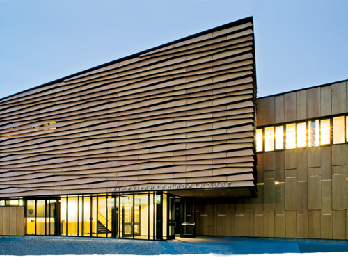
Community Rowing Boathouse, Boston, Massachusetts, USA, 2008 designed by Anmahian Winton Architects
For inspiration for the wood Community Rowing Boathouse, the architects looked to regional vernacular linear buildings, such as covered bridges and tobacco sheds. Tobacco sheds provided a particularly compelling model because sculls and shells, like tobacco leaves, need proper ventilation. This observation led the architects to the idea of a kinetic building. -- Architectural Record
 |
| Source: Michael Heinrich archdaily.com |
DEA Vogelweh Kleeblatt, Kaiserlautern, Germnay, 2009 designed by Molter-Linnemann Architekten
As a sculpture the building would be able to underplay its true size and purpose. It seemed somehow fitting to apply these dazzle-paint patterns to an unmovable object in a vortex of moving spectators, hiding shape and size but drawing attention to its presence, which in a public space can be considered an additional form of security. -- ArchDaily
 |
| Source: chankrieger.com |
Yawkey Distribution Center, Greater Boston Food Bank, Boston, Massachusetts, USA, 2009 designed by Chan Krieger Sieniewicz
Recognizing the prominence of the site from the highway, the project’s design is intended to serve as a billboard which will distinguish the façade from its large, utilitarian application while highlighting the important mission of the organization. The Food Bank’s wheat shaft logo is distributed across tabs on the exterior wall such that what at first seems to be a random pattern comes together momentarily as a coherent image, before fragmenting again as the car continues past the building. -- architect's web site
 |
| Source: Nicolas Waltefaugle archdaily.com |
A Canopy and a Pavilion at Porte des Lilas, Paris, France, 2009 designed by Matthieu Gelin & David Lafon
A golden lacquered perforated steel sheet wraps the circus pavilion. This double skin works like a moucharabieh. The mesh, permeable to light, protects the various elements of the program such as toilets, reserves and the workshop. This materiality corresponds to the idea of a circus; by night the interior light becomes a lantern that participates in the entertainment. -- ArchDaily
 |
| Source: Jeroen Musch archdaily.com |
Artistic amenity Stadshaard, Enschede, The Netherlands, 2009 designed by Cie
Its basic form is simple, while its elevations are clad in one-metre-square panels with expressive motifs and figurative depictions. These are reminiscent of the delftware tiles that line Holland’s traditional open hearths and therefore hint that this structure might have something to do with fire and warmth: the City Hearth. -- ArchDaily
 |
| Source: René de Wit archdaily.com |
Archive Depot, Van Harinxmakanaal, The Netherlands, 2009 designed by Bekkering Adams Architects
The building is clad with light bronze anodized aluminum panels with perforations and imprints, treating the material in the same way as the printed circuit boards, found in the computers of the data room. A specifically designed pattern is wrapped around the building, designed to its specific purpose: with many holes if ventilation is needed, with lights at the entrance area, and with zeros and ones in bas-relief, celebrating the computer language of the servers. The treatment of the aluminum panels strengthens the monolithical look of the building. -- ArchDaily
 |
| Source: Michael Nast archdaily.com |
Single Family House, Berlin, Germany, 2009 designed by Brandt + Simon Architekten
The untypical facade of coloured plain tiles make this house a peculiar new member of the urban fabric. Simultaneously the hasty passerby will not neccessarily take notice of the greenish structure blending with plants and trees deep in the gap between neighbouring buildings. -- ArchDaily
 |
| Source: Alejo Bagué archdaily.com |
Nursery, Zarautz, Gipuzkoa, Spain, 2010 designed by Ignacio Quemada Arquitectos
....designed and built it from LUXALON 84 R enamelled aluminium panels, selecting six colours from the reduced exterior colour chart. -- ArchDaily
 |
| Source: Laura Ceccarelli archdaily.com |
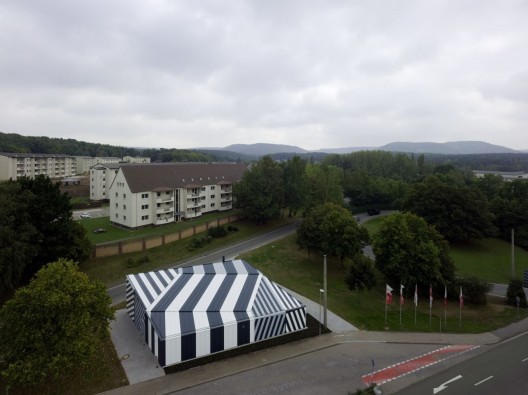
Museum Building, Cormano, Milan, Italy, 2010 designed by Area_Progetti
The entrance is in a sheltered area, covered by the museum box. This big outer hall crossed by the urban road is the way the building relates to the city. The new zebra-striped volume clearly declare indeed the new activities taking place in the cotton mill. -- ArchDaily
 |
| Source: Cino Zucchi Architetti archdaily.com |
Christ Resurrection Church, Cormano, Milan, Italy, 2010 designed by Cino Zucchi Architetti
The outer facades are faced with an array of vertical slabs of equal dimension but different materials: white Trani stone, Grey Serena stone, oxidized zinc sheets, silkscreened glass. Their rhythm, position and quantity changes according to sun orientation, quality of internal spaces and relationship with the urban setting, generating a bi-dimensional decorative pattern which acts as a finer texture in respect to the bolder volumetric statement. -- ArchDaily
 |
| Source: Hervé Abbadie |
Maison de la Petite Enfance à Clichy sous Bois, Clichy sous Bois, France, 2010 designed by Gaetan Le Penhuel Architectes
This new project of ‘’the house of the early childhood’’ is to reinforce the urban character of downtown Clichy Sous Bois. It should complement other equipment already built and provide a new use close to the town hall and communal cultural space. It must accompany a new social and urban vitality in the heart of this area with great potential. -- ArchDaily
 |
| Source: Ty Cole archdaily.com |
Nitehawk Cinema and Apartments, Brooklyn, New York, USA, 2011 designed by Caliper Studio
The façade’s distinctive organic pattern was generated algorithmically using evolutionary techniques. Thousands of lines of RhinoScript allowed for an iterative design process in which generations of patterns were evaluated based on visual criteria (variability and density for example) within a framework that required adherence to basic fabrication constraints. The same custom computational tools used in the design phase were then capitalized upon to automate the production of digital files used for CNC fabrication. -- ArchDaily
 |
| Source: John Gollings archdaily.com |
Pixel, Melbourne, Australia, 2011 designed by studio505
The facade is a system of perimeter planters, fixed shading louvers, double glazed window walls and solar panel shading. studio505 developed a complex yet simple patterning system to engender the project with a human scale ‘flow’ of textures allowing the reading of the various elevations, with their differing functional and ESD requirements and materials, to espouse coherency through fluidity. -- ArchDaily
 |
| Source: Gabriel Saunders |
Vivida, Hawthorn, Australia, 2011 designed by ROTHELOWMAN
Aware that the building would be seen from varying angles and distances, ROTHELOWMAN created a bespoke external wallpaper in direct response to the building’s internal cells, stacked up in neat, square boxes. This patterning served to re-skin the Telstra building, positively affect shading and heating requirements, and create a dynamic, metallic façade that changed in appearance at different times of the day, and when viewed at different angles. -- ArchDaily
 |
| Source: Shen Zhonghai archdaily.com |
Design Collective, Qingpu, China, 2012 designed by Neri & Hu
The existing building has been completely covered with an opaque graphic wrapper made with carbon fiber panel to create an introverted spatial condition to showcase furniture both visually and experientially. The main entry is characterized by a large steel funnel, serving as a transition element from the urban context to the exhibition space. The shape of the entry tube also serves as a means of emphasizing the arrival into the 3 story exhibition hall where the visitors introverted journey begins. -- ArchDaily
 |
| Source; Philippe Ruault archdaily.com |
Teletech Call Center, Dijon, France designed by MVRDV
The façade for example could not be exchanged but is transformed with a simple print of a QR flashcode translated into the activities of the company; the façade acts as communicator and signals the transformation. -- ArchDaily
 |
| Source: Luc Boegly archdaily.com |
Saint-Nazaire Theatre, Saint-Nazaire, France, 2012 designed by K-architectures
Concrete is conferred sovereign status as a material. It is smooth in parts, chiselled in others. Here and there, it is adorned with a floral imprint pattern providing a classical link to the station and to romantic theatres. This imprint, inspired by a 17th century French silk textile motif, has been scaled to the size of the building – a simple ornamental feature trans- posed to the relief of the material itself. In places, this relief is so deep that it digs into the concrete walls, taking the shape of rosettes. -- ArchDaily
 |
| Source: Stéphane Chalmeau archdaily.com |
Mervau, Saint-Gilles-Croix-de-Vie, France, 2012 designed by Tetrarc Architects
The sun shading equipment is in the form of playful vernacular designs. The walls and boundaries between the housing appear as cast shadows, an allusion to the pine trees in the Vendée forests, heightening the hamlet’s seaside resort atmosphere. -- ArchDaily
 |
| Source: Adjaye Associates archdaily.com |
Sugar Hill Development,Harlem, New York City, New York, USA, 2012 designed by Adjaye Associates
The cladding is achieved with rose embossed graphite tinted pre-cast panels, which create an ornamental effect, paying tribute to the rich culture and history of Harlem. The roses on the building façade are set to varying sizes and depths to enhance the play of light across the surface. The tinted precast concrete material was refined through a series of studies, samples and tests, and is designed to sparkle with sunlight allowing the building to shimmer throughout the day. The graphite color also serves as a contrast to the luminous glass facade that begins at the public entry plaza and wraps around the entire building creating a glowing beacon for the gateway to the Sugar Hill district. -- ArchDaily
 |
| Source: Mecanoo architects archdaily.com |
Library of Birmingham, Birmingham, UK, 2013 designed by Mecanoo architecten
The exterior of the building, from the first to the eighth floor will be wrapped with an intricate metal façade, echoing the tunnels, canals and viaducts which fuelled Birmingham’s industrial growth. -- ArchDaily
Read a post from ArchDaily
Intermediating Patterns Exhibition, Tokyo, Japan -- ArchDaily
 |
| Source: Chae Soo Uk archdaily.com |
The Sarang Community Church, Suwon-si, Gyeonggi-do, South Korea, 2013 designed by Seoinn Design Group
Wood finish in exterior and landscapes in roof garden creates the ambience of nature to the people. -- ArchDaily
 |
| Source: Pedro Pegenaute archdaily.com |
111 Dwellings in Larrein Salburua, Vitoria-Gasteiz, Álava, Spain, 2013 designed by Roberto Ercilla + Miguel Angel Campo
The domestic façade, with hollows and terraces, is wrapped in silk-screen printed or perforated recycled aluminium panels. These panels vary density and size of the circles and provide changing images to simulate a large mural of light and shadows, which vary according to openings and lighting of the hollows. This skin can be opened or closed on all hollows of the façade, as if it were a practicable shutter. The final effect gives a unified image to the block and provides it with its own personality standing against its surroundings. -- ArchDaily
 |
| Source: Eibe Sînnecken archdaily.com |
Kleine Rittergasse 11, 60594 Frankfurt am Main, Germany, 2014 designed by Franken Architekten
For the façade, Franken Architekten employed the notion of the afterimage – the effect of staring at an object for a length of time and seeing a blurry or faded rendition of it after closing one’s eyes. So a fuzzy picture of the demolished building (visible at bottom) would be produced in the new building, but an image that would be blurrier the closer one gets. To achieve this, a computer algorithm scanned drawings of the original to create a new drawing of parallel lines and inserting a “parametric jitter” each time it crossed the trusses. -- ArchDaily
No comments:
Post a Comment