Showing posts with label Cube. Show all posts

Thursday, November 6, 2014

Cube 9

Source: Reading Tom archdaily.com
Plan, Source: archdaily.com
Citigroup Center, New York City, New York, USA, 1977 designed by Hugh Stubbins + William Le Messurier
Resting on four stilts perfectly centered on each side, it cantilevers seventy-two feet over the sidewalk and features a trademark 45-degree sloping crown at its summit. -- ArchDaily

Source: Rafael Vargas archdaily.com

Plan, Source: archdaily.com
Puig Tower, Barcelona, Barcelona, Spain designed by Rafael Moneo + Antonio Puig, Josep Riu GCA Architects + Lucho Marcial
The tower strictly follows the floor plan and height established in the original plans, and the proposition that it was to be perceived as a united figure and not only as a simple superimposition of horizontal floors, led to the suggestion of the spiral glasswork which encases everything. 
The floor plans of the tower- a 27.5m by 27.5m square- shows the importance of the core, which not only resolves the vertical connections, and the service and mechanical elements, but also contributes to defining and structuring the usable space.  -- ArchDaily

Source: Young-chae Park archdaily.com

Site plan, Source: archdaily.com
G-Tower, Art center-daero, Yeonsu-gu, Incheon, South Korea, 2013 designed by HAEAHN Architecture + Designcamp Moonpark dmp + Gyung Sung Architects + TCMC Architects & Engineers
Four atriums reaching up to 6 floors and sky garden of 25m depth reverse-slope influence characteristic of a building as drastic and creative element. Formativeness of a diagonal line shown on the elevation of a tower building is simple and dynamic figure. -- ArchDaily

Monday, March 31, 2014

Urban Elements: Train Stop

Source: Domyjinak archdaily.com
Train Stop Varnsdorf – Pivovar Kocour, Liberec, Czech Republic, 2013 designed by Domyjinak
The first private train stop in the public space and private administration in the Czech Republic.... The concept of the simple volume, two intersected open cubes, found the inspiration in wooden brewery boxes – beer basses. From the interior of these boxes a massive wooden bench with names of train stops on, protrudes into the space. The bench is carried by the logo of the brewery – steel „statue“ of the tomcat (“kocour” in Czech). -- ArchDaily

Tuesday, February 4, 2014

Cube 8

Source: Adrià Goula archdaily.com
Plan, Source: archdaily.com
Beach Modules, Barcelona, Spain, 2010 designed by Màrius Quintana Creus
The cube is proposed as a common form to all the elements that have to conform the various programs. The cube as minimal and simple form that requires a discipline in the design of all its parts and its layout, repetition and aggregation strategies. -- ArchDaily

Source: Domyjinak archdaily.com
plan, Source: archdaily.com
Train Stop Varnsdorf – Pivovar Kocour, Liberec, Czech Republic, 2013 designed by Domyjinak
The concept of the simple volume, two intersected open cubes, found the inspiration in wooden brewery boxes – beer basses. From the interior of these boxes a massive wooden bench with names of train stops on, protrudes into the space. The bench is carried by the logo of the brewery – steel „statue“ of the tomcat (“kocour” in Czech). -- ArchDaily

Source: Arunas Skrolis archdaily.com
plan, Source: archdaily.com
Parallelepiped Rectangle House, Vilnius, Lithuania, 2013 designed by Devyni Architektai
....strict-shaped house with echoing of the rectangular. Therefor lots of glass framed in concrete construction and decorated with fine polished stone exterior.... -- ArchDaily

Source: Javier Callejas archdaily.com
Plan, Source: archdaily.com
Mixed-Used Leisure Complex, Montrond-les-Bains, France, 2013 designed by DATA architectes
Composed of six blocks containing the differents entities of the program and arranged mainly on a single level, this new complex offers a clear and simple internal route through the large glass-roofs taken between these six volumes. This formal and organizational system allows the addition of new volumes and thus easily integrate possible future expansion of the complex. -- ArchDaily

Source: Javier Agustin Rojas archdaily.com
Plan, Source: archdaily.com
Buenos Aires Contemporary Art Museum, Mar del Plata, Buenos Aires Province, Argentina, 2013 designed by Monoblock
A system of independent structural modules, which ensures that each of these can be completed in itself, allows the building to open with only 2/7 of the total building completed. A building with modular growth provides great flexibility for the developer to have large variations in the stages of completion, as this is a building with an open functional structure. -- ArchDaily

Source: Harunori Noda archdaily.com

Plan, Source: archdaily.com
Tohogakuen School of Music, Chofu, Tokyo, Japan, 2014 designed by Nikken Sekkei
....new arrangements of lesson rooms has been developed in which it’s not a typical campus style, nor dispersive location of schools.It has a look of a city observed in Quartier Latin. -- ArchDaily

Thursday, January 16, 2014

Cube 7

Source: Jeremy Bittermann archdaily.com
Clyfford Still Museum, Denver, Colorado, USA, 2011 designed by Allied Works Architecture
Through the trees, the structure of the building is visible, consisting of cast-in-place architectural concrete walls with a variety of surface relief and texture. The façade features thin, vertical lines of concrete that project from the building’s surface in a fractured, organic, and random pattern, creating a rich surface that changes in the intense Denver sunlight and forms varied shadows across the building. -- ArchDaily

Source: Chang Kyun Kim archdaily.com
White Block Gallery, Heyri Art Valley, South Korea designed by SsD
A matrix of 3 solid gallery volumes carefully positioned creates 7 additional galleries in a compact but open ended configuration. Designed to showcase global contemporary art from super sized sculpture and paintings to multi-media installations, the spaces are unique in proportion and lighting allowing curators to accommodate new future forms of art and media. -- ArchDaily

Source: Brad Feinknopf archdaily.com
McGee Art Pavilion, Alfred, New York, USA, 2011 designed by ikon.5 architects
The McGee Art Pavilion is an expansion to the School of Art and Design at the New York State College of Ceramics. Designed as a large ceramic container for holding art and light, the pavilion is set on a plaza between two existing campus buildings on the main pedestrian road on the campus, creating a realization of the manufacturing history of Alfred. -- ArchDaily

Source: Marc Lins Photography archdaily.com
Fresach Diocesan Museum, Fresach, Austria, 2011 designed by Marte.Marte Architekten
The public square has been completed by a monolithic block placed on the gently rising land to the northeast. The foundation and main level divide the hermetic shell for the diocese’s church treasures, and bring the large cube into harmony with the scale of the surrounding buildings. -- ArchDaily

Source: David Holmes archdaily.com
The Lighthouse Young People’s Centre, Birmingham, UK designed by Associated Architects
The site has a strong visual presence in the local area, overlooking a major route into Birmingham city centre. The use of semi-transparent coloured cladding allows the sports hall to be naturally lit in the day and to provide a strong dynamic presence in the area.  In the evening, the use of artificial lighting and feature LED lighting allows The Lighthouse to become the ‘beacon’ within the community. -- ArchDaily

Source: Joshua White archdaily.com
Matthew Marks Gallery, West Hollywood, California, USA, 2012 designed by ZELLNERPLUS
This is a 3000 square foot, free standing new building for renowned New York art dealer Matthew Marks.
The building was conceived as a monolithic, windowless, 70 x 40 x 32 foot white stucco box. -- ArchDaily

Source: Didier Boy de la Tour archdaily.com
Mont de Marsan Mediatheque, Place de la Caserne Bosquet, 40000 Mont-de-Marsan, France, 2012 designed by archi5
The Media Library stands in the middle of the Bosquet barracks, and care has been taken to augment the dialogue with the place’s strong architectural whole. With its clean envelope of pure geometric lines, a 197 ft x 197 ft square, the building complies with the classical layout yet contrasts with its austerity by offsetting the system with a corner opening onto the city. Its facades reflect the surrounding barracks like a respectful, deferential mirror. -- ArchDaily

 
Source: KSG Architekten + BDA Feldschnieders + Kister archdaily.com
Research Building DLR SpaceLIFT, Robert-Hooke-Straße 7, Bremen, Germany, 2012 designed by Ksg Architekten + Architekten BDA Feldschnieders + Kister
To its outside the square layout presents itself as a solitary volume with a dense, two storey cubature. Integrating a colonnade on the upper level, the inside opens itself up to its visitors despite the high levels of security. -- ArchDaily

Source: Steven Massart archdaily.com
MuCEM, Marseille, France, 2013 designed by Rudy Ricciotti
First of all a perfect square of 72 m per side, it is a classic plan, Latin, under the control of Pythagoras. Within this square, another of 52 m per side, comprising the exhibition and conference halls identified as the heart of the museum.. -- ArchDaily

Source: Christian van der Kooy archdaily.com

Erasmus Pavilion, Rotterdam, The Netherlands, 2013 designed by Powerhouse Company + DeZwarteHond
A compact building volume, the positioning of the mass in the center core, a careful orientation of the program toward the sun—combined with the active facade, the solar panels on the roof, the natural ventilation, and flexible zoning transform this transparent building into a low- consumption landmark. -- ArchDaily

Source: 11h45 archdaily.com
Auditorium Of Bondy & Radio France Choral Singing Conservatory, Bondy, France designed by PARC Architectes
The architecture of the building plays with the aesthetics of the hangar : a very simple square plan and an undulated metal skin. Unlike a traditional hangar, it opens to its context through a series of arches, letting in natural light and views. Inside, every space has a specific acoustics related to its function and its ambiance. -- ArchDaily

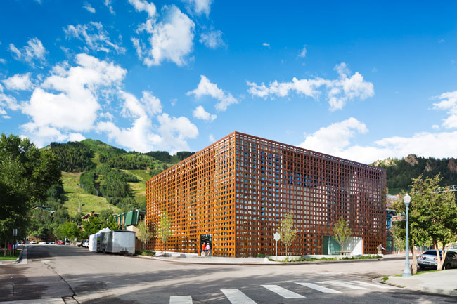
Source: Michael Moran archrecord.construction.com
Aspen Art Museum, Aspen, Colorado, USA, 2014 designed by Shigeru Ban Architects
From the exterior, the museum’s main feature is the basket-weave cladding that covers its two street-facing facades. The slats, “woven” together on-site, are made from a paper-and-resin composite sandwiched between two thin layers of brown okoume wood protected with a UV coating. The density of the weave changes from top to bottom and as it moves away from the corner of the building. Practically, the screen provides shade from the intense Colorado sunlight. Aesthetically, it helps give the museum a craftsy, homemade quality, despite its bulky presence. -- Architectural Record

Source: Pepo Segura archdaily.com
Girona Public Library, Girona, Girona, Spain, 2014 designed by Corea & Moran Arquitectura
The square-shaped volume is almost entirely glazed in U-glass punctuated by sections of transparent glass, flooding the interior with a diffuse light especially comfortable for reading while framing views of the surrounding neighborhood. At night the library glows like a giant urban lantern, welcoming everyone to enter and become part of this place for knowledge, culture and community life. -- ArchDaily

Thursday, January 9, 2014

Cube 6

Source: philly.curbed.com
Plan, Source: philly.curbed.com
Fisher House, Hatboro, Pennsylvania, USA, 1967 designed by Louis I. Kahn
Characterized by its dual cubic volumes, stone foundation and detailed cypress cladding, the Fisher house stands as a clear statement of how Kahn was working at the time and how his work differed from that of his contemporaries. In the Fisher House, Kahn eschews the linearity of the modern plan and focuses on a simple geometry, allowing the cubes to provide a separation of public and private space. -- wikipedia

Source: Felipe Combeau archdaily.com
Plan, Source: archdaily.com
Casa Nº1 en Curacavi, Curacaví, Santiago Metropolitan Region, Chile, 2012 designed by Felipe Combeau + Pablo Alfaro
It is a 14×14 m square that contains the entire program in a single level.  ....a pass through the square in order to establish a clear way to enter and exit the house and internally separate the public areas from the private ones. This operation allows the box to break and make the outside enough permeable. -- ArchDaily

Source: Peter Jarvard archdaily.com
Plan, Source: archdaily.com
Campus Roskilde, Roskilde County, Denmark, 2013 designed by Henning Larsen Architects
Campus Roskilde will consist of four square buildings – slightly rotated towards each other to screen the area from the motorway and create a more intimate, varied space around the campus square. -- ArchDaily

Source: Adam Mørk archdaily.com

Plan, Source: archdaily.com
City in the City, 211 18 Malmö, Sweden, 2015 designed by Schmidt Hammer Lassen Architects
The building consists of cubic areas that are twisted and given different sizes to match the directions and heights of buildings in the surrounding city.  The different functions of the building are organised as separate elements to resemble a small city. The lobby becomes the street, which runs through the entire ground floor and ties everything together. Like medieval cities, which had curved, narrow streets organised around plazas and squares, the lobby is designed to form small gathering places and recesses where visitors can stop, sit and enjoy the view of the canal and the park. -- ArchDaily

Wednesday, April 11, 2012

Cube 5

Source: Michele Alassio archdaily.com
Cordoba House, Cordoba, Spain, 1975 designed by Emilio Ambasz
Two tall, rough stuccoed white walls meet at a right angle, creating an envelope for the house, and defining its entrance. From this entrance, auditorium like steps of increasingly greater width lead down to an open-air square patio onto which the house opens.
The house is centered around the formal square patio, onto which all rooms open, in the Arabic-Andalusian tradition. This formal square patio is an outdoor extension of the living spaces since full walls of glass stack away to allow free movement from the outdoors to the indoors. -- ArchDaily

Tuesday, February 28, 2012

Cube 4

Sammlung Goetz Munich, Munich, Germany, 1992 designed by Herzog & de Meuron
The gallery is a freestanding volume situated within a park-like garden of birches and conifers between the street and a house from the 1960s. A timber configuration rests on a reinforced-concrete base of the same dimension that is half buried so that only its upper glazed perimeter is visible from the outside. A similar matt glass strip surrounds the timber volume at the uppermost section, admitting diffuse glare-free daylight from a height of 4 meters into the exhibition spaces. -- architect's web site
Read a post from ArchDaily 

Source: Architektur-Fotografie Ulrich Schwarz
Youth Centre Amsterdam-Osdorp, Amsterdam, Netherlands, 2011 designed by Atelier Kempe Thill
The realized building consists of the simple stacking of two – diametrically opposed – concepts of space. The ground floor level is designed as a flat sandwich-space, which opens up completely to the surroundings thanks to the glazing on all sides. On the upper floor is the Community Hall. In order to realise the desired multi-functionality and neutrality, it has a fully closed façade and forms a hermetic and introspective space. -- ArchDaily

Sunday, February 12, 2012

Cube 3

Source: Jürg Zimmermann archdaily.com
Trublerhütte, Schlieren, Zurich, Switzerland, 2008 designed by Rossetti + Wyss Architekten
The country house is located on a slope surrounded entirely by trees. The proximity to downtown, the ease of transportation and the possibility of parking make this idyllic setting to continue to be the ideal place for social gatherings. -- ArchDaily

Source: Takuro Yamamoto Architects archdaily.com
F-White, Kashiwa city, Japan, 2009 designed by Takuro Yamamoto Architects
What the architect invented, was to put the rectangular courtyard at an unusual oblique anglerather than a right angle.  Locating courtyard in this way makes spaces around the courtyard can have enough room to stay, and be chained each other directly at their corners, without aisle -- ArchDaily

 Source: Van den Pauwert Architecten
Witlox Van den Boomen new Headquarters, Waalre, The Netherlands, 2011 designed by Van den Pauwert Architecten
a compact, square building that complements the villa. A point symmetry at the heart of the building brings together all the sight lines and contacts. The top two floors do not favour any particular direction.  -- ArchDaily
Source: Pia Johnson archdaily.com
Quartette Haus, Melbourne, Australia, 2011 designed by Bluebottle
There are 52 places available in the Haus for each performance. Seated in two circles about a slowly revolving central performance space, no member of the audience is more than two meters from the performers. The proximity of the listener to the performer accentuates the visceral theatre of live – string or other acoustic – quartet performance. -- ArchDaily

Source: archdaily.com
Luminous House, Kagawa, Japan, 2011 designed by Shinichi Ogawa & Associates
The white house of one-story is located in a rural landscape. Its spatial composition is really simple, being closed toward the outside by 3 vertical surfaces and a horizontal plane, has a semitransparent wall and a tunnel as the entrance in the principal façade. Thanks to this glass wall, sunshine reaches into the rooms during the daytime, and the house changes to a luminous box in the darkness. -- ArchDaily

Source: Kuo-Min Lee archdaily.com
Lightbox, Taipei City, Taiwan, 2011 designed by Hsuyuan Kuo Architect & Associates
The site is located by a lakeside park surrounded by the forest in Chu-pei, Hsinchu County. Facing the lake in front, the building extends its space into the nature and captures the greenery into the room through its glass panels. To facilitate a better view, the designers raise the house one meter higher. At night, the glass box transforms itself into a luminous cube floating on the water.  -- ArchDaily

Source: Felix Krumbhlotz archdaily.com
Pavilion Siegen, Siegen, Germany, 2012 designed by Ian Shaw Architekten
The 12 x 12 m structure conforms to a strict proportional grid that determines both the position and heights of the walls, as well as the shuttering joints and fenestration divisions. The 3 x 3m door panels – built by the client’s engineering company, and weighing 340 kilos per door – pivot on bespoke spindles, allowing each to be opened with the push of a single finger. -- ArchDaily

Source: Jeroen Musch archdaily.com
Mirror House, De Eenvoud, Almere, The Netherlands, 2013 designed by Johan Selbing + Anouk Vogel
The Mirror House is a private villa with a facade consisting entirely of reflective glass, which acts as a camouflage and an obstruction of the view of its  interior. The floorplan has been designed to be as compact as possible, with the possibility to adapt to different lifestyles. -- ArchDaily

Source: Santos-Díez archdaily.com
Maritime Station Vilanova de Arousa, Rúa Porto do Cabo, Vilanova de Arousa, Pontevedra, Spain, 2013 designed by 2C Arquitectos
The proposal is the configuration of a serene space overlooking the sea and westward facing. It is a fully glass-enclosed space, under a surround of dark concrete and protected from noise and bustle by a wooden box which contains all the services. -- ArchDaily

Source: Fernando Guerra | FG+SG archdaily.com
The Pavilion, Faro District, Portugal, 2015 designed by Marlene Uldschmidt Architects
The Pavilion has been designed as a modern day folly, is constructed of timber and glass and is located in the grounds of an existing detached villa in the Algarve. -- ArchDaily