Showing posts with label Fluid-Form. Show all posts

Wednesday, October 31, 2012

Striated 2

 Source: Mr. T in DC @ Flickr
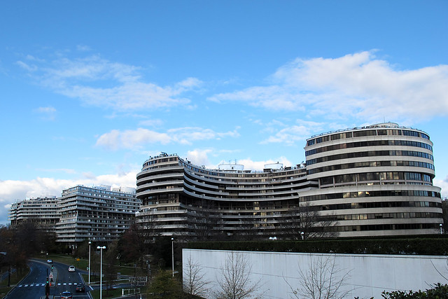
Watergate complex, Washington, D.C., USA, 1971 designed by Luigi Moretti
The 10-acre site contains an office building, three apartment buildings, and a hotel-office building. The Watergate's curved structures were designed to emulate two nearby elements. The first was the proposed Inner Loop Expressway, a curving freeway expected to be built just in front of the Watergate within the next decade. The second was the shape of the nearby Kennedy Center, then in the planning stage and whose original design was supposed to be curvilinear. Because of the curves in the structure, the Watergate complex was one of the first major construction projects in the United States in which computers played a significant role in the design work. The curving design has continued to draw praise. A noted 2006 guidebook to the city's architecture concluded that the Watergate brought a "welcome fluidity" to the city's boxy look. -- wikipedia
Some construction photos from 1964-65.

Source: archdaily.com
Club 218, Siófok, Hungary, 2008 designed by A4 studio
The planned building is stretching on the lake shore as a giant curve. This characteristic architectural gesture organizes the main bulk. As there are no secondary facades, all the apartments bear the same values and orientation. An important issue was to fit into the street view of Szent István promenade, lined with other hotels and apartments.  -- ArchDaily

Source: Radek Brunecky archdaily.com
Maison des Etudiants, Geneva, Switzerland designed by Lacroix Chessex
The facade consists of private balconies at the East and large “coursives” at the West side. It expresses a superposition of great horizontal slabs, which also play the role of filter against the sun and the noise. The height of the balustrades varies according to angle of incidence of the noise from the trains passing by. This principle also provides the building a facade that progressively lightens itself to the sky. -- ArchDaily

Source: Hantabal Architekti archdaily.com
Omnipolis, Bratislava, Slovakia, 2009 designed by Hantabal Architekti & AFR
.... a building that is expressive through its rich colors and horizontal repetition. -- ArchDaily

Source: Andrei Margulescu archdaily.com
Olympia Tower, Bucharest, Romania, 2010 designed by PZP Arhitectura
In order to confer personality to the building, the facade became the element which confers a dynamic attitude to the volume and the alignment will be the attitude to the surroundings – provoke and complete the square space. -- ArchDaily

Source: Pedro Lobo archdaily.com
Living Foz, Porto, Portugal, 2010 designed by dEMM Arquitectura
The balcony angle articulation creates spaces enriched by contrasts of light and shade, exposure and protection, emphasized by the contrast between the white cast-in-place concrete and the dark Glass Reinforced Concrete -- ArchDaily

Source: Jason Zytynsky archdaily.com
Absolute Towers, Toronto, Canadaa is designed by MAD Architects
Serving as a gateway to the city beyond, the towers’ facade contains a continuous balcony wrapping the entire building. -- ArchDaily
Video: The Story behind MAD Architects Absolute Towers -- ArchDaily

Source: chicagotribune.com
Aqua Tower, Chicago, Illinois, USA, 2009 designed by Jeanne Gang
Studio Gang Architects has earned a PETA Proggy award for using bird-deflecting elements in the Aqua Tower residential building and hotel. By including an undulating exterior and specifying the use of fritted glass—which is etched with gray marks to make it easier for birds to see—the company has created a design that will help prevent birds from flying into windows. -- Cityscape.
Another article from Architectural Record May 2010.

Source: Werner Huthmacher archdaily.com
Adidas Laces, Herzogenaurach, Germany, 2011 designed by kadawittfeldarchitektur
In contrast to conventional office typologies, the ring structure developed by kadawittfeldarchitektur lends to the building a double relationship to the landscape – both to the outer surroundings and to the communicative landscape of the atrium. -- ArchDaily

Source: Marko Dabrović archdaily.com
Lone Hotel, Rovinj, Croatia, 2011 designed by 3LHD
The hotel’s identity is recognized through the external design of the building, with a facade that is defined by dominant horizontal lines – terrace guards designed to evoke the image of slanted boat decks. The building’s floorplates contract from level to level going up, creating an elevation that is tapered at all angles. -- ArchDaily

Source: Jean-Michel Landecy archdaily.com
120 affordable appartments, Geneva, Switzerland, 2011 designed by meier + associés architectes + Burckhardt Partner
Surrounded by newly planted trees, the building has a visually pleated effect created by undulating bands of subtly coloured concrete on the walls. The balcony parapets and inset glass facade together create an ‘organic’ rhythm that emulates the foliage of the trees. -- ArchDaily

Source: Dahin Development archdaily.com
Ocean Grand Residence, New Taipei City, Taiwan, 2011 designed by Dahin Development + T. D. Lee ARCHITECT
The building’s form is derived from the water flow and dedicated to reflect the link between nature and residential construction. -- ArchDaily

Source: Iwan Baan archdaily.com
Galaxy Soho, Beijing, China, 2012 designed by Zaha Hadid Architects
Its architecture is a composition of five continuous, flowing volumes that are set apart, fused or linked by stretched bridges. These volumes adapt to each other in all directions, generating a panoramic architecture without corners or abrupt transitions that break the fluidity of its formal composition. -- ArchDaily
Another post from ArchDaily

Source: Liven Photography archdaily.com
Housing in Tres Cantos, Tres Cantos, Madrid, Spain, 2012 designed by R&AS
The horizontal lines are the tendency in the façade. This is highlighted with the black and white brick walls that predominate throughout the façade. In the north façade balconies stand out and in the south façade the extending terraces stand out. -- ArchDaily

Source: Thomas Mayer archdaily.com
Zorlu Center, Beşiktaş/Istanbul Province, Turkey, 2013 designed by Emre Arolat Architects + Tabanlıoğlu Architects
....the residential units form three identical towers, detached from the shell with “piloti” and their structural formation continues the horizontal projections of the terrace flats, without turning into symbolic elements of the complex. -- ArchDaily
SOurce: Iwan Baan archdaily.com
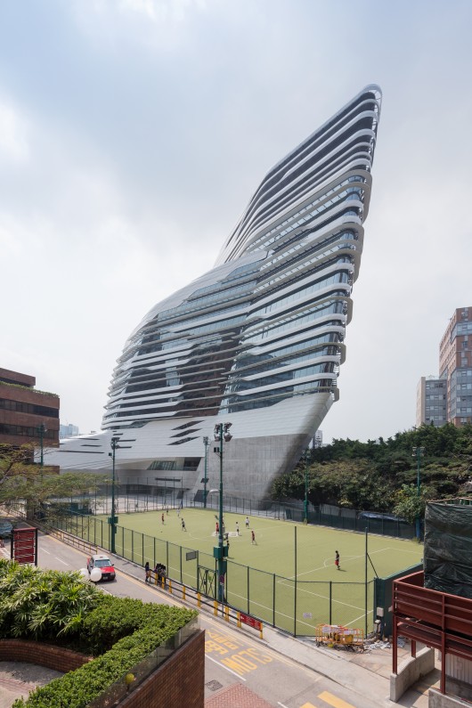
Jockey Club Innovation Tower, The Hong Kong Polytechnic University, Hung Hom, Hong Kong, 2014 designed by Zaha Hadid Architects
The JCIT creates a new urban space that enriches the diversity of university life and expresses the dynamism of an institution looking to the future. -- ArchDaily

Source: Zhao Qiang archdaily.com
Hainan Blue Bay Westin Resort Hotel, Lingshui, Hainan, China, 2014 designed by gad·Zhejiang Greenton Architectural Design
The pearly luster on the aluminum sheet of the outer wall presenting various glosses under sunlight of different time, together with the graceful horizontal line of the architecture and the transparent light glasses, has made the architecture of this size flow when observed at a distance. -- ArchDaily

Source: kpf.com
One Jackson Square, New York City, New York, USA, designed by KPF
Undulating bands of glass identify individual floors, creating a ribbon-like series of convexities and concavities along the street wall. -- architect's web site

Source: Philippe Ruault archdaily.com
Pushed Slab, Paris, France, 2014 designed by MVRDV
....a slab shaped volume  of 150 m long and 21 m wide. An opening in the volume preserves the view of a historic building. To create this urban window and to enhance the urban quality of the neighbourhood, the slab is “pushed” until it breaks, then twisted and pushed to the south. This pushing act creates a distortion of the floors, offering multiple terraces which can be directly accessed from the work areas as well as from the external staircases. The urban window offers a large terrace on the second level. The terrace and the balconies are furnished with trees planted in large pots, offering employees a friendly environment to relax. -- ArchDaily

Sunday, March 4, 2012

Fluid Forms 4

Source: archdaily.com
Mimesis Museum, Paju Book City, Republic of Korea, 2009 designed by Alvaro Siza + Castanheira & Bastai Arquitectos Associados + Jun Sung Kim
Form will be given by cast concrete, light grey, the colour of a cat. Inside, the white of the walls and ceilings, of the marble, which we hope will be from Estremoz and also the honey colour of Oak. Timber for the internal frames, and glass. As for the external windows, timber, painted steel and crystalline glass. -- ArchDaily

Source: Shu He archdaily.com
Ordos Art & City Museum, Ordos, Inner Mongolia, China, 2011 designed by MAD Architects
.... an amorphous building that seems like it has landed on the earth. The structure is wrapped in polished metal louvers to reflect and dissolve the planned surroundings. This results in a solid, windowless, building firmly anchored to the ground. This shell encloses a interior totally separate from the urban reality. -- ArchDaily

Source: John Lewis Marshall archdaily.com
Puur Pavilion, Amsterdam, The Netherlands, 2012 designed by emma Architecten
Paviljoen Puur is located on the exact site of a former soldiers shelter. The footprint of this shelter was taken as the basis for the pavilion. Around its base a wooden wall curves up to protect the site and encompass the program. The design is inspired by the undulating forms of the slopes and the surrounding landscape. Openings in the sloping wall give views of the gun bays, a terrace and the direction of the island Pampus, the next fortress of defence line. -- ArchDaily

Source: Arkispazio archdaily.com
Museum MUMAC, Milan, Italy, 2012 designed by Arkispazio
The facades of the museum are covered with strips of metal “red Cimbali”, sinuous and enveloping to resemble the waves of hot coffee, which at night filters the artificial light creating a striking illuminated reticle that evokes the energy of MuMAC. -- ArchDaily

Source: Fabien Terreaux and Amoor Maadi archdaily.com
Shining Lighthouse in Belfort, Belfort, France, 2012 designed by Archi5
The facade has a flexible movement along the landscape and recalls the dynamism of sports activities. Concave and convex folds react to straight lines. A translucent glass covers the building allowing the entrance of natural light. At night, the building becomes a bright beacon that reflects the events that take place within it. It is firmly anchored to the hillside and the glass fits perfectly into the artificial topography. In turn, the glass appear to be separated, almost floating. -- ArchDaily

Tuesday, February 7, 2012

Zig Zag

Source: Nelson Garrido archdaily.com
Zig Zag Towers, Doha, Qatar designed by MZ & Partners
The West Bay Lagoon Plaza proposes two identical towers whose structure is obtained through a rethinking of the rules, manipulating basic forms in an unconventional way to produce buildings that are functional, yet also visually striking, favoring simplicity and denying decorative gestures.  -- ArchDaily
Source: archdaily.com
Menzis office building, Groningen, the Netherlands, 2005 designed by Cie
The 12-storey building is divided into three identical prismatic segments, rotatred 90º in relation to each other. With dimensions of 43 x 43 m, the segment is characterized by functional yet aesthetic compactness. Each segment contains four storeys, intersected vertically by an atrium. As a consequence, a spiral of atria is generated, forming an internal response to the dynamic exterior. -- ArchDaily

Source: Paul McCredie archdaily.com
Telecom Central, Wellington, New Zealand, 2011 designed by Architecture +
The glazed street façades to the east and west comprise a unitized curtainwall glazing system spanning floor to floor. This is either vertical or sloping inwards or outwards by 400mm per floor, set as a series of vertical glass ribbons. The glazing, although providing significant visual and thermal performance, is highly transparent, offering a clear view of activities within the building when viewed by passersby. -- ArchDaily

Source: Fougeron Architecture archdaily.com
Flip House, San Francisco, California, USA, 2012 designed by Fougeron Architecture
Like many San Francisco homes, this one poorly integrated its many levels with each other and with its sloping topography and solar orientation. Reversing its reading, we recast the back of the house as its primary façade with a faceted, custom-built glass wall. Divided into three vertical panels that push in and out, this dynamic prism brings animating light and spectacular views to the communal living spaces, now placed at the rear. Bedrooms were flipped to the front. -- ArchDaily

Source: Scenic Architecture archdaily.com
The Green Pine Garden, Qingpu, Shanghai, China, 2010 designed by Scenic Architecture
On the “wood building”, a screen of local pine battens folds vertically on the east part of the building to give sense of privacy for the internal VIP dining rooms and create exterior cavity space for air-conditioning machine. This wood screen therefore achieves a visual effect for views between inside and outside. -- ArchDaily

Source: Jorge Taboada Morón archdaily.com
Innovation and Technical and Technological Transfer Park, Heroico Colegio Militar 4700, Nombre de Dios, 31150 Chihuahua, Chihuahua, Mexico, 2013 designed by Grupo ARKHOS
The faceted geometry of the building takes influence from ”Stealth” technology used in aviation and the aggressive lines used in sports cars. -- ArchDaily

Source: Michael Nagl archdaily.com
DC Towers I, Vienna, Austria, 2014 designed by Dominique Perrault Architecture
The towers function as two pieces of a gigantic monolith that seems to have split into two unequal halves, which then open to create an arch with undulating and shimmering façades that bring the newly created public space to life in the void created there. -- ArchDaily

Source: Broadway Malyan archdaily.com
National Heart Centre, Singapore, 2014 designed by Broadway Malyan
The patient-focused environment builds on traditional hospital design, emphasises light and features open spaces with a mixture of green courtyards, sky-gardens and landscape views to create a welcoming and calming environment conducive to patient wellbeing and the healing process. -- ArchDaily

Source: Takuji Shimmura archdaily.com
Majunga Tower, La Défense, Paris, France, 2014 designed by Jean-Paul Viguier et Associés
This complete reinvention of an office block is distinguished notably by its articulated façades composed of three vertical bands bracketed together. The 39-storey building is 195 meters high. -- ArchDaily

Source: Peter Aaron / OTTO archdaily.com
Tour Carpe Diem, La Défense, Paris, France, 2014 designed by Robert A.M. Stern Architects
The building’s faceted facades reflect this dual orientation and catch the ever changing Parisian light to give the building a strong identity among the towers of La Défense. -- ArchDaily

Friday, December 23, 2011

Fluid Forms 3

Source: Ketil Jacobsen archdaily.com
Tverrfjellhytta, Hjerkinn, Dovre Municipality, Norway, 2011 designed by Snøhetta
The building design is based on a rigid outer shell and an organic inner core.
The rectangular frame is made in raw steel resembling the iron found in the local bedrock. The simple form and use of natural materials reference local building traditions. However, advanced technologies have been utilized both in the design and the fabrication process. Using digital 3D-models to drive the milling machines, Norwegian shipbuilders in Hardangerfjord created the organic shape from 10 inch square pine timber beams. The wood was then assembled in a traditional way using only wood pegs as fasteners. The exterior wall has been treated with pine tar while the interior wood has been oiled. -- ArchDaily

Source: Nelson Garrido archdaily.com
Chapel Tree of Life, Braga, Portugal designed by Cerejeira Fontes Arquitectos
The structure of the chapel is designed by hand, developing in almost sculptural contours coated wooden blades that create moments of opening, allowing light to filter the power from inside to outside and vice versa giving greater dignity to the structural elements a result of manual labor. Banks arise from the excavation walls, as if it were a cave.  -- ArchDaily

Friday, September 23, 2011

Fluid Forms 2

Source: Edmund Sumner architecturetoday.co.uk
Boiler Suit, Guy’s & St Thomas’ Hospital, London, UK, 2007 designed by Heatherwick Studio
Boiler Suit is fabricated from high grade stainless steel frames, with braid woven through as the “warp”. The 108 tiles are geometrically identical, with 17 variants required to accommodate specific junctions. The tiles are a secondary façade system that is demountable and allows the machinery to vent through, whilst framed reveals shade the large windows on the south façade to reduce solar gain.  -- designer's web site.
Read a post from Architecture Today.

Source: cooper.edu

The Cooper Union for the Advancement of Science and Art, New York City, New York, USA, 2009 designed by Morphosis Architects
In the spirit of the institution’s dedication to free, open and accessible education, the building itself is symbolically open to the city. Visual transparencies and accessible public spaces connect the institution to the physical, social and cultural fabric of its urban context. At street level, the transparent facade invites the neighborhood to observe and to take part in the intensity of activity contained within. Many of the public functions – an exhibition gallery, board room and a two-hundred-seat auditorium – are easily accessible one level below grade. -- Morphopedia
 
Source: Archipelontwerpers archdaily.com
The Gown, The Hague, The Netherlands, 2010 designed by Archipelontwerpers
From the understanding that cities are changing continuously; we translated the once existing historical art nouveau facades into a contemporary fragment of liquid architecture.  -- ArchDaily

The Yellow Diamond, Seoul, Republic of Korea, 2010 designed by Jun Mitsui & Associates Architects + Unsangdong Architects
The exterior is angled planes of gold-yellow frit-pattern glass representing a unique gem. As the visitors approach from either direction, they encounter changing sparkle and enjoy glimpses into the retail spaces. The public passage through the building draws pedestrians inside, heightening the intrigue to explore the creative spaces within.  -- ArchDaily

Source: Stéphane Groleau archdaily.com
Ville de Lévis, Lévis, QC, Canada, 2010 designed by STGM Architectes
The other three facades– without windows due to the building’s water treatment installations were designed differently. To mitigate the visual impact of these facades on the neighborhood, the architects devised aluminum cladding that reacts to the different light modulations. The regular, steady rhythm of the panels gently undulate the facade which change the perception of the building through the day and season. The silver panels provide a textured rendition of the material as a reference to the light reflecting on the water and a reminder of the building’s purpose. -- ArchDaily

Source: archdaily.com
Zahner Factory Expansion, Kansas City, Montana, USA, 2011 designed by Crawford Architects
the form for the façade was derived from metal oxidation patterns inspired by those found on Zahner’s campus. The final graphite concept sketch drew inspiration from multiple patterns to create a form that was specific to the proportions and context of the expansion. Once the sketch was complete, a computer based algorithm converted the sketch’s tonal values into a 3-dimensional digital surface model of the façade. The resulting form grows out of the rigid, solid geometry of the existing building’s east façade with a single sweeping motion, and increases in complexity as it moves around the corner to the west, paying tribute to both Zahner’s past and future.  -- ArchDaily
Another article from ARCHITECT Magazine.

Source: Rafael Gamo archdaily.com
Kiral Apartments, Mexico City, Mexico, 2011 designed by Arqmov Workshop
Kinetics and Op Art inspired the project, transmitting an optic illusion of movement that requires and captures an active attention from the viewer. Mexican society experiences a continuous and uncontrolled motion; therefore the building responds to this phenomenon and reflects the reverberation of the city. -- ArchDaily

Source: Henning Köpke Fotografie archdaily.com
Interims Audimax, Technical University Munich, Germany, 2011 designed by Deubzer Konig & Rimmel Architekten
The facade consists of rough cut spruce planks. To counter the varying exposure to the weather and given the short time of service, the decision was made to coat the facade in black wood stain, so that the aging process is not visible. By offsetting the facade’s substructure by one module the image of an undulating surface is created, which is shaped by the light. -- ArchDaily

Source: Luc Boegly archdaily.com
Cräche rue Pierre Budin, Paris, France, 2012 designed by ECDM
The building is in prefabricated concrete, long-lasting and resistant to the torments of the urban life. The surrounding wall is drilled by translucent and colored windows. These windows have various heights, for a place thought as much for the children than for the adults, the parents or the staff. -- ArchDaily

Friday, August 26, 2011

Fluid Forms

Source: sepientia.com
The Melting Building Mural is a spectacular Mural created at Georges V Ave. in Paris France. This illusion involves three dimensional imagery instead of the standard two dimensional murals. The French name for this is Trompe-l’oeil Meaning trick of the eye. Via Sepientia.  What if the real buildings were melting, here are some examples:

Source: seidler.net.au
North Apartments, Sydney, Australia, 2004 designed by Harry Seidler & Associates
Every one of the 49 apartments has a wave-shaped balcony, so as to accommodate outdoor furniture, at its widened part. The balconies are arranged in a vertically staggered pattern so as to maximise the spatial feeling. -- architect's web site

Source: archdaily.net
The DE BEERS Ginza Building in Tokyo, Japan designed by Jun Mitsui & Associates was completed in 2008.
The DE BEERS Ginza Building design is intended to reflect the sophisticated Ginza streetscape and fit appropriately into this dynamic context. ... The expression of the curtain wall varies continuously as it ascends and as it reflects the ever-changing appearance of the sky. The exterior surface of the building reflects the sunlight and Ginza city lights in a subtle way and the impression of the façade as time passes. On the exterior of the building, specially-finished stainless steel pipes are horizontally laid-out creating sparkles of light throughout the surface of the building. -- ArchDaily.

Source: chicagotribune.com
Aqua Tower in Chicago designed by Jeanne Gang completed in 2009. 
Studio Gang Architects has earned a PETA Proggy award for using bird-deflecting elements in the Aqua Tower residential building and hotel. By including an undulating exterior and specifying the use of fritted glass—which is etched with gray marks to make it easier for birds to see—the company has created a design that will help prevent birds from flying into windows. -- Cityscape.
Another article from Architectural Record May 2010.

Source: archdaily.com
Living Foz, Porto, Portugal, 2010 designed by dEMM Arquitectura
The balcony angle articulation creates spaces enriched by contrasts of light and shade, exposure and protection, emphasized by the contrast between the white cast-in-place concrete and the dark Glass Reinforced Concrete. The geometric and material principle of the facades continues trough the external areas, creating landscaped spaces for playing, strolling and relaxing.  -- ArchDaily

Source: chicagotribune.com
Frank Gehry's new 8 Spruce Street apartment tower in Manhattan.
The 76-story high-rise, Gehry's first skyscraper, is wrapped in a sensuous exterior of stainless steel that ripples like folds of drapery and brilliantly catches the light. -- Cityscape blog by Blair Kamin of Chicago Tribune.
Source: Jason Zytynsky archdaily.com
Absolute Towers, Mississauga, Canada, 2011 designed by MAD Architects
The textured band-like facade is created by a continuous balcony that wraps the entire building . The building is also shifted off its core by varying degrees to provide views of the surrounding scenery, keeping city dwellers attune to the natural environment. -- ArchDaily
An update of the project from ArchDaily

Source: contemporist.com
GT Tower East, Seoul, South Korea, 2011 designed by ArchitectenConsort
The form and positioning of the 130-metre-high building are the impressive result of the vision of architects Peter Couwenbergh and Edgar Bosman of ArchitectenConsort. They chose a uniform, glass finish for the facade, which has resulted in an organically pure form. The undulating motion of the facades provides an optically changing primary form when passing the building. -- Contemporist

Source: 24H architecture
Hatert Housing, Nijmegen, The Netherlands, 2011 designed by 24H architecture
a sturdy tower with free formed balconies around, which make a recognizable sculpture from all directions; the new ‘crown’ of Hatert.  -- ArchDaily

Source: Archdaily.com
208 West 96th Street Residences, New York City, New York, USA, 2011 designed by Arctangent Architecture + Design
The main architectural characteristic of this building is an undulating powder-coated laser-cut steel ‘veil’ that becomes both the balcony railings as well as a playful design element for the framing of city views from within the dwellings. This layered ‘veil’ with its gradated perforations constantly plays with light, views, reflections, and the materialization / dematerialization of mass making it a provocative and dynamic addition to the complex urban fabric of New York City. -- ArchDaily