Showing posts with label Skin. Show all posts

Tuesday, January 6, 2015

Skin of Architecture: Undulating Fins

Source: John Gollings archdaily.com
Surgeon’s Rooms, Melbourne VIC, Australia, 2014 designed by FMD Architects 
....to emphasise the parallels between the disciplines in the built form. The layered façade references the tools, prosthetics and the human frame. The design creates interplay between the 2 dimensional and 3 dimensional qualities of the X-ray, another essential analytical tool of the surgeon. The façade emphasises the thinness of an X-ray sheet, while developing a depth through layering film, steel and recycled plastic forms. As it is backlit by the interior, the façade mimics the visual qualities of the X-ray on a lightbox. -- ArchDaily

Friday, October 17, 2014

Skin of Architecture: Pattern 13

Source: Daici Ano archdaily.com
Louis Vuitton Matsuya Ginza Facade Renewal, Ginza, Chuo, Tokyo, Japan, 2013 designed by Jun Aoki & Associates
Gentle bulges and dents elaborate the façade of opal beige reliefs. With these pattern, the façade reveals various appearances in sunlight, and also during the night, the LED lights behind the reliefs lit the façade to render another expression reminiscent of Louis Vuitton’s monogram. -- ArchDaily

Wednesday, August 13, 2014

Skin of Architecture: Map

Source: Andrés Valbuena archdaily.com
Click Clack Hotel, Bogotá, Bogota, Colombia, 2012 designed by Plan B Arquitectos
This hotel is an attempt to open or permeate the norm: it is slim and has four open facades due to side setbacks; the larger facades are set back to allow a double skin of metal and glass, and the main facade articulates urban life and cantilevers the 1.5 m allowed by the building code. -- ArchDaily

Source: Harry Cock archdaily.com
Train Station and City Hall complex, Delft, The Netherlands, 2014 designed by Mecanoo
Within the new station hall an undulating ‘vault’, which has been designed to evoke an “unforgettable arrival experience”, features a scaled 1877 map of the Dutch city rendered in blue and white. -- ArchDaily

Friday, June 20, 2014

Skin of Architecture: Grids

Source: Guillermo Hevia García archdaily.com
Casa del Fascio, Como, Italy, 1936 designed by Giuseppe Terragni
Planned within a perfect square and half as high as its 110 foot width, the half cube of the Casa del Fascio established the pinnacle of strict rational geometry. Looking like a giant Rubik’s Cube, the building is a serious game of architectural logic. Each of the building’s four facades is different, hinting at the internal layout and rhythmically balancing the open and closed spaces.  On every side except the south-east elevation which articulates the main stair, the windows and the external layers of the building are employed in such a way to express the internal atrium. -- ArchDaily

Source: wikipedia.org
Council House, Perth, Western Australia, 1963 designed by Howlett and Bailey Architects
Built in a modernist style, the building has been the subject of vigorous public debate about its heritage value. Some parties, such as the Royal Australian Institute of Architects, consider the building to be an important example of modernist architecture in the city, whilst others consider it ugly. These conflicting views led to animosity in the 1990s, when the State Government refused to heritage list the property, and instead recommended its demolition. Despite this, the City of Perth opted to renovate the tower and keep it as its headquarters. Following this, the building was admitted to the State's Heritage Register. -- wikipedia

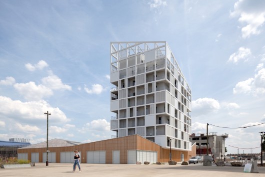
Source: Walter Mair archdaily.com
Student Apartments in Luzern, Steinhofstrasse, Lucerne, Switzerland, 2013 designed by Durisch + Nolli Architetti
The vertical and horizontal development of the modular building, allows an adaptation to the topography and the adjustment of the building volume to the program; also allows a limitation of the height of the building in relation to the residential neighborhood. The new building is built in a modular complex form. -- ArchDaily

Source: Jérôme Beg archdaily.com
Internat Montceau Les Mines, Montceau-les-Mines, France, 2013 designed by X’TO Architectes
On the south & west front, balconies induced by the structural grid ensure solar & rain protection for the façade: wood timber frame & square wooden sections. -- ArchDaily

Source: Paul Ott archdaily.com
Office Off, Burgenland, Austria, 2013 designed by heri&salli
From the material point of view a compressed climate envelope was integrated in a spatial grid structure, departing from the boundaries of the property as a plane piece of land. -- ArchDaily

Source: Jörg Hempel Photodesign archdaily.com
Blue Office Bochum, 44801 Bochum, Germany, 2013 designed by SSP SchürmannSpannel
The unique location with a beautiful view over the Ölbachtal provides an excellent combination of indoor and outdoor spaces through room high glazing and a spacious terrace. Maximum energy efficiency according to the Passivhaus-Standard is generated by the building through an optimal ratio of building surface to volume and a highly insulated facade. -- ArchDaily

Source: Rafael Gamo archdaily.com
NT24, Tlaltenango, Cuernavaca, Morelos, Mexico, 2013 designed by Aflo Arquitectos
The apartments are arranged so as to have the greatest amount of natural lighting and ventilation, to optimize power savings. -- ArchDaily

Source: Alexandre Wasilewski archdaily.com
30 Social Housing Units, Nantes, France, 2014 designed by Antonini + Darmon Architectes
The community building is a slender volume rising towards the sky where it culminates in a point, a steady prow, proving to be simple but strong. Echoing the urban thread, the facade receives a skin like surface, an almost living moucharaby or lattice work, alternating between solid, void and the movement of the shutters as they are opened and closed. -- ArchDaily

Friday, June 6, 2014

Skin of Architecture: Cuts 3

Source: Cerejeira Fontes Arquitectos archdaily.com
Spinpark, Guimarães, Portugal, 2008 designed by Cerejeira Fontes Arquitectos
The building was designed in order to exploit the use of natural light in all its spaces, mostly reflected or indirect, enhancing energy savings and visual confort. The exterior concrete envelope provides shade in the summer avoiding overheating in the interior spaces. -- ArchDaily

Source: Agence Rudy Ricciotti archdaily.com
Jean Cocteau Museum, Menton, France, 2011 designed by Rudy Ricciotti
....looks terrific in close-up detail shots and aerial night views, where writhing fingers of finely molded concrete extend around it like “octupus tentacles,” “flowing hair,” or “chandeliers,” in the words of the architect, who drew these images from Cocteau's dreamy 1946 film La Belle et la bête. Seen firsthand, however, the building is rather one-dimensional. The architect concentrated all his attention on those fascinating concrete tentacles, but they do little to relate the building to the town. -- Architectural Record
Read a post from ArchDaily

Source: Ralph Kämena archdaily.com
Spordtgebouw, Dordrecht, The Netherlands, 2011 designed by NL Architects
By applying a function to the elevation the obligatory ‘sports hall look’ could be avoided. The expressive character is created by ‘slicing’ a standard climbing hall; the interior is exposed and becomes Logo! -- ArchDaily

Tuesday, December 31, 2013

Skin of Architecture: Pattern 12

Source: Thomas Fischer archdaily.com
Institute buildings University Kassel, Kassel, Germany, 2010 designed by ATELIER 30
....the busy public spaces such as the foyer and main entry zones are highlighted by a glass facade opening up the buildings interior towards the campus and the historic structures of the former industrial complex “Henschel- Anlage”. This stands in stark contrast to the Jura-stone facade with its precisely inset window strips. -- ArchDaily

Source: Arthur Meerloo archdaily.com
BioPartner, Wassenaarseweg, Leiden, The Netherlands, 2012 designed by JHK Architecten
The similar design and alignment of the two buildings creates a powerful ensemble, which is further accentuated by the consistent use of materials, clear horizontal segmentation and high-quality detailing. The omni-directional design of the buildings ensures that there are no rear or side elevations and every façade is presented as frontage.   -- ArchDaily

Source: Metropolis archdaily.com
Building Omega, Santiago de Surco, Peru, 2013 designed by Metropolis
Other facades were cover with aluminum panels and a broken weft of windows so a visual tension could be generated in the whole complex. -- ArchDaily

Source: Mathieu Ducros archdaily.com
Academy Of Art Crafts (ESMA), 50 Route de Narbonne, 31320 Auzeville-Tolosane, France, 2013 designed by LCR Architectes
The school, overlaid with two levels of parking (55 spaces reserved for school and 60 for the residence), offers facades that affirm their identity on different orientations. -- ArchDaily

Friday, December 20, 2013

Skin of Architecture: Punched Holes 7

Simmons Hall at MIT, Cambridge, completed in 2002, has a cast-concrete exoskeleton clad in sanded aluminum. Read the description from architect's web site.

Source: trendir.com
Cell Brick House, Tokyo, Japan designed by Atelier Tekuto
three-storey home featuring a unique facade of alternating steel blocks and glass. While the connection between architecture and nature may not be immediately apparent, this amazing home’s checker-board exterior lets light permeate interiors, like sunlight beaming through foliage. On the inside, these steel boxes become built-in storage shelves. -- TrenDir

Source: archdaily.com
KMAR – Koninklijke Marechaussee, Amsterdam, The Netherlands designed by Wansleben Architekten
The building’s outer facade stands out by dint of a seeming sobriety indicative of a defensive nature. You initially feel you’re facing a massive, dark complex – square, plenty of windows that nevertheless look small in their deep recesses, and with a facade texture like that of a woven carpet, partly due to the windows.  -- ArchDaily

Source: Vulkers Fotografie archdaily.com
ROC Mondriaan Laak II, Den Haag, The Netherlands, 2011 designed by LIAG
The building forms a powerful and colourful (a la Mondriaan) completion of the Leeghwaterplein. Seen from the train, it serves as a calling card for ROC Mondriaan. The building has a grid shaped concrete façade decorated in the ROC colours. The effect in combination with the windows results in a strong whole.  -- ArchDaily

Source: Giovanna Silva archdaily.com
Office Building, Vado Ligure, Savona, Italy, 2011 designed by Carlo Bagliani + Antonio Norero
....a chess textile because of the industrial landscape around the parcel, thinking to some building painted in black and white chess in order to be viewed by the air traffic. -- ArchDaily

Source: Mika Huisman archdaily.com
Helsinki University Main Library, Kaisaniemenkatu, Helsinki, Finland, 2012 designed by Anttinen Oiva Architects
The architectural starting point – the cityscape considered – was a vision of a unique public building that will suit its surroundings in terms of its materials, design and height.  The dense fenestration grid, which blurs the standard floor division, together with the large arched openings give the library a distinct external appearance. By varying the size of the arched openings the building is fitted as an integrative solution within a situation of three different types of street space. -- ArchDaily

Thursday, December 19, 2013

Skin of Architecture: Text

Source: José Oller archdaily.com
Mary Immaculate Parish Hall, Santa Cruz of Tenerife, Spain designed by Equipo Olivares Arquitecto
The very nature of a building intended for worship, raised the need to get spaces for contemplation and meditation. For this, the Parish Hall turns to the interior gardens, isolated from the outside by cyclopean concrete walls and reinforced concrete. The closings are understood as light screens. -- ArchDaily

Source: Ernesta Caviola archdaily.com
Villa Sottanis Library and Gamesroom, Via Annuti, 36, 16030 Casarza Ligure Genoa, Italy, 2008 designed by 5+1AA Alfonso Femia Gianluca Peluffo
A number of verses written by Gianni Rodari, who was and still is the greatest fairy tale writer of the 20th century, have been chosen to represent the new centre. The cultural and playful nature of the project can be interpreted through his works that the building explicitly pays tribute to. -- ArchDaily

Source: Pietro Savorelli archdaily.com
Curno Public Library and Auditorium, Via IV Novembre, 24128 Bergamo BG, Italy, 2009 designed by Archea Associati
Through various laboratory tests and various samples, they opted for a colored concrete with a “mix-design” integrated with natural iron oxide pigments and with the addition of lubricants to make the concrete workable according to particular conformations of the molds.
The realization of the letters on the surface of the walls was made possible by the positioning of plastic matrices onto those surfaces. -- ArchDaily

Fougères Biblioteque, Fougères, France, 2009 designed by Tétrarc Architects
The Fougères Biblioteque follows the contemporary approach to libraries as meeting spaces, rather than just book storage. Due to the public function of the building,it expresses itself to the city trough the facade details -- ArchDaily

Source: Element Arkitekter AS archdaily.com
The Teachers House, Osterhaus gate 4, Oslo, Norway designed by Element Arkitekter AS
Two layers of glass and the screen print (silketrykk in Norwegian) on the outside of the inner glass. In the competition we put art on the façade in order to symbolize the important role of Union of Education Norway concerning teaching and education. The art also functions as sunscreen. -- ArchDaily

Source: FG+SG archdaily.com
Corten Apartments, Venice, Italy, 2012 designed by 3ndy Studio
The facade designed by 3ndy Studio reproduce the dimension of the destroy one, but however suggests the spot of time on the plaster. In order to complete the facade and make it an exclusive one. 3ndy Studio under suggestion of Philippe Daverio, asked Giorgio Milani, a sculptor from Piacenza, to take part in this big artistic operation. Milani wrote on this page, enriching by using fullness and emptiness due to the words of the alphabet carved from the panels of corten steel. From here has been born “ Footfalls echo in the memory”, a work of lettering, which means composing letters and symbols carefully chosen by the artist, Giorgio Milani, according to their nineteenth-century origin (the age in which this building as been built) and their aesthetics dress, balancing 22 different alphabets, upper-case and lower-case letters, of different fonts in order to have an aesthetic and cultural harmony. -- ArchDaily

Source: Studio Erick Saillet archdaily.com
La Passerelle, La Saône, France, 2013 designed by Pierre Vurpas et Associés Architectes
A stone pebble cut like a diamond, a mineral forecourt that reaches out to draw in passers-by, a glass facade like an ever-changing skyscape, gilded like copper, words from the old French dictionary engraved into the glass panels, illuminated by curtains of woven metal: La Passerelle, a new cultural space for Trévoux, slots into the gap next to the hospital like a missing piece of the puzzle creating a perfect blend of history and contemporary architecture. -- ArchDaily

Wednesday, December 18, 2013

Striated 3

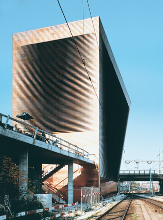
Source: Herzog & de Meuron
Central Signal Box, Basel, Switzerland, 1999 designed by Herzog & de Meuron
The ground plan evolves from bottom to top into a rectangle. The copper strips cover the steps in the façade so that it becomes difficult to read the building‘s geometrical shape. It evokes something more organic and vulnerable, like a head or a brain, rather than a piece of technical equipment.  -- architect's web site
Read a post from ArchDaily 

Source: Leonardo Finotti archdaily.com
CREA-PB Headquarters, Campina Grande, Paraíba, Brazil, 2012 designed by MAPA
The precast concrete permeable “skin” does not resemble the usual glazed institutional buildings, impervious and impermeable. Instead its transparency and lightness give the whole building qualities recommended for the modern state institutions. -- ArchDaily

Source: Tom Arban archdaily.com
St. James Cathedral Centre, Toronto, Ontario, Canada, 2012 designed by architectsAlliance
The addition is sheathed in a screen of horizontal glass ribs carried on a stainless steel supporting structure. The structural steel columns that support the new building are set back from the glass wall, allowing them to be read as a design element. -- ArchDaily

Source: Marcel Van Coile archdaily.com
Technology Building in Leuven, Herestraat 49, 3000 Leuven, Belgium, 2013 designed by de Jong Gortemaker Algra
From the first floor upwards, perimeter walls are closed with externally insulated precast concrete components. The thermally insulated panels are finished with black acrylic lining. In front of those, an aluminium subframe supports 600 millimetre deep fibre cement vanes. The secondary façade serves as an additional layer of thermal protection and a shield from rainwater and sunlight. -- ArchDaily

Source: Thomas Jantscher archdaily.com
DEY House, Les Masses, Hérémence, Switzerland, 2013 designed by Cagna + Wenger Architectes
The Mélèze facade is reminiscent of carefully stacked timber beams of an age gone by. The precise design of openings is emphasized by the play of light and shadow across the different surfaces of the wood. Horizontal and vertical beams work in unison to shape and lock the frame. Where the frame ends, light simply takes its place. -- ArchDaily

Source: Kengo Kuma & Associates archdaily.com
Shun Shoku Lounge, Osaka, Osaka Prefecture, Japan, 2013 designed by Kengo Kuma & Associates
We piled up pieces of wooden panels to build the interior like topography. Various kinds of food-related items are laid out on this wooden ground. We expected that the chemistry would be just right for eating and the wooden stratum. -- ArchDaily

Source: Kaare Viemose archdaily.com
Dalarna Media Library, Högskolan Dalarna Akademin Språk & medier, Campus Falun, Högskolegatan 2, 791 31 Falun, Sweden, 2014 designed by ADEPT
The characteristic double facade with reflecting horizontal lamellae fronting a wood cladding is developed in collaboration with Danish artist Jeppe Hein. Instead of creating an isolated piece of art work Jeppe Hein and Adept has developed the competition design for the façade into a detailed and refined expression with an immateriality that mirrors its surroundings and the people in it with broken reflections. The lamellaes are made from highly polished stainless steel while their wooden background is a Siberian larch. -- ArchDaily

Source: Bartosz Makowski archdaily.com
Lublin City Stadium, Krochmalna, Lublin, Poland, 2014 designed by Estudio Lamela
Designed facade makes the building illuminated block which is a distinctive landmark. The elevation was designed in the form of longitudinal strips of metal panels (with a relatively large perforations) girding the building. -- ArchDaily

Wednesday, November 27, 2013

Glass fins

Source: betterbricks.com
Upper Secondary School, Copenhagen, Denmark, 2007 designed by 3xn Arkitekter
The operable exterior shading devices--colored glass fins with graphic lettering--create this building's signature facade and provide dynamic shading to balance daylighting with solar heat gain. Behind the glass fins, operable windows provide natural ventilation. -- betterbricks.com

Source: Agence d’architecture Boyer archdaily.com
La Colle sur Loup, La Colle-sur-Loup, France designed by Agence d’architecture Boyer-Percheron-Assus et Associé
....the south facade shows a double facade: a succession of colourful “brise-soleil” which orient themselves according to the sun and the moment of the day. -- ArchDaily

Source: Keith Collie and Tim Crocker archdaily.com
Biochemistry Center, Oxford, UK designed by Hawkins Brown
Laminated colored glass fins were fixed to the mullions of the curtain wall system.  The fins provide a sense of privacy for those working in the labs and their varying color palette was selected to “pick up on the surrounding context.” -- ArchDaily

Source: Brad Feinkopf archdaily.com
South Campus Chiller Plant, College of Pharmacy, The Ohio State University, Columbus, Ohio, USA, 2013 designed by Ross Barney Architects
The materials for the new chiller plant will be concrete precast panels with a high sheen polish finish. Large glazed openings are located to help identify the function of the building by framing views of the chiller equipment. Since there are no visible moving parts, dichoric glass fins located in the joints of the precast panels, will convey a sense of motion as the colors change from the movement of the sun. -- ArchDaily

Source: Hisao Suzuki archdaily.com
Comisaría Provincial De Albacete, Albacete, Spain designed by Matos-Castillo Arquitectos
....a glass wall oriented northwest (offices) and a double skin of glass and vertical louvers oriented southeast (communications). The colour of the glass louvers has no specific references and helps to eliminate old stereotypes. -- ArchDaily

Source: Piotr Krajewski archdaily.com
Marshal’s HQ, aleja Niepodległości, Poznań, Poland, 2015 designed by / WAPA Warsztat Architektury
The exterior part outlines the cavity around the whole building, which makes it float above the heavy base and provides an outdoor terrace underneath the upper floors. The interior part is meant to be an extension of the open space around the core of the building and was designed as a transparent, multifunctional and flexible space for various purposes. -- ArchDaily

Monday, November 25, 2013

Inspired by Nature

Source: Herzog & de Meuron
Ricola-Europe SA, Production and Storage Building, Mulhouse-Brunstatt, France, 1998 designed by Herzog & de Meuron
Both long walls are light walls providing the work area with constant, pleasantly filtered daylight. Light filtering occurs through printed translucent polycarbonate façade panels, a common industrial building material. Using silkscreen, these panels are printed with a repetitive plant motif based on photograph’s by Karl Blossfeldt.  -- architect's web site

Source: Christian Richters archdaily.com
Gingko Project, Beekbergen, The Netherlands, 2007 designed by Casanova + Hernandez Architects
The glazed facade has been specially designed with a print of ginkgo tree leaves of different green and yellow tones that react to the constant changing light of the sky creating very special effects, reflections, shadows and silhouettes, depending on the time of the day and the season of the year. -- ArchDaily

Source: ABSCIS Architecten archdaily.com
Service Station Herverlee, Heverlee, Belgium, 2008 designed by ABSCIS Architecten
The principle building is constructed using a ‘superstructure’ consisting of a canopy and a roof. The roof is carried by columns made from white concrete. These columns are positioned in a crisscross formation. Infill modules created in glass, with a negative imprint of leafy trees, slide underneath the super structure to emphasise the transparency of the structure set against the white surroundings. -- ArchDaily

Source: archdaily.com
Tattoo House, Victoria, Australia designed by Andrew Maynard Architects
The tattoo was conceived as a continuation of the tree graphic around the simple white box- to soften the impact of this modern addition to a resolutely 19th-century neighbourhood. Furthermore the design was a neighbourly gesture. The household to the west has a manicured garden which is very important to the resident. A stencil of vegetation was created in-house and applied by the AMA team in a covet operation to give the neighbour an additional, though less than manicured, layer of garden. -- ArchDaily

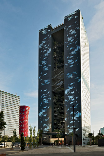
Source: archrecord.construction.com
Renaissance Barcelona Fira Hotel, Barcelona, Spain, 2012 designed by Ateliers Jean Nouvel
On the figurative side, Nouvel carries the oasis concept into a branding theme for the facades. Inside every guest room, he cuts a window out of the structural precast-concrete wall in the shape of the jagged crown of a palm tree. Outside, these openings are visible behind a continuous curtain wall of milk-white glass, silkscreened with palms at different scales, that blurs the reading of floor lines. -- Architectural Record

Source: Dennis Gilbert archdaily.com
Walsall Housing Group HQ, Walsall, West Midlands, UK, 2011 designed by Bisset Adams
The building has been welcomed as a new landmark with its memorable high performance glazed façade with abstract tree graphic, making reference to the town’s historic arboretum. -- ArchDaily

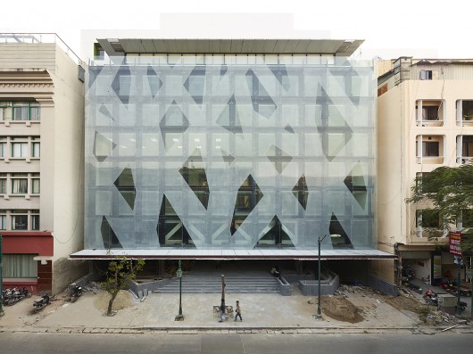
Source: Régis Golay archdaily.com
Coalimex, Hanoi, Hoàn Kiếm District, Hanoi, Vietnam, 2013 designed by group8asia
The main façade, which is directly in contact with the street, gives its strong identity to the Coalimex building and deals with its constraints. It is made of double-layered glass. On the second layer, a pattern that interprets the meeting of the trees of the Hanoi streets and the coal (symbol of the client) is printed on the glass. -- ArchDaily

Source: Mikkel Frost archdaily.com
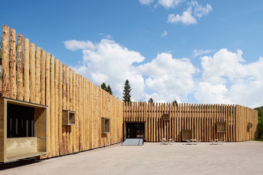
RebildPorten, Rebild, Denmark designed by CEBRA
The structure is designed as a hymn to Nature and the hills and forest, next to which it is situated. It is created in the encounter of building and nature and appears as a sculptural structure made of bluff timber, thus making the building accessible to the eye of the observer – very similar to a forest’s opening and closing when one moves through it, looking upwards through the branches’ chaotic network of crossing lines. By shaping the building out of raw cut timber, the visitor not only experiences a ‘walk in the forest’, and a particular atmosphere determined by Nature’s own strength and rustic weight, but also the scent of wood and nature, which sets the mood for the visit to the forest and hills. -- ArchDaily

Source: FG+SG archdaily.com
International Accommodation Center For The Oceanological Observatory, Aquarium de Banyuls sur Mer, Avenue du Fontaulé, 66650 Banyuls-sur-Mer, France, 2013 designed by Atelier Fernandez & Serres
The project, a rectangular monolith entirely coated in a gown of pink-ocher coral, faces the marina. It also marks the limits of the shore and the city. Behind this undulating envelope, access to the bedrooms is provided by large peripheral walkways that also serve as balconies for the accommodations. These walkways are covered with a self-consolidating concrete mesh inspired by a graphic, light and see-through coral design (Gorgones). We developed the facades using a limited amount of distinct shapes, also called strands, that were casted on site. These strands were then assembled in modules according to a simple mathematical algorithm which creates a vibration in the shadows and the matter. -- ArchDaily

Source: Bornstein Lyckefors archdaily.com
Torsby Finnskog Center, Torsby, Sweden, 2014 designed by Bornstein
The architects chose to work with raw materials from the forest in the facade. To achieve that, the old school building was smutted black and covered with a veil of standing timber. The facade has openings for entry and extra sunlight intake. Protruding wooden boxes also provides space for benches, signage and artwork. -- ArchDaily