Showing posts with label Curved-Form. Show all posts

Wednesday, October 2, 2013

Curved Form 8

SOurce: Young Chae Park archdaily.com
National Library of Sejong City, Sejong City, South Korea, 2013 designed by Samoo Architects &Engineers
....with the motif of a book page being turned over, a simple geometry of a gently curved paper forms the basis of the design and creates a unique outline that is easily recognizable as one of the landmark buildings of the city. -- ArchDaily

Monday, May 20, 2013

Curved Forms 7

Source: Richard Meier & Partners
Plan, Source: richardmeier.com
Jubilee Church, Rome, Italy, 2003 designed by Richard Meier & Partners
These three walls vary in height and are, in fact, segments of a sphere. Each shell is built of pre-cast  concrete segments, post-tensioned in situ; by virtue of the curvature in plan, each is independently supported. -- architect's web site
Read a post from ArchDaily

Source: Enforma Studio archdaily.com
Plan, Source: archdaily.com
Vila Stoliv, Stoliv, Montenegro, 2010 designed by Enforma Studio
....in formal expression of “seashell”, which is “opening” to the “views”, creating unique space, both in interior and exterior. Unique design approach is implemented in two aspects. First, radial stone walls are creating three primary parts, which are fuctionaly and structuraly parts of house and ,second, into a big glass surfaces of house which “bring” enviroment in interior, creating subtle mix of inner and outer space. -- ArchDaily

Monday, April 29, 2013

Curved Forms 6

Source: kpf.com
International Commerce Centre, Hong Kong, China, 2010 designed by KPF
The tower’s subtly tapered re-entrant corners and the gently sloped curves at its base are designed to optimize its structural performance. These curves splay out at the base of the tower, rooting the tower in its surroundings, while creating sheltering canopies on three sides, and a dramatic atrium on the north side. -- architect's web site
Read a post from ArchDaily

Source: Hufton + Crow archdaily.com
CMA CGM Headquarters, Marseille, France, 2013 designed by Zaha Hadid Architects
However, although the tower’s vertical form may steal the spotlight, special attention was also placed upon the ground life of the tower. Situated on a busy site, surrounded by an elevated motorway viaduct and on top of a convergence of public transport facilities, the tower’s lower portion extends its horizontality in order to “relate to the extreme horizontal energy of pedestrian, automobile, tram and shipping movements at ground level. -- ArchDaily

Source: Miró Rivera Architects archdaily.com
Circuit of The Americas, Austin, Taxes, USA, 2013 designed by Miró Rivera Architects
The architects bring their innovative approach to the structural systems: rather than being concealed behind a building’s façade they are articulated and become significant parts of the design. An architectural theme reoccurring throughout the site is the use of red steel tubes. The tubes cascade down the side of the Observation Tower to form a canopy for the Amphitheater stage and also frame the Main Grandstand. Evocative of sports cars and movement, this element ties the structures together creating a consistent visual experience. -- ArchDaily

Tuesday, October 9, 2012

Organic Forms

Source: eikongraphia.com
Friedrichstrasse, Berlin, Germany, 1919 designed by Mies van der Rohe

Source: eikongraphia.com
Maquette Glass Skyscraper, Berlin, Germany, 1922 designed by Mies van der Rohe
The randomly curved glass-façade of the 1922-project is not the result of an internal, autonomous form. The glass surface has its own logic and is dependent on- and connected with the city-life through the properties of the glass. But the design is also not a direct effect of its situation; it is a critical interpretation of it. The glass curtain wall – alternating transparent, reflecting, and refracting depending on the sun and the point of view – reflects and deforms the image of the city, and places the building in a specified time and place. -- Eikongraphia

Source: wikipedia.org
Lake Point Tower, Chicago, Illinois, USA, 1968 designed by John Heinrich and George Schipporeit
Lake Point Tower was inspired by Mies van der Rohe’s 1922 design for a glass-curtained skyscraper in Berlin. Schipporeit and Heinrich took van der Rohe's unbuilt office building concept and converted it to a residential building. Lake Point Tower is much taller than van der Rohe’s original project, more regular in form, and its exterior glass curtain wall is tinted; however, the building owes much of its innovative design to the van der Rohe original - and because of the design's origins, many in Chicago still consider Lake Point Tower to be a Mies van der Rohe building, albeit executed by two of his protégés. -- Wikipedia

Source: Helder Sousa archdaily.com
Plan/Section, Source: archdaily.com
Water Tank, Travessa da Aldeia Nova, 8650 Budens, Portugal, 2000 designed by Pedro Bandeira + João Figueira e Associados
It recalls the chimney of Le Corbusier’s Unité d’Habitation, but it now stands on the ground, suggesting that the entire building has been buried. This is a metaphor that demonstrates a significant movement away from the more radical theories of the Modern Movement and towards the process of participation involved in the construction of the new village. -- ArchDaily

Source: Nelson Garrido archdaily.com
O-14, Dubai, United Arab Emirates, 2010 designed by Reiser + Umemoto
.... the office tower typology has been turned inside out – structure and skin have flipped to offer a new economy of tectonics and of space. -- ArchDaily
Read an article from Architectural Record, August 2011
Read about a book on this project from A Weekly Dose of Architecture

Source: Koichi Torimura archdaily.com
Higashifuchuu Apartments, Fuchuu-shi, Tokyo, Japan, 2010 designed by Mejiro Studio
It is nine apartment complexes in the suburbs. We try to find its independent appearance in such vague scenery peculiar to the suburbs. The building is planned at an angle of 45 degrees to surrounding and the surface of the building is uneven. -- ArchDaily

Source: Kim Zwarts archdaily.com
 
Plan, Source: archdaily.com
Instituut Verbeeten, Breda, The Netherlands, 2010 designed by Wiegerinck
The shell around the building creates various patios in the waiting and treatment rooms. It forms a filter between the outside world and the building, creating a feeling of openness and privacy. -- ArchDaily

Source: Jussi Tiainen archdaily.com
Plan, Source: archdaily.com
Villa Musu, Finland, 2010 designed by Sanaksenaho Architects 
Villa Musu is located on a beautiful lake shore lot with a pine tree forest surrounding the house. The design is shaped into a soft, organic plan that naturally flows into the landscape. -- ArchDaily

Source: Iwan Baan archdaily.com
Cerro del Obispo Lookout Point, Cerro del Obispo, San Luis Potosí, Mexico, 2012 designed by Christ & Gantenbein
The column on the peak of the Cerro del Obispo, a mountain with almost 2,000 metres height, protrudes like a huge bone out of the woody landscape above the valley of Ameca. A detached, organically shaped monolithic concrete wall composes the tower of 26.55 metres that can be acceded from one side through a small entrance. Inside a unique view into the sky awaits the visitor – and the sunlight, that comes in through the opening, reflected from the light concrete walls, gathering on the floor. -- ArchDaily

Tuesday, March 6, 2012

Curved Forms 5

Source: Jong Soo (Peter) Lee @ Flickr 
Sydney Opera House, Sydney, Australia, 1973 designed by Jørn Utzon
a solution that consisted of a ribbed system of precast concrete shells created from sections of a sphere. This system permitted each rib to be built up of a number of standard segments cast in a common mold at the site. Utzon wanted the shells to be portrayed like large while sails in contrast to the deep blue waters of the ocean it stood upon. In order to achieve this aesthetic the shells are covered with 1,056,066 ceramic tiles made in Sweden from clay and crushed stone. Along with the placement of the tiles, it took eleven years to complete the iconic roof structure.  -- ArchDaily

Source: Futo-Tussauds
Lotus Temple, New Delhi, India, 1986 designed by Fariborz Sahba
the Lotus temple is organized as a nine-sided circular structure that is comprised of twenty-seven “leaves” (marble-clad free-standing concrete slabs), organized in groups of three on each of the temple’s nine sides.  The structure is inspired by the lotus flower and is arguably one of the most visible instances of biomimicry in contemporary architecture.  -- ArchDaily

Source: Richard Meier & Partners
Jubilee Church, Rome, Italy, 2003 designed by Richard Meier & Partners
These three walls vary in height and are, in fact, segments of a sphere. Each shell is built of pre-cast  concrete segments, post-tensioned in situ; by virtue of the curvature in plan, each is independently supported. -- architect's web site
Read a post from ArchDaily

Source: shepleybulfinch.com
Holocaust and Human Rights Center of Maine, University of Maine, Augusta, Maine, 2007 designed by Shepley Bulfinch
The design concept, based on the metaphor of a flower, creates fringes of a "calyx": walls pull away to define the exhibit space, gather light into the building, and provide circulation. Symbolizing the fragility of democracy and human rights, the innermost permanent gallery is a "bud" tucked into the folds of a larger program space for learning and reflection. The outer, shell-like facades "protect" the interior, flower-like space. The permanent gallery features a sophisticated multi-media program.  -- architect'e web site

Sunday, February 26, 2012

Curved Forms 4

Source: archdaily.com
Reflections, Keppel Bay, Singapore, 2011 designed by Daniel Libeskind
The series of high-rise undulating towers is the focal point of this project. These sleek curving forms of alternating heights create graceful openings and gaps between the structures allowing all to have commanding views of the waterfront, Sentosa, the golf course and Mount Faber.
These ever shifting forms create an experience where each level feels unique as it is not in alignment with either the floor above or below. No two alike residences are experienced next to one another or seen from the same perspective; the result of this design is a fundamental shift in living in a high-rise where individuality and difference is not sacrificed. -- ArchDaily

Sunday, December 25, 2011

Curved Forms 3

Source: Anonymous Blogger
Luce Memorial Chapel, Taichung, Taiwan, 1963 designed by I.M. Pei
Set on an irregular hexagonal base, the chapel occupies a site of 12,000 square meters of the campus, providing 477 square meters of floor area, including a nave with 500 seats, a chancel and robing rooms. The four manipulated planes that make up the walls of the church stretch 19.2m high, establishing a central focal landmark on the campus.  -- ArchDaily

Source: Liao Yusheng archdaily.com
The Cathedral of St. Mary of the Assumption, San Francisco, California, USA, 1971 designed by Pietro Belluschi and Pier-Luigi Nervi
The hyperbolic paraboloid creates a graceful flow upwards until it reaches 190 feet where the four corners meet in a cross. The cathedral measures 255 square feet and is crowned with a 55 foot tall golden cross at its apex. -- ArchDaily

Source: Fran Parente
San Josemaría Escrivá Church, Lomas de Santa Fe Alvaro Obregón, Mexico City, México, 2008 designed by Javier Sordo Madaleno Bringas
The architects began developing the architectural concept with geometrical strokes and enrolling in the repetition of the 7 golden rectangle, two curves referring to the Christian fish symbol and raised these curves with straight lines to a diagonal in the rectangle forming the cross of light, facing north.  -- ArchDaily

Source: HS Arquitetos archdaily.com
The Santuary of Santa Paulina, Nova Trento, SC, Brazil designed by HS Arquitetos
Icon of religious building, the coverage ascending lines stimulates the search for spirituality and meditation, like a mantle, launched candidly about building houses the main nave, chapels and support area, and defines access to the sanctuary. -- ArchDaily

Saturday, December 24, 2011

Curved Forms 2

Source: wikipedia.org
Thomas J. Watson Research Center, Yorktown Heights, New York, 1961 designed by Eero Saarinen
is a large crescent-shaped structure consisting of three levels by 40 aisles. The lowest level is partially underground in some areas toward the shorter side of the crescent, which also leads to the employee parking lots. A large overhang protrudes from the front entryway of the building, and faces the visitor parking lot ... -- Wikipeida

Source: wikipedia.org
Toronto City Hall, Toronto, Ontario, Canada, 1965 designed by Viljo Revell
Revell’s design consists of twin towers surrounding a white disk-like council chamber which is mounted on a raised platform, with entrances located below that are open to the public. There is also a ramp from the square that connects to the podium green roof and also leads to the council chamber. The two towers are of unequal height as the east tower is taller than the west. The City Hall is nicknamed “The Eye of the Government” because it resembles a large eye in a plan view. Revell died a year before the New City Hall was completed.  -- Wikipedia

Source: Choo Yut Shing
Pearl Bank Apartments, Singapore, 1976 designed by Tan Cheng Siong
Organizationally, the parti of the Pearl Bank Apartments is a ¾ cylindrical tower enveloping a west-facing interior courtyard on the lower level.  Not only did this orientation minimize solar heat gain from the afternoon sun, it also was vital to capturing the magnificent views afforded at the top of Pearl’s Hill.  -- ArchDaily

Source: seidler.net.au
Australian Embassy, Paris, France, 1977 designed by Harry Seidler & Associates
The design of the two opposing quadrant shaped buildings relate to the axes of the Champ de Mars. The resulting concave and convex building facades take maximum advantage of the magnificent views.  -- architect's web site
Source: Niels Marius Askim archdaily.com
Plan, Source: archdaily.com

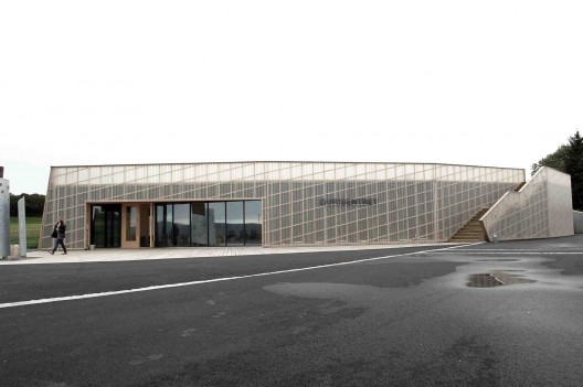
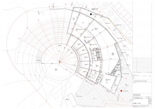
Gurisentret Outdoor Stage and Visitor Centre, The Edøy Island, Smøla, Norway, 2008 designed by Askim/Lantto Architects
The centre is cut into a sandy hill, on the edge of an agricultural landscape which includes an eight hundred year old church. The new amphitheatre shields the stage from the quayside. To maintain possible movement in the landskape adjasent to centre, a roof terrace has been formed over the visitorcentre as an extention to the surronding farm landscape. The roofterrace creates a good viewing platform for surrounding landscape. -- ArchDaily

Source: Migdal Arquitectos

Plan, Source: Migdal Arquitectos
Plaza Residences, Mexico City, Mexico, 2008 designed by Migdal Arquitectos
In response to the Columbus traffic circle, the building, with its glass interior façade, is erected in the shape of a boomerang, creating a concave interior space that we give to the city by way of Reforma. This concave shape opens up and embraces the majestic traffic circle, integrating it into its concept. The boomerang shape draws out from a long linear element which constringes into the plot with the intention of presenting a considerable unfoldment of façade towards Reforma, making it possible to favor all the apartments with views towards the majestic avenue.  -- ArchDaily

 Source: Boris Cvjetanovic archdaily.com
Plan, Source: archdaily.com
Segrt Hlapic Kindergarten, Sesvete, Zagreb, Croatia, 2008 designed by Radionica Arhitekture
Projects and realisations of Radionica can often be reduced to elementary parts: basic geometric figures and their combinations. Complex rather than complicated relations between simple parts create layered, inner and outer, closed and open rationalised landscapes. -- ArchDaily

Source: archdaily.com

Plan, Source: archdaily.com
Club 218, Siófok, Hungary, 2008 designed by A4 studio
The planned building is stretching on the lake shore as a giant curve. This characteristic architectural gesture organizes the main bulk. As there are no secondary facades, all the apartments bear the same values and orientation. An important issue was to fit into the street view of Szent István promenade, lined with other hotels and apartments.  -- ArchDaily

Source: BitterBredt archdaily.com


Plan, Source: archdaily.com
The Ascent at Roebling’s Bridge, Covington, Kentucky, USA, 2008 designed by Daniel Libeskind
Reaching 300 feet at its pinnacle, the 310,000 sqf building includes 70 residential units, a swimming pool, garden facilities, large public event space, and a restaurant on the plaza level. Its curving crescent form and sloping roofline are designed to maximize views, resulting in unobstructed visibility of the Cincinnati skyline from every unit.  -- ArchDaily

Source: Tarvo Varres archdaily.com

Plan, Source: archdaily.com
Aluminium House, Rannamõisa near Tallinn, Estonia, 2008 designed by Arhitektid Muru & Pere
The concept was born out of the wrist movement when scribbling on paper. The area allowed for building was very long and narrow due to multiple restrictions. We began piling the rooms in one row at one end until we met the border; then we turned the room itself backwards and that is how the building obtained its current form.  -- ArchDaily

Source: David Frutos archdaily.com

Diagram, Source: archdaily.com
360 House, Galapagar, Madrid, Spain, 2010 designed by Subarquitectura
An extreme shape, the house is curved, generating the greatest quantity of linear meters towards the good views. It is shored up in the landscape and turns back on itself, completing the revolution. The degree of intimacy increases as the distance to the ends increases.  -- ArchDaily

Source: Noda Gankohsha archdaily.com
Hoki Museum, Midori-ku, City of Chiba, Japan, 2010 designed by Nikken Sekkei
Inside galleries, people can not only access each painting in traditional sequential move, but also take a random-access way because galleries are slightly curved and people can recognize positions of all the paintings at a glance. Galleries that extrude longitudinally along the site, measure up to 100 meters long. The visitors will face to the super-realistic paintings in a seamless gallery without any joints of finish and outstanding existence of lights. At the end of a gallery, they can enjoy natural light and scenery outside. After a short rest, they will move to the next gallery. -- ArchDaily

Source: Mushenko & Jackson archdaily.com
Plan, Source: archdaily.com

Cooroy Library, Sunshine Coast, Queensland, Australia, 2010 designed by Brewster Hjorth Architectsi
The building was designed a two curved opposed pavilions. The western pavilion is dug into the slope of the site, and is covered by an earth sheltered grass roof. To the east, the library opens to a sunken internal courtyard, edged by a large stonewall, providing much needed cooling in the summer from the stone mass and shading. -- ArchDaily

Source: Tim Crocker archdaily.com
Aloft London Excel, London, UK, 2011 designed by Jestico + Whiles
The plan of the building has a convex central spine containing bedrooms and the vertical circulation, flanked by two concave wings which house further bedrooms and corridors.These wings are clad in thousands of specially treated, highly reflective stainless‐steel shingles creating the extraordinary effect of constantly changing colour with the passing of the day.  -- ArchDaily

Source: ©2012 Eric James archdaily.com
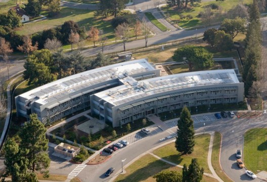
NASA Sustainability Base, Moffett Field, California, USA, 2011 designed by William McDonough + Partners and AECOM
The most iconic feature of the building is its structure. Inspired by the wind tunnels of NASA Ames Campus and the images of NASA satellites, the exoskeleton approach gives the building increased structural performance during seismic events, provides a framework for daylighting and shading strategies, and creates a column-free interior space that facilitates workplace flexibility. -- ArchDaily

Source: Emma Cross archdaily.com
Plan, Source: archdaily.com
Punt Road Oval Redevelopment, Richmond, VIC, Australia, 2011 designed by Suters Architects
The long narrow strip of land around Punt Road Oval allowed the continuation of this motif, with the building contorting and squeezing between the oval’s boundary and AFL Way, as it progresses towards the MCG from Punt Road. -- ArchDaily

Source: Lira Arquitectos Asociados archdaily.com
Plan, Source: archdaily.com
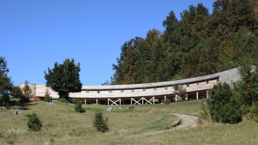
Casa Retiro Kawelluco, Pucón, Pucón, Araucanía Region, Chile, 2011 designed by Lira Arquitectos Asociados
The situation at half height overlooking the valley, the amphitheater form due to the uneven terrain and the brief gives rise to a continuous horizontal two-storey building, which settles as a single volume on the hillside, in contrast with mountains and surrounding vegetation. -- ArchDaily

Source: Shu He archdaily.com
Plan, Source: archdaily.com
Weihai Pavilion, Weihai, Shandong, China, 2012 designed by Make Architects
The pavilion is only glazed on one elevation to provide 180 degree uninterrupted views, the rest of the structure is solid. The glazed facade allows floods of natural light into the main space while the over-sailing roof provides shade for the building during the hot summer months. These elements ensure a more energy efficient building. -- ArchDaily

Source: Miao Design Studio archdaily.com

Plan, Source: archdaily.com
Visitor Center in Lake Yangcheng Park, Kunming, Yunnan, China, 2013 designed by Miao Design Studio
....a curved “wall,” 99 meters long and 7.75 meters high, along the entire north side of the parking lot, Three doorways of varied sizes are punched out from this “wall,” freeing passages that direct towards the Park. Being accentuated by the surrounding “wall,” the views captured by the openings appear particularly enticing, -- ArchDaily

Source: Piuarch archdaily.com
White Wave, Milan, Italy, 2013 designed by Piuarch
As part of the Porta Nuova urban renewal project, the so called “White Wave” is a building for showrooms and offices, which has become the symbol of the new architectural dynamism of Milan. The simple and sinuous form of the building articulates and integrates the two volumes in a single element distinguished by a deep central fissure. -- ArchDaily

Source: Shahriyar Mazaheri archdaily.com
Plan, Source: archdaily.com
Dashte Noor’s Gym Building, Mazandaran, Iran, 2013 designed by Narges Nassiri-Toosi
....the concept was designing a building with a dynamic mass which is an integral and a part of the surrounding landscape. -- ArchDaily

Source: Gremsy archdaily.com
Plan, Source: archdaily.com
Farming Kindergarten, Biên Hòa, Dong Nai, Vietnam, 2013 designed by Vo Trong Nghia Architects
....the building is conceived as a continuous green roof, providing food and agriculture experience to children, as well as an extensive playground to the sky. The green roof is a triple-ring shape drawn with a single stroke, encircling three courtyards inside as safe playgrounds. Recently, an experimental vegetable garden was realized on its top. Five different vegetables are planted in 200m2 garden for agriculture education. -- ArchDaily

Source: Tom Blachford archdaily.com

Plan, Source: archdaily.com
Royal Automobile Club of Victoria, Great Ocean Road, Victoria, Australia, 2015 designed by Wood/Marsh
The design for the new building is based on a cluster of soft arcs that shift through native landscaping and sit comfortably within the coastal site. Rammed earth walls take up the colour of the sandy soil and appear as if they have grown out of the ground. These walls arc out beyond the building mass into the landscape and help delineate different zones within the building. The form gently follows the land contours as it curves gradually across the site, maximising views to the ocean. -- ArchDaily