|
| Source: machado-silvetti.com |
Graduate student apartment, Harvard University, Allston, Massachusetts, USA, 2003 designed by Machado and Silvetti Associates
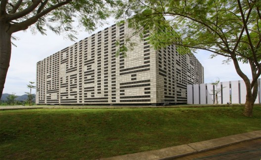
The low-rise is wrapped in two brick patterns, one for the exterior walls and the other for the interior walls. These overlap in the entry passageway, producing a third pattern. The mid-rise and the bridge are clad in cast stone blocks, but used differently from one another. The surface treatment of all of the volumes is designed to allow the ideal prismatic geometry of the various building masses to register on the façade planes. -- architect's web site.
TongXian Gatehouse, Beijing, China 2003 designed by Office dA
The gatehouse will serve as an entry into the site, and includes apartments and double-height studios for two artists-in-residence. --
architect's web site
 |
| Source: Ralph Feiner archdaily.com |
Winery Gantenbein, Fläsch, Switzerland, 2006 designed by Gramazio & Kohler + Bearth & Deplazes Architekten
The initial design proposed a simple concrete skeleton filled with bricks: The masonry acts as a temperature buffer, as well filtering the sunlight for the fermentation room behind it. The bricks are offset so that daylight penetrates the hall through the gaps between the bricks.
The robotic production method that we developed at the ETH enabled us to lay each one of the 20,000 bricks precisely according to programmed parameters—at the desired angle and at the exact prescribed intervals. This allowed us to design and construct each wall to posses the desired light and air permeability, while creating a pattern that covers the entire building façades. According to the angle at which they are set, the individual bricks each reflect light differently and thus take on different degrees of lightness. -- ArchDaily
 |
| Source: Iwan Baan archdaily.com |
Brick House, Gaochun, Jiangsu Province, China, 2008 designed by AZL architects
Terracotta bricks were made from local clay with local knowledge, composing the structure and façades. Skilled village construction workers very familiar with the medium were able to facilitate the marriage of traditional savoir-faire with new and progressive design. Three different textures of brick skin make up the façade. An interlocking pattern leaves perforations between bricks, and protruding bricks cast shadows along the wall. Windows punctuate the texture, and the brickwork along the edges of these portals further develops abstract geometric relations while remaining loyal to the structural logic. -- ArchDaily
 |
| Source: construction.com |
Brick-Weave House, Chicago, Illinois, USA, 2009 designed by Studio Gang
the front facade’s meticulously detailed masonry veil. The single-withe screen wall, which is given lateral stability by a steel frame and a custom-designed anchor system, shades the floor-to-ceiling window walls beyond and also provides visual privacy. Within the garden and on the adjacent exposed concrete floor of the house’s interior, the screen creates a constantly changing play of light and shadow. --
Record House 2009
GMT Institute Of Property Management, Jakarta, Indonesia designed by PHL Architects
The uniqueness comes from the façade’s material (exposed bricks and concrete, rusty iron); which is composed in certain patterns to give texture to the ‘skin’ of the building. --
ArchDaily
 |
| Source: Carlos Fernández Piñar archdaily.com |
8 B Nave, Legazpi, Madrid, Spain, 2009 designed by Arturo Franco
In a small nave of the old slaughterhouse of Madrid, nave 8B, the tiles of a roof in disrepair have been removed, piled, and brought inside to meet a need. This could be the summary of this intervention. -- ArchDaily
 |
| Source: Emilio Photoimagination archdaily.com |
Al-Irsyad Mosque, Kota Baru Parahyangan, Padalarang, Jawa Barat, Indonesia, 2010 designed by Urbane
The architecture of the KBP mosque is unique in that it uses stacked stones as the main façade to create tectonic effect, while embedding Islamic text/calligraphy on the façade as a graphic element and reminder prayer. -- ArchDaily
 |
| Source: Jose Hevia archdaily.com |
High School Extensión, Carrer Joan Coll-Vell Duc, 2, 07008 Palma de Mallorca, Balearic Islands, Spain, 2010 designed by SMS Arquitectos
The facade was made with “german blocks” of the company Palerm, and in
their production only gravel aggregates from a local quarry have been
used. The extension it can be considered as a 1:1 test of the aesthetic
and structural possibilities of small precast blocks. --
ArchDaily
 |
| Source: Alireza Mashhadmirza archdaily.com |
Brick Pattern House, Tehran, Iran, 2011 designed by Alireza Mashhadmirza
Brick pattern house is a residence located in poor area in Tehran. In order to recall the traditional architecture, I used brick as the
main construction material and made a kind of contemporary mashrabiya to
cover the whole façade and to mitigate the glaring sun light of Tehran. --
ArchDaily
 |
| Source: Youngchae Park archdaily.com |
The West Village, Seoul, South Korea, 2011 designed by Doojin Hwang Architects
On the southern facade, a unique brick pattern was used as a visual filter to screen the view of the building in front while allowing sunlight in. This unique pattern of bricks produces various shadow patterns by change of the time and the season, and makes the space rich and alive. -- ArchDaily
 |
| Source: SHEN Zhonghai archdaily.com |
The Lanxi Curtilage, International Intangible Cultural Heritage Park, Chengdu, China, 2011 designed by Archi Union Architects
It is an interpretation of traditional Chinese architecture through the language of digital fabrication methods. The design of the ripple wall derived from a digital interpretation of
water, a flexible yet natural conception. We developed an algorithm that
mimicked the transient behavior of water, which could be frozen in time
allowing a literal architectural expression of its transient behavior.
We adapted this algorithm to process a traditional building material,
blue bricks, in a staggered joint pattern, in the same way as it
produced a surface before, creating a bonded brick pattern with the
intrinsic dynamics of water, and providing a light and transparent
effect as well as structural walls. The design focuses on developing an
artistic pattern as well as on creating a feasible fabrication pattern. --
ArchDaily
 |
| Source: Filip Dujardinarchdaily.com |
Westvleteren Community Center, Westvleteren, 8640 Vleteren, Belgium, 2011 designed by Atelier Tom Vanhee
The use of different types of bricks betray the successive renovations
in the past. The new added walls in contemporary bricks build in the
recent renovation strengthens the patchwork of different bricks. --
ArchDaily
 |
| Source: Indriķis Stūrmanis archdaily.com |
Samrode Building, Ventspils, Latvia, 2012 designed by Krists Karklins & Arhitektūras Birojs
The material palette of “Samrode” is also based in the historic precedent. Traditional construction techniques, nevertheless, are re-interpreted according to standards of present-day design aesthetic and contribute to the unmistakably contemporary character of the building. See-through stacking of bricks along the main façade should be noted in particular, as it allows combining close resemblance to the visual character of the opaque brick warehouse precedent with the must-have requirement for light and views of a modern-day office building typology. -- ArchDaily
 |
| Source: Peter Bennetts archdaily.com |
Little Brick Studio, Melbourne, Australia, 2012 designed by MAKE Architecture
The ‘Little Brick Studio’ pays homage to the suburbs industrial past. The beautiful brick detailing in the area inspired the design, we wanted to make our own contribution to the brick texture of the suburb. Bricks protrude out by 90mm and slowly disappear into the wall, corners are carefully considered and brick cutting was minimised where possible. -- ArchDaily
 |
| Source: Mecanoo archdaily.com |
Fontys Sports College, Eindhoven, The Netherlands, 2012 designed by Mecanoo
Sporting figures are incorporated in the dark brick walls a swimmer, a footballer, a hockey player. --
ArchDaily
 |
| Source: Hufton + Crow archdaily.com |
Wellington House, Petty France, London, UK, 2012 designed by John McAslan + Partners
Design development has addressed the fact that the triangular site sits within a conservation area, and careful consideration has been given to the building’s Indian Sandstone façade. Surrounded by buildings of various scales, typologies and historic architectural styles, John McAslan + Partners collaborated with the artist Georgia Russell to develop an incised treatment – inspired by the flight pattern of birds and of wind flow – that brings a distinctive new character to the building and creates a visual focal-point for the immediate area. -- ArchDaily
 |
| Source: Rafael Gamo archdaily.com |
Z53 Social Housing, Azcapotzalco, México, 2012 designed by MAP/MX + Grupo Nodus
The masonry brick walls play an important role on the project as they are part of the structure and re-interpret the traditional brick wall, blurring the boundary between structure and ornament. With the use of a single unit; red mud artisanal brick we were able to produce a heterogeneous coherence in the facades, creating walls that are sensible to shadows and lights. -- ArchDaily
 |
| Source: Anand Jaju archdaily.com |
Pete Mane, Gundlupet, Karnataka, India, 2012 designed by Architecture Paradigm
The volumes are animated by light which is filtered through strategically located openings and shading devices which are created out of weatherproofing clay tiles engineered as baffles. They are used vertically and horizontally to form surfaces lending privacy while delivering filtered light,as a result the façade is about the textural surface highlighting the introverted nature of the house. -- ArchDaily
 |
| Source: Chin HyoSook archdaily.com |
ABC Building, Seoul, South Korea, 2012 designed by Wise Architecture
Black bricks present the respect to the historical park. The building
starts with laying a piece of brick on the ground. From middle of the
building, it changed to the steel frame system and dry brick wall
fabrication façade without traditional mortar masonry. It creates
transparent experience of solid brick wall with multiple brick wall
layers. --
ArchDaily
 |
| Source: Martin van Welzen archdaily.com |
Restoration and Extension Museum Nairac, Barneveld, The Netherlands, 2013 designed by Van Hoogevest Architecten
The new extension is made of translucent brickwork and a glass façade to create a transparent connection between the monumental building and the new building. -- ArchDaily
 |
| Source: Robert Les archdaily.com |
House in Serdarova Street, Zagreb, Croatia, 2013 designed by Dva Arhitekta
Even though the house is painted from the outside in earthen color,
which functions as an element of landscape, the accent in design is not
on color, but rather on texture. The clinker tiles of varied thickness
are arranged so as to form a three-dimensional mosaic with an agitated
and flickering cover. Its flicker indicates that it is only a mantle or
curtain around the body of the house. --
ArchDaily
 |
| Source: Sun Namgoong archdaily.com |
Scale-ing House, Bundang-gu, Seongnam-si, Gyeonggi-do, South Korea, 2013 designed by Jeonghoon LEE
....
about 20,000 basalt bricks, which are
the main material to compose the rough surface, are divided into two
parts according to their angles and recomposed on the architectural
form. The basalt bricks are allocated horizontally in five parts ranging
from 5 degrees to 45 degrees. In addition, it is divided into the
embossed and the engraved parts vertically. -- ArchDaily
 |
| Source: Guadalupe Campos archdaily.com |
Municipal Boxing Gym, Chihuahua, Mexico, 2013 designed by Urbánika
The container is integrated by stone-faced concrete-brick walls that are
rotated seven degrees each from their centerline. This rotation creates
a pattern with a connotation to textiles: rough as the skin of a boxer
and artistically hand-crafted at once. --
ArchDaily
 |
| Source: Mike Tsang Photographs archdaily.com |
The Herringbone House, Islington, London, UK, 2013 designed by Atelier Chanchan
The light shade of herringbone brickwork, articulates the houses’ two
volumes and frames the picture windows setting the house apart from the
other buildings on the street. --
ArchDaily
 |
| Source: Katsuhisa Kida archdaily.com |
Shugoin, Tokyo, Japan, 2013 designed by Love Architecture
For the south and north facades, openwork bricks and running bond bricks
are used, respectively. As a result, the only indications that the
passage goes through to the next street are the gaping holes in the
privacy-protecting walls along the streets. --
ArchDaily
 |
| Source: Alex Bland archdaily.com |
LSE Saw Hock Student Centre, Houghton Street, London School of Economics and Political Science, London, UK, 2013 designed by O’Donnell + Tuomey Architects
The surface of the brick skin is cut out along fold lines to form large
areas of transparent glazing framing views in and out from street to
room. --
ArchDaily
 |
| Source: D’HOUNDT+BAJART Architects & Associates archdaily.com |
Boa Canteen, Lillom, 12 Rue du Château d’Isenghien, 59160 Lille, France, 2014 designed by D’HOUNDT+BAJART Architects & Associates
The architectural treatment is contextual in its urban form and its
materiality; the use of the brick, which dominates the landscape, has
received a contemporary and qualitative review showcasing the polychrome
emblematic brick bonding of the regional architecture. The layout of
the masonry, with an almost random pattern, evokes the snake skin and
activates the imaginary potential, architecture and young children
dream-like: in a world where you have to respect the rules of the urban
game, the building delivers a message of imagination, and seems, with
its “snake skin” and “scale-like windows” to have the power to move… --
ArchDaily
 |
| Source: C.F. Møller Architects archdaily.com |
Danish Meat Research Institute, 2630 Taastrup, Denmark, 2014 designed by C.F. Møller Architects
.... the individual institutes are designed in a simple and austere
architecture with red brick and exposed concrete lintels. The new
building is based on the same simple design idiom, but with more modern
twists such using pre-fabricated brick reliefs, and incorporating bay
windows. --
ArchDaily
 |
| Source: Fernando Guerra | FG+SG archdaily.com |
B+B House, State of São Paulo, Brazil, 2014 designed by Studio MK27
The arrival at House B+B – the access to the social area – is through an
architectural trajectory, via an open ramp, located on the eastern side
of the construction. This space is protected by hollowed-out concrete
elements to the side, which create surprising effects of light and end
up functioning as protection from bad weather conditions. --
ArchDaily
 |
| Source: Philippe Ruault archdaily.com |
Social and Cultural Center in Landsberg, Rue du Landsberg, 67100 Strasbourg, France, 2014 designed by Heintz-Kehr architectes
The envelope is made of a deep mat black structural concrete. Opacity,
minerality , thickness, are all questions / answers to a hardcore
postmodern context , and the formal and chromatic hypertrophy linked to
it. Taking aesthetic and technical risk that reintroduces the question of
pattern and figure is also an archaic way to affirm the public character
of the building. The project rethinks the inertia of heavy facades,
mineral and opaque, almost antic. --
ArchDaily
 |
| Source: Stefano Graziani archdaily.com |
House of Memory, Via Federico Confalonieri, 14, Milano, Italy, 2015 designed by baukuh
The House of Memory is entirely covered with large images depicting Milan’s recent history. The façades of the House of Memory are entirely realized in bricks and
combine a frame made of pilasters and architraves in slight relief with
large recessed fields entirely occupied by images: nineteen squares with
portraits (4.6 x 4.6m) and eight large rectangles with historical
scenes (9.6m in height and with variable width). --
ArchDaily
 |
| Source: Miguel de Guzman archdaily.com |
Cultural Center La Gota - Tobacco Museum, 10300 Navalmoral de la Mata, Cáceres, Spain designed by Losada García
....the building brings the atmosphere of the light from the tabaco
drying-building through a ceramic fabric inspired by the traditional
brick found in these kinds of buildings. Light enters -in those spaces
that the program allows- through the holes in the facade. This produces a
dematerialized facade with refined geometries, which allows the
filtration of sunlight through the walls. --
ArchDaily