The Cloth Simulation A creation of Andrew Hoyer, a nice cloth simulator based on lines and dots. In fact, every point is a constant with no actual dimension and is based on mass and location. Just click and drag any of the points available on the “clothing item” to manipulate it. -- Devstand
Friday, May 18, 2012
Saturday, May 12, 2012
Settle into the Ground
| Source: Juan Solano archdaily.com |
Volumes With Gender, Carlos, Ecuador designed by Longhi Architects
The house is composed of three volumes separated by open spaces that allow natural light and cross ventilation for all private spaces while providing common vertical and horizontal circulations articulated by cast in place sculptural elements that pretend conversations with the sun during different times of the day. -- ArchDaily
| Source: Kodiak Greenwood archdaily.com |
House Ocho, Carmel, California, USA, 2004 designed by Feldman Architecture
In order to reduce the impact of the home’s massing and to preserve site lines, the building settles into the ground and overhanging roofs are planted with tall native grasses. The house is also divided up into a series of pavilions to lessen its overall mass. -- ArchDaily
| Source; Barbosae Benigno archdaily.com |
House Foz do Arelho, Obidos Lagoon, Caldas da Rainha, Portugal, 2009 designed by Alexandre Burmester Arquitectos Associados
The house takes part of the sloping ground, developing in accordance with the local topography. Several volumes oriented to the sun and to the views. A part with access to the highest level, other semi-buried is linked by a common circulation, and both with communication with the ground. -- ArchDaily
| Source: Sama Jim Canzian archdaily.com |
Whistler Residence, Whistler, British Columbia, Canada, 2010 designed by BattersbyHowat Architects
Situated in a prominent site, the visual mass of the structure was diminished by making a substantial portion of the house appear to be below grade through the strategic removal of bedrock, and by the extension of the living room terrace over the garage. An upper courtyard deck area was also carved in to the massing to gather light centrally into the house. The result is a home that looks deceptively modest in relation to the neighboring properties. -- ArchDaily
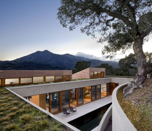
| Source: David Wakely Photography archdaily.com |
Kentfield Hillside Residence, Kentfield, California, USA, 2010 designed by Turnbull Griffin Haesloop Architects
The house is tucked under the living roof, which visually merges the house with the land. Growing out of the hillside, the roof is carved away to form a protected courtyard for the pool. Three volumes housing the living room, kitchen-dining area, and master bedroom rise up above the living roof with shed roofs angled to capture the sun for photovoltaic and solar hot water panels. -- ArchDaily
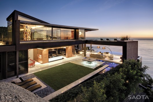
| Source: Adam Letch archdaily.com |
Nettleton 198, Clifton, Cape Town, South Africa, 2011 designed by SAOTA
....a six-bedroom, seven-level home that makes the most of the site, the views and the mountain. The site enjoys spectacular views, both of the sea and Lions Head and these views and the impact of the sun were key informants contributing to the overall design. The sun being both a defining and also harsh influence on the property inspired the choice of screens, shutters and louvres that give the lower levels its distinctive gravitas. The living room can open up onto the west and the east completely, giving it the feeling of an open pavilion. -- ArchDaily
| Source: Patricia Hernández archdaily.com |
The Forest Pavilion, Mazamitla, Jalisco, Mexico, 2011 designed by Espacio EMA
From the outside, the pavilion looks like a small glass box of 9 x 5 meters, which sits on the top of a 10 meters high rock and disappears beneath a roof garden, buried under the natural slope of the land as if it was a cave. The pavilion blends seamlessly with the site, establishing a direct relationship with the timber “box” of the existing house. -- ArchDaily
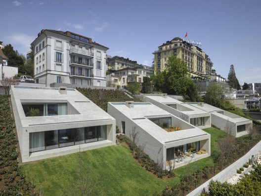
| Source: Lischer Partner Architekten Planer archdaily.com |
Urban Villas, Lucerne, Switzerland, 2012 designed by Lischer Partner Architekten Planer
Because buildings may only be on one level of the terrain, the buildings have surprisingly simple forms. The houses are built of solid yellow Jurassic limestone. The roof is covered with plates of the same material. This natural stone emerged about 150 million years ago as a lagoon sediment; its use underscores how the townhouses are in close dialogue with the historic fabric of their environment. -- ArchDaily
| Source: José Maria Oliveira archdaily.com |
N2X035 House, Azores, Portugal, 2012 designed by N2X Arquitectos
This project is located on a plot of land of some interest in a place called Lugar da Ribeira da Praia. We started from an unusual context, as this plot housed some ruins at a higher location, naturally kept apart from the surrounding lower agglomerate with which it apparently dialogues and which we then designated as “village”. The project’s idea is to “fill” the physical emptiness existing in these ruins by constructing two related modules that overlap each other and are similar to one another material-wise, but that differ in their limits, making evident the construction principle based on the loose and mismatched stone of the ruins and its surrounding walls. -- ArchDaily
| Source: Koichi Torimura archdaily.com |
House in Raizan-Forest, Itoshima, Fukuoka Prefecture, Japan, 2012 designed by Rhythmdesign
The site has over 14meters difference of elevation, and is the only one which remains original terrain. The house was built as if stairs bridge over the hill. We aimed to keep original landscape of the site as much as we could. -- ArchDaily
| Source: Ed White archdaily.com |
Lefebvre-Smyth Residence, Kaleden, BC, Canada, 2012 designed by CEI Architecture
Due to the steep sloping site, the building footprint was minimized in order to reduce complex foundation construction. The majority of living space is placed on a second floor cantilevering over the steep gorge of the property. -- ArchDaily
| Source: Phoebe Giannisi & Kotionis Zissis archdaily.com |
Summer House in Naxos, Paros, Greece, 2012 designed by Phoebe Giannisi & Kotionis Zissis
The building rests on the sloping ground building scalable two bars. One houses the public and other private areas (bedrooms, bathrooms). The interface is organized outdoor area with swimming pool, which is the center of summer life on an island. -- ArchDaily
| Source: Aytac Architects archdaily.com |
Hebil 157 Houses, Bodrum, Turkey, 2012 designed by Aytac Architects
Hebil 157 Houses is a manifestation of this idea. Five unique villas are spread over five acres overlooking the tranquil panorama of Hebil Bay. Each villa is positioned strategically. All equally benefit from vast and wonderful views of the bay as they interact with the surrounding Aegean landscape, and the Mediterranean Breeze. -- ArchDaily
| Source: Imeh Akpanudosen archdaily.com |
MUL:7691, Los Angeles, California, USA designed by VOID Inc.
Situated on steep incline, the design meets the challenges of the terrain and physical constraints of its L-shaped lot, presenting an optimal solution to a unique set of conditions. Its sunken nature not only guards against the harsh western sun, but also serves to maximize energy efficiency. As a result, the house seems to gently cascades down the hillside, allowing each level to have an unobstructed panoramic view of the landscape. -- ArchDaily
| Source: Eduardo Abreu archdaily.com |
RD House, Jarabacoa, Dominican Republic, 2013 designed by VASHO
Burying the house is proposed as a visual action. Hiding the overall volume of the work to the existing natural geography to cushion the impact of the volume to the eye upon arrival, being conscientious of the paradisiacal surroundings, but always seeking to make the natural surroundings appear from the interior before the user: “Disappear to make appear”. -- ArchDaily
| Source: John J. Macaulay archdaily.com |
Topo House, Blue Mounds, Wisconsin, USA, 2013 designed by Johnsen Schmaling Architects
Based on early conceptual studies interpreting the site’s distinct topography as a series of folded parallel planes, the house forms a low-slung, partially submerged building volume with a meticulously detailed copper roof plane that slowly peels itself up from the ground and extends the adjacent fields as a green carpet over the lower portion of the house. -- ArchDaily
| Source: José Ramón Oller archdaily.com |
House on a hillside, Mesa Mota, 38206, Santa Cruz de Tenerife, Spain, 2013 designed by Virgilio Gutiérrez Herreros
The project investigates the typology of the single family home, the construction of landscape in the margins, the relationship between object and nature -- ArchDaily
| Source: Haruo Mikami archdaily.com |
Torreão House, Brasilia – Federal District, Brazil, 2014 designed by Bloco Arquitetos
The roof garden works as an extension of the backyard, an observation platform open to all sides. It provides thermal insulation during the whole year and reinforces the visual continuity between the street, the house and the native vegetation. -- ArchDaily
Friday, May 11, 2012
Z
![]() |
| Source: Aryeh Kornfeld archdaily.com |
FEN Building, Santiago, Chile, 2011 designed by Marsino Arquitectos Asociados
The building is projected in Z shape within the narrow constrains of the site looking for the maximum exposure perimeter in order to make the most of the sunlight and natural ventilation. The structure is thought to be an exoskeleton, which means is completely exposed to the exterior, creating an open and transparent building in all its facades, as well as allowing an open layout for greater spatial flexibility, helping to preserve the architectural volume over any changing programmatic layout. -- Archdaily
| Source: Dennis Gilbert archdaily.com |
| Plan, Source: archdaily.com |
Walsall Housing Group HQ, Walsall, West Midlands, UK, 2011 designed by Bisset Adams
The building was designed to work with a number of site constraints, including a considerable slope, a large unmapped culvert and a road-widening scheme; the dynamic Z-shaped building sits comfortably within the landscape, making using of the slope and hugging the corner of the site to offer a dramatic and inviting entrance statement. -- ArchDaily
| Source: archrecord.construction.com |
| Plan, Source: archrecord.construction.com |
Prime Tower, Zurich, Switzerland, 2011 designed by Gigon / Guyer Architekten
In plan, the office tower is a condensed zigzag. “Two rectangles have been melted into each other,” says Gigon. Several small cantilevers upend the typical skyscraper taper, from top to bottom instead of bottom to top. “It oscillates between a jewel, a crystal, and becoming something like a torso,” she says. “It has a figurative association.” -- Architectural Record
| Source: Joanna Nowicka archdaily.com |
| Plan, Source: archdaily.com |
Cultural Center in Katowice, Krzyżowa, Katowice, Poland, 2013 designed by Rafal Mazur
A green space connection is made from the northern end traditional Silesian street to the southern border. The edge between the building and green space is invisible. The roof in the plan of a ‘Z’ shape rises from the ground level to two floors. The sectional form is inspired by mines, as all of the programmatic utilities are located ‘underground’. -- ArchDaily
Thursday, May 10, 2012
X
| Source: Yury Palmin archdaily.com |
| Site Plan, Source: archdaily.com |
Villa Rose and X-Park, Romashkovskiy park, Russia, 2004 designed by Project Meganom
The six houses present variations of the baseplan, where the four main spaces are arranged in an “X” shape: the swimming pool, the garage, the living and dining rooms, with the bedrooms located above. -- ArchDaily
| Source: Andrea Lhotakova archdaily.com |
| Axo, Source: archdaily.com |
Research Library, Hradec Kralove, Czech Republic, 2008 designed by Projektil Architekti
The five-storey building represents a concrete construction with the final visual in the form of a monolithic concrete façade. The original shape of the building is the precast concrete letter “X”. -- ArchDaily
| Source: Alejo Bagué archdaily.com |
| Plan, Source: archdaily.com |
Azahar Headquarters, Castellón, Spain, 2009 designed by OAB
Orientated on the east-west axis, the headquarters building is structured as two wings united by a central body around two open patios of a very different sort. The first as a “parade ground” or external reception area for users and visitors, and the rear one, landscaped and for more private use. -- ArchDaily>
| Source: Toshiyuki Yano archdaily.com |
![]() |
| Plan, Source: archdaily.com |
Oshikamo, Toyota, Aichi, Japan, 2011 designed by Katsutoshi Sasaki + Associates
The family space is arranged at the center of the site. The private space is arranged at the edge of the site , and they connect gradually by the one volume. Distance among rooms and curved spaces provide adequate privacy. Each rooms are indistinctly connected to each other via central space. -- ArchDaily
| Source: Sandra Pereznieto archdaily.com |
| Plans, Source: archdaily.com |
X House, Cabrils, Barcelona, Spain, 2012 designed by Cadaval & Solà-Morales
Mainly, the project of the X House uses form to qualify spaces of very different nature and provide them with an individual character, always incorporating landscape as a main actor. Beyond the effective spatial arrangement at the front of the house, the views are the protagonist in each space. -- ArchDaily
| Source: Walter G. Salcedo archdaily.com |
Raigal House, Rosario, Santa Fe, Argentina designed by Marcelo Villafañe
It is a two storey-house: bedrooms upstairs and high ceilings, composing a broken plan with a double hook shape, generating different angles, some very sharp, always free in their movements. -- ArchDaily
| Source: cmA Arquitectos archdaily.com |
| Plans, Source: archdaily.com |
Studio Dwelling, Boadilla del Monte, Madrid, Spain designed by cmA Arquitectos
The proposal for a studio-dwelling generates volumes defined for uses other than housing and office, without breaking up the unity of the resulting architecture. The project aims for a dynamic space in close relation to the potential of the existing plot, both its steep slope and the existence of large trees of great natural value. -- ArchDaily
| Source: Iwan Baan archdaily.com |
| Plan, Source: archdaily.com |
Fogo Island Inn, Main Street, Fogo, NL A0G, Canada, 2013 designed by Saunders Architecture
The Fogo Island Inn is a public building for Fogo Island with 29 rooms for guests. The building, located between the communities of Joe Batt’s Arm and Barr’d Islands on the Back Western Shore, is an X in plan. The two storey west to east volume contains public spaces while the four storey south-west to north-east volume contains the remaining public spaces and all the guest rooms and is parallel to the coast. -- ArchDaily
| Source: Tom Gustavsen archdaily.com |
| Plan, Source: archdaily.com |
Cabin at Femunden, Femund, Norway, 2015 designed by Aslak Haanshuus Arkitekter
The project consists of the two old volumes, and a new addition. The new volume is connected to the old buildings through the use of the same traditional construction method, and using timber of the same dimensions. The three volumes are connected by the enlongated roof, professing that they all belong together in the new entity. -- ArchDaily
Wednesday, May 9, 2012
Skin of Architecture: Cuts
| Source: Mal Booth archdaily.com |
Jewish Museum, Berlin, Germany, 1999 designed by Daniel Libeskind
The interior is composed of reinforced concrete which reinforces the moments of the empty spaces and dead ends where only a sliver of light is entering the space.-- ArchDaily
![]() |
| Source: predock.com |
Gateway Center and Plaza, University of Minnesota, Minneapolis, Minnesota, USA, 2000 designed by Antoine Predock
The design for the center invites visitors to the campus through the embodiment of Minnesota images ambiguously evoking a rock face or the iconic huddle of the Minnesota farmstead. The structure consists of three distinct forms: the large glass, granite and wood memorial hall which is adjacent to a sloping copper structure nestled against the regulating office block at the north. -- architect's web site
| Source: daniel-libeskind.com |
The Wohl Centre, Ramat-Gan, Israel, 2005 designed by Daniel Libeskind
The concept for the Wohl Centre, "Voices and Echoes", symbolizes the two essential components of the Bar-Ilan University: the secular and the sacred. Apparent in the form of the building is the interrelation between the dynamics of knowledge and the unifying role of faith. -- architect's web site
| Source: daniel-libeskind.com |
Royal Ontario Museum, Toronto, Canada, 2007 designed by Daniel Libeskind
The Extension to the Royal Ontario Museum (ROM), now called the Michael Lee-Chin Crystal is situated at one of the most prominent intersections in downtown Toronto.
....derives its name from the building’s five intersecting volumes, which are reminiscent of crystals. -- architect's web site
| Source: daniel-libeskind.com |
The Run Run Shaw Creative Media Centre, Hong Kong, China, 2010 designed by Daniel Libeskind
The distinctive crystalline design forms an extraordinary range of spaces rich in form, light, and material that, together, create an interactive environment for research and creativity.
Each space, whether self-contained or open, is a unique shape. Many of the walls slope or slice through space. Asymmetrical windows cut into the walls of interior lecture halls, classrooms and computer labs. -- architect's web site
| Source: Alexey Naroditskiy archdaily.com |
Vershina Trade and Entertainment Center, Surgut, Russia, 2010 designed by Erick van Egeraat
Read an article from ARCHITECTThe primary cuts in the facade divide this basic mass into “sharp volumes” that allow daylight in, and radiate artificial light out at night. -- ArchDaily
| Source: Cemal Emden archdaily.com |
Tripoli Congress Center, Tripoli, Libya, 2010 designed by Tabanlioglu Architects
Surrounded by the woods, the rectangular two-storey ‘block’ is nested in a semi-transparent metal envelop as a “shield” that opens up to the external landscape with a wide portico that defines the main entrance. Between the mesh and the inner glass walls a semi-open shady circulation area is created as an extension of the landscape. Incise patterns inspired by the trees around the site, permit controlled daylight to diffuse into the central space and at night , When the building interior is lighted, the oozing beams through the slits integrate with the wood at the background. -- ArchDaily
| Source: Oddleiv Apneseth archdaily.com |
Sogn & Fjordane Art Museum, Førde, Norway, 2012 designed by C.F. Møller Architects
The crystalline form provides an asymmetrical plan solution, with varying displacements in the facade. The facade is clad in white glass with a network of angled lines, reminiscent of the fracture lines in ice. This network also defines the irregular window apertures. In the evening these lines are illuminated, so that the museum lies like a sparkling block in the middle of the town’s darkness. -- ArchDaily
![]() |
| Source: Harunori Noda World Building Directory |
Jimbocho Teather Building, Chiyoda-ku, Tokyo, Japan designed by Nikken Sekkei Ltd.
The multi-sided form that emerged from the Sky Factor gave the shape a power, a toughness of what the town holds, as if to diffuse the convergence shape and the déjàvu the setback regulation has created. -- World Building Directory
| Source: Holzer Kobler Architekturen archdaily.com |
PALÄON, Schöningen, Germany, 2013 designed by Holzer Kobler Architekturen
Sharp, large- formatted cuts into the building façade offer wide-reaching and fascinating views to the place where the spears were discovered, the pit of the brown coal mine, the nearby forest, and the Przewalski horses grazing in the meadows. The expressive openings cut into the building like spears in the skin of the horses and reflect this dynamic in the form language. The abstract cuts into the building also formally react to the neighboring traces of opencut mining. The resulting expressive architecture mediates between manmade and natural landscape and forms an emblem for the place. -- ArchDaily
| Source: Stéphane Brugger archdaily.com |
Allez UP Rock Climbing Gym, Rue Saint-Patrick, Montreal, QC, Canada, 2013 designed by Smith Vigeant Architectes
The siding and outer metallic building envelope pay tribute to the industrial and monolithic character of this site, while the massive windows gaze far out onto St-Patrick Street. In long shafts, abundant natural light saturates the space, creating an effect of crevasses and voids on the climbing walls and revealing the interior climbing surfaces – a truly colourful heart at the centre of a metallic exterior. -- ArchDaily
Subscribe to:
Posts (Atom)