Wednesday, August 22, 2012

Buildings for Cars

Source: wikipedia.org
BMW Central Building, Leipzig, Germany, 2005 designed by Zaha Hadid Architects
.... constituted a radical reinterpretation of the traditional office -- transforming the building and the functions it contains into a more dynamic, engaging 'nerve centre' or 'communication knot' -- funneling all movement around the manufacturing complex through a space that transcends conventional white collar/blue collar spatial division. -- architect's web site

Source: unstudio.com
Mercedes-Benz Museum, Stuttgart, Germany, 2006 designed by UNStudio
The Museum’s sophisticated geometry synthesizes structural and programmatic organizations resulting in a new landmark building celebrating a legendary car. The geometric model employed is based on the trefoil organization. The building’s program is distributed over the surfaces which ascend incrementally from ground level, spiraling around a central atrium. -- architect's web site

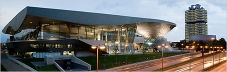
Source: zigersnead.com 

BMW Welt, Munich, Germany, 2007 designed by Cooperative Himmelb (l) au
The architecture is an experiment in fluid spatial encounters. Outside, BMW Welt’s steel and glass façade whirls seamlessly into the Double Cone – a dynamic 48 meter wide helical feature that provides structural support to the building’s floating “Cloud Roof.” -- Ziger/Snead

Source: Brigida Gonzalez mymodernmet.com
Porsche Museum, Stuttgart, Germany, 2009 designed by Delugan Meissl Associated Architects
The fascinating impact of the monolithic, virtually floating exhibition hall can be felt. This bold and dynamic architecture reflects the company’s philosophy. It is designed to convey a sense of arrival and approachability, and to guide the visitors smoothly from the basement level into the superstructure - this is how the architects express their dedication.
In their design, the architects at Delugan Meissl set out to create a place of sensuous experience that reflects the authenticity of Porsche products and services as well as the company’s character, while also reshaping Porscheplatz with an unmistakable appearance. -- official web site
Read a post from My Modern Met
Read a post from ArchDaily

Source: Paul Warchol archdaily.com
NASCAR Hall of Fame, Charlotte, North Carolina, USA, 2010 designed by Pei Cobb Freed & Partners
The results of Pei Cobb Freed & Partners’s explorations of speed and spectacle evolved into an architectural element they call the Ribbon, which envelops the varied program elements in a form that speaks to the imagery and spirit of NASCAR. Beginning as a curved, sloping exterior wall enclosing the building, the Ribbon twists in a free span over the main entry to form a welcoming canopy. Inspired by the dynamic quality of speed, captured in a second as a blur on film, the long, thin incisions in this metal skin are analogous to the blur of a car racing past the spectator at tremendous speed.  -- ArchDaily

Source: Miguel de Guzman archdaily.com
Mapfre Automovile Services Centre, Alcorcón, Madrid, Spain, 2010 designed by Beriot, Bernardini Arquitectos
First floor is dedicated mainly to vehicle storage, with all heating, cooling and water and electrical services placed above the ramp. The whole floor is wrapped in a perforated metal sheet, which allows veiled views of parked cars; its impressive corporate red endows the building a powerful and easily identifiable image. -- ArchDaily

Source: Cino Zucchi Architetti archdaily.com
National Automobile Museum, Turin, Italy, 2011 designed by Cino Zucchi Architetti
The existing courtyard becomes a new event space thanks to the addition of a glass roof which illuminates the space. By making the existing courtyard an internal space, onto which the museum routes face, the visitors are provided with a very natural means of orientation. The new wing on the west side, a large undivided space which provides very flexible exhibition space, integrates the existing body embracing the side of the building and giving continuity to the two “urban” elevations. -- ArchDaily

Source: HG Esch archdaily.com
Porsche Pavilion at the Autostadt, Wolfsburg, Germany, 2012 designed by Henn Architekten
Curving lines and exciting bends make the Pavilion a dynamic yet reduced sculpture with its characteristics derived from the Porsche brand image. As designed by HENN, the structure captures the dynamic flow of driving with a seamless building skin. Its lines pick up speed and slow down just to plunge forward in large curves with ever-changing radii. A matte-finished stainless steel cladding forms the flush envelope of this vibrant structure, creating the impression of a homogeneous unity, whilst creating a continuously changing appearance depending on light and weather conditions. -- ArchDaily

Source: Edmund Sumner archdaily.com
BMW Group Pavilion, London, UK, 2012 designed by Serie Architects
One of the pavilion’s functions is to display BMW’s new fleet of electric and hybrid vehicles. These vehicles use carbon fibre bodywork with fluid soft curves. The geometry of the pavilion roofs manifests a similar calm and rationale attitude to geometry through the use of off-phase sinusoidal curves set out in symmetrical arrangement. The dynamism of this form is a function of the immediate associations: wave forms, fluid dynamics, air flow all incorporate similar patterns. What is important here is that this form is an abstraction of these associations. The geometry does not imitate or in any sense look like something else: it is therefore best understood as the idea of fluidity. -- ArchDaily
Source: Andrea Morgante archdaily.com

Enzo Ferrari Museum, Modena, Italy, 2012 designed by Jan Kaplický of Future Systems
Designed by the late Jan Kaplický, the Czech-born founder of Future Systems, this colossal aluminum hood rises to the same height as the historic buildings. Its bulging crest is slit by 10 protruding gills, evoking the molded metal skin and air vents of car bodies without making literal reference to them. Despite the new structure’s extroverted form, color, and technology, Kaplický conceived it as a passive addition, like an open hand protecting the L-shaped complex of original buildings. It is parked discretely, like a very expensive car, in the background. -- ARCHITECT Magazine
Read a post from Dezeen 
Read a post from NY Times
Read a post from ArchDaily

Source: LARGE Architecture archdaily.com
LeMay Museum, Tacoma, Washington, USA, 2012 designed by LARGE Architecture
A soaring roof system made with curved glulam beams offers a striking sense of grandeur while simultaneously lending a warm, grounded aesthetic to the vast space.   Nicknamed “America’s Car Museum,” the 165,000-square-foot facility was created to celebrate America’s love affair with the automobile. -- ArchDaily

Source: Angelo Kaunat archdaily.com
Pappas Headquarters – Mercedes Salzburg, Salzburg, Austria designed by Kadawittfeldarchitektur
The user can move within the building as if on a public road: it is possible to drive through, park, get out of the car and experience the world of automobiles. The garage facilities and the sales offices are layered on top of each other and can be reached directly by car. -- ArchDaily

Source: Petersen Automotive Museum archdaily.com
Petersen Automotive Museum Unveils Eye-Catching New Exterior by Kohn Pedersen Fox
The Petersen Automotive Museum in Los Angeles has announced that it will celebrate its 20th anniversary in 2014 with a redesign of its interior and a complete transformation of its exterior facade to create a “world class museum that will showcase the art, experience, culture and heritage of the automobile.” The exterior design by Kohn Pedersen Fox Associates will give the Petersen a truly unique and iconic look that will hopefully attract architecture and car enthusiasts alike. -- ArchDaily

Friday, August 17, 2012

Pedestrian Ways: Modern Pedestrian Bridges 5

Source: Alan Williams wilkinsoneyre.com
Butterfly Bridge, Bedford, UK, 1997 designed by Wilkinson Eyre Architects
The bridge, at 32m in span, has twin steel arches which are inclined like butterfly wings to produce a feeling of containment on the deck and, simultaneously, an openness to the sky. The deck extends onto the landscaped banks at each end to engage with the open space around the bridge and enable step-free access, with longitudinal deck lighting concealed at kicker level within the parapets. The bridge is designed to create an inviting spectator platform and informal ‘grandstand’ during Bedford’s annual regatta. -- architect's web site

Source: wilkinsoneyre.com
South Quay Footbridge, London, UK, 1997 designed by Wilkinson Eyre Architects
The competition brief for this 180m long bridge, one of a series of new pedestrian crossings commissioned for London’s Docklands, was unusual. It called for a bridge with temporary and permanent elements - and the ability to open for shipping. The simple elements of the bridge – the curved lines of the oak-clad deck, two raking masts and the shifting arrays of cable stays – create a visual dynamic, accentuating the kinetics of the design and contrasting sharply with the uniform urban grid beyond. -- architect's web site

Source: Simon Warren wilkinsoneyre.com
Lockmeadow Footbridge, Maidstone, UK, 1999 designed by Wilkinson Eyre Architects
.... with two masts rising at divergent angles over each half of the bridge from a central springing point. These masts take a sculpted, skeletal form and almost disappear into the surrounding trees. The deck also has a minimal effect, being constructed with an extremely slender profile, while parapet infills of stainless steel wedge wire add to the lightness and transparency of the bridge. -- architect's web site

Source: wilkinsoneyre.com
Halgavor Footbridge, Bodmin, UK, 2001 designed by Wilkinson Eyre Architects
The Halgavor Bridge carries pedestrians, cyclists and horses across the A30 near Bodmin in Cornwall. It has a striking 48m suspension span and an innovative glass fibre reinforced plastic deck. -- architect's web site

Source: Ros Kavavagh wilkinsoneyre.com
Swansea Sail Bridge, Swansea, UK, 2003 designed by Wilkinson Eyre Architects
the 140m bridge has a curved deck, supported by stays along one edge from a 50m high inclined steel mast which stands on a sculpted concrete central pier. The simplicity of the overall form is augmented by the apparent delicacy of this asymmetrically suspended walkway.  -- architect's web site

Source: Ros Kavavagh wilkinsoneyre.com
University of Limerick: Living Bridge, Limerick, Ireland, 2007 designed by Wilkinson Eyre Architects
A curvaceous deck sweeps across the Shannon and its embankments in five spans between strategically located support locations. The impression is both of a single crossing but also of a series of bridges jumping from pier to pier, like stepping-stones.  -- architect's web site

Source: Paul McMullin wilkinsoneyre.com
Forthside Pedestrian Bridge, Stirling, UK, 2009 designed by Wilkinson Eyre Architects
This bridge greatly improves pedestrian connections between Stirling’s town centre and railway station. The bridge is aligned to better suit pedestrian desire lines and promote physical and visual connectivity with the town to establish an enhanced sense of place. -- architect's web site

Source: Daniel Hopkinson wilkinsoneyre.com
Media City Footbridge, Salford, UK, 2011 designed by Wilkinson Eyre Architects
The bridge has a dramatic curved form which responds to the radial masterplan of the site and which will form an integral part of an orbital pedestrian route around the Canal basin.  -- architect's web site

Source: Ros Kavavagh wilkinsoneyre.com
Peace Bridge, Derry, UK, 2011 designed by Wilkinson Eyre Architects
Linking former army barracks with the historic city centre across the water, the bridge has an S-shaped alignment which resolves two skewed axes at each abutment and responds to views up and down the river. -- architect's web site

Monday, August 13, 2012

O 2

Source: nationalarchives.gov.uk
The Treasury Building - 1 Horse Guards Road, London, UK, 1919 designed by John Brydon
The large circular court in the middle of the building is derived from Inigo Jones’ design for a new Whitehall Palace (never built)  and is a very distinctive piece of architecture.  -- HM Treasury

Source: cobra-museum.nl
The Cobra Museum of Modern Art, Amstelveen, Amsterdam, The Netherlands deisgned by Wim Quist 
Inside, the museum’s open exhibition spaces are an unexpected bonus. Their pervading daylight and visible closeness to nature set a positive mood for looking at the art exhibits. -- official web site

The 'Barcelona' Housing Complex, KNSM Island, Amsterdam, The Netherlands deisgned by Bruno Albert
Belgian architect Bruno Albert is responsible for the massive "Barcelona" housing block, located on Amsterdam's KNSM Island. The block contains 325 residences and features an inner courtyard.  -- goamsterdam

Source: archdaily.com
Skanderborggade Day Care Centre, Copenhagen, Denmark, 2005 designed by Dorte Mandrup
The path of the summer sun from northeast to northwest traces the cut of the slope. The slope angle offers the best sun exposure to both the slope and the courtyard from the south and west. -- ArchDaily

Source: A 69 archdaily.com
EggO House, Prague, Czech Republic, 2006 designed by A 69 Architects
The ovoid in this slab defines a focus around which the new house unwinds. It defines ego of the house, the fundamental of which is not the architectural, but the natural space of the original garden with preserved full-grown trees. -- ArchDaily

Source: Bill Timmerman archdaily.com
Plan, Source: archdaily.com
Hercules Public Library, Hercules, California, USA, 2006 designed by will bruder+PARTNERS
The library is organized around a white elliptical ‘sky garden’ with a café and reading areas around a tilted moss bed and magnolia tree. -- ArchDaily

Source: Yasuhiro Nukamura archdaily.com

Plan, Source: archdaily.com
House Like a Museum, Kamakura City, Kanagawa Prefecture, Japan, 2008 designed by Edward Suzuki Associates
the rectangular silhouette of the house was pushed to the boundary limits of the 776 square meter property in the center of which was placed a 15-meter diameter circular patio. The thrust of the planning was to allow each and every room to face and to have a view of this central garden. -- ArchDaily

Source: Gabriel Castro archdaily.com
Plan, Source: archdaily.com
Mine Museum and Archive’s Café, Belo Horizonte, Minas Gerais, Brasil, 2010 designed by MACh Arquitetos
....the café is partially underground. The concrete slab over the new space configure a grassy square that best integrates existing buildings both visually and functionally, providing better mutual access and flows between the floors leveled by this re-designing of the public space. -- ArchDaily

Source: Nelson Kon archdaily.com
Plan, Source: archdaily.com
Livraria da Vila, São Paulo, Brazil, 2011 designed by Isay Weinfeld
The one-story 760 m2 space was organized from the creation of a small atrium, intended to magazines and paper supplies, which serves as reception hall, followed by a large round room giving access – through different height, different width passages – to three specialized literature rooms, an auditorium and a café, all independent venues one from the other, but organized as satellites of the large central space. -- ArchDaily

Source: Roland Halbe archdaily.com
Plan, Source: archdaily.com
Kid’s University in Gandía, Valencia, Spain, 2011 designed by Paredes Pedrosa
.... it respects the position of six existing white mulberry trees, arranging the classrooms around them and shaping a central lobulated courtyard. This courtyard will be the core of the Kid University, linking open spaces, covered areas and indoor rooms. -- ArchDaily

Source: Tang Yu archdaily.com
Twin Trees Pavilion, Suzhou, Jiangsu Province, China, 2012 designed by Atelier Archmixing
Two big trees, a 20-year-old neem and a 15-year-old orange dominate the site and lend inspiration to the design as well as the name. Hybrid structure is employed in this project. All bricks from the dismantled pigpen are recycled to build the new walls in various laying patterns. A moderate yard is created around the trees by leaving an oval void in the slightly sloping concrete roof paralleling the graveled ground in original situation. -- ArchDaily

Source: Juan Carlos Loyo archdaily.com
Plan, Source: archdaily.com

Studio House Sabinos, Querétaro, México, 2012 designed by Juan Carlos Loyo Arquitectura
The use of a central (oval) patio to divide public and private spaces also allowed us to create a sculptural garden, that it’s flooded with rain water in summer for cooling. Cross ventilation and outside living is encouraged through the connection of inner spaces to terraces and gardens. -- ArchDaily

Source: Florian Kleinfenn archdaily.com
Plan/Elevations, SOurce: archdaily.com
Complex School in Bobigny, Bobigny, France, 2012 designed by Mikou Design Studio
....the scheme’s overall form is a spiral with a three-storey front on the north, designed to base the amenity’s institutional function on the pedestrian passage and the entrance esplanade, with gradual lightening of the built mass from the second upper floor downwards to the ground floor on the east and west, thereby allowing maximum sunlight into the classrooms and the school playgrounds. -- ArchDaily

Source: Luc Boegly archdaily.com

Plan, Source: archdaily.com
Les Trois Mondes School Group, Bordeaux, France, 2013 designed by Joly&Loiret
The ground floor is the primary school, earth. It is the “geological and topographical layer” with a connection to the mineral world. An argilo-calcareous stone base from the Gironde region occupies the centre of the playground The first floor is pre-school, the forest. It is the “biological layer”, designed to experience and discover the self and others. Hideouts and cabins abound.The second floor is the day care centre, the sky. It is the “atmospheric layer”, with its luminous, nuanced and translucent ambiance. -- ArchDaily

Source: Joonhwan Yoon archdaily.com
Plan, Source: archdaily.com
Nine Bridges “The Forum”, Seogwipo-si, Jeju-do, South Korea, 2013 designed by D·Lim Architects
The circular void is in the shape of the CJ’s official logo, which represents notions of joy the meeting rooms and workspaces are positioned around this core element to absorb natural daylight and uplifting energy from the sky above. -- ArchDaily

Source: Iwan Baan archdaily.com

Plan, Source: archdaily.com
Courtyard House, Aurora, Oregon, USA, 2013 designed by NO ARCHITECTURE
Framing the central living spaces is a single courtyard. Planted to continue the surrounding indigenous landscape, the courtyard is conceived as a spatial divider, like a family camp, to consolidate and share the conviviality and burdens of daily living without feeling overcrowded at night. -- ArchDaily
Source: Yu Xu archdaily.com

Site Plan, Source: archdaily.com
Tiantai No.2 Primary School, Tiantai, Taizhou, Zhejiang, China, 2014 designed by LYCS Architecture
With land scarce, the 200m running track was projected onto the roof level, giving an additional 3000+ sqm of usable area on the ground as well as the oval shape of the school building, creating a sense of inwardness and security for the students. -- ArchDaily