DETAIL Practice: Colour
DETAIL Practice "Colour" provides the expertise that
every architect working with colour needs, covering colour theory and
the laws of colour harmony through the basics of colour perception and
colour's effects, and up to strategies for developing consistent colour
concepts in the design process. -- ArchDaily
 |
| Source: Pedro Mutis Johnson archdaily.com |
Los Heroes Building, Santiago, Chile designed by Murtinho y Asociados Arquitectos
To create and transform the old and grey `70s building into a new one expressing character, we use the relationship of leisure – nature as the main architectural concept. The ludic and light expression was the way to conjugate and symbolize this concept-relationship (leisure-nature). The façade skin builds this ludic and light expression, and celebrates the relationship between the institution and its urban context, or in other words, between the building and its “urban nature”. -- ArchDaily
 |
| Source: Scagliola en Brakkee |
380 Student Units and Public Space Design, Utrecht, The Netherlands, 2008 designed by Architectenbureau Marlies Rohmer
The facade consists of a grid of multicoloured aluminium panels in which the windows are omitted. Seen from a distance, the colours blend into a grey, scaly skin. The closer you come, the more it appears as a colourful honeycomb for the bright young students – our ‘smarties’ – from all over the world. --
ArchDaily
 |
| Source: Marcel van Kerckhoven archdaily.com |
Department of Education Hogeschool Utrecht, Utrecht, The Netherlands, 2008 designed by Ector Hoogstad Architecten
The colourful west facade gives the HU a face towards the city, makes the building scale-less and abstract, while also alluding to the speed of the traffic racing past. The facade is an expression of the occupants and their diverse activities, a metaphor for the HU’s multifaceted community. -- ArchDaily
24 Social Housing,PAU Carabanchel, Madrid, Spain designed by Rafael Cañizares Torquemada & Eduardo Valdillo Ruiz
 |
| Source: Stephan Lucas archdaily.com |
Sports and Leisure Center, Saint-Cloud, France, 2009 designed by KOZ Architectes
The building uses colour very openly and assertively, with a wide palette ranging from red to green, by way of yellow, pink and orange. These colours cover the façade in wide stripes. Inside, the same colours are systematically repeated, like stepping in an oversized graffti. A colour coding that helps you locate from the outside the areas created on the inside. A means of spatial orientation for young children. An echo to street culture codes for those who crawl on what is dubbed the coolest indoor climbing wall in France,or practice on the pop fencing rows below! -- ArchDaily
 |
| Source: Miguel de Guzmán archdaily.com |
Housing Building, Carabanchel, Madrid, Spain, 2009 designed by Amann-Canovas-Maruri
The clustering of dwellings is obtained from mechanical necessities. The interior is made with integrated furniture; versatile space with openings available in the wall. The exterior body is constructed of metal, therefore acts as a ventilated façade. The building is an ordered set of car bodies whose metallic colours are the choice for users. -- ArchDaily
 |
| Source: Republica DM archdaily.com |
Bollullos, Seville, Andalusia, Spain, 2009 designed by Republica DM
The buildings that make up this center are designed based on criteria of passive, solar architecture, intended to achieve maximum energy efficiency both in their form (open but protected to the south and closed to the north, to allow natural ventilation and light ingress), and in their materials (prefabrication to minimize waste), and with the same attention to the building process as to the subsequent maintenance. -- ArchDaily
 |
| Source: RE-ACT Now Studio archdaily.com |
Spectrum Residential Ensemble, Constanta, Romania, 2009 designed by Re-Act Now
The «spectral crystallization» of the facades looking onto the sea ends the story about the things above, make everything appear unreal, hallucinating, filtered, illusive… It is a mental-visual trance that you welcome and which remains in your mind, in your senses, in the conscious and subconscious. -- ArchDaily
 |
| Source: betterbricks.com |
Upper Secondary School, Copenhagen, Denmark, 2007 designed by 3xn Arkitekter
The operable exterior shading devices--colored glass fins with graphic lettering--create this building's signature facade and provide dynamic shading to balance daylighting with solar heat gain. Behind the glass fins, operable windows provide natural ventilation. --
betterbricks.com
 |
| Source: Yoshihisa Araki archdaily.com |
Harvest Medical College, Hyogo, Japan designed by Shogo Iwata
Its design theme is “reflection of various color ”. The building uses six primary colors in interior, exterior, furniture and signs. The composition of these colors reflects embracing diversity that we regard as the primal concept of medical and welfare. The frontal facade consists of the composition of primal colors. The checker board patterned steel porous folded plates layered in front of it make the facade rich and ephemeral. -- ArchDaily
 |
| Source: Tord-Rikard Soderstrom archdaily.com |
Kuggen, Lindholmsplatsen, Göteborg, Sweden, 2011 designed by Wingårdh Arkitektkontor
Finally, its brocade of glazed terracotta panels takes on different appearances depending on our viewing angle and the changing daylight conditions. The red colors refer to the industrial paint that was closely associated to the wharfs and the harbor. Here and there they meet a contrasting green patch, as in an autumn leaf. These details change the building’s character from one side to another, and over the course of the day. -- ArchDaily
 |
| Source: Elenberg Fraser archdaily.com |
A’Beckett Tower, Melbourne, Australia, 2011 designed by Elenberg Fraser
With 347 louvres in 16 different colors, you could be forgiven for thinking Elenberg Fraser was engaging with the local architectural context with their new building for Pan Urban, A’Beckett Tower. Au contraire, they are exploring the sensory effects of color, rather than symbolic representation, by testing Goethe’s Theory of Colors. -- ArchDaily
 |
| Source: Studio Olafur Eliasson archdaily.com |
Your Rainbow Panorama, Aros Allé 2, 8000 Aarhus, Denmark, 2011 designed by Studio Olafur Eliasson
The circle of
Your rainbow panorama complements the museum’s
square plan exactly. These basic geometric forms challenge each other in
a friendly dialogue about spatial dimensions, movement, and the passing
of time. The continuous curve limits your view to about twenty meters
ahead, revealing one colour shade after the other. The intimacy created
by this short distance is reflected back on the moving bodies. --
ArchDaily
 |
| Source: Ronan Lacroix archdaily.com |
Rebière 21 housing, Paris, France, 2012 designed by Hondelatte Laporte Architectes
Detached from the building, three elegant columns of covered flower-shaped terraces spiral upwards. Each housing unit has its own remarkable terrace, designed as an “extra room” with specific qualities: it is an independent, hybrid space somewhere between the exterior and the interior, and its specific colour gives each flat its own atmosphere. -- ArchDaily
 |
| Source: Roger Frei archdaily.com |
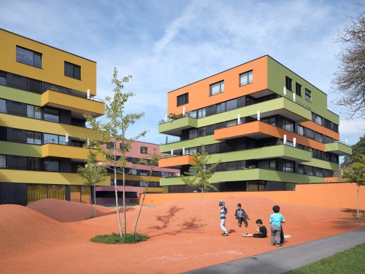
Affoltern Housing Development, Wehntalerstrasse, CH-8046 Zurich, Switzerland, 2012 designed by EM2N
The positions of the large projecting balconies (which also have recessed areas) are staggered from floor to floor and thus sculpture the volume of the building. Together with the coloured parapets and metallic bands of windows they help structure the buildings and shape the character of the development. -- ArchDaily
 |
| Source: Burton Hamfelt Architectuur archdaily.com |
MBO College North, Amsterdam, The Netherlands, 2012 designed by Burton Hamfelt Architectuur
Designed as a series of five interchangeable separate buildings, the colorful and parceled facade is primarily related by the functional distribution of the building and at the same time intended as an eye-catcher for the whole area. -- ArchDaily
 |
| Source: Toshihisa Iishi archdaily.com |
Enviromental Building, Okazaki, Aichi Prefecture, Japan, 2012 designed by Henri Gueydan
Close to Nagoya, this environmental building for rental and shops,
complements an older type of housing, now fully renovated and colorful.
In this rather dreary suburb, the idea is to break with the existing
view as if the start making of a new urbanity. --
ArchDaily
 |
| Source: Alberto Ruiz López & María Giménez Molina archdaily.com |
Renovation of the Saint Exupéry School, Alcobendas, Madrid, Spain, 2013 designed by Argola Arquitectos + Flint Archicture
Architectural integration is achieved through the use of brick facades, present both in the existing building and in the common services new construction.
This structure, supports a lighter construction made of colored glass walls, which aligns with the geometry of the existing building. -- ArchDaily
 |
| Source: RCR Arquitectes archdaily.com |
“Els Colors” Nursery, Manlleu, Barcelona, Spain designed by RCR Arquitectes
Ease in composition comes from the equal size of the parts, and the identification of each of them in the entire assembly comes from their color. Glazed facade with laminated glass and opaque aluminum doors to patios. Lattice elements with metal plate structure and colored glass (red, orange and yellow) 2/3 acid-tinged and 1/3 transparent. -- ArchDaily
 |
| Source: Pieter Lozie archdaily.com |
A Colorful Demolition: The Abandoned Interiors of Ghent’s Rabot Towers Revealed, Ghent, Belgium
With the removal of the facade panels we get to see behind the
building’s public face, revealing the many living room interiors, where
the bright walls are framed by the tight rhythm of the window frames,
almost like an abstract artwork. --
ArchDaily
 |
| Source: Cecilie Bannow archdaily.com |
Grønneviksøren Student Apartments, Bergen, Norway, 2013 designed by 3RW Arkitekter
By using different window sizes and different façade panels and colors,
it breaks up the monotony of a modular building system and gives it a
lively layer. The result is far from what one might expect from a
modular project of this size. Working both with and against the module
principal has been crucial to eliminate the risk of creating monotone
and characterless architecture. --
ArchDaily
 |
| Source: KSR Architects archdaily.com |
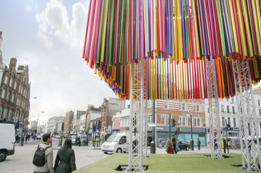
Colorful Pop-Up Pavilion Forms the Centerpiece for Camden Create Festival, London borough of Camden designed by KSR Architects
As part of a new three-day festival in the London borough of Camden, KSR Architects have
designed a brightly colored pop-up pavilion for the famous Britannia
Junction. The festival’s centerpiece is made up of 640 fluorescent tubes
hanging from a stage truss system to make a colossal wind chime,
animating the area with movement, color and sound. --
ArchDaily
 |
| Source: archdaily.com |
OMA to Research the Link Between Color and Economic Development
Paint company AkzoNobel has announced plans to fund a global research project by OMA which will investigate the link between color and
economic development. The project is part of AkzoNobel’s wider ‘Human
Cities’ initiative, which they say “highlights our commitment to
improving, energizing and regenerating urban communities across the
world.” -- ArchDaily
 |
| Source: a21 studio archdaily.com |
The Chapel, Ho Chi Minh City, Vietnam, 2014 designed by a21 studio
The multi-layer colorful curtains are orderly arranged and placed in the
opens to add more colors to the entire space as well as soften the
coldness of the metal frames. --
ArchDaily
 |
| Source: Jesús Granada archdaily.com |
12 dwellings in Jaen, Calle Llana de San Juan, 41, 23004 Jaén, Jaén, Spain, 2014 designed by bRijUNi Architects
....the colorful facade, challenging the monotonous and constructive regulations, and the existing rich chromatic diversity in the surroundings, to become the protagonist of such a unified but not individualized project.... -- ArchDaily