Monday, May 27, 2013

Urban Elements: Charging Stations

Source: Miloš Milivojević archdaily.com
‘Black Tree’ Public Solar Charger, Tašmajdan Park, Belgrade, Serbia, 2012 designed by Miloš Milivojevic 
Strawberry Company invented the first public solar charger for mobile phones – The Strawberry Tree. The new Black Tree is conceived as an artificial tree which transforms the solar energy into the necessary electrical energy and this way joins the surrounding forest in a common struggle for the planet richer in oxygen. With its function, this Strawberry Tree reminds us of insufficiently exploited potential of the energy of Sun, through people’s everyday habits such as sitting under the tree and using the nature as a shelter from the Sun. -- ArchDaily

Source: popupcity.net

Source: popupcity.net
AT&T Launches Solar Mobile Charging Stations In NYC
As part of an ongoing effort to keep New Yorkers connected, telecom provider AT&T launches free solar mobile charging stations in public spaces across the five boroughs of the Big Apple. The Street Charge stations are obviously more than some piece of street furniture. The interesting thing here is that they seem to be function as little meeting places. Almost everyone needs a battery recharge from time to time, so the solar-powered stations make the perfect occasions for people to relax for a moment and say “Hi” to a stranger who is in the same situation. -- The PopUp City

Monday, May 20, 2013

Curved Forms 7

Source: Richard Meier & Partners
Plan, Source: richardmeier.com
Jubilee Church, Rome, Italy, 2003 designed by Richard Meier & Partners
These three walls vary in height and are, in fact, segments of a sphere. Each shell is built of pre-cast  concrete segments, post-tensioned in situ; by virtue of the curvature in plan, each is independently supported. -- architect's web site
Read a post from ArchDaily

Source: Enforma Studio archdaily.com
Plan, Source: archdaily.com
Vila Stoliv, Stoliv, Montenegro, 2010 designed by Enforma Studio
....in formal expression of “seashell”, which is “opening” to the “views”, creating unique space, both in interior and exterior. Unique design approach is implemented in two aspects. First, radial stone walls are creating three primary parts, which are fuctionaly and structuraly parts of house and ,second, into a big glass surfaces of house which “bring” enviroment in interior, creating subtle mix of inner and outer space. -- ArchDaily

Monday, May 13, 2013

Cylindrical 12

Source: Luc Boegly arcdhaily.com
La Luciole Concert Hall, Alençon, France, 2008 designed by Moussafir Architectes Associés
....the buildingʼs forms evolve from rectangular to cylindrical, yet the core idea – two tilted, interconnected volumes containing the audience and the stage – remained intact. -- ArchDaily

Monday, May 6, 2013

Gardens in the Sky

Source: halvorsondesign.com
Ulfelder Healing Garden , Massachusetts General Hospital, Boston, Massachusetts, USA designed by Halvorson Design
The Ulfelder Healing Garden unites two contemporary trends in landscape architecture: green roofs and therapeutic landscapes. The garden is located on the 8th floor of Massachusetts General Hospital's Yawkey Center, which provides clinical care for patients with cancer and other serious illnesses.
Designed by Halvorson Design in collaboration with the Yawkey Center's architects, Cambridge Seven, this healing garden is a welcoming refuge for patients, families, friends and care givers. Directly adjacent to the pediatric cancer facility, the garden is an oasis away from the waiting rooms, machines, IVs, and treatments—a place for people to gather, talk, reflect, and be consoled. -- architect's web site


Source: archrecord.construction.com
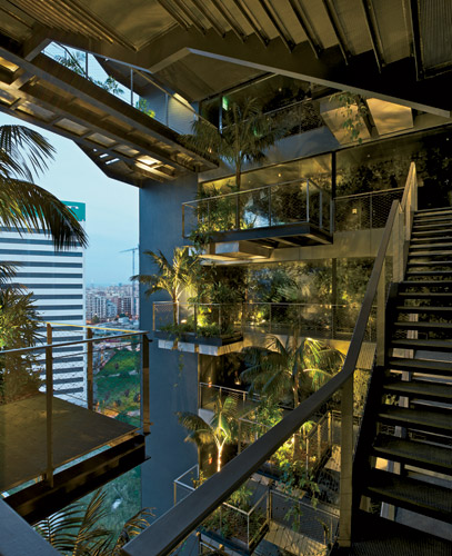
Renaissance Barcelona Fira Hotel, Barcelona, Spain, 2012 designed by Ateliers Jean Nouvel
The literal oasis is a central open-air garden that runs vertically through the hotel's 26 floors, filling every level with palm trees and other vegetation. This vertiginous, north-facing void, animated by zigzagging fire stairs, rises between two solid volumes containing guest rooms. These are accessed from single-loaded open galleries that overlook the garden and its spectacular views to the city. -- Architectural Record

Source: Patrick Bingham-Hall archdaily.com
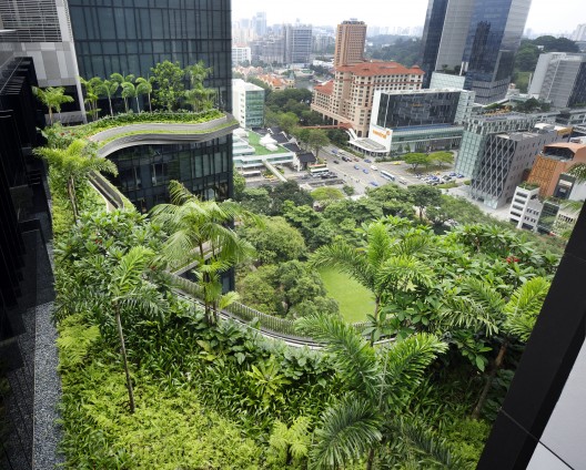
PARKROYAL on Pickering, Singapore, 2013 designed by WOHA
Massive curvaceous sky-gardens, draped with tropical plants and supporting swathes of frangipani and palm trees, are cantilevered at every fourth level between the blocks of guest rooms. Greenery flourishes throughout the entire complex, and the trees and gardens of the hotel appears to merge with those of the adjoining park as one continuous sweep of urban parkland. -- ArchDaily
Read a post from A Weekly Dose of Architecture

Monday, April 29, 2013

Curved Forms 6

Source: kpf.com
International Commerce Centre, Hong Kong, China, 2010 designed by KPF
The tower’s subtly tapered re-entrant corners and the gently sloped curves at its base are designed to optimize its structural performance. These curves splay out at the base of the tower, rooting the tower in its surroundings, while creating sheltering canopies on three sides, and a dramatic atrium on the north side. -- architect's web site
Read a post from ArchDaily

Source: Hufton + Crow archdaily.com
CMA CGM Headquarters, Marseille, France, 2013 designed by Zaha Hadid Architects
However, although the tower’s vertical form may steal the spotlight, special attention was also placed upon the ground life of the tower. Situated on a busy site, surrounded by an elevated motorway viaduct and on top of a convergence of public transport facilities, the tower’s lower portion extends its horizontality in order to “relate to the extreme horizontal energy of pedestrian, automobile, tram and shipping movements at ground level. -- ArchDaily

Source: Miró Rivera Architects archdaily.com
Circuit of The Americas, Austin, Taxes, USA, 2013 designed by Miró Rivera Architects
The architects bring their innovative approach to the structural systems: rather than being concealed behind a building’s façade they are articulated and become significant parts of the design. An architectural theme reoccurring throughout the site is the use of red steel tubes. The tubes cascade down the side of the Observation Tower to form a canopy for the Amphitheater stage and also frame the Main Grandstand. Evocative of sports cars and movement, this element ties the structures together creating a consistent visual experience. -- ArchDaily

Monday, April 22, 2013

Folded Form 5

Source: Gabriel Saunders
Vivida, Hawthorn, Australia, 2011 designed by ROTHELOWMAN
Aware that the building would be seen from varying angles and distances, ROTHELOWMAN created a bespoke external wallpaper in direct response to the building’s internal cells, stacked up in neat, square boxes. This patterning served to re-skin the Telstra building, positively affect shading and heating requirements, and create a dynamic, metallic façade that changed in appearance at different times of the day, and when viewed at different angles.  -- ArchDaily

Source: Vincent Fillon archdaily.com
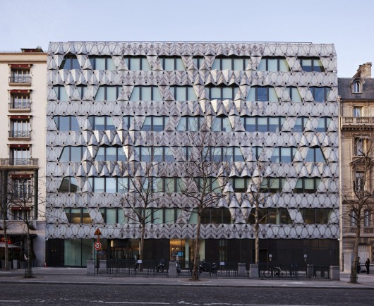
Origami, 36 Avenue de Friedland, Paris, France, 2011 designed by Manuelle Gautrand Architecture
An emblematic showcase of the building – the main façade is mostly glass, partially covered with a second-skin of screen-printed marble pattern. The rendered effect is a tremendous origami and the view of this delicate folded marble can be enjoyed both from exterior and interior of the building. -- ArchDaily

Source: Simon Menges archdaily.com
Keystone Office Building, Karlin, Prague, Czech Republic, 2012 designed by EM2N Architects
The external appearance of the building takes up geometrical themes found in Czech Cubism at the start of the 20th century. The volumetric concept of the façade creates an ambivalently legible network of forms oriented in different directions. The double-layered façade not only produces a sculptural outer skin, but also improves the performance of the windows in terms of thermal and acoustic insulation. -- ArchDaily

Source: Michael Compensis archdaily.com
Textilmacher, Munich, Germany, 2013 designed by tillicharchitektur
Its iconic feature is the geometrically folded facade, which deforms the simple cubature by an animated play of light and shadow.
The matt bright surface of the anthracite pigmented concrete responds to its environment. Depending on the season, time of day, weather, and light incidence, the facade continuously changes its character. -- ArchDaily

Source: Gerard Van Beek Fotografie archdaily.com
Veilige Veste, Leeuwarden, The Netherlands designed by KAW Architecten
Covering the whole building with especially designed square composite elements; that is how architect Beatrice Montesano translated the work of the previous mentioned artists in the transformation of the old police station.  The strict 12 by 12 feet grid constituting the building inspired Montesano to design the diagonally angled squares, that are positioned alternately to create the diamond shape pattern that covers the building. -- ArchDaily

Monday, April 15, 2013

Skin of Architecture: Pattern 11

Source: Takeshi Yamagishi archdaily.com
Kanayama Community Center, Ota City, Gunma, Japan, 2009 designed by Kengo Kuma & Associates
The exterior wall is a thin and light screen, a transformation of the ‘stone wall’ that characterizes the historic spot. Stone is fit in the steel plate supporting the load of the entrance porch, so that a feel of calmness and strength can be added to the semi open-air space. There are two types of shapes in the stone, determined by the weight that can be carried by one person, and they are developed in a regular pattern to gain a sense of lightness, seeking a symbol born from the pattern. -- ArchDaily

Source: Raimund Koch archdaily.com
Urban Townhouse, New York City, New York, USA, 2009 designed by GLUCK+
The front façade engages the street with a custom water-cut aluminum rain screen with brick-shaped openings relating to the solid bricks of its neighbors and panel joints corresponding to the neighboring building stories. During the day, it appears as a flat, patterned mass, marked off from the adjacent houses by the tall glass slots on either side. The horizontal joints of the aluminum panels break up the vertical surface as a reference to the rhythm of the window spacing of the row houses. -- ArchDaily

Source: Luis Asín Lapique archdaily.com
Enterprise Park in Arte Sacro, Av. Ingeniería, s/n Sevilla 41091, Spain, 2010 designed by Suárez Santas Arquitectos
The production spaces are located behind a continuous enclosure built with a lattice of white concrete prefabricated pieces, modulated following a five-meter grid, and adaptable to each specific need. -- ArchDaily

Source: Lucas Shaller archdaily.com
BTV branch, Innsbruck, Austria, 2011 designed by Rainer Köberl
Black and white squares cover the building in a regular pattern. It suggests a chessboard, but also has something of the white snow-covered mountains that surround Innsbruck. The striking feature of this bank building is its steeply rising roof – Köberl wanted to make the building as tall as possible so it is not swamped by the surrounding urban architectural jumble. Underscoring the shape is the striking pattern of the facade. Like a chessboard, the outer skin consists of square, concrete-coloured panels made of fibre-reinforced concrete alternating with black air holes of the same size. -- ArchDaily

Source: Adrià Goula archdaily.com
Viviendas en Toulouse, Toulouse, France, 2013 designed by Mateo Arquitectura
A complex of four independent but conceptually connected volumes (A, B, C and D) arranged around a semi-private garden. ....finished in black and white brick, in varying but complementary proportions. A, on the street tarmac, is mainly black (80% black, 20% white). B, designed to reflect, is its opposite (80% white, 20% black). C, at the corner, is balanced (50% white, 50% black). -- ArchDaily

Source: Alex Chan archdaily.com
Library of South University of Science and Technology of China, Shenzhen, Guangdong, China, 2013 designed by Urbanus
GRC (Glass Fiber Reinforced Concrete) was originally specified for the library façade. With the consideration of façade scale, structural load, sizes of fabricated structural components, local shading requirement, and other factors, the GRC unitized component was designed into a light and high-strength hollow module that had a dimension of 1,800*675*400mm; its hollow core was then filled with insulating materials, with mold release and curing treatment. -- ArchDaily

Source: Derek Swalwell archdaily.com
Fairbairn House, Melbourne VIC, Australia, 2013 designed by Inglis Architects
The house presents itself to the public and does not seek refuge behind a fence. Whilst doing so it only hints of its inner workings through materiality allowing a mounting of suspense. The breezeway brick screen is a key device and creates these necessary layers. It serves multiple purposes. The first being a strong idea of entry by creating a secondary landscaped space which gives the property a sense of intimacy. -- ArchDaily