 |
| Source: archdaily.com |
Torre Velasca, Milan, Italy, 1958 designed by BBPR
The Torre Velasca, planned to loom over its surrounding structures at a height of nearly 100 meters, was to be an important addition to Milan’s skyline.
The upper third of the building, which protrudes outward from the lower levels, was designed to resemble medieval watchtowers.
By using the Torre Velasca to build upon the ideas of ancient architecture, BBPR was able to connect the modern building to its historic past and keep the design of the new addition from feeling out of place.
Its functionality paired with the architects’ attention to the surrounding environment made the Torre Velasca a seamless, as well as functional addition to the ancient city of Milan. -- ArchDaily
 |
| Source: Te-Ming Chang |
First National Bank Building, Boston, Massachusetts, USA, 1971 designed by Campbell, Aldrich & Nulty
The design of the First National Bank Building is unusual, as it has a bulge of several stories near its base. The building has earned the nicknames the "Pregnant Building", the "Pregnant Bank" and "Building with a Belly." The architect of the skyscraper, Campbell, Aldrich & Nulty, designed the building with the bulge in order to give pedestrians a wider view of the street but at the same time provide the building with more floor space at higher levels. -- Wikipedia
 |
| Source: watersideplaza.com |
Waterside Plaza, New York City, New York, USA, 1974 designed by Davis, Brody & Associates
Waterside Plaza is a community of four residential towers overlooking the East River. Recognized as a model of urban design, the complex offers 1400 residential units, a health club, a large beautiful plaza, shopping, dining and parking.
In 2001, architecture critic Herbert Muschamp described Waterside as a "great urban composition" that is "picturesque and historically informed."
"People tend to overlook Waterside Plaza," said Muschap. The architects, Davis, Brody & Associates, successfully aspired to the stark geometric power of Louis Kahn's work, he said, "but the complex also recalls the towers of San Gimignano, the walled medieval town in Tuscany. -- official web site
 |
| Source: wikipedia.org |
Rainier Tower, Seattle, Washington, USA, 1977 designed by Minoru Yamasaki
The skyscraper has an unusual appearance, being built atop an 11-storey, 37 m (121 ft) concrete pedestal base that tapers towards ground level, like an inverted pyramid. -- Wikipedia
The Tower's grace belies its strength and utility. Its design underwent three environmental tests before construction. It was tested first for strength in the event of a severe earthquake, then for stability during high winds. The results proved Rainier Tower as one of Seattle's safest buildings. Even its unusual shape was tested, finding that it would eliminate the "canyon effect" of strong winds that can occur around modern high-rise buildings. -- Unico Properties
Its tower is mediocre, dulling an already dull skyline, and where the building should have calmed down, at the bottom, it suddenly went wild, breaking the line of connection with neighboring buildings and creating that looming, threatening shape. It is a self-aggrandizing narcissistic flamboyance, not an entertaining one, and it is ironic indeed that the whole thing should be presented in the rhetoric of "planning for people". -- Paul Goldberger, "On the Rise", P. 103
 |
| Source: archdaily.com |
Block 16, Stadshart Almere, Koetsierbaan, the Netherlands, 2005 designed by René van Zuuk Architekten
The design of Block 16 is largely based on an analysis of tunnel formwork constructions. Implementation of this mode of construction is financially attractive in developing major housing projects. The basic principle of tunnel formwork is the simultaneous casting of floors and party walls.
Variation in the length of adjacent tunnels breaks the monotonous structure. The result is a wavy façade surface providing the block with a dynamic quality. This unusual application of tunnel formwork implies a relatively small rise of the building costs, but yields a much more expressive image. -- ArchDaily
 |
| Source: NKS Architects archdaily.com |
Meteorite Housing, Dazaifu, Fukuoka, Japan, 2008 designed by NKS Architects
We made the first floor area minimum to fit the footprint of the building in the designated area, while the second floor was much bigger, and the third floor was smaller again. -- ArchDaily
 |
| Source: Kokkinou-Kourkoulas Architects archdaily.com |
Shop & Trade, Pireos 222, Moschato Tavros, Greece, 2010 designed by Kokkinou-Kourkoulas Architects
The front facades are visually continuous woven surfaces which also serve as screens. The vertically curved elevation of the main building is rendered as a curtain that expresses the flow of energy and breezes across the site. Thus, it becomes the memorable image of transverse spatial openness. The garden is planted with trees, indigenous grasses and herbs that require minimum maintenance and irrigation and mark the seasons through their scents and changing colors. -- ArchDaily
 |
| Source: Luuk Kramer archdaily.com |
Gym Hall TNW, Utrecht, The Netherlands, 2011 designed by NL Architects
The idea of TNW is to ‘peel off’ the skin at the top to bring daylight into the interior. By partly bending out the facade a gap comes into being between the roof edge and the walls: indirect light will reflect into the hall. The carefully deformed envelop creates a mildly glowing gradient that lights up towards the top. A pleasant side-effect of bending out the facade is that the building becomes sculptural: an optimistic gesture comes into being. -- ArchDaily
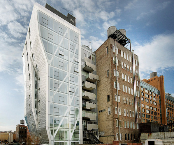 |
| Source: archrecord.construction.com |
HL23, New York City, New York, USA, 2011 designed by Neil M Denari Architects
To capture the most floor area possible, they adjusted the silhouette of the building to contract and expand according to site constraints and zoning regulations. Where the High Line meets the HL23's south facade, they bent the curtain wall inward and pushed out the east facade to regain lost square footage. -- Architectural Record
 |
| Source: Lester Ali archdaily.com |
Sowwah Square, Al Maryah Island, Abu Dhabi, UAE, 2012 designed by Goettsch Partners
Four office towers frame the stock exchange building: two at 31 stories and the other two at 37 stories. The first full office floor of each building starts 34 meters above the ground level, providing a highly transparent, open lobby and elevating the views on all tenant floors. A landscaped plaza connects the four buildings and the exchange. -- ArchDaily
 |
| Source: Daici Ano archdaily.com |
Urbanprem Minami Aoyama, Minato, Tokyo, Japan, 2012 designed by Yuko Nagayama & Associates
The shape of the building is fairly bent skywards, like a stomach being stuck out forward, which does not allow people to tell how many stories it has in looking up the building from the street. The design of two slit patterned windows that opens on each level also makes unclear the scale. -- ArchDaily
 |
| Source: Wansoon Park archdaily.com |
Gilmosery, Seoul, South Korea, 2012 designed by Kim in-cheurl+ARCHIUM
The skeletal structure creates the space and frames of the form; and hid the boundaries of the contents to inside. And it forms a gap between the structure and the space. As the planters and chairs act as the rail, this surplus space is neither classified as inside nor outside. -- ArchDaily
No comments:
Post a Comment