 |
| Source: archdaily.com |
Zollverein School of Management and Design, Essen, Germany, 2006 designed by SANAA
These walls, punctured by numerous apertures, filter the light and view from the surrounding factory landscape, softening the transition between exterior and interior. --
ArchDaily
 |
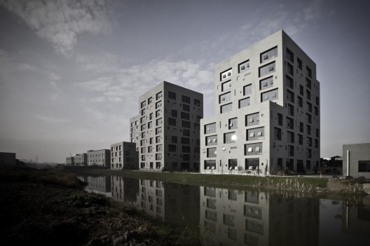
| Scoure: Bruno Klomfar archdaily.com |
Special School and Dormitory Mariatal, Mariatal, Kramsach, Austria, 2007 designed by Marte Marte Architects
The two new volumes, school and boarding house, are built in exposed concrete. The solidity of this material in combination with the decision to seize on the typology of the old building’s perforated façade, make the new volumes fit harmonically into the ensemble. -- ArchDaily
 |
| Source: deshaus.com |
Plot 6 of Jishan Base, Nanjing, Jiangsu, China, 2008 designed by Atelier Deshaus
...focused instead on creating traditional spaces. These include interior courtyards, dense lower floors, and open upper floors that provide multiple views of the hilly landscape surrounding the software park in Nanjing. Whitewashed walls reflect light into the courtyards and between buildings, while shelflike wooden screens in front of glass curtain walls create a decidedly modern take on traditional Chinese wooden architecture. --
Architectural Record
More from
architect's web site
 |
| Source: archdaily.com |
Habitat 15, Hollywood, California, USA, 2009 designed by Predock Frane Architects
The varying size (based on client standards) and location of the exterior enhances the sense of separation by avoiding overlapping views between units while simultaneously extending views beyond the site. -- ArchDaily
 |
| Source: archdaily.com |
Euromax, Maasvlakte, Rotterdam, The Netherlands, 2009 designed by KOW
Steel construction is used for the sloped top, with curtain wall. Transparent glass panels and opaque, enameled glass panels alternate in anthracite grey aluminium casing.
The specific form of the Euromax Terminal office building offers a subtle variation in profile depending of the differing points of view being a powerful statement in the Rotterdam harbor. -- ArchDaily
 |
| Source: Scagliola/Brakkee archdaily.com |
Blok1, Arnhem, The Netherlands, 2009 designed by GROUP A
Its solitary character is enhanced by the building’s all-round orientation and façades, which are punctuated by a large number of windows, making the building look bigger than it actually is. This particular fenestration makes that no two dorms have the same layout. --
ArchDaily
 |
| Source: deshaus.com |
Kindergarten, Jiading, Shanghai, China, 2010 designed by Atelier Deshaus
A formidable concrete block encloses the circulation ramps for the school, while a punctured block with perforated aluminum panels, irregularly placed windows, and indoor/outdoor play spaces houses the classrooms. The facades, though, fool expectations—with the closed concrete box hiding a large vertical space, and the open facade masking a tight arrangement of classrooms. --
Architectural Record
 |
| Source: David Frutos archdaily.com |
Central Office of FEDA Confederation of Employers of Albacete, Albacete, Spain designed by Cor & Asociados
We have designed this project from the idea of ‘diffuse limits’ and ‘blur’ architecture. Our intention was to cover the volume of the building with a veil capable of bluring it and making it change. We wanted the building to react to the variations of weather and the movement of users with different levels of brightness and textures. In the opposite view, this second skin had to be perceived as a space with constant shape and without scale changes. Likely, the inner façade with the windows is the one able to defragment the building because the windows are very large compared to the human scale. -- ArchDaily
 |
| Source: Toshiyuki Yano archdaily.com |
One Roof Apartment, Niigata, Japan, 2010 designed by Akihisa Hirata
Since there is a lot of snow in winter, terraces are not suitable. We wanted to create a huge roof for the house volumes, which can cover the common space protected from the cold weather. When the normal cubic volume diverges, a space will be formed in between and people feel welcomed by the warm and large space. The unique branched shape from the outside will symbolize as a comfortable place in a contemporary way. --
ArchDaily
 |
| Source: Reiulf Ramstad Architects archdaily.com |
Fagerborg Kindergarden, Fagerborg, Oslo, Norway, 2010 designed by Reiulf Ramstad Architects
There are many cultural heritage guidelines to be considered in the project site. The area is characterised by residential buildings from 1900-1950. As a requirement from the local authority, the kindergarten is to have a contemporary expression. With its location in the middle of a small city park, the kindergarten has an outdoor area that is protected like an enclosed garden. -- ArchDaily
 |
| Source: Atelier HAKO Architects archdaily.com |
House in Oiso, Oiso, Naka District, Kanagawa Prefecture, Japan, 2010 designed by Atelier HAKO Architects
In the south elevation, wide window and shallow depth wood deck which is like japanese traditional ‘engawa’ were provided as connect elements of the internal area and the garden, whereas other elevation was designed defensive to outside. -- ArchDaily
 |
| Source: Misae Hiromatsu archdaily.com |
Cube Tube, Jinhua, China, 2010 designed by SAKO Architects
Aluminum panel covers the outside walls of ‘CUBE’. Transparent, grey and black colours of glass are adopted for the ‘TUBE’. Randomly placed terraces lessen the effects of the floor slabs to articulate the facade, thereby emphasizing the simple forms of the Cube and the Tube. All of these factors make the two simple blocks become a landmark facility in this area. -- ArchDaily
 |
| Source: Silviu Chiţu archdaily.com |
Cathedral Plaza, Bucharest, Romania, 2010 designed by Westfourth Architecture
The tower’s core is placed asymmetrically towards the southern wall of the building, in order to set the office areas towards the north and the better natural light for a working environment. The structural system is composed of steel frames, braced diagonally along the perimeter walls. The north facade, towards the cathedral is clad with stone panels, while the irregular punched windows on this wall are marked by aluminum projecting frames. -- ArchDaily
 |
| Source: Sabrina Scheja archdaily.com |
MFH Glattlistrasse, Bassersdorf, Switzerland, 2010 designed by L3P Architects
The circumferential window band of the new building shows the curious visitor under the spell, one wants (and is allowed) to know which function underlies this building. The façade becomes transparent and a view in the courtyard is desired. With the evening bustle artificial light supports the meaning of the newly articulated middle point of the home. -- ArchDaily
 |
| Source: 2b Architects archdaily.com |
Urban Villa Beaumont, Lausanne, Switzerland, 2010 designed by 2b Architects
The compact building with its punctured window “holes” reinterprets
characteristic qualities of the 19th century buildings. For example, the
mineral washed concrete façade uses a colour that blends in with the
surrounding vegetation. Since the concrete surfaces of each individual
apartment are treated differently, the typologically interwoven
character of the interior can also be perceived on the exterior. --
ArchDaily
 |
| Source: Åke E son Lindman archdaily.com |
Umeå School of Architecture, Umeå, Sweden, 2010 designed by Henning Larsen Architects
From the outside, the building has a cubic expression with its larch facades and square windows placed in a vibrant, rhythmic sequence on all sides. --
ArchDaily
 |
| Source: archdaily.com |
Courthouse and Public Square, Sankt Poelten, Austria, 2011 designed by Christian Kronaus + Erhard An-He Kinzelbach
The mediation between old and new does not only function in formal terms but also on a spatial and organizational level. In particular, a system was developed that efficiently connects the three storeys of the courthouse building with the five storeys in the new building while, at the same time, mediating between the differing ceiling heights. --
ArchDaily
 |
| Source: Leonardo Finotti archdaily.com |
W305 Building, São Paulo, Brazil, 2011 designed by Isay Weinfeld
.... a building made up of two articulated, yet quite distinct, volumes: the first, long, narrow and perpendicular to the street, is a “mass” cut by openings – sometimes windows, sometimes French windows – whose inside is sheltered from the excessive sunlight on the Eastern and Western facades; the other volume, removed from the street and with facades facing North, South and East, is moderately hit by sunlight and is completely encased in glass, on all faces. -- ArchDaily
 |
| Source: Simon Deprez archdaily.com |
OP13, Paris, France, 2011 designed by PHD Architectes
It is part of the redevelopment of the site operations launched by Paris
Habitat and the City of Paris: creation of a pedestrian link between
the ZAC Rungis and Parc Montsouris, along the inner ring road,
construction of 60 homes , a nursing home and student housing. Mixed wood- aluminum frames are sized depending on the nature of the
piece they light on a pitch of 60 cm (kitchen / bathroom 60×60 cm,
120×120 cm bedrooms, living room 240×240 cm). They punctuate the
polycarbonate shell as needed, increasing the randomness of openings in
accordance with the frame siding. --
ArchDaily
 |
| Source: Shu He archdaily.com |
Pool At Fragrant Hill, Beijing, China, 2011 designed by Zephyr Architects
The skylights and windows let in sunlight and reflect the passing of time during the course of a day and seasons of the year. There are three sizes of window openings: 1200mm, 800mm and 400mm. The fenestration is designed according to lighting and privacy needs. There are more openings in the southwest facade, facing the courtyard, and less in the east façade adjacent to neighboring home. -- ArchDaily
 |
| Source: Frédéric Henriques archdaily.com |
Tianzhoushan Tea House, Anhui, China, 2011 designed by Archiplein
For this specific situation we develop this philosophy of vanishing. The strategy is to consider the building as the continuity of the existing topography so as to reduce his impact on the land. The building is bended by following the natural movement and defines as set of different faces that minimizes its size. -- ArchDaily
 |
| Source: Frédéric Henriques archdaily.com |
Office Complex Haokang, Kunshan, Suzhou, Jiangsu, China, 2011 designed by Archiplein
....developing an architecture design more massive, more physical. Economy prevailing in this project, we will use a simple process for both the expression of the structure and exterior. -- ArchDaily
 |
| Source: Cosmin Dragomir archdaily.com |
Dante Alighieri School Expansion, Bucharest, Romania designed by LTFB Studio
The randomly perforated facade of the educational volume (already an usual approach in the contemporary architecture) should be read in a playful key, as a contrast to the uniformity and monotony of the existing facade. This “game with windows” seems a puzzle with pieces of the tree foliage and green light filtered through them, seen from the inside. -- ArchDaily
 |
| Source: Ariu + Vallino Architects archdaily.com |
Dwellings, Spotorno, Italy, 2011 designed by Ariu + Vallino Architects
The residential complex is composed by 30 modular units with hall,
dining room, kitchen, bedroom, utility room and bathroom. All living
spaces have view to the sea. Modules can be joined in case the client
needs a bigger house. All the apartments have a big terrace of about m.
2,20×8,00 to be used as summer living room. Some apartments have a
little private garden. All the apartments are gathered around the
swimming pool and the common park. From swimming pool level it is
possible to get to the beach by a private wainscotted lift. --
ArchDaily
 |
| Source: Christian Richters archdaily.com |
 |
| Model, Source: archdaily.com |
29 Apartments in Blaricum, Blaricum, The Netherlands, 2012 designed by Casanova & Hernandez Architects
The twin apartment blocks are conceptually divided into two parts: an outer black skin perforated with windows and voids that wrap the inner part of the building and the open air spaces coloured in white. The playful rhythm formed by the apparently random positioning of the voids in the façade has been created by alternating different floor plans within the building. The different size of windows and the variety of their relative positions inside the rooms produce a large diversity of interior spaces, making it impossible to find two identical apartments within the building. Difference and repetition are interlinked within a single entity, creating an environment related to the human scale which, at the same time, is based on geometrical principles and on an abstract image. -- ArchDaily
 |
| Source: Luc Boegly archdaily.com |
Apartment Blocks, Nanterre, France designed by X-TU
The inspiration to create this architectural landscape in its urban
setting came from the original specifications for the project.
Strong vertical fragmentation was another requirement, as was a broken
skyline. As requested, the south facade features large six- to
ten-metre openings, which are integrated by the vertical fragmentation.
The volumes are split vertically by planted breaks. These clean-cut
spaces structure the organisation of the ground plan and create a
transparency between the terraces and the Promenade des Provinces
Françaises. --
ArchDaily
 |
| Source: Marcel van der Burg archdaily.com |
 |
| Facade Diagram, Source: archdaily.com |
Two in One House, Leiden, The Netherlands, 2012 designed by GAAGA
The design of the facade is based on a neutral grid, avoiding an evident hierarchy. Because all openings look – despite their differences in size and infill – similar, it is not immediately clear what is happening inside. From the outside one cannot discern a bedroom from a living room. In this way the facade acts like a mask, a 3-D layer that conceals the structure behind. The facade consists of a white framework, in which rectangular openings are filled in with aluminum window frames and wooden panels. The wooden panels vary in position, some are placed close to the white stucco surface and some are placed deep into the facade. In combination with the wooden surfaces around the openings the idea of the facade as a 3-D layer is intensified. Furthermore, the variable wooden infill gives the projects its expressive and dynamic looks. -- ArchDaily
 |
| Source: Luc Boegly archdaily.com |
Harbonnieres Residential, Harbonnières, France, 2012 designed by Chartier-Dalix Architects
This new residential care home in the heart of the Picardy countryside provides capacity for 36 disabled people in an extension of the existing Notre Dame care home. Concrete floors and supporting walls are left rough and covered with a slightly glossy varnish to create interplays of light and discreet reflections. -- ArchDaily
 |
| Source: bureau SLA archdaily.com |
Buddhist Meditation Centre Metta Vihara, Hengstdijk, The Netherlands, 2012 designed by bureau SLA
The overall form of the meditation centre is an interpretation of the so-called Mansard roof, also known as the French roof. The windows in the steel skin – in facade and roof – are standard Velux
windows, which are technically superb and relatively inexpensive. As
with the corrugated steel, however, there is often an aesthetic
compromise in the joints with other materials. In the case of
Metta Vihara, though, they are framed with white painted wood, giving
them a distinctive look. --
ArchDaily
 |
| Source: Jesus Granada archdaily.com |
88 Jerez Dwellings, Gran Canaria, Spain, 2013 designed by Daroca Arquitectos
The chosen typology for the set of dwellings is the closed block with an interior open courtyard. Thus, we built 16 dwellings per floor, with two vertical cores that provide access to all the dwellings from galleries that are open towards the courtyard. -- ArchDaily
 |
| Source: Torben Eskerod archdaily.com |
Ama’r Children’s Culture House, København, Denmark, 2013 designed by Dorte Mandrup
The Children’s Culture House mediates the varying scales of adjacent buildings through extruding and cutting their forms. The joint of the building, where the extended lines of the existing buildings meet, is lowered to allow maximum sunlight to reach the neighboring courtyard. The expression of the Children’s Culture House is surprising and imaginative: the roof and facades are treated the same, and the House does not have a “start” and “end” as ordinary houses do. -- ArchDaily
 |
| Source: Thomas Mayer archdaily.com |
Social Complex, Gelsenkirchen, Germany, 2013 designed by Agirbas & Wienstroer
Windows of different sizes on the outer walls of the building, as well as the number of openings, contain some mystical religious symbolism. The North and South facades contain 19 window openings each, while the Western facade contains 9 and the Eastern facade contains 10 window openings (9+10=19). Here, the architect made metaphorical use of the mystery of the number 19, which is acknowledged as the mathematical code of Koran. -- ArchDaily
 |
| Source: Störmer Murphy and Partners archdaily.com |
Haydau, Fritzlar, Germany, 2013 designed by Störmer Murphy and Partners
The elongated structure seems to hover above the remains of the historic
walls, which continues up to form the hotel with its perforations
functioning as windows. -- ArchDaily
 |
| Source: Hiroshi Tanigawa archdaily.com |
House in Kitakarasuyama, Setagaya, Tokyo, Japan, 2013 designed by Mizuishi Architect Atelier
This is a small house built in the corner plot that is before coming to a
dead end. Residents are husband and wife and two young boys. It is the
location of the favorable conditions facing the roads in south and east. --
ArchDaily
 |
| Source: JSa archdaily.com |
169 Amsterdam, Mexico City, Federal District, Mexico, 2013 designed by JSa
Its main characteristics are its double facades, made of white concrete,
glass and pine, where terraces that face Amsterdam street are located. --
ArchDaily
 |
| Source: Hannes Henz archdaily.com |
House in Brissago, 6614 Brissago, Switzerland, 2013 designed by Wespi de Meuron Romeo architects
Due to its spatial diversity, complex relationships between interior and
exterior spaces, diverse path choice, this house can be experienced
like a historic village. --
ArchDaily
 |
| Source: Michel Bonvin archdaily.com |
Boissonnet Building, Chemin de Boissonnet, Lausanne, Switzerland, 2014 designed by TRIBU architecture
The facade is in white roughcast 3mm (semi-mineral) to give a new bright
picture to this “hole”. The designs of window frame in roughcast 0.5 mm
and executives plated anthracite windows merge with the glazing
windows. The windows disappear in an abstract design on a white
background that reflects the environment and demonstrates this green
situation.
In a few months, residents have given a name to their building: the
panda, with reference to two colors white and black, and the presence of
the forest. This is an illustration of the strong visual identity of
the project but also the strong identification of the inhabitants of
their home. --
ArchDaily


No comments:
Post a Comment